Blog


Eggplants as inspiration

 These eggplants were the last I harvested from my garden before the temperatures dropped. I decided to memorialize them as I wasn't sure I would be able to eat them all. I set them on my dining room table being to lazy to go up to my studio as well as wanting a different venue.

#1

Here they are in front of my seat at the dining room table

#2

Then I went to the chair across the table and did the reverse view. I must be easy to please as I had so much fun doing these.

#3

Deciding I did not want to move the set up, I left it up and did this painting at the table. I did not have any clean 9x12 panels so I grabbed a panel with an old painting on it that was not worth saving. I like painting over old paintings anyway. This was painted in less than an hour. 

#4
Of course, I then had to do the other side too! The painting below is the one underneath #4. It had been varnished, which tends to absorb the paint on top of it which you can see in the top of the new painting. The whitish effect from the varnish. I liked the red 'swirls' coming through from below. These paintings are done just for the pure joy I get from doing them to see the effects. I could have spent more time totally obliterating the painting beneath. This was done in less than an hour too.


These acorn squash and peppers were also the last harvest from the garden but way back in the day. I want to say 20 years ago.

Read Full Post


Remake-Saulsalito House Boat


Original with a few adjustments already begun


Almost finished, but not quite, 20x16


This is a remake of an old one I did when in class over 10 years ago. It is quite ugly and every time I came across it I wondered why I didn’t just throw it away. It is of a houseboat in Sausalito CA. Richard and I had stopped there on our way back from San Fransisco to his parents house. It isn’t a pretty boat to begin with, but I sure didn’t improve it any! I could not find where I had ever taken a photo of it that is how much I disliked this painting.


So as you can see, the top one is the ‘original’ from class, when we were studying textures. Which I did very well as far as that goes. But it was so dark. I had already decided to take out the wooden structure on the left and you can see my corrected drawing, in pink, as to the top of the boat so there would be more sky and better proportions. The siding should be white but it looked so gray and dingy. So will it ever be a great painting? No. But it gives me a feeling of satisfaction to fix something like this. I still have to finish the big window and put the bike back in a few more finishing touches, but you can see the difference, which is all I wanted for today. Side note: I wrote this almost two weeks ago and then was distracted by a bathroom remodel so never posted. Here is the painting today as I did get some work done on it between painting walls and trim.


I used the side of an old credit card to get the illusion of rough wood with peeling paint. It is fun to do, although would not work for most of what I paint, it works well for this. 

Sausalito Houseboat, 16x20, oil on panel, available


Here is the 'finished' painting, at least for now. From the last photo, I dulled down the wooden screen in the window, finished the plant, redid the reflection and finished the bike. 


Read Full Post


Wildflowers revisited

Years ago, when my children were young and we were getting them started on hiking, I began to draw and paint wildflowers during our many pit stops along the trail. It was a way to help me learn the names of the 100's of flowers that are found in the Rocky Mountains. This year is a banner year for wildflowers and I decided to pick up where I left off in 2003, the last drawing I did and when I had put together a little book of my drawings.
My first attempts to draw small after drawing with a paintbrush on large canvases seemed difficult for me. I felt the drawing was way off and stilted.  The relationships were off between the leaves and the flower.

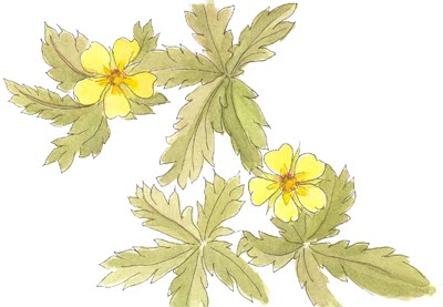
potentilla, false start
Cinquefoil (pontentilla) 2003


I redrew flowers I knew I had done before just to see how much my style might have changed in the intervening years. I would say it has changed quite a bit! To me I think the older version would be better for keying into and identifying the flowers in the field.

watercolor of low penstemon
Low Penstemon, 2020

This low penstemon I did the other day I had to lay on my belly to see it at eye level. I made sure that there was no flora that I would crush, just a dusty dry gravel. The trail was running between the flower and me.

Low Penstemon, 2000

Here is another one I thought I had done before and I wanted to see which was the 'better' of the two. Lo and behold, I had not done it before! This is called Butter and Eggs and I thought it was a Golden Pea. Obviously, it has been awhile since I have seen the golden pea! They are alike in height and similar in color and structure, but very different.

Butter and Eggs, 2020


Golden Pea, 2000

I had a good illustrative style going after doing so many every summer back in the day. I need a bit more practice before I will use any of my newer drawings. They are too different and need some refining. The one exception might be this Sego Lily. Amazingly, this is one I had not done before. They were in two colors, white and pale pink. I think I prefer the drawings without doing them in pen. I will leave them done in pencil in future. Your thoughts?

Sego Lily, 2020


I have been so enjoying renewing my connection with the wildflowers of Colorado. It is a banner year and it has given me a reason (as if I needed one) to get up to them there hills to hike and sketch. It has renewed my soul, and is starting to refresh my observation and drawing skills as well.

Read Full Post


The Old and the New

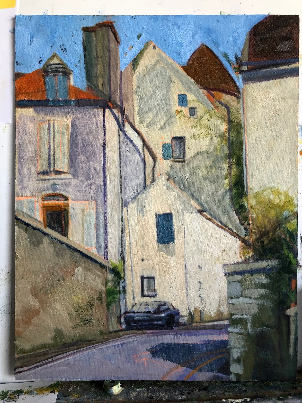
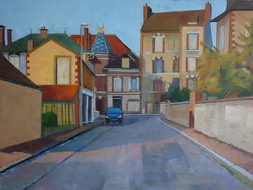
Semur Street Scene with Car, 14x11, block in

To start of this new year of 2020 I am posting an updated painting I started back in 2015. Here is the original block in from that year. Not bad at all. I did a number of paintings from that 3 week trip to France. In my quest to have better paintings overall, I picked this painting to update. Surprising to me was that I had no updated images of it since the block in phase and I had considered it 'finished' at some point in time. So I did  not think to photograph it before redrawing it and starting in again. Below is the latest restructured image. Not too many corrections overall. I wish I had looked at the original block in before starting over as I see plenty of things I like in it.


Semur is an old walled town in Burgundy, France. I found so much to like about the winding streets and old buildings. We only spent an afternoon walking around this town yet I have done at least 5-6 paintings from there. It is amazing how many centuries these houses have seen, yet still stand.


Semur Street Scene with Car, 14x11. oil 


Read Full Post


Paris Rains

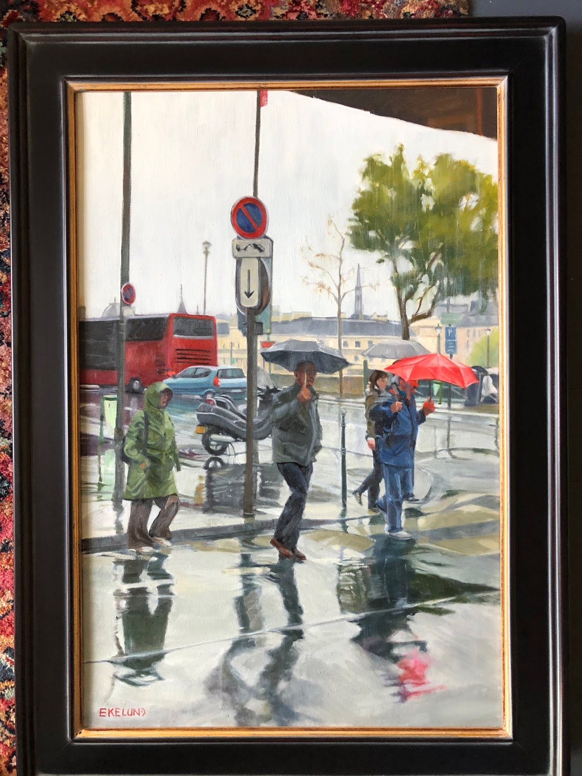
Paris Rain, 30x20, oil on linen

Here is a painting I did about 5-6 years ago. I was so very pleased with it at the time and proudly hung it in my home. It was done in the master painting class I took with Kevin Weckbach and it was the piece I did for the month we studied Dark/light pattern. In my quest to make improvements on existing 'finished' art works, I started to study this piece. Why had it never sold? Was it the subject? Or the way it was handled? Composition seems good to me. There were a few small things that I thought could be improved upon but overall I was still pleased. BUT. Once I got started working on it so much started to pop out. Drawing being premier. Just some subtle things but which I think make a difference.

The bus at a wrong angle on the backend; a few angles here and there on the umbrella's; I added some  tiny features to the figures faces. I don't like faceless humans and though there was a hint at features in the faces, I put a bit more character into them; a bit more shape was added to the clothing: The woman's raincoat was lightened and given more form, the man in the middle now has a pocket on his jacket with his left hand now in a pocket; and the man in the red umbrella lost a little weight and has a brighter blue jacket on, which brings him out from the woman behind him. I darkened the pavement (although in the image it doesn't quite show up as the paint is still wet) and made the crosswalk a bit more distinct. My daughter's comment was "It looks so much lighter." And yet I had darkened more down than added more light. An interesting paradox.

I had pulled this painting out to update it prior to Notre Dame burning but the spire is in this painting. So weird to contemplate that it is now gone. Let us pray that when the repairs and rebuilding are done that they have enough common sense to rebuild as it was and not some horrific idea of 'improving' upon it. Our culture seems to have a huge ego and superiority complex, especially when it comes to history.

Read Full Post


Satisfied

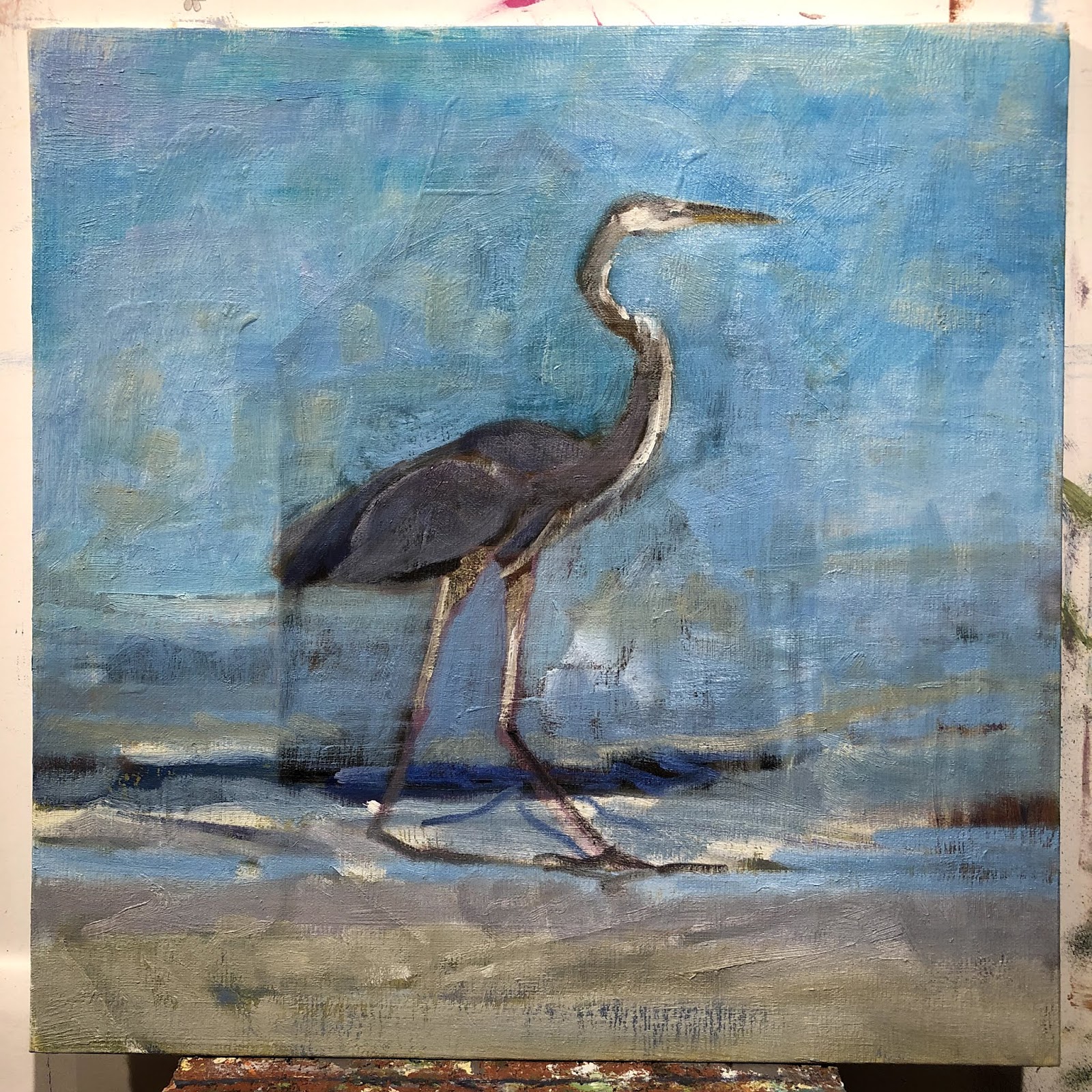
Satisfied, 12x12, oil on linen panel

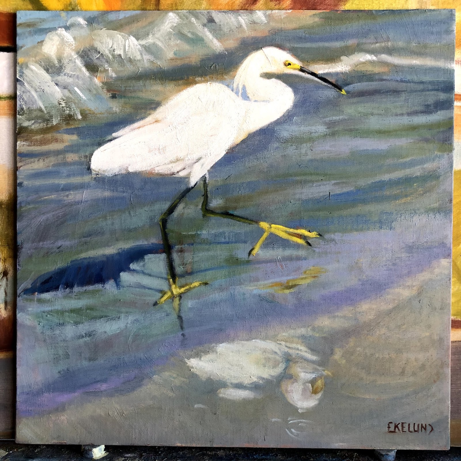
Here we have a satisfied Heron. I took this photo right after I saw him catch and eat a fish. I am painting these shore birds with great delight. Ah to live where they are an every day occurrence. Not that we don't see Blue Herons and lesser Egrets right here in the middle of Denver Colorado. We do. I see them at the park 1/4 mile from my house every summer. But the lake with its not so glamorous broken walls or caged rocks aren't quite as pretty a back drop as the Gulf is. With waters that glimmer and change color along with the shifting colored sand.
Here is a progression for you. I started with painting over a plein air painting from a few winters ago:

From the looks of it, I was painting over another old painting...one I must not have ever considered done as there is not title for it on the back...So the Heron is #3, oh my! I was not unhappy with this painting for having painted it on site on a cold crisp January day in record time, but really, the subject wasn't very interesting.


You can see after my initial block in over the old barn you can still see a ghost of it. In the finished painting it is much fainter and if I didn't show it to you, you would most likely not ever see it. I don't understand why I enjoy doing this so much but I know I am not alone in this. There is one more shore bird I am going to do painting over another plein air painting that isn't that great before I run out of 12x12 paintings to paint over. Stay tuned!

Read Full Post


Goin' Fishin'

On the Prowl, 12x12, oil on linen panel

Progress has been made on my egret painting. I painted in more than I had originally intended but there you have it. From day to day what we are going for can change. Everyone seemed to really like the daffodils coming through the egrets body so I left some but not as much as I had thought I would.
I still like it and overall, I think more people will like it this way too because they won't know any better!

Here is a bit of the progression. The image below is where I first stopped. I could not bring myself to 'ruin' what I felt it had going for it and everyone who saw it in this stage said to leave it alone! Eventually it just called out for more trust in my abilities and more paint. This first block in was where I stopped and had a hard time wanting to mess with it. It looked very oriental in style and the shapes coming through the light wash were an interesting element.

Original block in on top of still life painting

Here is the next phase when I finally decided I had to make it more a painting as I had originally intended before I got distracted by the textures and color showing through:

First foray into trusting my gut

I wasn't sure if I wanted to let go of the daffodils in the image above. Ultimately the whites were competing too much. The bird was not coming forward and being center stage. I then was asked by a new acquaintance if I would be willing to film myself painting for a project he is working on. I know he is a musician but I didn't ask what the project was. He has been generous in sending me recordings from the class we are taking together. I did not think to record the lectures until weeks into the class so I felt I owed him a return favor. I picked this painting as it looks good on film and I had only a few touch ups to do. Once I got going I changed my mind and saw the daffodils coming through as a distraction.

Read Full Post


Then and Now

An acquaintance/collector contacted me today. Here is what her email said:
I haven't seen you in a long while but did want to let you know how much I am So So ...enjoying your partings in my home on - going - ly!  I just moved one from downstairs upstairs to my office to so that I can look at it as I work at my desk.  I thought of you and how much I wanted to let you know.  Much love to you and our old investment group too!... Love... M
I have attached a photo of the one I look at now everyday in a new way...
Painting Along Cherry Creek, oil

I looked in my art files to see if I could find the images for this painting and its name. I could not! It is from before the age of digital photography! Oh My. It is my only palette knife painting and painted plein air back in the day when I was just starting to paint outdoors. It is very gratifying to know that it is still being enjoyed after all these years.

Spring Reflected, 36x24, oil on linen


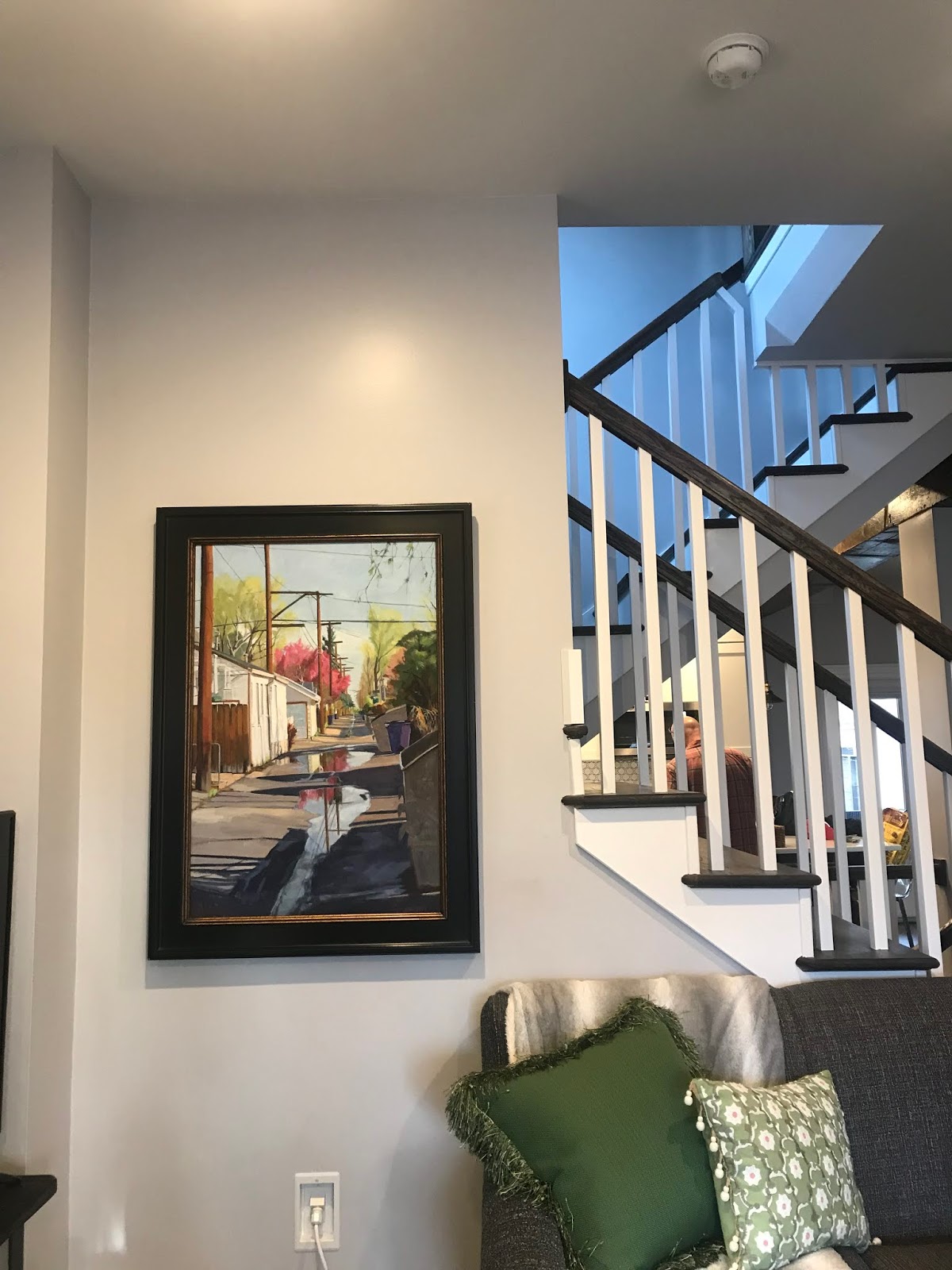
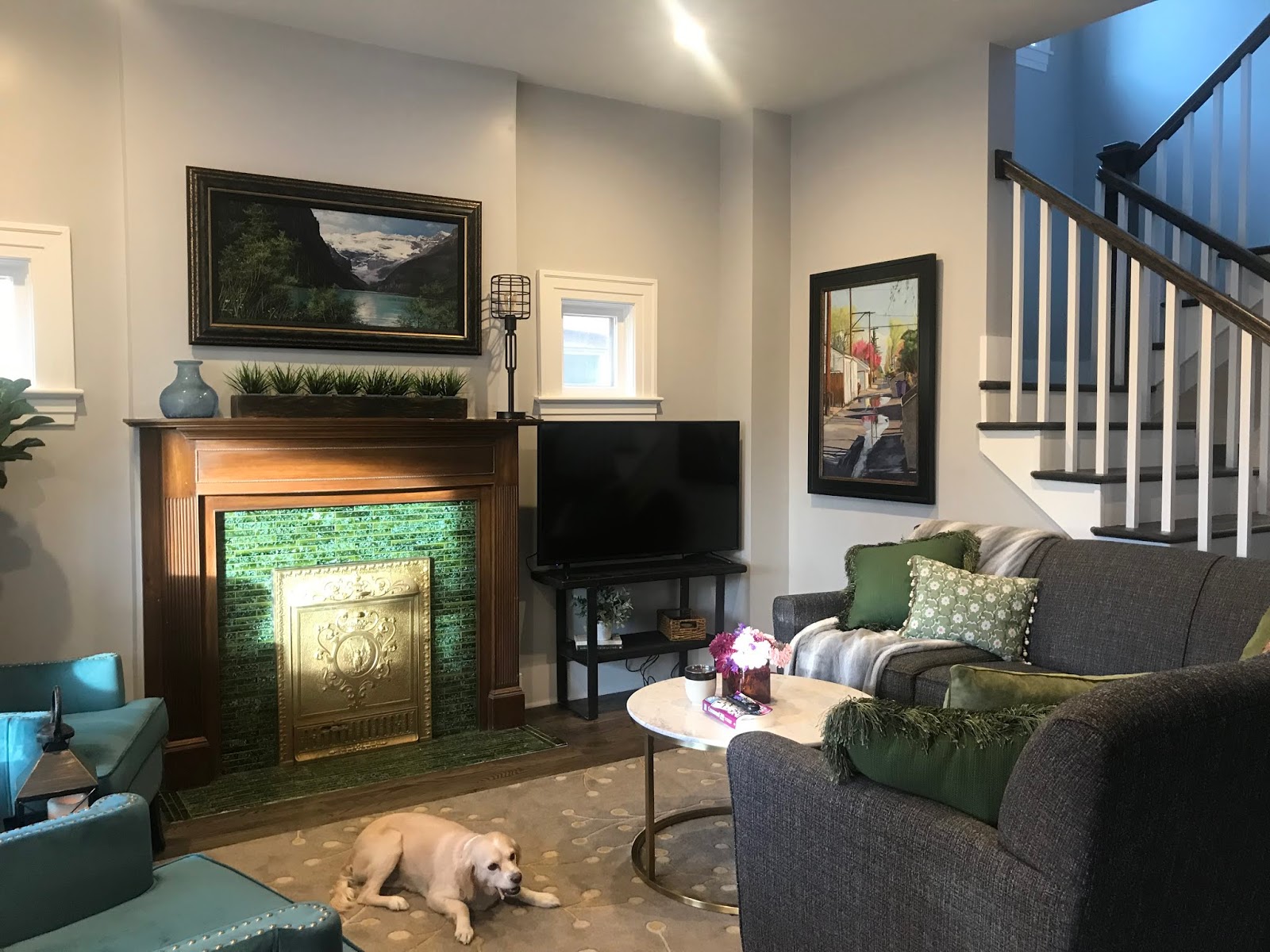
And here is a painting I just sold to someone who found me via Nextdoor! One never knows how you will be found. I had responded to someone months ago who was looking for local art to furnish their office. I was never contacted from that post. Last week I had a private message from new neighbors looking for local art to hang in their new home who had seen my response. They are so happy with their new painting and it just so happens to be of their alley! Isn't it amazing how things work out? 

Read Full Post


Have a Seat - View of the Aegean Sea

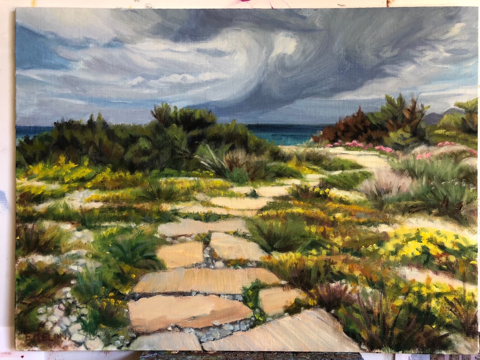
Have a Seat, 12x16, oil on panel   available


A few months ago I posted a painting of the Path less Taken. I mentioned in that post that my son suggested I do a companion piece so that we could all see what was at the end of the path and I included the block in of the new painting. I personally like the idea of the path leads where each individual decides what they want to see at the end of the path, but like so many mothers, I aim to please. So here is the scene where that path led. It is on the island of Milos in the Aegean Sea. The ice plant flowers were supersized adding a wonderful splash of bold color here and there.

Read Full Post


Cortona Italy


oil on linen panel, 15x30


Here is a scene from a trip to Italy I was on a few years back. It is in the Tuscan town of Cortona. One of the many walled used to be city states.  I was taken by the colors and the building block effect I saw as I came down a hill towards the main square. We were only there for a few hours, but in that time we went to a private wine tasting, the sprawling street market and explored many of the side streets away from the main tourist sections. Yes, there are still places in a small town to escape the disgorging of tourist buses. Even if that area seems to be shrinking daily. 


I have no name for this painting yet so if something comes to you, please let me know.

Read Full Post


New Years Day-Roxborough

New Year's Day- Roxborough State Park, 16x20, oil on panel

So Here We Go Again. I had just decided to not do anymore 'before and afters' on my blog. Afterall, I consider myself a 'professional.' Professional artists don't make mistakes of such an egregious nature. Of do they? I know this artist does.

2 or 3 years ago version

But then last night I had a call from a dear friend of mine. She is also an artist and I value her input and her eye. As we were talking she mentioned how helpful she found my 'before and after' posts. That they contain valuable information. Jeez Louise. Now what? I laughingly told her how I had just vowed to do no more of those as I spent the last week or so excitedly redoing paintings I found to be flawed in one way or another. Some of them I wasn't even sure what it was that bothered me but I just knew they were  not for public consumption. I was telling how much fun it was to all of a sudden 'see' with such clarity what was wrong in a number of these 'face to the wall' paintings.

Here is one such failure. The bottom one was done from a photograph (yes, you read that correctly. A 3.4 x 5' photograph to be precise). This scene is from before digital cameras if you can even remember back that far. I came across it as I was culling my old morgue file. Before throwing this photograph away I decided to paint it. From a photograph. Like I used to. How we did that is so hard to fathom these days.

Let me start with the fact that the shadows are not united in form. Add to that the fact that the grasses are so bright against the purple and are not reading as they should; that some of those plants are in fact, in the shadows. If I remember correctly, I was in a hurry when I painted the original. Looking back I do see that the photograph is brighter like the original version is. So at least I got that right. That dark bullseye purple shadow in the middle did nothing but detract from the whole, drawing your eye right to it. How did I miss that?

In the new version my first step was to change the sky color. I darkened it down a wee bit in value and put some violet in it. Then on to unite that shadow shape and tone down the purple, adding value and temperature shifts within the shadow. Adding a variety of plants-they are not all grasses! In the plants I added greens and cooler yellows and some deep reds as well as keeping some of the oranges and warmer yellows. I remember that originally I wanted the deer to blend in to the scenery and now on this version I want them to stand out. Even though it is not overall as bright and sunny as the original, I believe the new toned down version reads better overall. And if I did not show the original you would not know the difference. It is always a crap shoot redoing a painting. Always someone who prefers the old vs the new. But though I may still decide to brighten it up and add more warmth to it I am much happier with it now.

Read Full Post


Path Less Taken

I am back! It has been awhile. It isn't that I haven't been painting. It is that I have been unable to believe that anything is finished...is that being stuck? Or is it just that I have been too distracted with other projects that this area of my life has suffered? If I am honest, it is both. It has been a summer of electricians, contractors, energy auditors and getting roommates. In all honesty, that is enough to keep anyone very busy.

Here is a painting I did last week; another one from my series from my trip to Milos, an island in the Aegean where I went this past Spring. This little seaside path to the sea is in Pollonia.


My son said he really liked it but he wants to see where the path leads. So I may just do a companion piece, but my thought is it leads to the sea and we all have our ideas about what that looks like. That being said, I must admit that the Aegean Sea is like no other I have encountered!

For me it is more about the journey than the destination. It is a sunny day with the threat of a cleansing rain, the island is abloom with spring flowers, and the sea beckons.

After adding the photo above, the image seemed too light. Some of that is from the lighting conditions when I took the photo. But it made me think it wasn't dramatic enough. I put the painting back on my easel this morning and redid the sky as I wanted the piece to have real feeling to it. The only other thing I did to it was to redo the dark hedges along the the horizon line. I wanted them to read more of a unit. Other than those changes the rest is the same. The photo below is darker, taken inside at my easel but is truer to the original than the washed out image above.

Looking for a Title, 12x16, oil on linen panel. Available. Contact me for information

After wrapping this up I blocked in the companion piece. It is the same size, same surface but I am going for a more abstracted landscape approach. Let's see if I can pull it off. I am happy with it so far. Here it is:

Read Full Post


Attachments

I figured out why I was so stuck on one of the paintings I started in January this year. It seems to always be the area one is attached to that is holding up progress and/or one's unwillingness to let go of said area. So even though I haven't finished this piece yet, I wanted to post it to show how attachments you need to let go of, hold you up.


Last Saturday I had dinner with a writer friend of mine. She was talking about a new essay she had written for her online newsletter. She was lamenting that she had to cut the best line out of her latest work to make the rest of the article pull together. How her attachment to that one line was keeping it from being a cohesive whole. But that maybe she could work that cut line in some not yet unwritten piece in the future. I then proceeded to tell her I had the exact same thing happen to me! Except in paint. Her first response was oh how sad! I could not ever reuse it. Which isn't exactly true. I feel that every time this happens there is always a takeaway from it.

This first image is where I had finally roughed in the sky really liking the energy of it. Unfortunately, I put it in after I had already begun painting atop the block-in of the rest of the painting. I remember being intimidated by the sky in the reference, so I was in avoidance mode. Leave it until I am ready or can't ignore it anymore.

When not done in proper order, confusion results

If I had added the sky when the rest of the painting was in the same state (below), who knows where it might have gone, right? My aim is always to keep some of that block-in brushwork but it is so rare, not sure why I keep thinking that will happen.

block in as I figure out shapes and proportions

Here is the painting with the new sky that better fits the rest of the piece. The new sky actually helps the piece overall so much it almost seems like a new painting and yet I feel I was able to keep some of the brushwork I had become so attached to. I can finally go back to the rest of it now that it doesn't feel like two separate paintings. I don't think it will take much to finish. To be continued.

Starting to pull together finally

Read Full Post


My Dog Ate My Painting!

There are many things to be thankful for. This year it is that I have never heard of "the dog ate my painting" until now. That isn't quite the correct assessment, but the dog did chew this painting. A friend of mine's husband came to my art open house a few weeks ago and found a little plein air I did one spring day at Rocky Mountain National Park about 10 years ago. I had carpooled with an artist friend as we delivered art to a gallery in Estes Park. Why waste a trip to Estes Park when you can paint in the park?? What does it matter that it is frigid cold and snow is fast approaching? This particular friend never lets such trifles stop her. So we hauled our gear out into a field and went to work. So that is the back story on the painting...
Now here is the story of the dog chewing this painting. It has to be shared just because it is a unique story. So, my friend was having an acupuncture appointment in her home, when the acupuncturist remarked that it looked like her dog had gotten into something and was chewing on it; maybe a piece of paper? except it didn't sound like a piece of a paper. She replied nonchalantly would he mind checking on the dog to see what it was? He remarked "it is a painting, I think" She jumped up off the table, needled like a porcupine to find that indeed it was a painting, the one her husband loves so much. She is so upset about this that she took it back to the frame shop where we had been the day before to see if they could fix it. She didn't even want to tell me! Of course they can, but to pay to remove the canvas remount it and repaint was not worth the cost of paying for that conservation. So I told her I would repaint it.

The back, so you can see the damage
The front

I don't know. I think it is a fun story. In fact, yesterday I had the thought to see what I could do to make the original painting work without the conservation costs as the dog chewing the painting adds to the story in such a unique way. I own a book press, so I soaked the board, which is a soft particle board of some kind, and put it in the book press last night. It made a difference to the 3D teeth marks on top. The surface is now flat which softens the puncture holes. This morning when I took it out of the press, I noticed that some of the fiber board was above the line, so to speak, or sticking up above the straightness of the canvas. I just rewet it and pushed the fibers down to be aligned with the canvas edge and stuck it back in the press. I am thinking this painting should be framed as is. But I think it might also be possible to rebuild the corners and match the sky if required.
My new painting is almost done as well, so there will be a choi

Read Full Post


Orchids Evolve

Studio Orchids II, oil on panel, 20x16

Here is an oldie but goodie. This piece originated in 2002 when I was very interested in orchids in particular, and plants in general. I liked doing what I considered 'plant portraits.' Not so much in the botanical illustration mode, although I did take a class in that at the Denver Botanic Gardens at the time. For me, being what some consider a detail-oriented person, botanical illustration did not appeal to me.

I had orchids lining every windowsill in my home. This scene was in my studio. I was even a member of the Denver Orchid Society so I would have access to more varieties of orchids. I still like having an orchid or two around the house, but I no longer have them in every window that was feasible. Working on this painting has made me realize that I miss the color and the jauntiness of orchids in my life.

Not sure I should show the original version, but here it is, painted from life. Oh, the things that I have learned over the years! What is 'wrong' with this version, as if I need to point them out, they are so obvious. No, instead I will focus on why I thought it worth saving: It shows the character of the plants coming through which was my goal at the time.

The window faces north. So the light coming through the blinds would not be warm. First thing that had to change. Second, the perspective has every thing falling off the canvas to the lower right. Can't have that. Funky Orchids was the title of the painting as I tried to take a lighter, less serious approach to my work, but there are still some things that need to be considered, even going for a less formal format. The Moses in the Cradle leaf coming into the painting from the lower right had corner was supposed to help with the tilt of the blinds and board and it does, but not enough. Luckily the drawing of the plants themselves was good, and only required a little tweaking, the blinds and putting the plant stand in where it belonged took a bit more brain power. Unifying the shadow shape was helpful too as I tried to be more true to the light source. I can't believe now that I put all the shadows into black but back then I thought it would help the flowers be more colorful.

I was reading in "American Art Review" earlier this week an article on an upcoming Richard Diebenkorn show opening next month on his early years. I was heartened to read this about him and his process:
"Many have described this process as one of trial and error-even Diebenkorn himself-but it was not so much that he was creating and correcting 'errors' as he was attempting to find a better way, the extended journey being relevant to his final result.".. then finishing with "He kept working until he believed the painting was not wrong anymore, feeling his way until, in his mind, the painting had somehow become "miraculously right."

This idea has been floating around in my head for awhile now, and I liked that the journey was the important thing for Diebenkorn. And the idea of not correcting errors but finding the rightness.

I do hope I can get to Sacramento's Crocker Museum to see the show this fall.

Read Full Post


Winter Still Life

Winter Still Life, 16x20, oil on panel

This painting below that was posted this past winter needed to be reworked. I did this painting from an old slide I found from decades ago. I always liked this image so I was happy to find it after years of being packed away in the basement.

I wanted to put it in so you can see the difference as I explain what I did. the most obvious is that I lightened up (or added atmosphere to) the trees across the way. then I added more color and warmth to the overall painting. More reflected light gave the overall structure less heaviness and the birds now are more interesting.

Here is an interesting note. In my spring cleaning I came across a photo I had had made from the slide. I had forgotten all about it, but then remembered having framed it to hang on my wall. The photo was much better visually but it was also a mirror image to that of the slide! So though I had this improved image, I had to switch it visually from the photo to the painting. A mind bender to be sure.

Let me know your thoughts.

Read Full Post


The Rush is On


Starting with the finished piece first and then the explanation for a change. I repainted this piece over three or four days while also working on a few other paintings. It took me a bit longer than I expected as I thought I would only "fix" a few areas. I don't think I left anything untouched except the hair on both of their heads.

2017 The Rush is On, oil on canvas 24x24


2010, oil on canvas, 24x24


2016 showing repair and mounted on board (bad lighting lightened up the overall image)

This painting is 6 years old. There is nothing major wrong with it for where I was at 6 years ago. A year or two ago I had hung it in a place where I could look at it with the thought to revisit it. If a painting hasn't sold, it is always fair game. For whatever reason, it fell off the wall one night - it woke me up- and on it's way down, hit a few places and in one particular sensitive area ripped a substantial hole. I could not decide if it was worth fixing or if I should just chuck it. I researched repairing paintings. So many different approaches. Some said do not patch an area as it will shrink at different rates and then will always looked patched, so reline the whole painting. Others said patch and you will be fine! The repair kits I found were nowhere near a 24x24" size. This particular painting was cotton canvas on the 1.5" profile of stretcher bars. Not my favorite painting surface.

After much contemplation, I took it off the stretcher bars and glued it to a gator board trying very hard to line up the edges of the tear across the front waiters forearm. I filled in the area with a bit of gesso and lightly sanded the area. I could not sand it smooth as the texture of this canvas was rough. I tried refilling the area and sanding again. All I can say is that it is as good as I can get it. It was worth trying to save at this point as moving forward I was going to repaint the whole thing. The structure and drawing are pretty good so it should be pretty straight forward. The major issue with the original version from my perspective today is once again a value thing. So in the redo, I pushed the values away from the middle. Not much color shift overall except in the skin tones. I thought the waiter in the back had too blue gray a skin tone so I lightened up his face overall and to his arm in the shadow made it a reddish blue.

There is something about the original version that I still like but overall I am still happier with the redo.

Read Full Post


Not every attempt is a success

mid-century hand blown beer glasses

A photo sent to me from my daughter's phone; I gave this pair of Weisse Bier glasses to her for Christmas. I believe they are from either the late 50's or early 60's. I grew up with them in our home. They appear to be hand-blown, hence their irregular shapes. I liked that about them. I did get further than this before I decided to wipe it off. Don't ask me why as I am not sure now. Seemed the thing to do at the time.
It is painted over an old plein air painting which is why there are still some dark blotches that don't quite make sense yet. I will be starting it again at some point as I am not to be defeated. Figured I need to post the good with the not so good. It happens...

Read Full Post


Take a Seat

Almost finished!


as it is being taken down to the frame


Finished chair in natural light

Once upon a time, in a life faraway, there was an artist that decided to learn upholstery. This artist had a premature infant that required a full time mom, so the family had only one income stream from dad, a taxi driver. Furnishing the home was out of the question, so this artist became an alley rat. There was much to be found in the central Denver alley's around Cheeseman Park, but most needed work, and lots of it. Taking the very inexpensive Upholstery class at Emily Griffith Opportunity School, these finds from another era soon furnished the living room with wonderful antiques from the 1920's and 1930's and a little side business developed. By this time another child appeared, so still not ready to pull out the oil paints just yet. There were no odorless turps or mineral spirits in those days.

Those infants are now in their 30's and I have not upholstered anything but dining room chairs in decades. This chair was going to be joint project with my daughter, but after 2 years of storage in our garage, my husband wanted it out. Hence the idea to do it as a Christmas present. I had intended to have it done by a professional, but the quotes on it were $330 and $430 and it would take 4 months! Certainly not by Christmas, even though I started research on this in late September/early October. The good news about taking it in for a quote is that I learned it was an Eastlake chair that was mainly manufactured in the Midwest/West during the mid to late 1800's. They were usually sold in pairs. He said this was a higher end chair for the period due to the extra carvings on the top and the piece of burl wood on the front of the seat. He said the name came from a furniture maker in the 1700's who had this idea to mass produce chairs and had designed it to be so. This idea did not catch on until it was brought to the USA by some enterprising soul almost a 100 years later as an affordable, but good looking seating option. I can tell you it is a very hard wood, possibly walnut as it was very hard to tack and staple into!

It was hard to find the inner pieces I needed to work on this chair, so fortunately I had enough still stored in my basement to complete the task. Thank goodness for Youtube as I had not tied springs in 25 years. There are 5 springs in the seat I had to tie 8 ways so that they move as a unit. Only had to tie each one 3 times to get it taut enough, straight enough, etc. There were many aspects of rebuilding this chair that I did 3 times to get it right. The seat was not straightforward with the little extra detail or brace on the side coming off the back. Made that corner very tricky for cutting fabric. I can honestly say I am glad I got it done. It was fun, up to a point, but am I ready to tackle another upholstery project? Not really, at least not yet. But this is where my creative juices have been focused for the last week or so. Hence, it is worthy of a post.

Read Full Post


Having Fun with old works from July 2015

I found this old draft for a post that I never uploaded. Since it is the holidays and I would rather not post something new right now, I am going to put it out there as originally written with a few added adjustments.


The other day 18 new, large canvases arrived. Two large boxes and one thin medium; and nowhere to put them. It really made me realize I need to move some paintings as I tried to reorganize the basement.

These are the first I grabbed to work on today. I hope to work on the rest during the week as I have time. Some of these don't look so bad in their original state but over the years I have dinked on them, sometimes much to my chagrin.

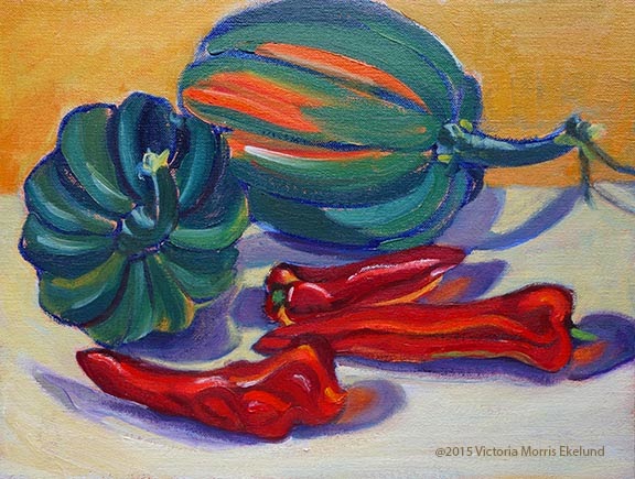
Last Harvest 2003, 9x12, oil on linen
Last Harvest, 2015, 9x2 oil on linen

For the Acorn Squash, I remember when I first did this piece I was trying to create energy; No one has paid much attention to it over the years so I felt I had nothing to lose by reworking it. After seeing the "remake"  however, I think the purple cast shadows are too much of a distraction and I miss the energy aspect. I think this one may get my attention again...

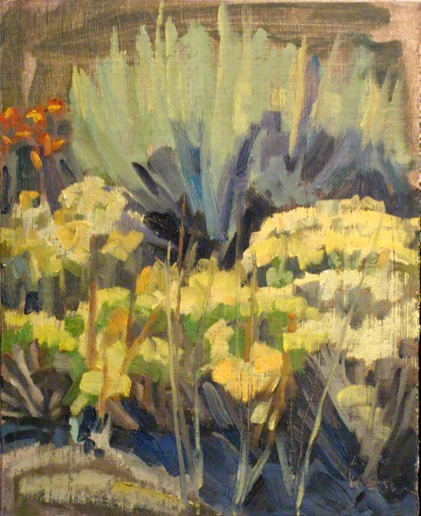
The "Sagebrush" paintings were done in bright late morning sun. Although the painting itself is "not bad" it does not really give you sense of that bright overhead light. That is why I brightened up all the foliage and flowers and darkened down the top part which was not doing its part in the original. I also took some of that orange red of the flowers and wove it through the rest of the flowers for a feeling of continuity.

Sagebrush, 2008, 12x9, oil on linen


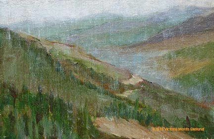
"On Berthoud Pass" we have a decent plein air painting; It does give a sense of distance but not a sense of rain. I was painting in the rain. I also tended at that time to put a lot of color shifts without thinking of the values. If the colors stay within the overall value (value = on a scale of 1-10, white to black) of the object(s) then it gives a sense of unity. My original has strips of color which is distracting to the whole.  A side note on this painting: my mentor, Kevin Weckbach, came to my recent open house and picked this painting out as a perfect example of edges that are working. He knows how I struggle with this particular aspect of painting and he said I did an amazing job and that I needed to keep it not sell it. High praise indeed!
On Berthoud Pass facing North, 2006, 6x8, oil on linen

Read Full Post


Roof lines revisited

Still no title, 24x30, oil on board


Last seen in 2015, 24x30, oil on board

European roof lines intrigue me. It is the catawampus way of building without a grid I think that just makes them so interesting to me. Since most of the places that have these great angles are also usually built on hills, helps. The history that can be discerned from the ages of the tiles and the shape of the stucco or bricks or stones. This scene is from a walled town in Burgundy called Semur. It was an afternoon's byway on our way from Dijon to Paris. I did the bottom painting and was never quite satisfied with it. The color of the roofs are too similar with the red one jumping out in the middle like a bulls eye.

After finishing up the Cesky Krumlov scene recently I decided to give this one a revamping of its rooftops. I had figured out in that one what was missing in this one. In the original lower image, I was going for a more orange and violet complement but somehow it didn't work as well as I would have liked. I felt the painting lacked something. I set about in the upper left hand corner and worked my way left to right on each layer of roofs going for visual interest and texture forcing value shifts as needed, something I am often hesitant to do for some reason. Being bolder in adding pinks and pale blue greens to the rooftops. I had started on that idea but was timid in not going further. Adding texture to the red bulls eye roof in the middle helped to add to the visual interest and tied it to the break up of shapes in the shadows down below it. In that big shadow shape down below and heading up the right side of the painting I added a bit of lighter blue gray to stair step the tops of the bricks up to the tin roof to help the circular rhythm that I was originally attracted to.

I changed the color of some of the houses in shade leaning towards the blue green in some and adding more yellow red green to the once violet cast shadow on the house that is to the left and in the middle row. The cast shadow now blends from the house across the wall unifying the two. The wall with its tiles casting a shadow moves from that yellow orange to a more violet when it gets to the right.

In the deep shadows (window holes, doorways and blocks), I warmed them up. Where once they were towards the dark blue violet I added some yellow making them not only deeper but helping to break up the too blue violet of the shadows. This adds to the eye movement through the shadows and back up into the light, stair stepping the shapes.

Read Full Post


A new painting emerges

A bit of a story to this post. I have a painting I did a year or two ago where I played with abstraction. I had it hanging at the office for fall as it is a scene where the dawn light was casting its long fingers across a street in the river town of Migennes, France. I was out looking for a patisserie to bring back breakfast. I am an early riser, even on vacation. One of my co-workers asked me if he could make a comment on the painting and of course I replied yes. I am always thrilled when someone looks at my work long enough to want to comment. He told me that the foreground of the road bothered him because there wasn't enough interest at the entry point into the painting. GREAT observation. So I took the painting home that weekend and fixed the road. Unfortunately, that little fix was leading me into wanting to repaint the whole thing as I am not in the same place I was when I painted it. On this particular painting I wanted to leave it alone. I was and am happy with it 'as is.' Here is the original painting with the road repaired:


Migenne at Dawn, 18x24, oil on panel over old painting. Available

Not on my agenda that weekend was to start a new painting, same subject, but that is what I ended up doing. I was jazzed! I found another old painting, same size at 18x24, on which to paint. I found out through this process that it is a different result depending on if the original painting ever had varnish on it or not. The painting above had varnish. Even with removing the varnish, the paint is still tacky so the brush glides over it and sticks. Which is the effect I like in the above painting. The new rendition over another old painting did not ever have varnish on it so it was like painting on a fresh canvas.
I took photos along the way so you could see how it works. I had intended to make a slideshow out of the progression so it would not involve so much scrolling but the latest versions make it so much harder than the easy Picasa I used for all my slideshows in the past! Maybe I will figure it out but today, it is not happening and I have been messing with this for weeks and I am over it.
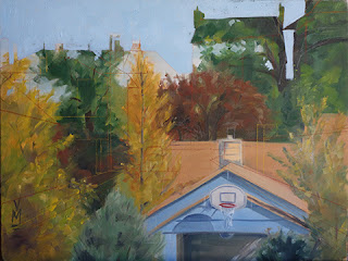
1. I don't have the original painting but in this first image it is mostly there. I have drawn in the basic structure of the new painting and blocked in the outline of the new sky.

2. Here I have added the road and some guiding lines of the gutters. The roof color is already as a wall and the chimney looks like a door.

3. Here I have added walls in two different values. One color for the walls in the light and another for the same color walls in shadow.


4. Finishing up more houses. I do like how the trees work with the composition of the new scene.

5. Roofs are coming into play and the side of the orange building with its basic structure and the sidewalk on the left is no longer tree colored. The chimney pots are taking shape as well. The growth is tied to big blocks of color.

6. More roof's and finishing up another house to the left.

7. this photo was taken after dark so it is studio lit. I did not want to stop yet so that is why the colors look a bit yellow. The houses at the end of the street are coming in. Oh how I struggled to want to cover up the trees but it had to happen. Windows are being shuttered as the town is still asleep. The car shape is added.

8. Day 2: more details. Windows, roofs and car. The sidewalk is finally put in on the right as is detail on the wall. I changed the color of the beige walls that are shadow. They were too warm in color. I am starting to shape the green bushes.


9. working on color shifts. I thought the roof was too green on the tall house. Added more detail that is particular to France.

 10. Minor changes here. Starting to work on the greenery on both sides of the street.

 11. This is where I stopped. I am not finished. I don't normally paint in such a methodical way. In this case it had to be or I would have been lost in the trees, no pun intended. Now that I have the structure in the next step will be to force some areas and tone down others. I don't yet get the feeling in this version that it is dawn. The road needs more visual interest and the bushes on the right need better definition of being bushes in the dawn light. They are a bit indistinguishable for my taste. In other words, not reading right. I will post the finished piece when I get there but this is where it ends for now. It is the way of the artist. I need a break from this piece as I work on others. That way I can let these ideas simmer until they are ready to be manifested.

Read Full Post


Reading on a Jet Plane

Reading on a Jet Plane, 20x16, oil on canvas panel

From the takeaway from the workshop I did earlier this month, I decided to redo one of the subjects started there. Not over paint the existing painting as is my habit, but start over from the beginning on a new canvas. I spent more time getting the proportions correct up front instead of covering the canvas with big shapes as I did in the previous version. This version is working so much better. You see the second figure reading much more clearly. His hands don't look like hams.

In my efforts to always improve, I decided it was good to start over as I knew what I wanted to do differently after the study done in the workshop. In this version I wanted to keep the yellow/violet complements but not overuse either. I wanted to keep the big shapes simple. I think it gives a good idea of the bright light you get flying high above the earth. 

Since this photo dates before digital imagery or maybe at the beginning of digital photography (was it really 13 years ago?) I worked from a 4 x6 photo I had in our photo album from our trip to Germany in 2002. This is my son (sans glasses as I did not think that the glasses were needed for the success of the painting and it is not technically a portrait) and my daughter is in the window seat.

Read Full Post


Fraser Valley Meadow - How to...Hold shapes together

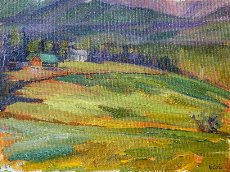
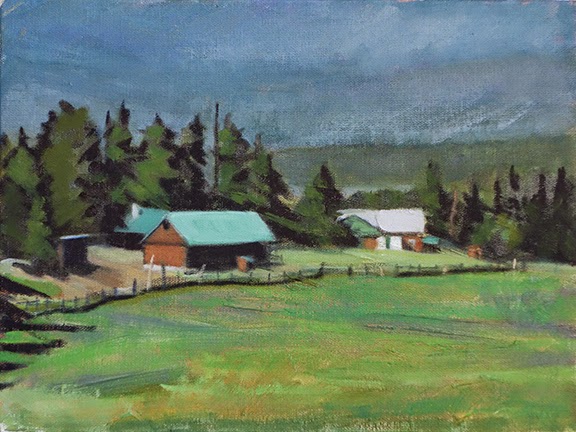
Original Plein Air, Fraser Valley Meadow, 2006, oil on panel


Fraser Valley Ranch, 9x12, oil on panel

You have to close your eyes on this one! Can you tell I loved color in the original painting on top? (I still do, but I use it differently now.) There is a certain sense of energy to it. BUT, when I got the reference photo out I could not get the proportions of the canvas to make that scene fit as I painted it.  I admit that my recollection of where I was when I painted this "the story" was about the meadow. In this paint over, the story is about the ranch and the setting of the ranch. There is still plenty of meadow and I allowed some of the much loved color to come through.

As I have been going through my box of old  paintings I found that there is a pattern to my painting outdoors. I did not always keep the "big shapes" together. By that I mean, as an example,  in the original meadow, the colors and values are carving too many shapes within the whole so the whole is not sticking together. ie see the difference between the two meadows above. There is a lot of variety of colors within the green but it is holding together as a lawn of grass; in the original you are not sure what it is, although the colors sure are pretty...

As what happens with alot of painters, especially painting outdoors, the values were not strong enough. If you squint at the top painting there are three values, barely.If it weren't for the white house it would be only two, and those two values are very close in range with the exception of the yellow green in the meadow. In the remake you definitely see three values. I carved out the houses with trees. The misty mountains and the meadow are very close in value and they are medium with the sun lit roofs being my lightest value. Even though the trees are technically in the light, they need to be a darker value to group the trees together. The composition still has a nice circular feel to it which was something else I remember drawing me to this scene.

Read Full Post


Auvers sur l'Oise street scene - revisited

Auvers Street Scene, 24x24, oil on board

Here is a painting you may have seen before. I posted it this past winter. I determined that it was not really where I wanted it to be after all. Something was not quite reading as I wanted it to; That what drew me to paint the scene in the first place was not quite reflected in the painting. Back to the easel it went! A few changes to note: I redid the tiles of the roof, downplaying them. Then I pulled out the stones and the varied patterns in the different buildings to create interest and directional paths for the eye. I have learned not to say a painting is finished until it is actually sold and out of my hands, so though I am pleased with this piece now, it is not the same as saying it is "finished."

Just a reminder that this is the town where Vincent Van Gogh lived and was under the care of Dr. Gachet when he was tragically killed. It is a village built on a hillside and the field where Vincent painted the famous crow painting sits above the town on the plateau.

Read Full Post


Lost in a Good Book nee Junior Great Books

Lost in a Good Book, 18x24, oil on canvas


This painting is a blast from the past. I started it at least 20 years ago when I first started to paint in oils. It is of my daughter at the age of 6 or 7. I must not have taken a photo of the painting in the early trial of the life of this piece. I was going to scan it if I had one, but luckily, I never saw any reason to photograph it. I had stuck the painting in the basement hoping to one day resurrect it, which I did about 10 years ago. Here is what it looked like from that point in time (below). I did put this painting in a show and had lots of positive feedback on it. But it went back to living in the basement as I decided it did not meet my standards after all. Everything outlined and not very clear as to the fact that she is in shadow! She definitely looks too light and bright for that. There are two light sources coming in, one as you see is an west facing window and the other is a small window that is higher up and faces north. The drawing is good and I like the composition so a few weeks ago, when I came across the original 4x6" photograph (remember now, 20 years ago there were no digital cameras!) I went looking for the painting to see what I could see. I saw that I could definitely improve it so set to work to do just that.

Junior Great Books, circa 2004

Having the composition already in place makes the work a lot easier. The drawing had to be corrected here and there along the way. I started from the top and worked my way down. From window/wall, to couch/pillows and finally placing her on top. The light was made blue instead of yellow and lightened considerably. The white background of the quilt had to come down in value to read as in the shadows. I had added the quilted "flower" above her head even though it was really just stitched in as a white on white on the quilt. I decided to take that out to see how it worked; I don't miss it. While working on that I noticed that the angle of the top of her head was off-that it needed to slope down into the pillow. Her profile also had to be restructured so she is not so flat faced, which she was not! I darkened the shadows on the couch to match the dark of her shirt and sink her into the couch. Her skin had to be darkened down and since the light is blue, I could use the red shadows I originally had used and have it be more believable. The book had to be given depth and the curve accentuated.

I was surprised to feel nostalgic about this old couch while I was reworking the painting. It is the couch I grew up with and it was called a studio couch. These are hard to find these days. It opened into a double bed by lifting it from the bottom of the front of the couch. You brought that up and then folded it towards the back until it clicked it into a flat surface. There was storage under it for blankets and sheets. The springs were a little tired by this point in its life, but boy did I love that silly couch.

These were the days when we lived month to month so I made most everything I could, including reupholstering the couch.The quilt was my first attempt at such a thing so it is by far not a piece of art but it was functional. The pillows I made from old curtains I had bought at a yard sale. The pink tropical patterned curtain fabric was from the 50's but I found enough to to salvage for these pillow cases. My daughter is in hand me downs from her cousin. "Those were the days!" Every picture tells a story...and speaking of that, I am curious to know if people who view and or buy paintings like to know about the painting or prefer to make up their own story for it? I was counseled at the opening a week ago by an art consultant to never tell the history of the scene in the painting to a viewer. That was not the way to sell a painting! I am not sure how I feel about that. I personally can rewrite the story if I choose but I am curious about where it is and what drew the artist to paint that particular scene.

Read Full Post


Repeat until Complete

In the Name of Blue; 20x30; oil on linen

A bien Mesdames et Monsieur
Here we are yet again as I continue to tweak and fine tune to get the painting correct. Every time I get to it there are things that are gained and some that are lost. I made some changes that I hope make the scene read as it should. Misty fog, mysterious light and a road less traveled. I await the verdict with baited breath. I am not inclined to give away what the changes are hoping someone will notice and comment.

Read Full Post


Documenting Changes in the Platte Park Neighborhood #1

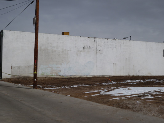
THEN: White on White Alley, 12x16, oil on board

I painted this alley on a sunny day in October 2010. The location is the alley behind Duffyroll on Louisiana and South Pearl Street in Denver. As you can see, it was a beautiful clear sunny day. Driving past this location the other day - it is all gone! The only thing left standing is the flat building in the background. Here is a photo of what is now a lot. I asked at a nearby business if they knew what was going in here and I was told a 30 unit apartment complex. In an already high density area where parking is nigh impossible. Good Move. But Heck, can't stand in the way of progress!

NOW: empty lot-soon to be apartments


It has been amazing to me (and not sure why) that ever since I started focusing on finding new and exciting things to paint in my own backyard so to speak, it has turned into a documentary of the changes that have gone on in our neighborhood (Platte Park) since. Most of the alleys that I have chosen to paint have gone under enough new construction or privacy fencing that they no longer provide the visual interest that they once did. I will write more posts on this to show you all just how fast the area you live in can change without too much notice. Since I am paying such close attention now it is very noticeable even with those changes that aren't quite so drastic.

Read Full Post


At the Wheel-Before and After

At the Wheel, 12x16, oil on linen

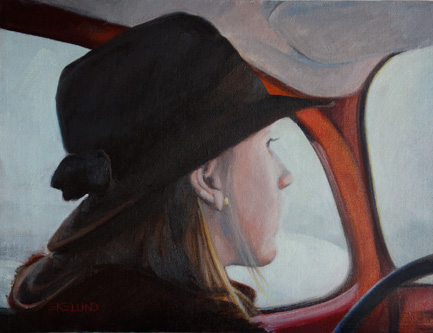
Here is a painting I did from a slide taken in December 1977! Oh my. My sister is driving my father's VW bug and we are on or way to Erfurt in West Germany. We lived in Zweibruecken at the time.  It is a cold winters day and it looks cold inside the bug as well. I painted the top painting in 2004 in an afternoon and I remember being very proud of myself. This painting was last hanging in my daughter's apartment but when she moved she decided to give it back in exchange for something new. Hey, with a mother as an artist, she can pretty much have revolving art! Well once I got it back in my hot little hands I knew I had to do something about it and it was the perfect project to work on during the holidays when there is so much else going on. As usual, the drawing itself and the proportions were okay. Value relationships and color left a lot to be desired! The first thing I decided to do was to block in the big dark shape and unify them. In other words, I made the upper rim of the door tie into her hat, her hair and her coat and then wrapped it around the molding and steering wheel. I knew that the liner was too light and had to be darker than the snow outside the window. So I lightened the snow outside and darkened the headliner-still not convinced it can't go darker...The red of the metal came next and it obviously was too warm and too light and not enough reflected light on it. Then I went back and cooled down her face which was totally off color. How could she be warm toned in all that cold?? I used some of the color from the snow to make the transition from the light hitting her face to the color of her skin..and got rid of the harsh outline. Her cheek looks natural now. I did very little to her hair from the mass blockin, just very subtle color and value shifts, and tied it into her scarf and hat. The hat I just put in some light to give it form and otherwise left it a solid color. I played a little with the repeating pattern between her scarf and her hat brim. It reads So Much better now.

Read Full Post


Reflections Now and Then


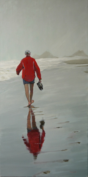
This painting is a favorite of mine, and I like it so much that when we repainted our dining room this past winter, the new color matched this painting to a "T." I have been looking at it during every meal since. I decided I would like to enter it into an upcoming juried show. Now this piece got noticed in the online juried show, Bold Brush in January, so it is not that shabby. Yet there were a few niggle-y "little" things I wanted to fix. However, once I got it out of the frame and in the studio again, I realized there were lots of  "little" things needing to be fixed so I ended up starting all over on this one too.
For one, the waves were too white; the reflection was incomplete, the feet bothered me, the beach did not seem to recede into the distance as well as it might, his head faded into the drizzle too much, I punched the red up a notch,  etc etc. I think it is a much stronger, more adult, painting now.

Reflections, 36x18' - 2011, oil on canvas

Read Full Post


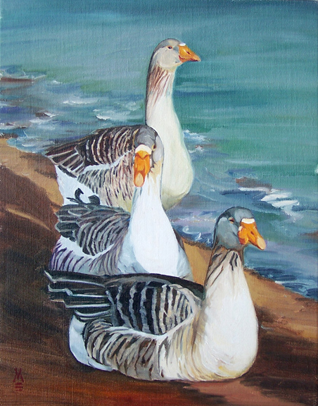
We Three Geese

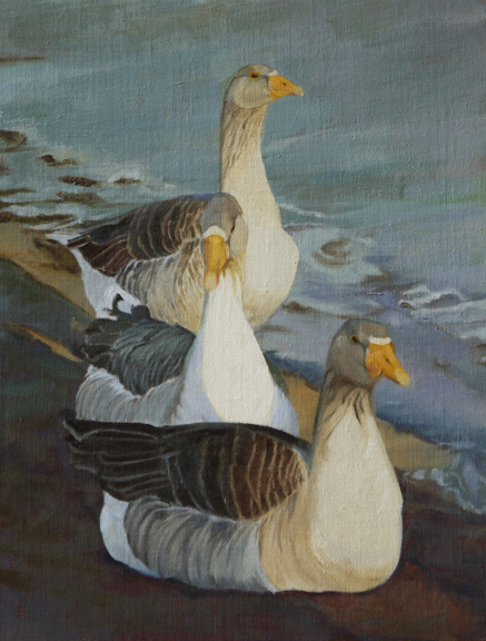
We Three Geese, 2012, oil on linen

Lately, I have heard many artists in my circle say they have so many paintings stacking up, that I decided to redo a few more "Oldies but Goodies" instead of starting a fresh piece. It does me good to see how far I have come and to try and salvage what I have. All about recycling!

I actually started the redo of this painting months ago when I needed to warm up before tackling a new project and there it sat until last Saturday. Where I left it was the water and the ground had been blocked in as big shapes. I had also redrawn the necks and blocked in the big shapes in the light and dark on the geese removing all details. So yesterday I just corrected more drawing and values and then started Sunday morning on details.

It was hard to tell in the original painting below, what was in the shadow on the birds. The value shift was not strong enough. The middle bird's head had been a conundrum for me at the time I painted this in 2005 so I was never happy with the head and beak on that bird in particular. This was a "good" painting for me at the time. Again, this was painted from a 6x4" photo, not a digital image.What a difference a few years make! Both in technology and in personal growth. I like the new name better, too!

Wash Park Sentinels. 2005, 18x14 oil on linen

Read Full Post


Before and After-Oysters

AFTER, 2012, 16x12, Cleaning Oysters
BEFORE, 2004

Oysters are something we almost always get when we go visit relatives in California, and at the time, the oysters we bought had to be cleaned. This is a painting that I did from a photograph (a 6x4" photograph at that) 8 years ago. The photo was taken in 1997, a bit before digital photography. In the original painting I left out the petunias on the wall, a favorite of my Mother-in-law's, but in the redo, I thought not only would they be a great reminder of her, but it also adds visual interest.
I started out safe, and redid the boxwood hedge and then added the petunias. The petunias halted the eye moving off the painting via the wall. Then I redid his shirt and shorts really trying to simplify the shapes and giving a better sense of the light and dark patterns. Next, the figure. Softening the transitions between the light and darks and softening the definitions of his muscles. I warmed him up quite a bit giving him a nice farmer's tan. I pushed the right leg back into the shadows where it belongs. His hair is platinum blonde and I am not totally convinced that I am done on that point. Last came the bucket and the foam cooler. I think it is much improved.

Read Full Post


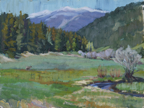
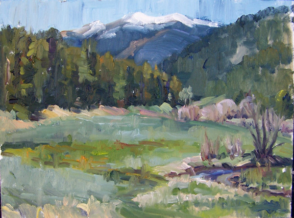
Upper Bear Creek Revisited


Upper Bear Creek Meadow, last week, 2012

Upper Bear Creek, first revisited, 2010
Upper Bear Creek Meadow, Original 9x12 2008
This painting has been hanging in our home for awhile and it has been bothering me enough that I finally took it down last weekend. Time to try again. In the bottom photo is the original as painted plein air. The expressive brushstrokes I like but the meadow does not read as a meadow. It is a jumble. The bushes look like I don't know what. I do like the trees on the left but that is about all. I like the blue of the mountains but I don't think they are pushed back enough into the distance.

In the middle version, I can't remember what I was thinking but I can see that I added more color to the meadow and the brush of the bushes but did not necessarily make anything better. I don't like the mountains being purple or the added color in the grasses because it still is not reading as a flat meadow with variations of grasses in it.

Last week, I did have a plan to flatten the meadow, push the mountains back, clean up the bushes, and then I added the deer yesterday. I did not reference the original photo of the painting, but I came back to more of the colors and feel intuitively. The large bush on the right has always bothered me, and so I have put the painting back up yesterday to see how it reads now.

Read Full Post


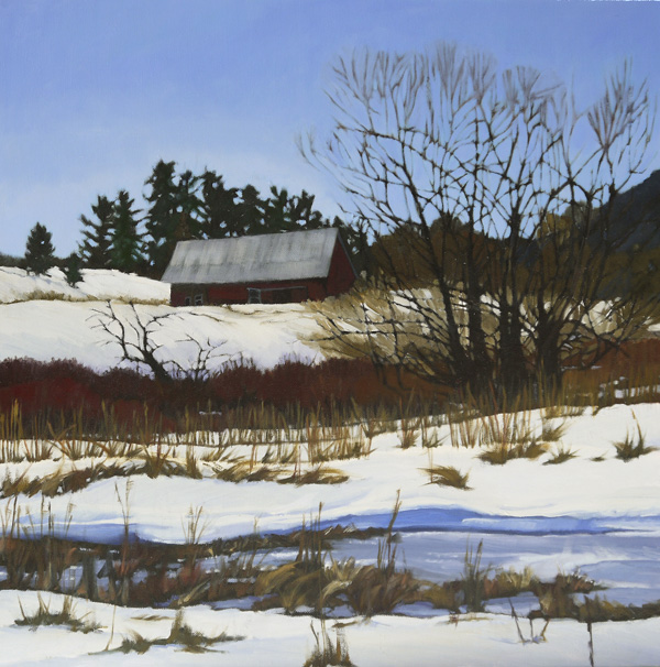
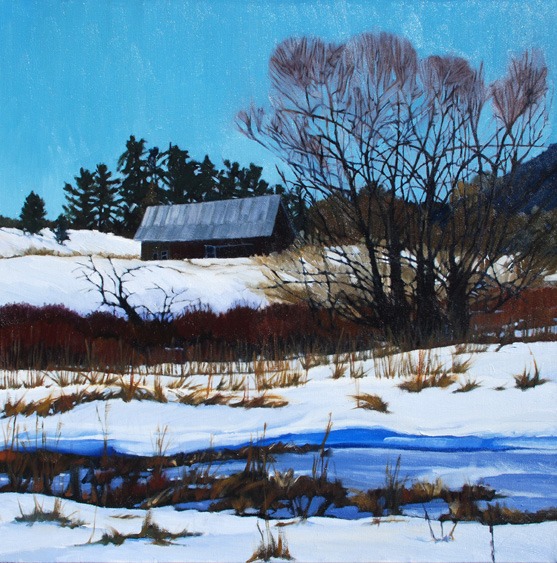
Winter Compostion

   
Winter Composition, 24x24, oil on canvas


Winter Composition, 2007, oil on canvas

This painting was meant to be stylized, but the longer I looked at it the longer I did not like the tops of the winter trees or the blue green sky. The sky did not go well with the more violet blue frozen water. This painting got a lighter, more violet blue sky and simplified tree tops. The barn roof was also lightened a tad and the barn made more red, yet still keeping it in the shadow. A few of the bushes and some of the dried vegetation got a tiny bit of attention. The main difference in color between the two is different cameras as I did not touch the snow, the frozen water, tree trunks or anything in the background.

Read Full Post


Smokin' Revisited

Smokin', 16x20, oil on canvas
Smokin, 2009

This painting is from a photo I took while on a trip through Burgundy in 2007. (This medieval walled town of Semur was really a neat place to stop.) I decided that his face still did not read as well as I would like it to; so my intent was to fix that. Well, once I got it on my easel I saw a myriad of "issues." The only things I did not touch were her jeans and shoes and his shoes. Everything else was redone. I started with the wall that is in full sun and brightened that up. I then redid his cast shadow and the steps they are sitting on. I decided to work on her first, starting with giving her a neck. I hadn't realized what a bull neck I had given her. I both lightened and darkened her hair giving it more form. From there, her shirt, adding more variety of color and form. The shirt then reflected into her face where I then went in and softened the planes of her face and neck. Her arms and hands needed the same thing, and also more color (red!) in between her fingers.

On him, I had noticed his jeans didn't read quite right; what was in the sun needed to be lighter and what was in the shadow needed to be darker; the reflected light bouncing off the wall didn't work as well as it could, so that got fixed. On his shirt, I realized I had made the neck of it too high on his neck, so I took that down and did some other minor adjustments. I realized that his head is in full sun, and yet I had his hair as pretty much a solid dark, so he needed his curls put in. Not quite ready to do his face, I simplified his backpack and the started on his arms. Once that was done, he got a much needed facelift. In the original I had tried to simplify the shadow side of his face, but in doing so, I had not given him any features at all. Very amorphous. Still wanting to keep that one big shadow shape, I was able to give him a complete nose and set of lips. To be fair to myself, this painting was done when I was trying to go back to my graphic roots, so the goal was to keep the shapes and forms more flat.

I can't decide if I am giving too much information out in these before and after's. If I should just post the new version as a new painting and forget the "before" version. My thought is that any artist struggling in their own work see what is possible and that there is almost always hope; from the viewer's perspective, my intent is to educate. If I talk about why I am making the changes, that the viewer can learn how to get more out of any painting they come across and become more discerning. Any and all feedback is always welcome!

Read Full Post


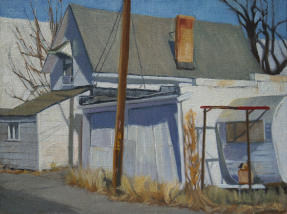
The White Alley or Duffy Roll Alley at 1300 S. Pearl Street

White on White final, 12x16 oil on canvas panel
White on White original, 2010

This painting was originally done with a white on white theme. I purposely went for everything tending towards white which means lighter than normal. Kevin had critiqued it saying that the whites were too much the same white and that I needed to add more color to them. Just enough to give them a yellowish or pinkish or whatever-ish tint. Along with doing that, I also strengthened the contrast as I would in a normal light and shadow painting.
I started with darkening the alley road. I decided to add the darker band  in the road to draw the eye back in to the painting; leading the eye to the slanted roof line and back to the house; next came color added to all the south facing walls, getting lighter from left to right; the shadows were then given a base color with some reflected light thrown in where needed including clarifying the shadow on the trailer (I am noticing that the shadow of the telephone pole reads a bit warm in this photo so I may need to fix that); weeds were given more color and definition to finish it off. This touch up went really fast, but I think it is much enhanced.

Read Full Post


Touch up of Bobolink Trail Head

Here is an older (re: 2008) plein air piece. The original was painted on an overcast gray and rainy October day at Bobolink trail head in Boulder. I tend to add more color instead of concentrating on the value. I felt that I did not give a good sense of distance in this piece.
I updated it in the middle version not long after I painted the original. The field is reading better but i felt I had lost the unity of the tree in the center and the field vegetation is still a bit chaotic.
This past week I did minor touch ups to clarify the scene. I carved out more sky in the group of yellow cottonwoods in the upper left and made them read as a unit; same with the color of the main tree clump, and the field. The field needed more flat spots of green grass and a pattern to the other vegetation. Even though most of the brighter golden yellows were lost, they show through in spots that are not that evident in the photo and I believe it reads better as a whole.

Read Full Post


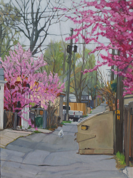
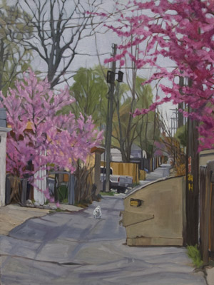
Fine Tuning Alley in Spring

latest


the one that came before

 
This past week has been spent fine tuning paintings. This painting, which has the uninspired title of "Alley in Spring," did not require much, but I ended up doing more than Kevin suggested. His suggestion was to darken the road because it was almost as light as the sky. What I did was to lighten the sky and the trees in the background and darken and unify the road. The road doesn't look that much darker but relative to the sky it is. I also lighten the shadows of the white truck and added a subtle pattern of light to the blooming trees.

Read Full Post


Another Save-Quayside

Quayside, 12,x16, 2005

In my effort to not work too hard for the Museum show, yet have a strong body of work, I have been looking at old paintings to see what I can salvage. This painting was a "good" painting for the time, and LOTS of people liked it, but it never sold. One year I had this hanging at the Summer Art Market where almost everyone walking by commented on how they liked it! I decided it was time to give it a new lease on life since at least I know it is a pleasing composition and/or subject. I started with the yellow boat, and worked out from there. I brightened the yellow using more pure color, and kept more yellow on the shadow side. For the shadow I mixed cad yellow medium with terra rosa and another pile of color using cad yellow medium and dioxide purple. I used these two to create transition from the darker to the lighter (from the back of the boat forward). The dark red boat color was about right, but I still worked on putting it into the sun; the light didn't read as well as it could. I totally missed the cast shadows of the ropes in the earlier version.

With the water, I started with the reflections making them more unified (there is that word again!). I then mixed a neutral gray blue green color as my medium color and blended that in all over the water (viridian green, burnt umber and a bit of Ultramarine blue and white). I let that sit overnight and then came back a day later and mixed a lighter medium value and then the lightest/brightest to hit the top of the water, also thinking about the water in back being lighter to transition to the darker water in front. Quite a save, I think; although there will always be those who prefer the original.

Read Full Post


Another Lesson Learned the Hard Way

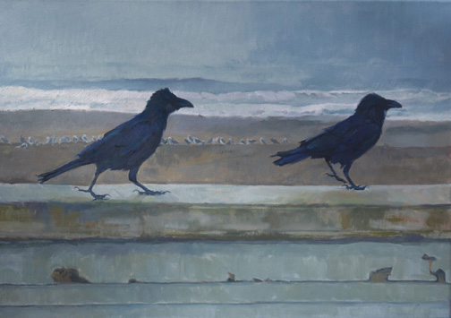
Wait for Me! 20x30, oil on canvas with a bit of wet paint glare
As submitted and not accepted

I know this is a topic not many of us want to discuss in a public forum - the rejection of the jury! While trying not to let this get to me I took the opportunity to critically look at the painting in question with a juror's eye, and I knew they were right in their assessment. I, again, as is my wont, was lazy. I let the current culture of the quick painting take over my inner judgment that this piece really wasn't as good as it could be. The interesting thing to note here is that I had started a blog post in December with the "finished" painting and the original block-in, and never posted it because I saw the inherent problems-the block-in looked better than the painting! But some of us are just plain hard-headed.

There were a couple of things I noted. First, that the sky going into the ocean was way too blue and the value  too dark. I lightened it all quite a few degrees and thought more about orchestrating the ocean waves. I also made the color more neutral (using Cerulean Blue/Burnt Umber/White) . I had known that the beach was the wrong color, and also too dark in value made more so now that the sky is lightened. The reddish cast had to go, so again I went with a more neutral mix (Viridian Green/Burnt Umber/White with some other colors thrown in for variety in the sand). I used the same colors, with different % to make the white caps. The wall I had known was too dark - that my original block-in value was more true, so I took it back to that value and got rid of the blue cast. The Ravens came next and I had been so caught up in the myriad colors that I had lost touch with the form, so I gave them both more form and thought less about all the color, simplifying that. I decided to take more time with the drawing of their legs and to create more of the shaggy appearance ravens are known for. The gulls on the beach came last. I was not content with them anyway, so I took a bit more time with them and yet tried not to give them too much definition to keep them in the background with a secondary place. I still see a few spots that need a little attention, but overall you can see the difference. Another lesson learned the hard way.

Read Full Post


Topics

Archives