Blog


Sargent at the Legion of Honor


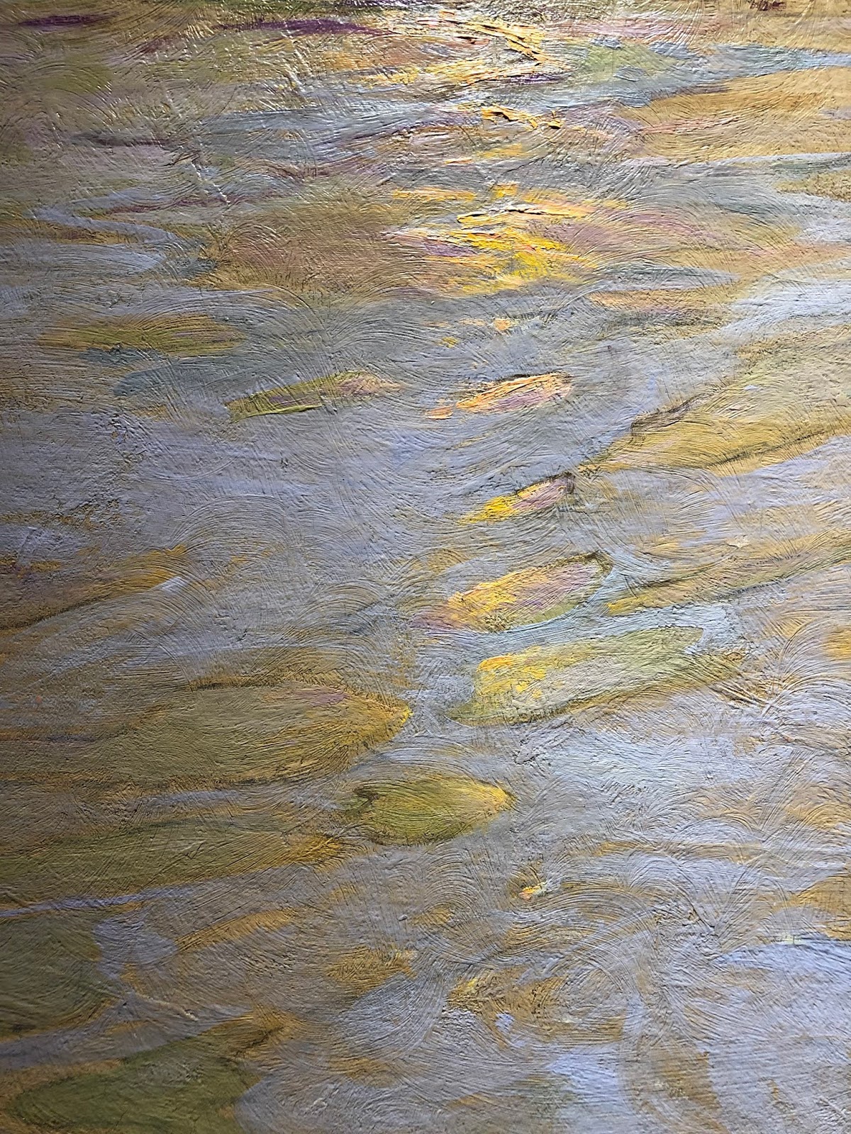
Detail from Landscape below

Detail from Landscape below

Spanish Hills-details above

Stunning light!


A familiar one
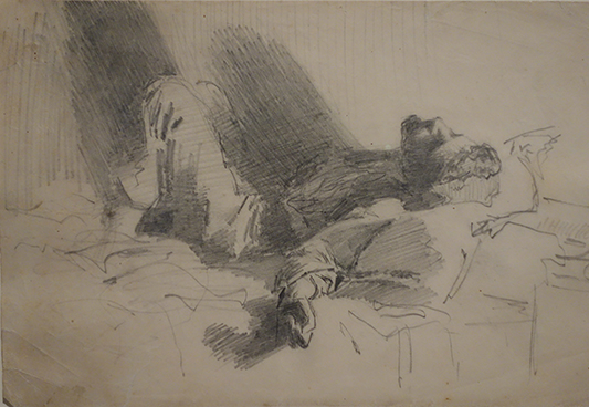
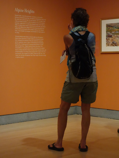
I am a late in posting about this exhibit, but there is still a month or so left if you happen to be in or near San Fransisco before May 14th, 2023. I was there last month, working a visit to the Legion of Honor into visiting family. It is funny how I manage to do that! (It was a rainy day or else we would have also taken the trail along the cliffs from the Legion of Honor) This is my third out of state trip to see a John Singer Sargent Exhibit  (two were in NYC and Brooklyn). This one focused only on his time in Spain. https://www.famsf.org/exhibitions/sargent-and-spain  He was so prolific there has been very little overlap in going to see his works. Thankfully, he had the ways and means to paint as much as he wanted, and we are all the richer for it. 


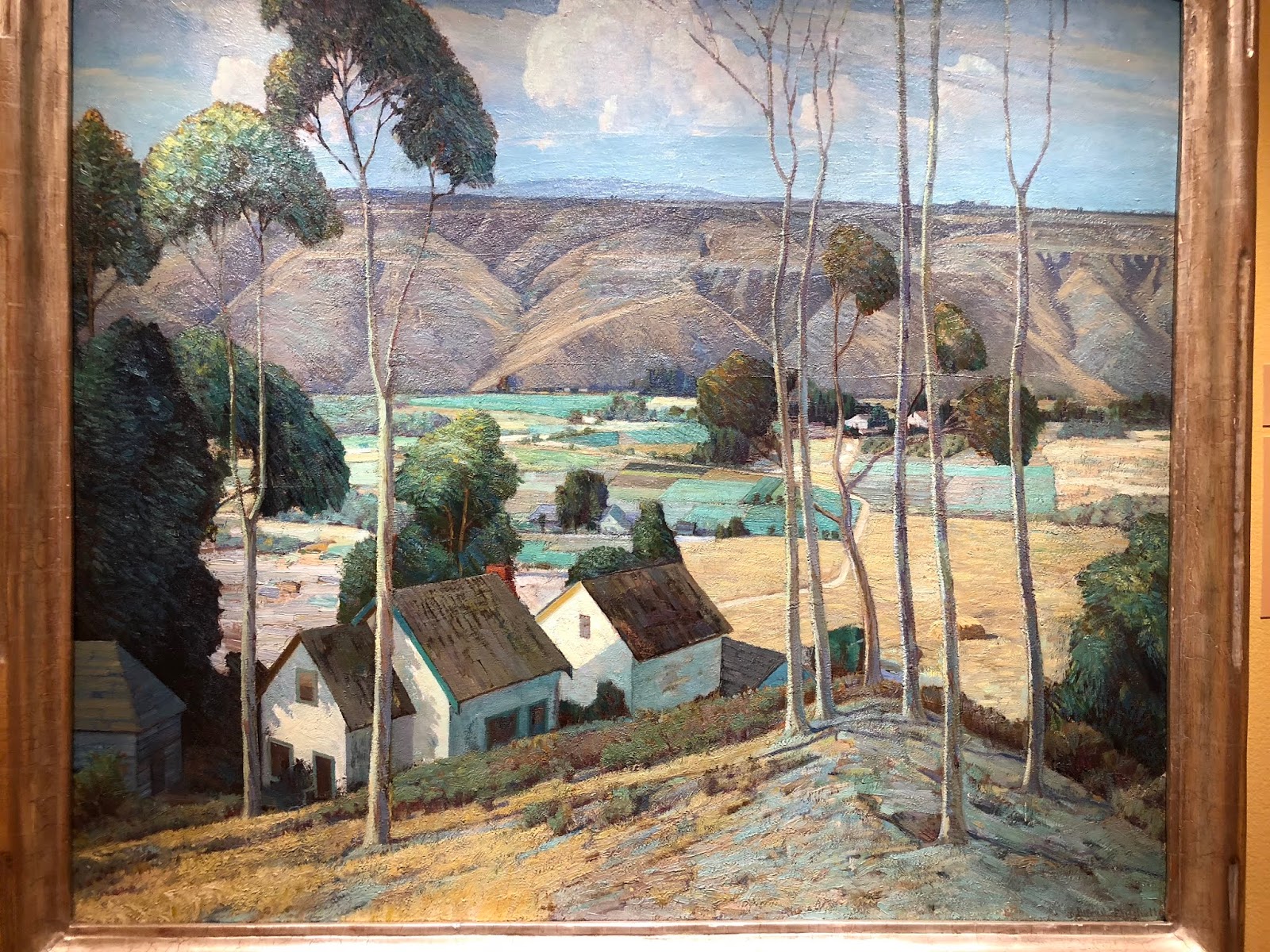
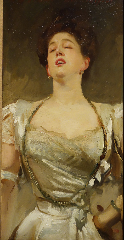
Sargent sure had a way with color and light. Some of these paintings positively glowed from across the room. Thankfully the day we went it was busy but not crowded so one could see both close up and from across the room. And take ones time. These are just a few examples of what caught my eye. The landscape was atypical for Sargent in my experience, but so rich in color and nuance. The last three above from the fountain to the girl walking down the street, show the continuity of his palette and how he can make the light around the fountain dance as well as light up the street from a distance or bring to life the Alhambra using very similar color mixes yet achieving very different effects.


The only disappointing aspect of this exhibition was the 'swag' being sold. The postcards chosen for reproduction did nothing for the paintings they represented and usually postcards are the better than what is printed in the books.  I tend to buy coffee mugs as I travel, and the only mug was of one of my least favorite paintings in the show, a pomegranate tree. Even my old iPhone captured the light dancing around the fountain with the beautiful reflected light! This is the third exhibit (Alice Neel at the deYoung Museum in SF and recently here at the Denver Art Museum) I have gone to in the last few years where the quality has decidedly gone down in the Museum gift shops...I can't figure that one out. Cost more, quality sadly lacking. What could possibly be the excuse? I noticed I wasn't the only one walking out without buying anything, not that I believe that to be unusual...


Read Full Post


Life Imitating Art - Baumann

Life Imitating Art - at the Gustave Baumann Exhibit, 36x18
I have been working on two paintings simultaneously over the past several months but they were interrupted because of the welcome pet portrait commissions. I just received the final approval on a dog portrait so it is now drying awaiting varnish.

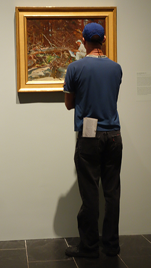
If you saw the link going around on Facebook from a photographer who took photos of people imitating the art they were looking at, I just want you to know these two paintings were started and this one almost finished, when I saw his collection. I did feel a bit gypped. This has happened to me before...where I get this idea and am in the middle of a painting and then something manifests in some form taking the uniqueness right away. I guess there is nothing new under the sun even when we want to believe it!

What captivated me about this scene is how she is standing like the trees she is looking at as well as the colors matching from her sweater and her skin tone. This one is from a now defunct art museum in Pasadena. It just recently closed its doors. It was a unique concept in that it showed only artists who painted in California, even if they did not reside there for long. There was no permenant collection. It was three galleries and there was usually one contemporary exhibit and two from the past. I had not realized that the Gustave Baumann exhibit was in the second gallery, so it was a very pleasant discovery to be sure! He is best known for his woodcuts of Taos. This exhibit actually included the press he used for his wood cuts as well as examples of the different color blocks. The pictures she is looking at were gouache, I believe. I wrote about the main gallery show, Joseph Kleitsch, if you care to check his amazing work out.

The second painting in this particular series is from NYC. The contrast is striking...to be continued.


Read Full Post


James Tissot at the Legion of Honor - San Francisc

Recently I had the pleasure of going to this exhibit on James Tissot called Fashion and Faith. I must admit that prior to this point, I knew very little about James Tissot. Over the years I had seen his work sprinkled among a myriad of museums and museum shows and noticed his work, but not enough to delve deeper.

The back story is that going to spend 4 days with a friend in the Bay area and planning to hike and wine taste, I thought to check what if anything of interest might be up during my visit of a more cultured tone. I recognized the painting used on the Legion of Honor's main page for the exhibit so I ran it by my friend and also my traveling companion. They both were up for it. So it was built into our schedule of events.
 This lovely painting was listed as a "study." Wow. Looked finished to me.
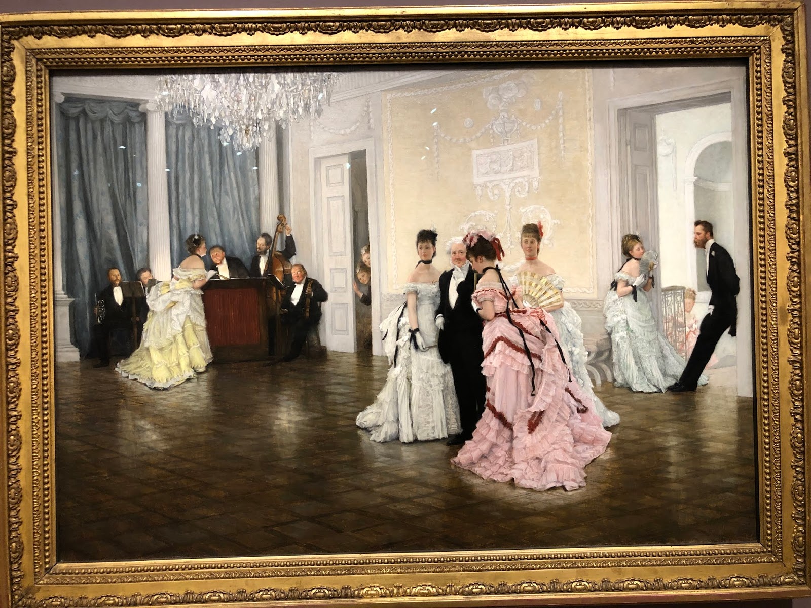
One of his "fashion" pieces. His family was in 'textiles' and his handling of the fabrics of his day is stunning. What I enjoyed so much about his group scenes like this is how each face tells a story. Almost as if there was thought bubble above their heads speaking outlaid. It is the first time I can recall where I have seen this phenomena in paintings.
Here is one of many of his painted stories. I do remember the title of this one "Early to the Ball."
Not mentioned in the title for this exhibition is that he was also an official chronicler of the, if my memory serves - Franco Prussian war. I thought the follow painting, done in watercolor, poignant.
Now for the 'faith' piece. While living in London (he was French), he met a young divorcee of 2 children. They lived together until her death from tuberculosis. He was devastated and turned back to his Catholic faith and returned to France. He had already done a series on the prodigal son but he did a second version of it and also did over 100 watercolors from the new and old testament. Below is our prodigal son asking papa for his inheritance. The faces on the people at table are priceless in their judgement of this request. These same characters are in all the illustrations he did for this one parable. I believe there were 5 or 6 illustrating this reading alone. 

In the watercolor series he did, a couple of them were used in movie scenes. I apologize for not remembering the movie from the 1920's that used one of his images, but the one everyone should recognize (I did not take a photo of it however) was a scene he painted with the ark of the covenant. His rendition of it was taken and used in Raiders of the Last Ark.
Lastly, here is one that really stood out for me from his illustrations from The Life of Christ; It is Jesus praying at Gethsemane. Never, in my imagination, had I thought of Christ praying like this. Yet it makes all the sense in the world when one really thinks beyond the common illustrations of the Bible we were all brought up on.
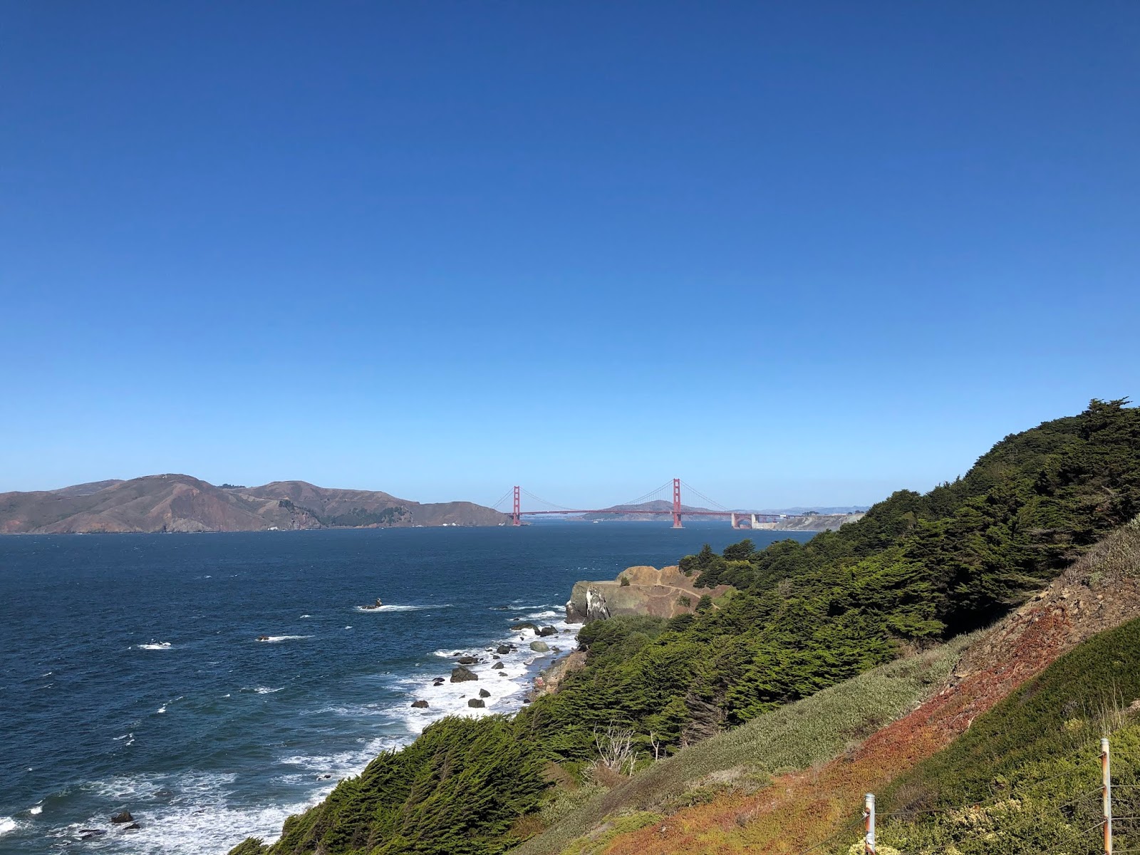
If you will be in the Bay area and can go see this exhibit, it is up until February 9, 2020. I highly recommend it. To sweeten the deal, the Coastal trail goes right by the Legion of Honor and on a clear day it is a beautiful hike along the water with the Golden Gate Bridge in view. Nature and Culture!


Read Full Post


A World to Discover Part 1

Recently, on a road trip, I made some discoveries I would like to share. These are little gems hidden in places I had not heard of before I did a little research. Well, that isn't quite true as the first place I want to talk about was at Bethany Lutheran College and I had heard of this museum before...Bethany Lutheran College is where Birger Sandzen taught. If you don't know who Birger Sandzen is, he was a Swedish immigrant who taught art at the college in the small Swedish town called Lindsborg. I wanted to see the campus and the museum there in his name. I was fortunate to have seen the collection of Birger Sandzen held by the college a few years back when it was sent to Colorado Springs Fine Art Center while the museum in Kansas underwent renovation. Or I might have been very disappointed. The front room was Birger's work, and some of the side hallways held his etchings and drawings. But that was the extent of his work on display. Prime examples to be sure. And the room did him and his work justice. It was to be left wanting more.

It was visually delightful. He handles color and thick paint with such ease. The textures he portrays makes you want to reach out and touch. The disappointment could have come from it not being ALL about Birger Sandzen as it was in Colorado Springs...however...in the second gallery was a Kansas artist. His name is Aaron Morgan Brown. I was quite intrigued by his work. The first one that caught my eye was the kid in the museum with all these huge ancient sculptures. In this painting there is a tea cup on the  half wall as if the horses head were going after it. On the floor at the base of the wall is a hammer. And the kid looking into the next gallery holding an apple. It just gets you thinking in a very different way. So I went back and started over and really started to delve into each painting a bit deeper. Every painting drew you in a very different way. Photo realism yet with a decided twist that all is not what it appears. On his website he calls it "constructed dreaming." I have included a few for you to see but please go to his website for a visual journey. I hope you enjoy them as much as I do.


Read Full Post


A View from the Uffizi Gallery

Tuesday, February 26, 2019

A View from the Uffizi Gallery


A View From The Uffizi Gallery, 30x30, oil on linen
I started this painting before I went to Greece last Spring. After the initial block in which always gets me excited I somehow lost my way. Here is the blockin:

It was not becoming what I had envisioned. Not many of my paintings do, come to think of it. I had this conversation with my sister recently. About how hard it is for me to paint a scene the way I see it in my mind. That doesn't mean I don't like the end product...And that might be what keeps me coming back. The insatiable quest to get it to come out the way my mind's eye sees it. Or does the vision in my head change along the way? I don't know. I did have someone come into the studio a few weeks ago and exclaimed what a great painting it was, so that made me realize maybe it was done after all, at least for now. So I am posting it, finally. It does make me want to go back to Italy I will say that for it.

The lines to get into the Uffizi had discouraged me from going in when I was in Florence for a few days on my own. Then one afternoon I happened by on the way back to where I was staying and there was no line! The Museum was only open for another hour or so, but I decided to go in just the same. I think I spent as much time looking out the windows at the views of Florence than at the art...And this view towards the Duomo is just not one you see highlighted so I thought I should give it a go. I just love the jumble of tile rooftops and the construction added visual interest and a complimentary color.


Read Full Post


Laguna Beach Art Association Part 2

So. Last week I showed only one known artist to me and spent the time on the art and artists that were new discoveries. Then today a friend of mine sent an article on the healing properties of going to see art as an aid to healing! The title was "Take Two Emily Carr's And Call Me in the Morning." It is in fact being implemented in a certain place that will be revealed in another post. But, don't you just love it? It made my day.


First up today is William Wendt. I found out at this exhibit that he was a deeply religious man and he endeavored to do God's creation justice. I do think he succeeded as I always think of him as an amazing landscape painter.
These are not all stellar photos as sometimes the glare just could not be avoided. And I did not take photos of all the name tags. But my memory of who is who is pretty good.

William Wendt, The Mantle of Spring

His landscapes are always memorable to me. Rich in color, texture and composition. So much movement.

William Wendt

Laguna Beach. Gives you such a sense of place.

William Wendt


Below is one final photo I took of his and it was grouped with Nicolai Fechin. If that isn't high praise I don't know what is! I don't know that I have ever seen a Fechin 'seascape' before. He was a Russian Immigrant who came to the US around 1923. After living in NY for a few years he went to Taos where he painted the Taos Indians. I know him more as a portrait painter or painter of people more like. It is not known when he went to La Jolla exactly but around 1925 the tag said. A worthy artist to look into.

Nicolai Fechin top, Old Pier; William Wendt below

I did not get this artists name, but the painting below stood out in its overall simplicity yet boldness of use of Thalo blue green. This color is very strong and in the wrong hands can be overwhelming, but I was quite taken my how well he managed it.


Then there is Joseph Kleitsch, whom I have written of before. I went to the now closed Pasadena Museum of Art to see a whole exhibit on Joseph a year and a half ago. This was the last painting in this current exhibit and a fitting way to end a great show. On a lazy afternoon, strumming a guitar while a faithful companion sits patiently waiting.

Joseph Kleitsch

This is just a small taste of well put together group of artists that painted in and around Southern California 100 years ago. I once again urge anyone who is in the area to make the effort to see this exhibit that is up through January 13, 2019 at the Laguna Art Museum. Be prepared to feel a part of another time and place but in the company of some masterful artists. We are so blessed!

Read Full Post


The Laguna Beach Art Association Exhibit

Last week I flew to SoCal. One reason was to see the Laguna Beach Art Association Exhibit at the Laguna Art Museum. Edgar Payne was one of the main founders of this art association which started in 1919. Here is a painting by Edgar Payne hanging in the exhibit. There was also a magnificent large painting from the Sierra Nevada's.

Here is my most favorite "new" artist for me. I had never heard of George Brandriff before but these two paintings are both by him and I love them for different reasons. The top one has such an amazing composition as well as being very luscious in paint application. The second one I thought had particularly well done abstracted shapes that made up the whole.


detail of the abstract handling of this painting, Sunday Reflection, 1929


Here is another new to me painter, Frank Cuprien. This painting that at first I did not really like. It took some getting used to. It comes off as so Yellow. But the longer I looked at it or tried to ignore it (both) the darn thing kept calling me back for closer inspection. And upon further reflection it too made me marvel. The foreground water is a light wash over a wonderful palette of soft pastel under-layment which is thicker in texture. I learned that Frank built a house on a hill overlooking the ocean and was known for just painting water. This painting is from 1930.


Detail from Poeme du Soir, Frank Caprien
Thomas Hunt, Newport Harbor Scene

I like this Thomas Hunt, another artist I had not heard of before, Newport Harbor Scene, as it is so graphic and simple. With the blue flag hanging down out of the top frame. Very 'edgy.' There was one other by him, also boats, although more abstract than this one.

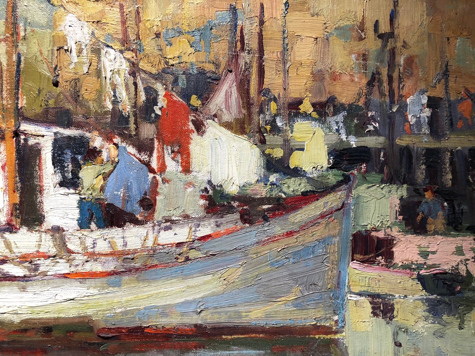
I did not take a photo of the tag for the painting below so I do not have that information to share with you. I guess you will have to go see the show if you want to find out! It is up through early January I believe. And it is well worth a visit if you are in the area. I really enjoyed the exhibit very much. I took the photo because I liked the abstract shapes of the porch and laundry and the colors used (a wee bit of glare there). I also thought the palm tree rather lovely with the warm browns in there. Not something you see painted in on palm trees too often.


To round out this first post on this exhibition of newly discovered painters for Victoria,  I will close with Ruth Peabody. I think her style is more reminiscent of the time period in which she painted but I did like her work.

Ruth Peabody, The Cookbook

I found out about this show through American Art Review a wonderful magazine that highlights shows around the USA every two months. I find a show that interests me and then figure out if I can go. My sister moved to just north of LA last year so it was a perfect marriage to go see her and her new home and go see this show.

Read Full Post


Rembrandt at the Denver Art Museum


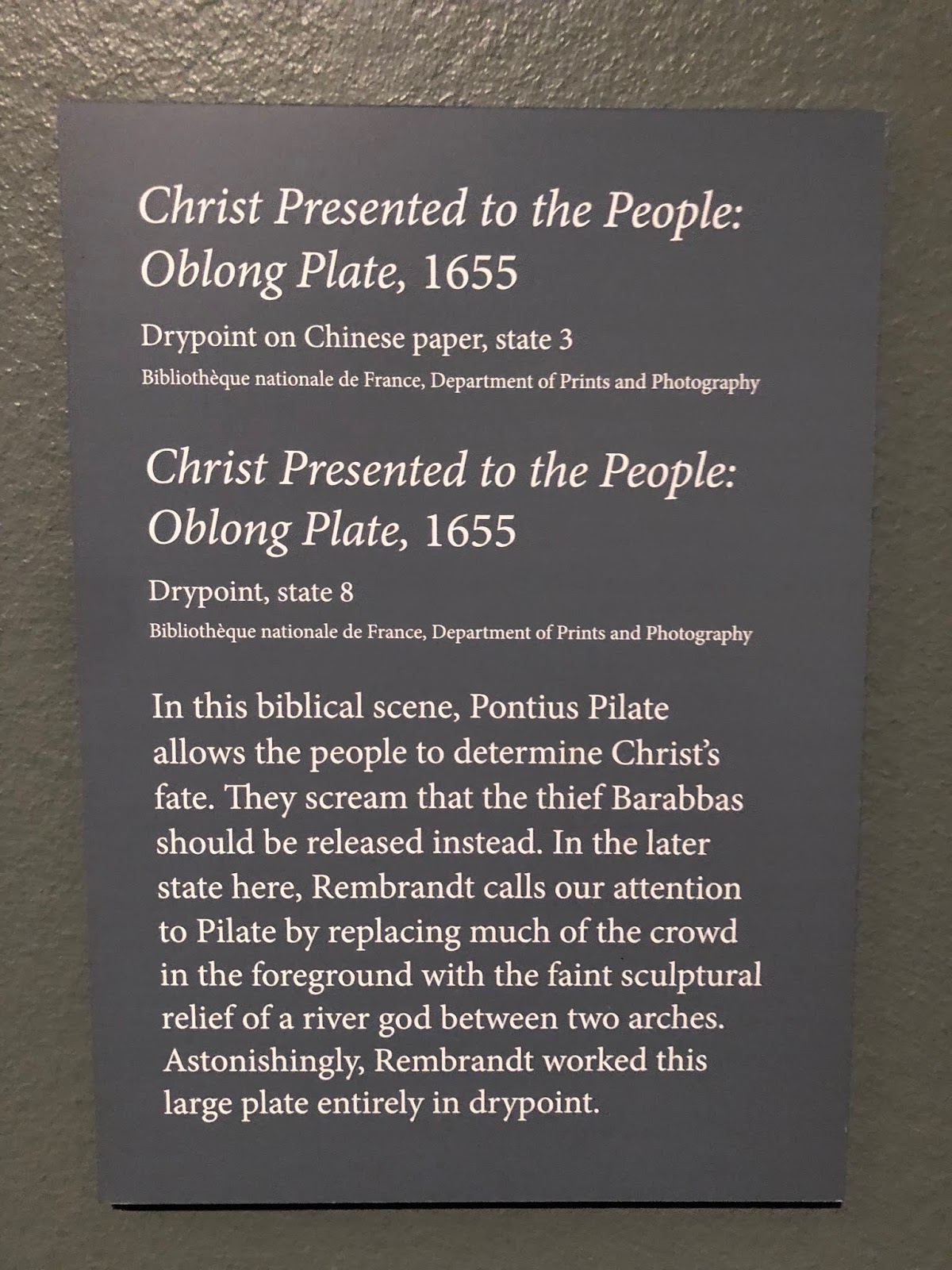
Rembrandt - Painter as Printmaker is currently showing at the Denver Art Museum. I went to see the exhibit Friday morning with a friend. If I needed validation in redoing paintings, I got it here. This is one prime example of Rembrandt redoing a plate. As shown in the tag, the top one was the 3rd State and the bottom is the 8th State or rendition. It is like doing one of those puzzles as kids to find out what is different between two pictures. He made some major changes! There were many examples of such plate states. This particular one was larger than most and so much action going on.


To be fair,  Rembrandt often changed the plate for a client. So someone who may have liked the overall theme of this print may not have liked the crowd scene so it was removed. Or wanted more architectural details, so those were added. It was a fascinating display of an old world master. Some of his early prints were barely 1.25" x 1.25" and yet with remarkable detail and emotion. It was gratifying to see so many people there engaged in his mastery of his medium. And not just mastery but a leading edge on technique as well. I highly recommend going to see this exhibit. It is up through early January.


Read Full Post


Icons

Welcome back Me!


A perfect swimming 'hole'

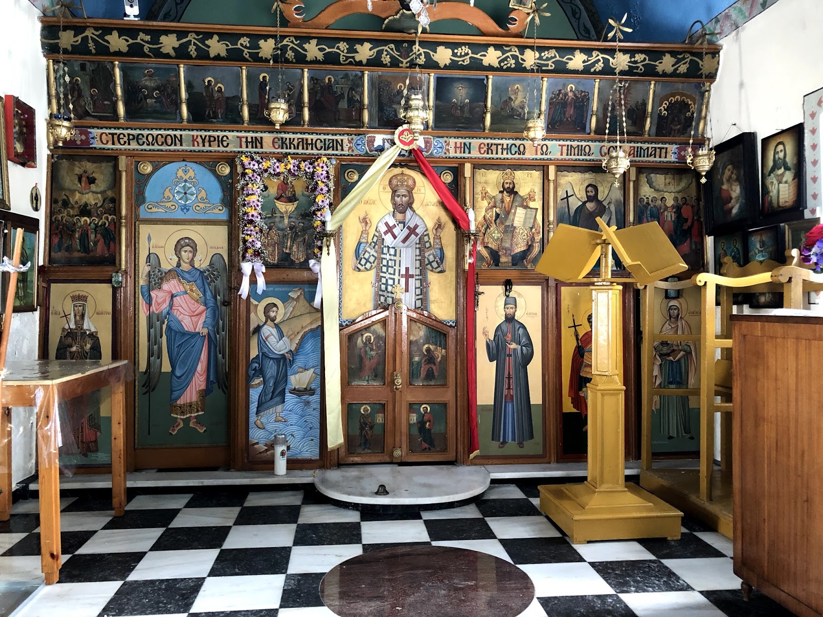
I spent two weeks on a Greek island in the Aegean Sea. The water is every bit as beautiful as you see in all the promotional photos, and more. This will not so much be a travelogue as on Icons. One thing I found out is that there are little chapels all over the island of Milos. I doubt it is unique in this quality, but I don't know. Churches too. Most of them were unlocked and you could stop in for a quick prayer any time of day.


Typical screened front. The alter is behind the doors

I have been contemplating taking an Iconography class this summer from a Greek Iconographer who is coming to do this workshop. It is an intense program, lasting 5 days I think it is, and full days. 9 a.m. to 4 p.m. And only finishing one smallish icon.

With this in mind, I was paying attention to the icons. My first impression is that so many of Jesus and especially the saints, looked so dour. The overall images could be beautiful but still not something that would inspire me. I realize showing a peaceful or holy continence is not necessarily easy. The ones I tended to gravitate towards mostly had an enigmatic smile.

Here is one that I found on a book cover of all places, but really felt an affinity towards. It is called the Blue Angel. The artist has a shop on Oia, Santorini which we did visit. He was there the two times we stopped in to see his shop and studio and he never once said a word to us!

I wish I knew more about who the saints were. This saint above I started to recognize by his robes, his white hair and beard and always holding a book. He never 'looked' the same twice but by these symbols I learned to recognize him as he was in many of the churches and chapels I stepped into.

When in Athens at the end of my trip, I went to the Byzantium and Christianity Museum hoping to see some amazing Icons. This museum took you through the history of the Orthodox Church in Greece so it was a large collection dating back to the 2nd or 3rd century AD. Icons came rather later on that timeline. I did like the cartoons that the museum had on display and these were for large icons. Here is one of Mary and baby Jesus that had color added so it is easier to see. The tracing paper had thousands of tiny holes to transfer to the panels.


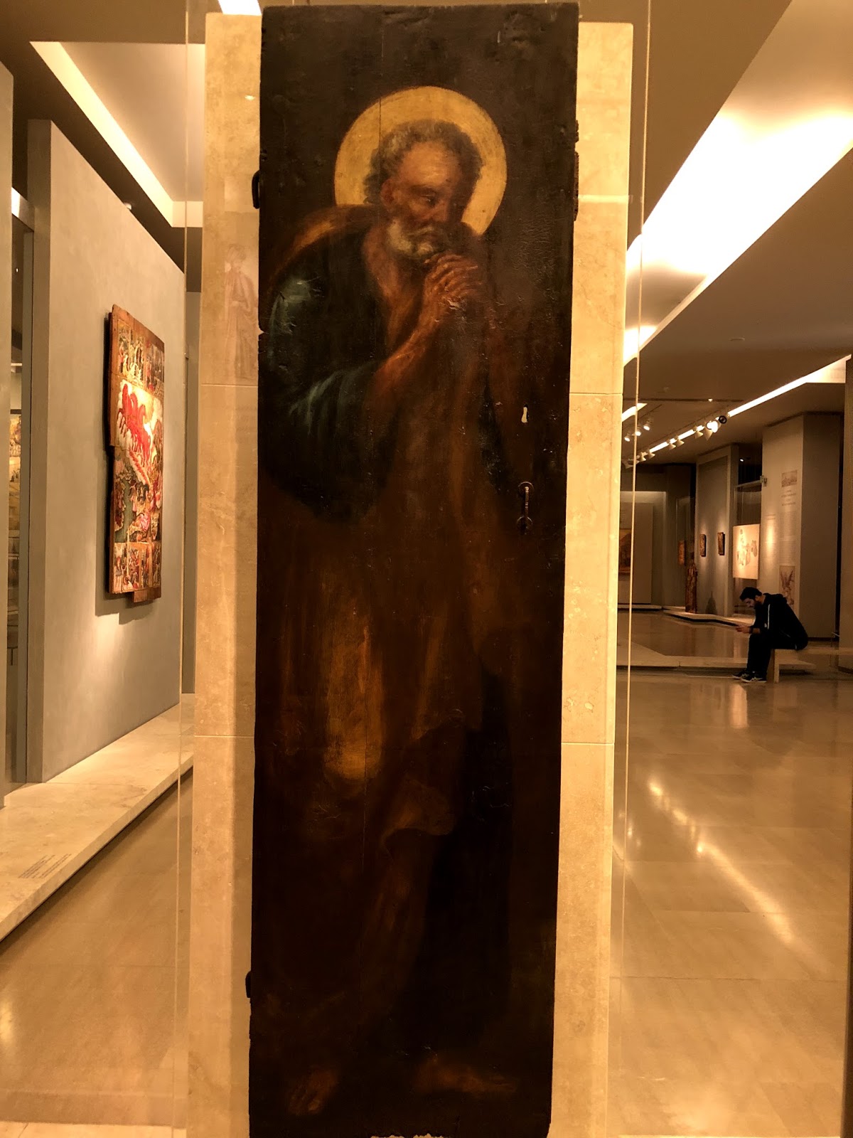
One of my favorite icons in this museum is not a typical one, if it is even an icon. It shows St Peter mourning his betrayal of Christ. It may be a painting on a panel from a church. I think I assumed it was an icon so really did not read the tag. He is more life like than is typical of iconography now that I am writing about it!


I am glad I went to this museum. It was well laid out and had not only religious artifacts but also how the early Christians lived, so included household items, jewelry, clothing, etc. I did not realize that hooks and eyes were in use as early as the 9th century, for instance. It was also like a little oasis in the sea of tourists that descended onto Athens everyday I was there from the cruise ships. There were people there but not many!

Read Full Post


Degas at Denver Art Museum

Monday I met a friend at the Denver Art Museum to see the Degas show. I had heard already from others who had already been to see it that it wasn't that great in their opinions. I went with an open mind, because often times, the artist has a different takeaway than they average person, but I did respect both of these people's opinions. One studied art history in college and the  other works as a volunteer at DAM.

Both me and the friend I went with had the same assessment, though. As artists, we felt that if this was our work, we would not want it on public display! It was like an attempt to show 'unseen' work of a master, as in scrapping the bottom of the barrel. That is not to say there weren't some good pieces by Degas in this show. But it is an extensive exhibit which meant going through a lot of chaff to get to the wheat.
Here is one that looked great from across the room. The graphic shapes and abstract quality were what drew me into it. However, it wasn't something you thought attractive up close. The woman's face on the right especially her nose and right eye were a sickly gray and even in this photo I think it shows up as a bit weird. The painting below it is one of the few in the show of his more recognizable ballerina paintings.


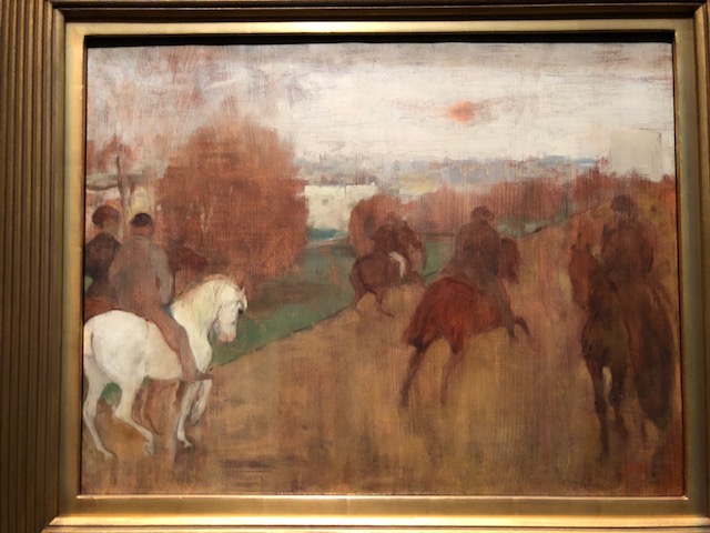
In the following pieces are the two of horses that were worth noting. I liked the top one for the same reasons I liked the three women above. The simple shapes and the abstract quality of the composition.

This second one is more a typical finished racing painting.

This is probably my favorite: very simple but a great composition. Nothing more needs to be said.


This exhibit is on view through May 20, 2018

Read Full Post


Klimt at the Legion of Honor

Lady with Feathered Hat
The show at the Legion of Honor in San Francisco is a double billing of Klimt/Rodin. For me, it was all about Klimt. Don't get me wrong, I like Rodin's work, but I came to discover and see Klimt's paintings in person. This painting of the Lady with Feathered Hat struck me because it brought to mind one  of Klimt's proteges,  Egon Schiele, whom I happen to really like, more so than what I would think of a typically Klimt piece. But this exhibit was not a show of what most people have in mind when they think of his work. A few pieces, of course, but not overall.

For instance, one usually thinks of females, especially the Kiss or the Woman in Gold. There was one piece that fit that mold, The Maiden, shown below. I took this long view of it to show its size. Klimt painted LARGE! But the size adds to the power of his images. I think there are at least 6 women in this painting, with the virgin in the middle of this menagerie.


My personal favorite works of Gustav are the landscapes. Most people have no idea that he painted landscapes. It said in the exhibit he fit them in around his commissions, but tended to do 3 or 4 per year. They are also quite large, and all of them are square. Below is one of the 4 that were on display. It is of the Schloss were he went for rest and recuperation. You can see the lake to the left where he boated. I took a close up of another painting so you can see the brush work. I was quite surprised to discover how loosely he really painted.


Next up, either Richard Diebenkorn or The Women of Paris from our own Denver Art Museum show...


Read Full Post


A New Year Begins! Welcome 2018

As a follow up to my last post, I will regale you with my take of the museum art shows we went to. To start, my son and I had a time of wonder and discovery together.

Starting with landing in LAX where my sister and her husband picked us up. We drove straight to the Pasadena Museum of California Art as it was 'on the way' home. The exhibit of E. Carlton Fortune was everything and more I could have hoped for. Photos were not allowed, unfortunately, so I did buy the catalog. I have not been impressed with exhibit catalogs of late so it is rare I will buy them.

The show started chronologically, but the first one that took my full attention was of Monterey Bay.
There are many artists who paint the coast, with the rocks, waves and coves, but not always do they take your breath away. Effie's (Effie is what her family and friends called her, but for her professional name she went by Charlton) handling of this subject was pure joy. Despite how many of her paintings I liked and would love to own, this one, for me, was the premier piece. I found this tiny image of The Lonely Shore to post here, but it does not do it justice nor does the image in the catalog.
Even as a thumbnail, I think it still shows it well enough. The colors and the paint application are stunningly luscious and varied.

If my memory serves, the image below is a view Effie painted from the old Santa Barbara Mission which burned down in the 1920's. The second painting below shows that Mission as a sprawling property with a cow grazing.


Charlton moved around quite a bit. She lived and worked all up and down the California coast painting as she went, mostly on site. One reason being, her home burned down in the SF earthquake. Eventually, she and her mother moved to Europe, where again, she moved around quite a bit. They lived and visited relatives in Scotland; they lived in St Ives, and also the south of France. While living in France, she entered the Paris Salon, and 'Mr Charlton Fortune' won an award and critical acclaim. She used her name to her advantage, as well she should!

Needless to say I could go on and on about Effie and this show; The good news is that after it leaves Pasadena in January it is going to the Crocker Museum in Sacramento so there is still plenty of time to pop over to CA to see this amazing painter's work.

Our next museum stop (not counting the Reagan Library, the Hearst Castle and the Monterey Bay Aquarium) was the Legion of Honor in San Francisco where the Klimt/Rodin exhibit is. Stay tuned...

Read Full Post


Joseph Kleitsch at the Pasadena Museum of California Art

Joseph Kleitsch; who the heck is he? Most of us have never heard his name before. I sure hadn't. He was born in Hungry and immigrated to the US at the turn of the last century. He lived in Denver (who knew?), Cincinnati and settled in Chicago by 1912. He was a very well known portrait painter and made a decent living at it. I have included some portraits for that reason. He was called to California to do a few portraits of Hollywood starlets, and after enjoying the warm climate there, moved to Laguna Beach in 1920. (He became friends with Edgar Payne) There, he started to do landscapes, and noticing how fast Laguna Beach was changing, started to document those changes. He also loved painting the Missions of the area. After his untimely death in 1931 he was largely forgotten. This is the first exhibit of his works since his death. So happy that he has come to light again.


The Pasadena Museum of California Art has no permanent collection. It holds exhibits of artists who lived and/or painted in California. This show is up through August 6. A must see if you are in the LA area. The icing on this cake was that there was a second show, on Gustave Baumann, as well. I have always liked his work but have rarely seen his prints in person. The exhibit included some of his wood blocks and print proofs. That may be its own post. Stay tuned!

I particularly love the painting above; the commentary on it was that this could be his wife, but more than likely is an 'amour' from his stay in France. No matter; it is a a beautiful tribute not only to her but what a stunning view of the reflected windows and into the room as well.

Another one I liked; Who knows if she is looking at a portrait of herself or if she is evaluating her own work? It is so graphically pleasing overall and I like the color harmony. Joseph's use of windows to frame his subjects was evident in a number of his works.

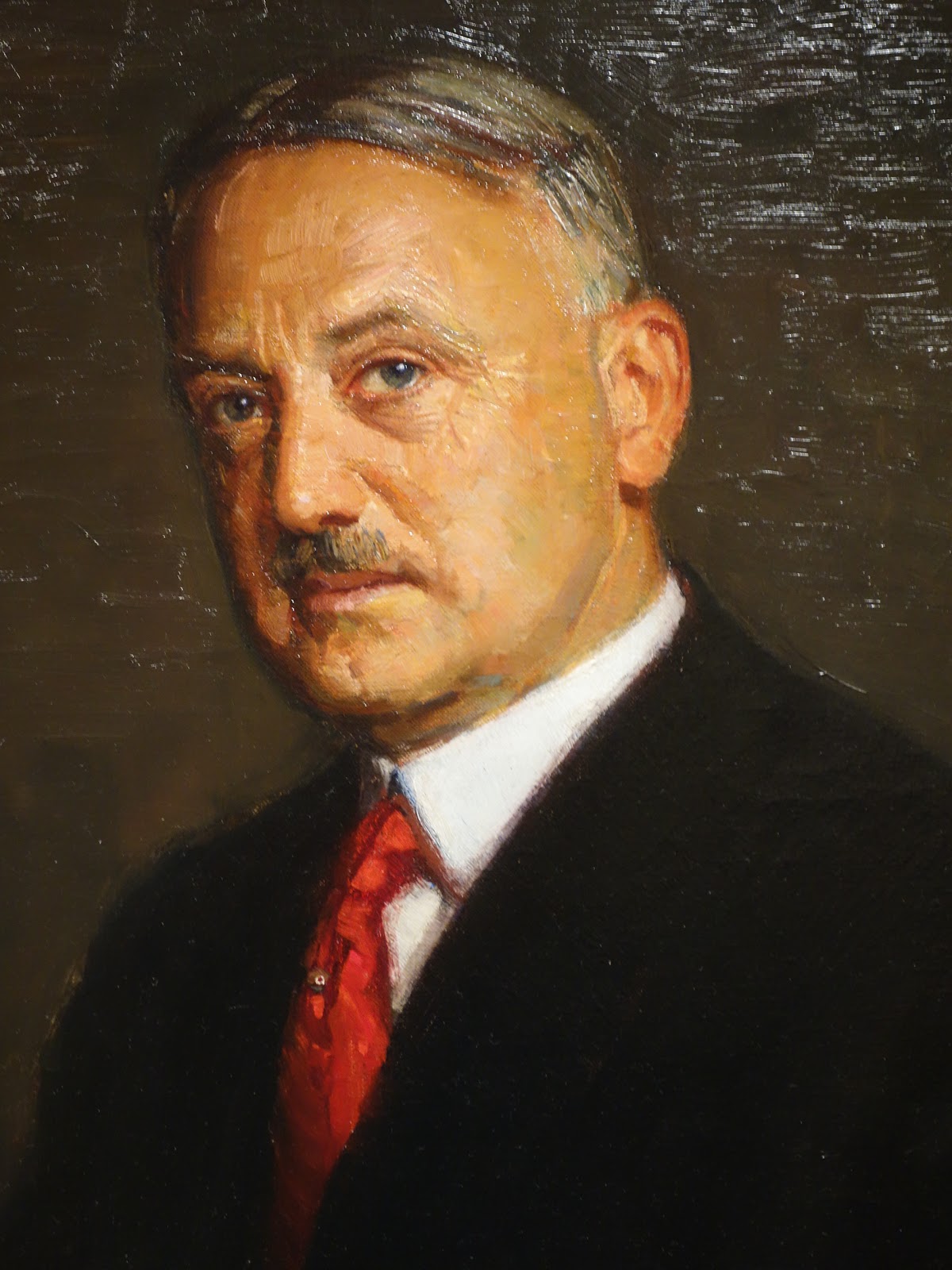
I cannot remember who this gentleman is. But he looks like a banker. I liked the look on his face.

This is a detail of an early self-portrait of the artist. Who could resist those blue eyes? The commentary said you could tell by his portraits of women that he held them captive with his charm and good looks.


Another early painting from his time in Paris. Not his normal subject but I thought the composition particularly interesting.

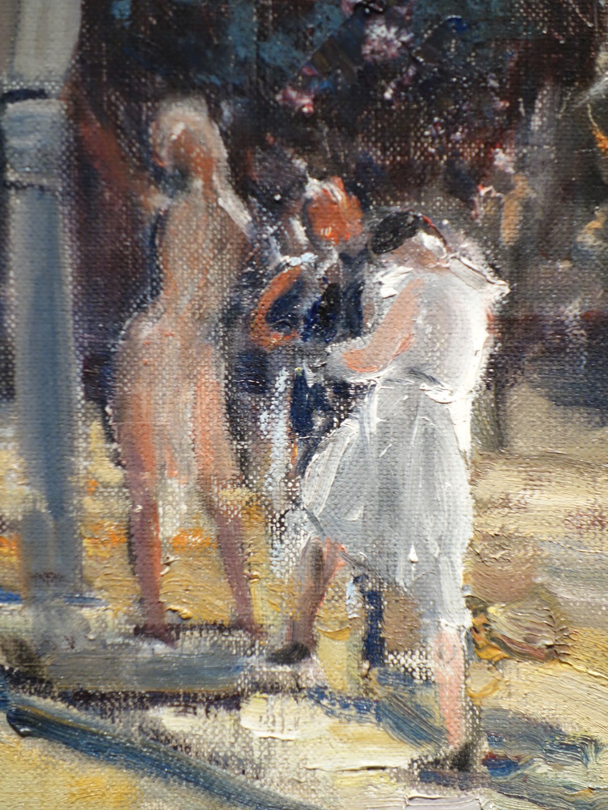
 Here is one of his scenes from Laguna Beach. Notice what seems to be dirt streets. This is a crop of the scene. Below is another closer in view to see how he showed how bustling Laguna Beach was becoming in the late 1920's. And a third, closer detail below that one. I noticed a number of loosely, almost nude appearing females in his paintings of Laguna Beach. His later works did get looser with more paint texture.


Last but by no means least, another stunning portrait using the window to frame his subject.

Read Full Post


Climbing the Wall - Denver Monolith

Climbing the Wall, 36x24, oil on linen

Here is a painting that has caused me great angst. One that I thought would be fairly straightforward. A man, mostly in shadow climbing a wall, mostly in shadow, and then a wall of glass reflecting...how hard can this be? Part of the reflection from the glass wall is hitting the Monolith; and the man has sun hitting him from the side, that is how hard it is. I even went downtown again to see the wall; it looks so black and dead and falling apart in real life. It is so hard for me to want to paint it that color!
 

So it may be 'too' blue but it is what it is for now. I need to take a break from it. Trying to make a man-made sculpture look like real stones is quite the challenge. Plus, the wall curves. Lots of things to throw you a curve ball. Challenges are what builds character, or so I hear.


I wanted to do this picture as part of my series on people experiencing art. This is just one of climbing on public art or sculpture that I have thus far completed. This was a first and only time I have ever seen anyone climbing the Denver Monolith which is in the plaza outside the main entrance to the Denver Art Museum. I did not hang around to see just how high he was able to go but here he is at the second story level.

Read Full Post


My first Flash Mob- at the Governor's Invitational Gala

In front of my paintings


Last Saturday night at the Governor's Gala Event at the Loveland Museum, just as things seemed to be at a lull, a beautiful tenor voice broke into song in the middle of the gallery. Then Carmen sang in response with the chorus joining in. It was so much fun and the Loveland Opera Theater sounded so good. What a wonderful surprise. I heard one older gentleman in cowboy boots tell the tenor afterwards that "it wasn't Merle Haggard, but he enjoyed it just the same." My friend, Jeannie, took a video with her phone but it was too large to load here unfortunately.

The show looks great and you can tell a lot of thought went into the hanging of it. Lots of variety of styles and subjects. I think it is worth your while to get up to it as a field trip/outing. I saw a brew pub a few blocks away...for an 'arts and crafts' date.

Read Full Post


Museum Exit

Museum Exit, 24x18, oil on panel

I saw this scene as I was walking out of the National Museum of Ireland. I immediately thought it was an abstract painting with all the colors and repeating shapes. And the buildings were catawampas on top of it. I had gone to the National Museum to see the 'bog' people. There is so much in this museum it is a shame I was already on overload and so really did just go to see what I wanted to see. The floors were beautiful mosaics and I had to walk past all the Celtic gold jewelry to get to where I wanted to go. The gold work looked amazing as I glanced at the display cases. I had already been to the National Gallery of Ireland to see art for a few hours, which I enjoyed very much. The two museums are very close which is why I headed over to the National Museum while I was in that part of Dublin. I had walked over from where I was staying which was across the river.

In this painting I was trying to get movement through color. There is the yellow that creates the most obvious movement; followed by the reds and then the blues. The image provided a good start to this structure as is, but I did force a few color notes as well. While working on this one I kept toying with making it much more abstracted in a Diebenkorn approach. Now that I have this one done I am thinking of doing it again, same size, with that more flattened, layered color block approach. Not sure if the figures would be included; that is still to be determined.

Read Full Post


Observations

Monday, August 3, 2015

Museum follow up - observations

A few months ago, I wrote a blog that I never posted. This one is a continuation of that theme but as it is on a museum and a particular show it is not the same, yet is similar.

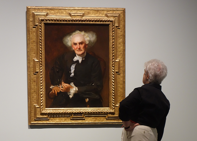
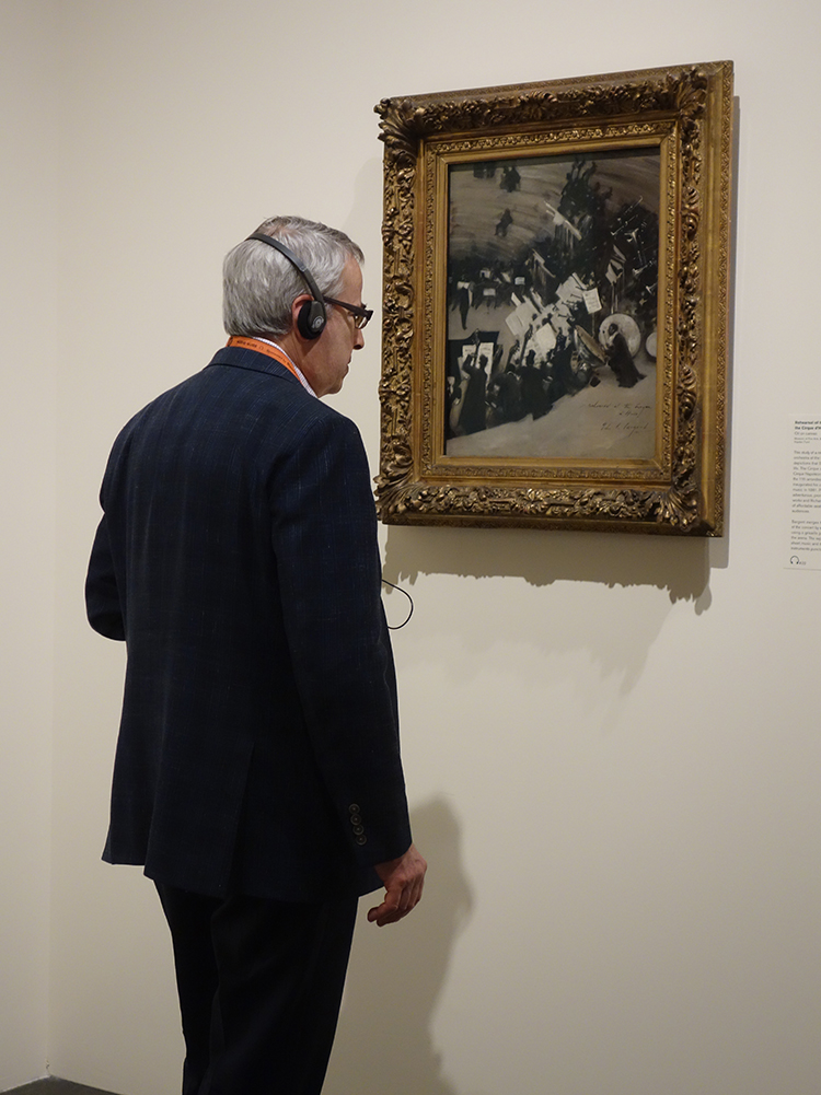
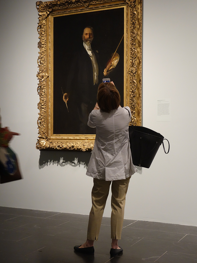
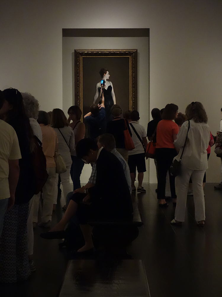
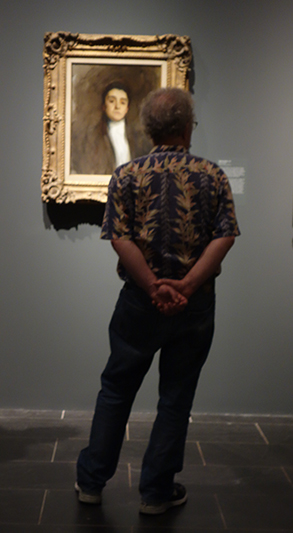
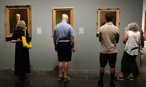
After going through the Sargent exhibit at the Met, I then started over at the beginning to take photos of museum goers to see what were the most popular paintings; which paintings did artists get drawn to (and yes, you can tell when artists are looking at art vs "normal" people); and which, if any, got not much attention. I was trying to see if my previous observation at a gallery opening for a one person show was valid here. It wasn't.  Here are my observations with photos to go along to illustrate.

Another great "head"
I love this portrait. It is of an actor in character; can't remember which character.

 Artists tend to really study a painting and if with someone, talk about it.


 People who get the audio spend more time looking at the art.


the gown of this actress from MacBeth was made with insect wings to get the iridescent look.

A noticeable amount of museum goers take photos with their phones and don't bother to look at the art itself but "may" do a quick read for more info.

William Merritt Chase-commissioned by his students


Madame X always had a gathering

Those with no audio, spend more time reading the placards then looking at the paintings. They read, then look for whatever might have been mentioned, and move on to the next placard. I am not coming down on this approach, as I learned a lot from my husband who read way more of those notations than I did, but it is an observation. And this is not to say "all" who read the notes do this, but it was a commonality. My husband found things in paintings I totally missed and were not on the cards! He looks at the paintings.


The "known" paintings got more attention than the unknown. And in this Sargent show at the Met there were many (1/2?) that I did not know existed. A very prolific painter.

In the galleries of the museum outside of the "special exhibits" more of a percentage of viewers were actually LOOKING AT THE ART and talking about it. I wonder if this is due to the lack of crowds in the normal galleries. Even in the 20th century European gallery which was filled with wonderful works, people were either just walking thru unless something caught there eye (guilty as charged) or they were actually animated about the works.

Read Full Post


John Singer Sargent at the Met

Oh my! where to begin? GO TO NYC; SEE THE John Singer Sargent exhibit. NOW. That about sums it up. Some of you may remember that I went to NYC in April 2013 to see an exhibit at the Brooklyn Museum of John Singer Sargent watercolors which literally blew me out of the water (pardon the pun). But this exhibit at the Met on portraits of his family and friends really takes the cake. I had great expectations of this show, not knowing the half of it. Not only was this exhibit extensive and covers most of his career, I saw works I knew not of. There were many that were well known for one reason or another (notoriety being one reason). But the portraits that were not well known were quite as stunning as those that are. And there was room after room of them. There was not many galleries at the Met where photos were not allowed. I was pleasantly surprised by the fact I could take photos of this show as in Denver it is very rare indeed that photos are allowed at any exhibit, not even without a flash. The thing is I had to look at the works too, so it took me a long time to get through the exhibit. I took some closeups of details I felt I needed for future reference. He handled paint so deftly. Makes it look so easy.

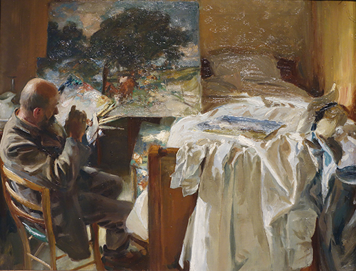
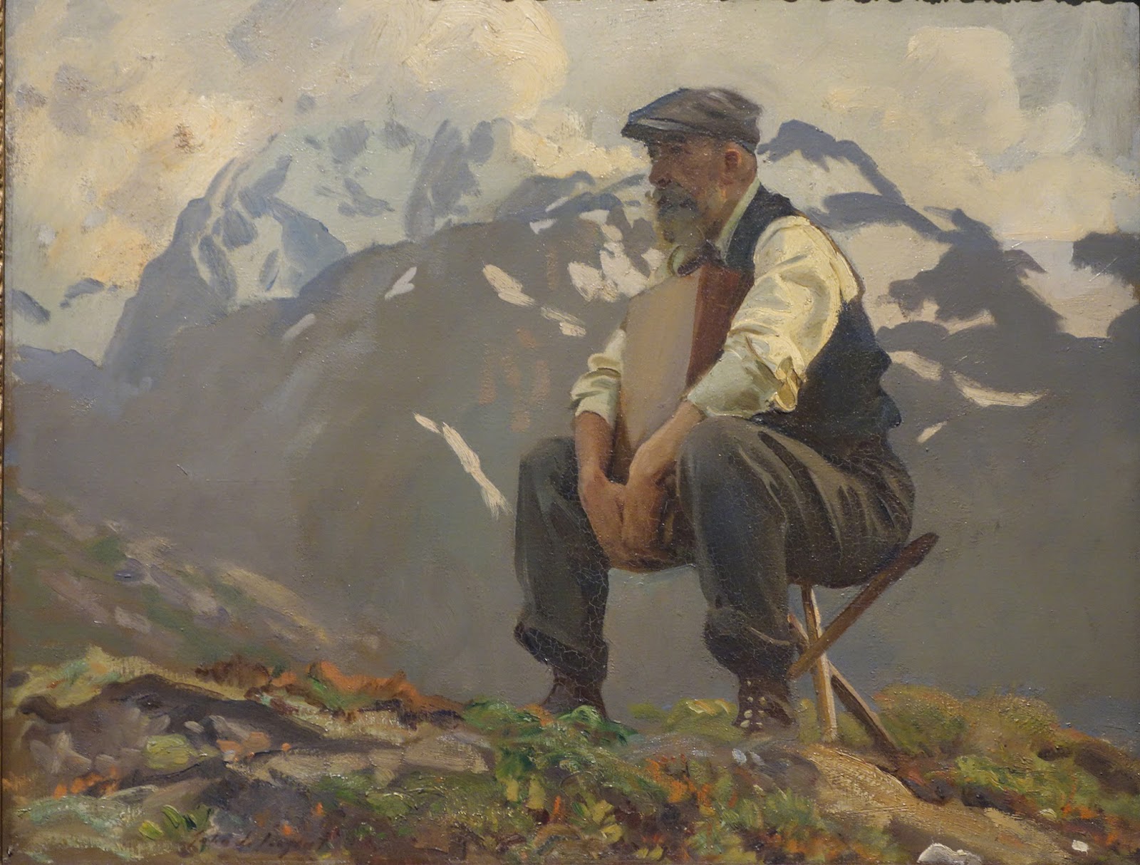
There were two paintings of this Italian artist friend of Sargent. The one above, which is a personal favorite, as well as the one below, which is also quite amazing. One must contemplate before one begins to paint out of doors. I apologize, I was not good about taking photos of the tags so I cannot remember this man's name. I did my best with the glare from the lights.  Some of them were under glass as well. More than few other artists did he paint and that were represented such as Claude Monet, Rodin and William Merritt Chase - a portrait that was commissioned by his students. It was a full length, life-sized portrait so those are some dedicated students to have commissioned that portrait for Chase.


There is a small room near the end of the show with drawings and watercolors from the Met's own collection of Sargent's; many of which had not been on view before. Sargent's sister, Violet, donated a sizable collection of her brothers personal works to the museum upon his death. Below are a couple. Included were some of his "Tommy" paintings that he did of British soldiers while he was out at the front to document WWI.


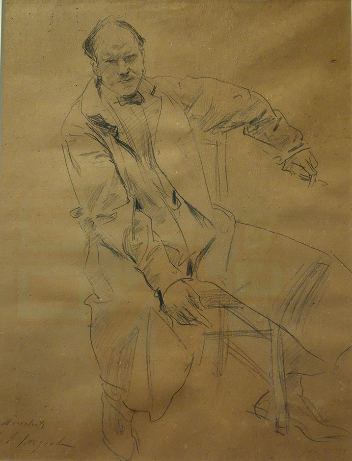
Paul Manship, January 30, 1921

Paul Manships daughter, at the age of 7, while watching Sargent sketch this portrait of her father remarked: "Mr Sargent is drawing Papa just like writing!" Does that not say all that needs to be said?

I will leave you with that "high" note.

Read Full Post


Brooklyn Museum- John Singer Sargent Exhibit

I was recently in the NYC area to visit relatives and to see ART. The Brooklyn Museum of Art had 4 memorable exhibits going on. Normally, one exhibit is more than enough for me, but knowing it was a one shot deal, we did almost 4. Today we will cover just one.

John Singer Sargent was the raison d'etre for going. It was well worth it.  The exhibit was the combination of the collection from the Brooklyn Museum and the Boston Museum; both venues had the foresight to purchase every painting Sargent exhibited at two different times, in NYC. This exhibit is the first time the two collections have been shown together, so there were around 100 paintings, mostly watercolor but about 6 or so oil paintings. The paintings were done in groupings by subject and place. The warm burnt orange of the walls was the perfect color to show off these amazing watercolors. The show was very well curated. We were allowed to take photos, too!

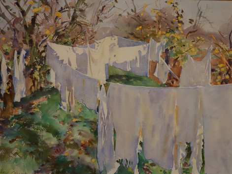
As some of you know, I started a laundry series after spending a few days in Venice, so of course I was drawn to this gem. It is called La Biancheria. The thing that I like about this painting, besides the subject, is how many colors he uses to illustrate WHITE laundry. there is very little pure white since most of the laundry is in the shade or silhouetted.

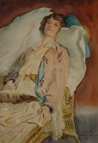
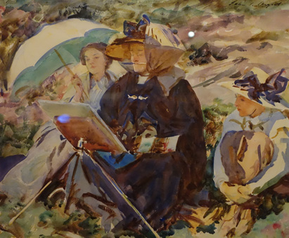
Above: This portrait is of Alice Runnells James; one of many stunning figurative pieces. It was not the top favorite of his portraits, but there was something about it that I did relate to. I think I was ready to lounge myself! And "The Lesson," below. (Please excuse the little bit of reflected light on the back of her easel and one right behind her hat. I did try to avoid those little bits, but sometimes it could not be helped.) Aside for the proverbial brush in her mouth, just how well he can give you a feel for the figures and what they are doing with very little detail. That little triangle of blue at the base of her orangish easel centers your attention yet also deflects to the observers.

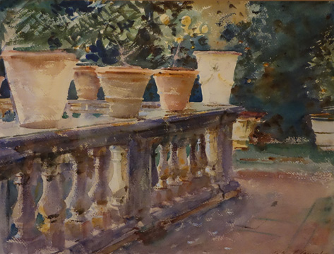
 I do not want to overwhelm you with all the photos I took, and I hardly got them all; I haven't even touched on all the different subjects or places illustrated by this extensive show. I had so many favorites, it is hard to chose what to show you. But here is a fine example of a garden. I think it is called Terra Cotta Pots. The colors that man uses in the old balustrade. You get a feel for the solid nature of it.

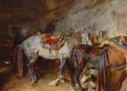
Pun intended, we will end with another favorite. Who would have thought the rear end of horses could be so beautiful? But they are. A fine piece called "Arab Stable."

Hope you enjoyed this little teaser. The show is up through the end of July if any of you will happen to be in NYC. Well worth it.

Read Full Post


Recap of Museums Visited - D'Orsay

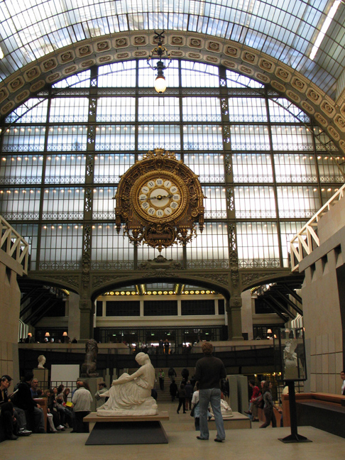
Another special exhibit was to be had at the D'Orsay Musee while we were in Paris, Impressionism and Fashion. I had read about it beforehand in the Wall Street Journal, and this was the selling point to get my traveling companion to go with me, as she is all about fashion, even in the historical context of this show. Impressionism and Fashion will travel to the Met in NYC from Paris, but many of the clothes will not go as they are too fragile to travel. It was a much more extensive collection of the fashions of the day then I expected, but you could really see how well the clothes were painted. I am eternally grateful that we are not subject to the corsets those women had to wear, or the day dress versus the dress for outings and dinner. But we definitely lack the feminine that the women of that time had in spades. The paintings themselves included many I did not know, but I did not write them down, and no photos allowed. Beautifully handled, that I do remember. A Sargent in particular, Renoir, a few from Manet and a Morisot.
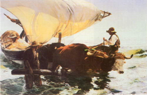
We also did a quick tour of the upper floors. The one painting I had wanted to see was no longer hanging (Gustave Caillebotte, The Floor Scrapers, none of these images come close to the "being there" this painting gives you), but there was a Sorolla that assuaged my disappointment. The reproduction below does not do it justice, but it gives you an idea of the light. The D'Orsay is still one of my all time favorite museums.

Return from Fishing, Joaquin Sorolla y Batista

Read Full Post


Recap of Museums Visited-Louvre


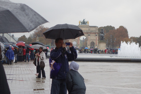
Most people are thrilled to go to the Louvre, but I, stubborn as I am, was not really enthused. I have been many times, and though have seen a very small section of the Louvre, would still rather do something else if I had my druthers. My traveling companion however, was hellbent on seeing the Mona Lisa, and it being a wet, miserable day, I said okay to going. We waited 30" in the rain to get inside and then another 20" to get a ticket. I then waited while she went to see Leonardo's painting. I drew the line at fighting the crowds there! While she was doing that I looked at the map of the different wings and opted to go to see the Flemish section. My photos may not be the best but I took some photos of the pieces that struck my fancy, including of course, those that are more easily recognizable.

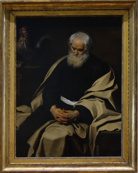
Repentant St Peter, 1651, Gerard Seghers
I really loved this painting. It had such depth to it and fit into the dark/light pattern we are covering this month in the Advanced Master Painting class.

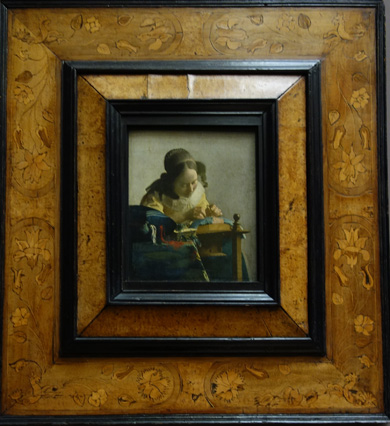
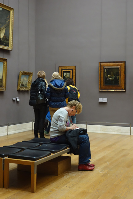
The Lacemaker, 1669, Johann Vermeer
My photo of The Astronomer did not turn out very well. The two Vermeers were on one wall together.
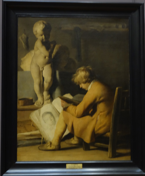
The Young Artist, 1673, Jan Lievens
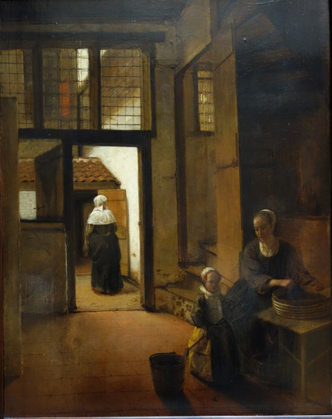
Woman Preparing Legumes, 1684, Pieter de Hooch
(there were a number of paintings by Pieter I liked, but this one was my favorite.)
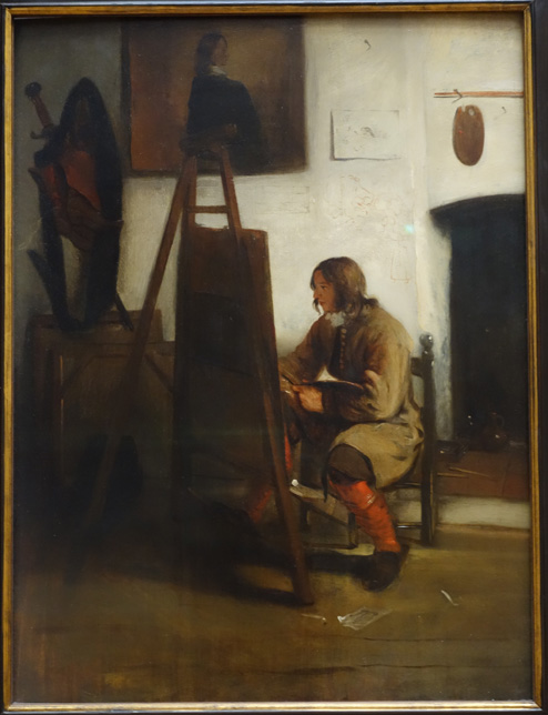
Young painter in the Atelier, 1673, Barent Fabritius

There were a number of Rembrandt's,both portraits and self-portraits. I enjoyed my sojourn in the 17th century very much. My companion wrote postcards under the Vermeer paintings while I took in the rest of Flemish artists. We then watched "Girl with the Pearl Earring" on our flight over the Atlantic to finish our trip.

As evidenced in the photo above and in the others I took, "The Lacemaker" got all the attention It was as if "the Astronomer" did not exist! Such a shame.

Read Full Post


Recap of Museums Visited - L'Orangerie

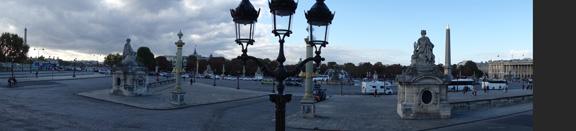
My first try at a Panorama, outside L'Orangerie

No photos allowed in the L'Orangerie. There was a special exhibit of Chaim Soutine, Order out of Chaos, who was the main reason I wanted to go back to this museum, so what a happy coincidence. Most people go to L'Orangerie, on the other side of the Tuileries from the Louvre, to see the water lily paintings by Monet, which take up the whole main floor. The water lily paintings are impressive in the shear size of them and I always go and sit and just absorb the peaceful energy, but I prefer the galleries downstairs.

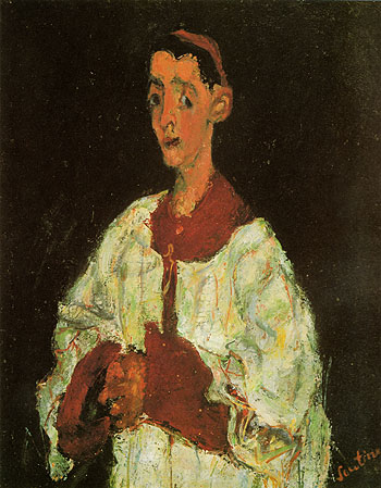
The essence of the personality that Soutine captures in his portraits is really something.

The Room Service Waiter, Chaim Soutine
The Choir Boy, Chaim Soutine

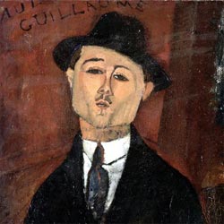
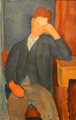
I also enjoyed the Modigliani portraits. I saw one of his sculptures at the Guggenheim in Venice-one of the better pieces housed in that museum.

Paul Guillaume, Amadeo Modigliani
The Young Apprentice, Amadeo Modigliani

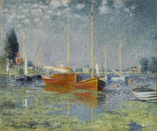
There was this little gem by Monet downstairs (little being relative to the water lilies upstairs):

Argenteuil, Claude Monet

Read Full Post


Recap of Museums Visited - Venice

Just returned home from two weeks in Europe and thought I would write a bit on the pieces that struck my fancy. The big one that tops the list, "Sewing the Sail" by Joaquin Sorolla y Bastida, was by far my favorite.

 
Sorolla’s painting was extremely large, about 10ft. x 7.5ft. I loved the sense of light but also the liveliness of the people. This painting was housed in the Ca' Pesaro Museum in Venice. There were a number of paintings I enjoyed there and Italian painters I discovered and hope to learn more about. A few are shown below.

"Abandoned" by Luigi Nono, above, painted in 1903 was one of them. Tenderly painted it really had an emotional impact; and this is after being harassed every time you turn around with the wide eyed, sad mother of however many children, begging. There was a certain look they all have down pat, whether on the trains throughout Italy, the metro or the streets of Rome.
Another was "Toothed Prows" by Guido Marussig, 1918. Very simple, very Venice, but effective.
I will end with Umberto Moggioli, "The Artist's House", from 1918. One thing of note, there were a number of paintings by Moggioli, and the museum mounted them in chronological order, which made it nice for the viewer to watch the artist grow and change over the years. This was the latest of those on exhibit. 

There were other paintings worth noting, such as the "Rabbi of Vitebsk" by Marc Chagall, "Nude at the Mirror" by Pierre Bonnard, Anders Zorn, "Stream" and Fernand Khnopff "Portrait of Miss De Rothmaler." A beautiful museum in and of itself, the works are definitely worth a visit if you find yourself in Venice.

Read Full Post


Topics

Archives