Blog


Painting in the Garden - Always an Adventure

Yesterday was a beautiful day. We have had smoke from the fires in Alberta Canada since last week creating a very gray environment. Finally, the air was clear and the temperature was perfect. The iris in my garden have not looked this good in years. In Denver, the weather conditions definitely determine what the garden is going to look like, or not, in any given year. I have not been outside painting, with the exceptions of my field sketches, yet this spring. And here it is almost June!


All is going well for awhile until about an hour into it. I am enjoying being outside and in the flow. The occasional distraction of my puppy charging the fence barking as people and dogs walk by. THEN, a house a block away and down the street, which has been under construction for the past two years, started using a high power washer to wash the new black brick that this compound was built with. You think, down the street a block, what is the problem? It is the short block, and it is a busy street that slopes up to my house. So this street acts like a megaphone into my property when there is noise going on there. Another monstrosity, being built two doors down, and called THE PRISON by neighbors on the block, has not been half as disruptive as the one further away. It is like a microclimate situation. Living in a neighborhood that has been under constant construction the past 6 years, you would think I would be immune to the noise by now. It is not so. I don't think myself a sensitive type, but I am becoming very reactive to it, which serves no purpose, yet drills into the brain and psyche nonetheless. I had to quit working on the painting, thinking I would set up again today and finish what I could before my afternoon appointment. 

Before and After of the iris

No. This painting was not destined to be completed outside. At 4 PM a wicked fast and furious hail storm blew through decimating my iris, among many other plants. Shockingly, the Particular stems I picked were the least damaged. I believe because the tree above provided some shelter. Iris in other parts of the garden were not so lucky. The good news is, that the buds withstood the assault, so not all is lost.


Read Full Post


Lilacs

Day 3 -mostly done-thinking the 'vase' is too prominent

Wednesday of last week (May 10, 2023) everyone on our morning walk was talking 'hail!' So, I came home, covered my vegetable garden plants (we here in Denver know not to plant before Mother's Day-but who listens?), cut some lilacs, iris and hellebores, 'just in case' to bring inside. If nothing else I could enjoy the heavenly scent of the lilacs, or possibly even do some sketching of the flowers on the grey day that ensued. It did rain for 24 hours straight, but thankfully, no hail here. The area where I live has been called  "hail alley."

Sketch of Lilacs

Friday, so two days into the cut flowers shortened life, I decided to paint one of the vases full of lilacs. Being still overcast outside the arrangement was under artificial overhead light. I went and found an unclean previously painted panel, 24"x12" and proceeded. Sometimes, the first run on a used panel is the toughest, especially if the painting was varnished, as this one had been. I could not find a photograph of the painting so I am surprised it was varnished. Despite the effort put in by me, who knows how long ago, to remove the varnish and then sand it, it still lingers. The first flush of new paint means it is absorbed by the old varnish so I must remember to go darker and lighter in value to combat this phenomenon. It doesn't seem to matter - it all ends up monotone.

From Nicotiana to Lilacs- starting the block in- carving out shapes

Day 1-Black almost covered - allowing this layer to dry a bit
Saturday is not so gray and the sun actually shines forth from time to time. But in keeping with what I had started, I turned on the overhead lights. My thought was even if I don't finish the study, it has been fun painting from life and fighting the substrate at the same time. Today's effort felt less like a wrestling match and more fluid and easy. 
Day 2- Big shapes defined

Day 2 before quitting for the day- Lilacs holding up so far 

Day 3 Sunday is just to finish the vase. Which is really for drinking wine, I believe. I inherited it from my parents and is from the 60's when we first moved to Germany. I am not sure what it says on it but I believe it has to do with cultivation of wine.  It does have a handle but I have ever only used it for a vase.


Read Full Post


Series: Doors/windows

Two weeks ago


A month ago


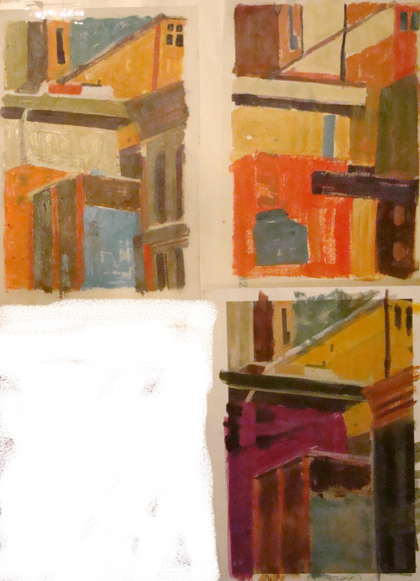
Since this is how I sent what I was working on to my aunt in a letter, (yes, I still write letters, and she is 96) this is how I am presenting them here as there is no other means now to show the progression. In the bottom image is the first image I sent her on where I was at that time, about a month or so ago. Mostly blocked in and taking shape if not yet pushed to finished. The first painting in the bottom image going from left to right, Georgetown CO, Morrison CO, the green door is from Bavaria, the blue door is Orleans FR from a photo I took in B&W back in the early 70's, and the old metal chair is in front of my garage, and the only one painted plein air.


The top image has most of them nearing completion although since I took this photo a few weeks ago, Georgetown hadn't made much progress, but now is almost done. I have also worked more on the Bavarian Green door. I will post the updated grouping once I finish Georgetown. 

I have been working on some larger paintings and I started to do these 9x12's as a way to break up the monotony I sometimes get into while working on large (30x40) for me paintings. I hardly paint this small anymore unless doing studies from life. It has been fun, and I have a few more in mind to continue and riff on this theme. I showed them to some friends of mine recently and I was surprised that they both liked the same painting the most, the one I expected the least attention from. Can you guess which one it is?


Read Full Post


Waterlily in progress

Here is where I ended up yesterday. I keep saying I really like the block in process and continue to hope that I can maintain the abstract quality and yet I rarely "succeed" in my own mind in doing that. It isn't that I don't like the finished product, but I can't seem to keep the under painting from adding that certain something that is in the block in. On this one the windows are showing through at the top giving it a grid pattern that continues here and there down the painting.

The image below is where I started to photograph the progress. I turned the unfinished painting underneath to its side so the the face wouldn't distract me. 
Continuing to block in the greens around the water lily so as to get a better feel for the pattern I was wanting to get. ie a circular yet not a halo effect. Still leaving the orangish color of the figure's skin to help keep it from feeling too green.
Adding the darks of the water and more outlines of the lily pads to prepare for finishing the whites of the lily.


Read Full Post


Attachments

I figured out why I was so stuck on one of the paintings I started in January this year. It seems to always be the area one is attached to that is holding up progress and/or one's unwillingness to let go of said area. So even though I haven't finished this piece yet, I wanted to post it to show how attachments you need to let go of, hold you up.


Last Saturday I had dinner with a writer friend of mine. She was talking about a new essay she had written for her online newsletter. She was lamenting that she had to cut the best line out of her latest work to make the rest of the article pull together. How her attachment to that one line was keeping it from being a cohesive whole. But that maybe she could work that cut line in some not yet unwritten piece in the future. I then proceeded to tell her I had the exact same thing happen to me! Except in paint. Her first response was oh how sad! I could not ever reuse it. Which isn't exactly true. I feel that every time this happens there is always a takeaway from it.

This first image is where I had finally roughed in the sky really liking the energy of it. Unfortunately, I put it in after I had already begun painting atop the block-in of the rest of the painting. I remember being intimidated by the sky in the reference, so I was in avoidance mode. Leave it until I am ready or can't ignore it anymore.

When not done in proper order, confusion results

If I had added the sky when the rest of the painting was in the same state (below), who knows where it might have gone, right? My aim is always to keep some of that block-in brushwork but it is so rare, not sure why I keep thinking that will happen.

block in as I figure out shapes and proportions

Here is the painting with the new sky that better fits the rest of the piece. The new sky actually helps the piece overall so much it almost seems like a new painting and yet I feel I was able to keep some of the brushwork I had become so attached to. I can finally go back to the rest of it now that it doesn't feel like two separate paintings. I don't think it will take much to finish. To be continued.

Starting to pull together finally

Read Full Post


A Journey Back in Time

Earlier I had mentioned that I was on a roll and had started all these new pieces. So here is another one of those starts from early January.


Last year about this time, I went through all the old slides my sister had pulled out of our mother's closest when she died 10 years previously. They had been in my basement all these years as I did not quite know what to do with them. Should I just toss or should I take the time to go through them all? Our mother was a traveler and I knew if I took the time to look at what was there I would find some treasures. They were still in the trays from her old slide projector and meticulously documented where they were taken and when.

So, after going through her slides, I also went through MY slide collection. I had quite a collection as well. Once I sorted through both collections, I picked 50 or so to take to Costco and turned into digital images. This is the second image from my mom's slides that I have picked to paint. This one is from France in the mid 60's. She is in the painting with her close French friend, Beatrice at Beatrice's family farm in the countryside outside Orleans, France, where we lived for 5 years. I picked this image to do for a number of reasons. One, it is my mother as I remember her as a preteen. Beatrice was a woman she met at the Franco American Club, a place for women to meet and cross the cultural divide in new friendships formed. Beatrice became part of our family and after we left France and moved to Germany, my mom often went back to visit Beatrice. I know, because I went with her once.

I was asking myself this question the other day? Is it strange to paint from old photos? Are they dated somehow? I am betting this farm house is still standing and hasn't changed all that much. I wish I knew exactly where it was located.

Here is the progression to date:

Peg and Beatrice, 20x30, block in stage
Peg and Beatrice, 20x30, oil, coming together

The slide made digital image is overly purple. I tried putting different filters over it to see what if any improved it or made it more natural looking, but none of them improved it enough for me to want to go that direction. I am enhancing the warm oranges that are already present and graying down the overall purple color. Believe it or not, that is what I have done here and it still appears purple, but I am okay with it.

Read Full Post


Block Ins!

After a dearth of inspiration, the new year has brought me back to life! It is my favorite part of the whole creative process for me and that is, The Block In phase. In the first week of January I started not one, not two, but FOUR new paintings. It is my habit to have multiple canvas's going at any one time and as it has been so long since I have felt any motivation to work, the ideas kept flowing out of me. I still have 2-3 unfinished pieces from when I left off but I needed a fresh start for the new year. They will find their place in the queue as the spirit moves me. One of them I am thinking will just have to start over a new life just as I am endeavoring to do. I have moved on and it just doesn't work for me anymore.

The first one of the new year is local. Walking Washington Park for the past three decades still brings new things to light. Our winter has been so warm, that fall extended way into December if not early January. I took numerous photos of this one particular view and many of the images clamored to be done until I settled on one that is a challenge for me. It is half graphic and half soft edges. I do not normally share the photograph, but I will this time.

What attracted me to this scene was the symmetry and the very, almost blocky shapes of the houses interspersed with the softening effect of the trees in winter.  But I can also just keep those trees very graphic as well. This stumped me initially, as to what to do, which approach did I want to follow? You will have to stay tuned to discover how the story ends. Here is a foretaste but no necessarily a clue.

Looking for the dark shapes


Working out the rhythms and patterns

In this bottom version I noticed that the cloud in the reflection is a bit too angled, so that will be rectified. A tree does go in front of it but that does not alleviate the need for adjustment. 

Read Full Post


My Dog Ate My Painting!

There are many things to be thankful for. This year it is that I have never heard of "the dog ate my painting" until now. That isn't quite the correct assessment, but the dog did chew this painting. A friend of mine's husband came to my art open house a few weeks ago and found a little plein air I did one spring day at Rocky Mountain National Park about 10 years ago. I had carpooled with an artist friend as we delivered art to a gallery in Estes Park. Why waste a trip to Estes Park when you can paint in the park?? What does it matter that it is frigid cold and snow is fast approaching? This particular friend never lets such trifles stop her. So we hauled our gear out into a field and went to work. So that is the back story on the painting...
Now here is the story of the dog chewing this painting. It has to be shared just because it is a unique story. So, my friend was having an acupuncture appointment in her home, when the acupuncturist remarked that it looked like her dog had gotten into something and was chewing on it; maybe a piece of paper? except it didn't sound like a piece of a paper. She replied nonchalantly would he mind checking on the dog to see what it was? He remarked "it is a painting, I think" She jumped up off the table, needled like a porcupine to find that indeed it was a painting, the one her husband loves so much. She is so upset about this that she took it back to the frame shop where we had been the day before to see if they could fix it. She didn't even want to tell me! Of course they can, but to pay to remove the canvas remount it and repaint was not worth the cost of paying for that conservation. So I told her I would repaint it.

The back, so you can see the damage
The front

I don't know. I think it is a fun story. In fact, yesterday I had the thought to see what I could do to make the original painting work without the conservation costs as the dog chewing the painting adds to the story in such a unique way. I own a book press, so I soaked the board, which is a soft particle board of some kind, and put it in the book press last night. It made a difference to the 3D teeth marks on top. The surface is now flat which softens the puncture holes. This morning when I took it out of the press, I noticed that some of the fiber board was above the line, so to speak, or sticking up above the straightness of the canvas. I just rewet it and pushed the fibers down to be aligned with the canvas edge and stuck it back in the press. I am thinking this painting should be framed as is. But I think it might also be possible to rebuild the corners and match the sky if required.
My new painting is almost done as well, so there will be a choi

Read Full Post


Crossroads - in Process

Crossroads, 36x48, oil on canvas

I am still working on this painting, the largest to date that I have attempted. This year has been one of great transition and I feel like I have been at the crossroads for quite some time now. Once I pick a direction another crossroads is before me. My 'plan' for this piece is to keep it very abstract. It was also to be another attempt for me to allow the under-painting show through for a layered effect. My intention was to document each layer to track myself. However, as is often the case, once I get working I do not think to stop and take a photo. I am very pleased with the fact I still have some of the original under painting showing through as I fight my tendency to cover it all up with the new layer. The left side is a bit more complete than the right at this juncture.

Here we have my first layer which took on a rainbow theme. IF truth be told, I was cleaning off my palette, but who needs to know that? I still thought it would create a nice color transition going across the canvas. This next image shows my beginnings of blocking in and placement of the crossroads. How high, how wide, how thick, how thin. You would not think something so simple would require much thought, but as I work on this piece, it has a mind of its own and I find myself going in directions I had not initially even considered. It has been a wonderful journey thus far despite many roadblocks. One of self-discovery. A road trip without ever getting into the car...

As I write this, it is drawing me back and into it.

Read Full Post


Take a Seat

Almost finished!


as it is being taken down to the frame


Finished chair in natural light

Once upon a time, in a life faraway, there was an artist that decided to learn upholstery. This artist had a premature infant that required a full time mom, so the family had only one income stream from dad, a taxi driver. Furnishing the home was out of the question, so this artist became an alley rat. There was much to be found in the central Denver alley's around Cheeseman Park, but most needed work, and lots of it. Taking the very inexpensive Upholstery class at Emily Griffith Opportunity School, these finds from another era soon furnished the living room with wonderful antiques from the 1920's and 1930's and a little side business developed. By this time another child appeared, so still not ready to pull out the oil paints just yet. There were no odorless turps or mineral spirits in those days.

Those infants are now in their 30's and I have not upholstered anything but dining room chairs in decades. This chair was going to be joint project with my daughter, but after 2 years of storage in our garage, my husband wanted it out. Hence the idea to do it as a Christmas present. I had intended to have it done by a professional, but the quotes on it were $330 and $430 and it would take 4 months! Certainly not by Christmas, even though I started research on this in late September/early October. The good news about taking it in for a quote is that I learned it was an Eastlake chair that was mainly manufactured in the Midwest/West during the mid to late 1800's. They were usually sold in pairs. He said this was a higher end chair for the period due to the extra carvings on the top and the piece of burl wood on the front of the seat. He said the name came from a furniture maker in the 1700's who had this idea to mass produce chairs and had designed it to be so. This idea did not catch on until it was brought to the USA by some enterprising soul almost a 100 years later as an affordable, but good looking seating option. I can tell you it is a very hard wood, possibly walnut as it was very hard to tack and staple into!

It was hard to find the inner pieces I needed to work on this chair, so fortunately I had enough still stored in my basement to complete the task. Thank goodness for Youtube as I had not tied springs in 25 years. There are 5 springs in the seat I had to tie 8 ways so that they move as a unit. Only had to tie each one 3 times to get it taut enough, straight enough, etc. There were many aspects of rebuilding this chair that I did 3 times to get it right. The seat was not straightforward with the little extra detail or brace on the side coming off the back. Made that corner very tricky for cutting fabric. I can honestly say I am glad I got it done. It was fun, up to a point, but am I ready to tackle another upholstery project? Not really, at least not yet. But this is where my creative juices have been focused for the last week or so. Hence, it is worthy of a post.

Read Full Post


How I love the block in process

After a month of no inspiration or even thinking much about painting in any way, I started with three, no four, block ins within 3 days. So exciting and excited to be off to a good start. Only one has been moved past the block in stage so it will get its own post shortly.


The first one was inspired by an artist I discovered via a share by a FB friend. The artist is Leonhard Lehmann, a contemporary Austrian artist. His abstracted scenes really drew me in and reminded me somewhat of California artist, Richard Diebenkorn. This is a direction I would like to go more towards. It isn't hard for me to do this in the block in stage but as I go forward, I tightened down no matter what I see in my minds eye. Here is the piece that broke my month long hiatus due to life circumstances.
Road Ribbon, 18x24, oil on linen panel. Block in stage

A week ago, late in the day, I went to my easel and got the canvas covered in about an hour or so. Just goes to show what you can do when you are motivated. The weekend before I had gone up to Fraser to house sit for a friend of mine. This is the county road heading to his house off of HWY 40. The field off to the right was full of hay bales. Looking this direction was looking into the sun so the colors are dark and muted. I turned around and shot a photo of the road I had just traveled and it is full of light - almost a night and day study. I used colors in this block in that I want to use in layering but they are growing on me so who knows what will happen once I get going on it. What drew me to this scene is that I feel I can play with the colors and the large shapes down to smaller shapes. The rectangles, circles and triangles. It comes across to me already as abstracted shapes so I am wanting to keep it that way while also playing with the colors and not so much thinking about the colors as they are in the image.
The next morning, I decided to start a companion piece to the one above and paint the hay bales in the field. I took a number of shots of this field at different times of day, but I settled on this one due to its repetitious shapes. The hills repeat the rounded shapes of the hay bales and I also like the lines leading the eye into a Zig Zag through the fields and the houses into the foothills.

Since I am looking at this scene with my back to the sun, you can see how bright it is going to be relative to the scene above. These were both shot between 5:30 and 6 pm.

Hay bales, 18x24, oil on linen panel. Block in stage

Today, I started to work on top of the block in of the hay bales and it is coming along nicely. I also started a small one of the road. Who'd have thought a country road could be so inspiring...or just what I needed?

Read Full Post


Blockin Pelican develops into struggle

Pelican Block in, 24x24, oil on panel
Pelican structure, 24x24, oil on panel

Loosely blocked in on the slick oil gesso I had put on the Masonite, makes for a very thin coverage of paint in the first photo. I am now building up paint layers. I added that sea green color to the sky to be under and behind the darker blue gray clouds that are building up in the sky and will pop the pelican's head out. I solidified the river's light color but I will be adding the darker edges of the waves that are rippling with the wind.
 I am still undecided whether I will leave the trash can in that is peaking out behind the tail feathers. I thought it might be a good balance to the beak but know am not so sure I like it. It seems to be competing instead of complimentary. There were two figures on the bridge that I have so far left out. One figure is fishing and has his back to the viewer; the other is peaking out from behind the pelicans shoulder and looking over his shoulder at the viewer. My husband said to take them out but I am not yet convinced they don't belong.

Pelican Drawing Correction

The Pelican's head, neck and beak just felt off to me so I had to redraw the whole thing. The only part I did not move was the back of the head and neck. The bird's body didn't seem able to support the head. I think the proportion's are better. I finished blocking in the feet and legs, too. Good drawing is so important to the whole painting's success. I was convinced I should take out the trash can but now I am waffling on it...again.

Those nice straight lines that I like so much will most likely be softened once I get down to really laying down the color. The slick surface forces me to layer, which is a good thing. I like having the depth of color. I still struggle with the good coloring book syndrome of 'keeping within the lines.' Which for me translates to cover everything flat within those lines, ie not allowing the underlying colors to come through. It is a challenge for me but I have been working so hard on that aspect I think I got it. It is my yin and yang fighting! In one sense I like the rigid Mondrian linear quality against the organic shape of the Pelican. Then I think, flatten down the Pelican to a more abstract linear image to go with the other lines...Then, no, soften edges! I am still not sure which side of me is going to win the fight on this particular painting.

Read Full Post


On the easel: Inspired by drive down I-70 from Vail

Vail Pass Descent, 30x30, oil on linen


Last Thursday and Friday I was in Vail for the FBLA (Future Business Leaders of America) State Conference. On Thursday I judged the Graphic Design competition and on Friday I helped in headquarters. The storm reports for Friday-Sunday were getting more and more horrendous so it was recommended I leave sooner than later. When I left Vail it was not only snowing and hailing but also thunder clapped. Hitting Vail Pass it was clear, although not sunny. This image is coming down from Vail Pass. Just before getting to Frisco I hit a white out. That was quite terrifying and took all my concentration. I slipped in behind a semi-tractor trailer and prayed he could see better than I could.

I wanted to get this painting started as not only is part of a new series I want to do, I wanted the freshness of the memory from the drive.

My first thought was to do this painting 24x24 but after looking at that size decided it was too small. Even 30x30 is looking a bit undersized but I don't want to go out and get a larger canvas when I have so much stock on hand. Plus, this is a good size for me. I must admit though, the more I work on these larger for me sizes the smaller they are tending to become.

This one started as per my usual approach of very thinned down paint color to just get the canvas covered and the big shapes blocked in. Then I go with a bit thicker paint and correct the drawing if that is needing to be done. There usually is some adjustments. Then I really start to lay on more color and paint. This is as far as I got but I am quite pleased with it thus far. I love this stage in the development. I could start paintings all day long. Just don't ask me to finish them...until I am good and ready.

Read Full Post


Another repurposed painting-Wynetka Farm

Block in for Wynetka Farm, 12x9 oil

I saw a friend of mine was painting this image. I was taken by the simple shapes and the obvious light and shadow on the white house with red roofs so I asked her if she would mind sharing it with mes as I would like to paint it too. She was willing. Wasn't that nice of her? She is painting it in a much larger format. I just wanted to do a small sketch. I did this initial quick sketch in an hour or so, using the Douglas County plein air painting below as the substrate. That is what I consider a failed attempt at abstracting the landscape. My husband came in after I put this up to look at it and said how much he liked it! Then I didn't want to touch it again for awhile. Don't mess with success right?

Wynekta Farm, oil

But this weekend I decided to finish it and not be distracted by a positive comment. I did try to leave some of the original painting coming through but not so much that it was overly distracting. You can see some of the rhythms still showing through. I quite like the finished product for a small diversion from the bigger pieces I have been doing recently. Feels good to feel finished without spending months on it.

Read Full Post


A new painting emerges

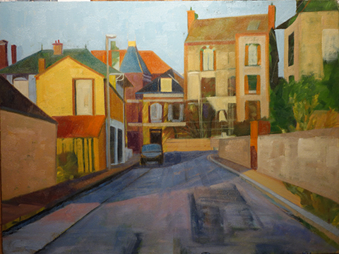
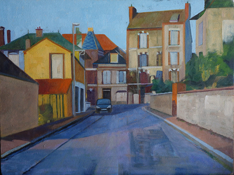
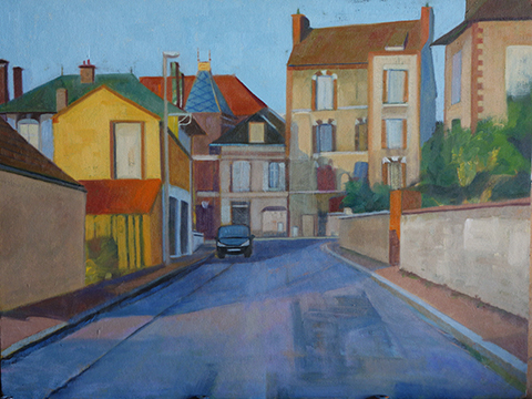
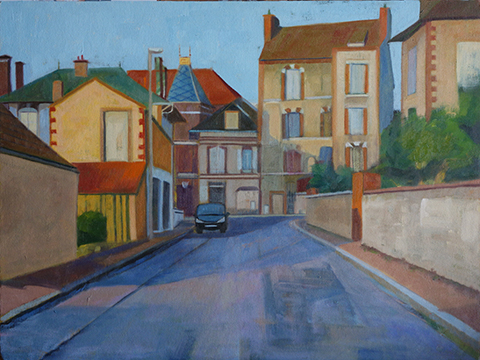
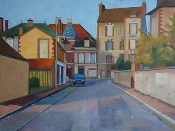
A bit of a story to this post. I have a painting I did a year or two ago where I played with abstraction. I had it hanging at the office for fall as it is a scene where the dawn light was casting its long fingers across a street in the river town of Migennes, France. I was out looking for a patisserie to bring back breakfast. I am an early riser, even on vacation. One of my co-workers asked me if he could make a comment on the painting and of course I replied yes. I am always thrilled when someone looks at my work long enough to want to comment. He told me that the foreground of the road bothered him because there wasn't enough interest at the entry point into the painting. GREAT observation. So I took the painting home that weekend and fixed the road. Unfortunately, that little fix was leading me into wanting to repaint the whole thing as I am not in the same place I was when I painted it. On this particular painting I wanted to leave it alone. I was and am happy with it 'as is.' Here is the original painting with the road repaired:


Migenne at Dawn, 18x24, oil on panel over old painting. Available

Not on my agenda that weekend was to start a new painting, same subject, but that is what I ended up doing. I was jazzed! I found another old painting, same size at 18x24, on which to paint. I found out through this process that it is a different result depending on if the original painting ever had varnish on it or not. The painting above had varnish. Even with removing the varnish, the paint is still tacky so the brush glides over it and sticks. Which is the effect I like in the above painting. The new rendition over another old painting did not ever have varnish on it so it was like painting on a fresh canvas.
I took photos along the way so you could see how it works. I had intended to make a slideshow out of the progression so it would not involve so much scrolling but the latest versions make it so much harder than the easy Picasa I used for all my slideshows in the past! Maybe I will figure it out but today, it is not happening and I have been messing with this for weeks and I am over it.

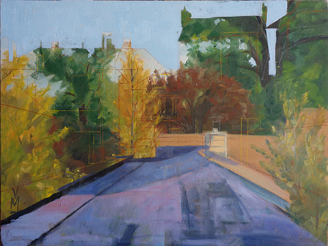
1. I don't have the original painting but in this first image it is mostly there. I have drawn in the basic structure of the new painting and blocked in the outline of the new sky.

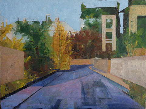
2. Here I have added the road and some guiding lines of the gutters. The roof color is already as a wall and the chimney looks like a door.

3. Here I have added walls in two different values. One color for the walls in the light and another for the same color walls in shadow.


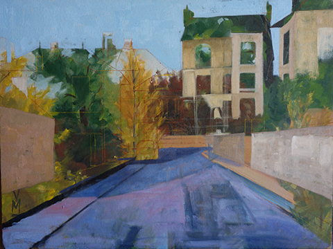
4. Finishing up more houses. I do like how the trees work with the composition of the new scene.

5. Roofs are coming into play and the side of the orange building with its basic structure and the sidewalk on the left is no longer tree colored. The chimney pots are taking shape as well. The growth is tied to big blocks of color.

6. More roof's and finishing up another house to the left.

7. this photo was taken after dark so it is studio lit. I did not want to stop yet so that is why the colors look a bit yellow. The houses at the end of the street are coming in. Oh how I struggled to want to cover up the trees but it had to happen. Windows are being shuttered as the town is still asleep. The car shape is added.

8. Day 2: more details. Windows, roofs and car. The sidewalk is finally put in on the right as is detail on the wall. I changed the color of the beige walls that are shadow. They were too warm in color. I am starting to shape the green bushes.


9. working on color shifts. I thought the roof was too green on the tall house. Added more detail that is particular to France.

 10. Minor changes here. Starting to work on the greenery on both sides of the street.

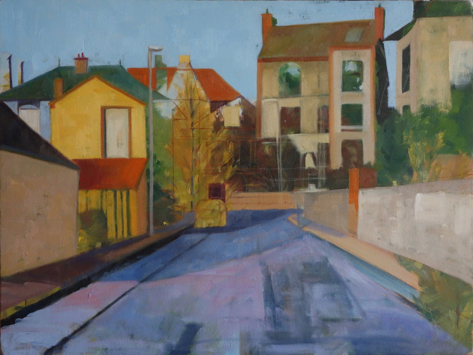
 11. This is where I stopped. I am not finished. I don't normally paint in such a methodical way. In this case it had to be or I would have been lost in the trees, no pun intended. Now that I have the structure in the next step will be to force some areas and tone down others. I don't yet get the feeling in this version that it is dawn. The road needs more visual interest and the bushes on the right need better definition of being bushes in the dawn light. They are a bit indistinguishable for my taste. In other words, not reading right. I will post the finished piece when I get there but this is where it ends for now. It is the way of the artist. I need a break from this piece as I work on others. That way I can let these ideas simmer until they are ready to be manifested.

Read Full Post


Janice Nowinski Workshop Day 1

I have not taken a workshop in years. In fact it has been so long I can't remember when the last one was. I took a three day workshop this past week with Janice Nowinski. I do not know her work but I was intrigued by the title description: photo as catalyst: Extracting and Transforming. I was hoping to break down some of my self-imposed barriers and to trust my instincts when editing and painting from photo references. Day One was Monday. Janice talked about what she meant by extracting and transforming as we viewed the photos and photos of art that we had all brought in as per the syllabus. We were to bring in 5 photos. Including postcards of favorite artist/painting. It was remarkable some of the themes that popped up on the display board. There were many Odalisques. One participant painted this theme all three days. Many had brought black and white photos of themselves or family members to paint. The first day I was the only one who did not paint a figure! I painted boats. It was interesting to see those who painted something personal vs those of us who did not. It seemed the class was half there to explore themselves thru their art. What can I say? I left the first day wondering what in the heck I walked into. Did I misread what the class was about? No. I was wondering if I was getting in my own way again and maybe I just needed to roll with it.

Here is the painting from day 1 of the workshop. It is not complete; but it is what it is for the time being. My goal was to make order out of chaos. The jumble of boats both in the foreground and the background seemed a challenge to me and I wanted to work on repeating patterns and colors. I think it is a good start.
 

Sligo Boats, 16x12, work in progress or study for larger painting

Read Full Post


Lowry In Snow 26

Lowry in Snow, 12x16, oil on panel

This photo came out very stark! But I am not sure I will have time to retake it any time soon so I am going with it. I painted over an old still life I had done in blues that was never finished and not likely to be. I figured blue and purples under a winter scape was apropos. It was a bit more difficult than I expected fighting that blue. I had a hard time with my values and colors on top of it. They still seem a bit overly warm to me and the sky needs to be a shade or two darker perhaps. Could be the light reflecting on the brushstrokes too. I am thinking out loud here...

This is the view from my window where I work on the old Lowry AFB again. This lone tree was actually in the photo with the Purple Deer on Day 20 but it did not add value. It is not a beautiful view but I have grown to love it over the years. Glad that I have a window and a view at all!

http://lesliesaeta.blogspot.com/2015/01/thirty-paintings-in-30-days-day-twenty_26.html

Read Full Post


Young Artist study 25

9x12 oil on linen

This painting was a black and white study for a larger piece I posted last month, #2 in that post. I decided to paint it in color and give it to the young lady in question when it is done. It is not where I want it to be yet but I have it mostly covered in color now so here it is as a painting for the challenge. I want to sit on it to see if I like the high key or if I want to tone it down a bit.

I was so exhausted by the time last Friday came around that I did not really paint anything this weekend for the week coming up to finish up the 30 paintings in 30 days challenge. My hat is off to anyone who manages to complete. It isn't that I haven't been at my easel everyday, as that I have managed to do. This weekend I really wanted to get some larger pieces finished that just needed a bit of attention. They started to weigh on me, and I was motivated to work on them. When I focus on the challenge it takes up my whole weekend. I could not do both.

http://lesliesaeta.blogspot.com/

Read Full Post


Berthoud Pass sketch - day 11

Berthoud Pass, 9x12, oil on panel

The trail is bumpy to this the 11th day of the 30 paintings in 30 days challenge. I am behind in posting but not so far behind in actual paintings. I had planned to play a bit of catch up today on this blog but our internet was not cooperating so I have given up on that and just going with this one and moving forward from here. My goal for myself was to do at least 15 in the 30 days, and I think I will make it.

Even though these is not technically "finished" according to my definition, I am going to go ahead and post it for today. I like the energy and the movement that is going on. If I decide to "finish" it at some point along the way, I will re-post it. One of the things I want to work on for this challenge is to paint quickly, as if I were actually outdoors painting. I got this done in about 30". I am focusing on keeping it simple, loose and energetic. I tend to tighten up the more finished the painting is. I found a few artists whose work I like and I keep those images in my browser so I can check in from time to time. I want to do a bit more layering too. This canvas was coated in a yellow ocher. As I progress, I have a tendency to not let those prior colors show through as much as I intend. The ocher under painting surface was still slick from the oil gesso I have on it so the paint slides around quite a bit. It makes for interesting brush work.

Read Full Post


Melbourne, FL - Beach with Sea Birds, WIP

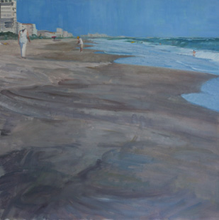
Melbourne, FL Beach with Sea Birds, 24x24, oil on board (Day 3)

Our last class project is to paint outside our normal  modus operundi. So if we normally paint with thick paint, to paint thinner; if you normally paint thin, paint with more texture. I normally paint thin and fairly graphically, so I am attempting to paint with more texture and less line.  I am using the brush to allow the strokes to be more integral to the painting. I am having so much fun.

I forgot to take a photo after the block in, but after two class periods I had gotten close to where I wanted it to be. Just needed the birds and the rest of the people on the beach to be added. By the end of day 3 I had the birds added and worked on a finishing the water. I also had added more color into the wet sand while make it all read better as one value. In the beach the sand looks too choppy. Tomorrow, before critique, I hope to have all the rest of the people added on the beach. I don't expect that to take too long.

After posting this I realized that the painting looks like two separate paintings. Ie, a 6x24, if you take the top part with the people, and then an 18x24 for the bottom section, with the birds. I worked on that today to integrate them into one unit so I did not finish getting the people in. Stay tuned!


Read Full Post


Blue: Color as a Visual Approach

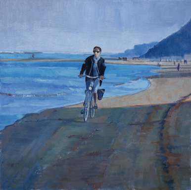
Along the Adriatic, 24x24 oil on board

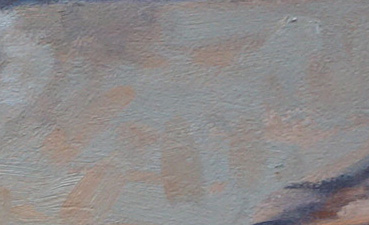
As I wrote last week, this project is Color as a Visual Approach. I chose an easy one to do in blues, since most of it already tended toward blue if it wasn't outright, like the sky and the sea. The only thing I really had to work at was the sand and the woman's face in the sunlight. It is reading as sand, but that sand actually has a lot of blue in it, making it a greenish color. See patch below and how green it looks on its own. BUT next to all the other blues, it still reads as sandy colored. Her face is basically the same pasty green but it reads as if it is in the light. This has been a good exercise for me. Even though the sand in the shadow has a lot of oranges and greens, the over color is blue if you squint down. That is the key. To use your whole palette and still keep the over color bluish.

Kevin critiqued this at the end of Monday's class. He likes it but said two things need to be done. The tire tracks on the right hand side are too soft and need a bit more graphic quality to them to match the overall graphic feel of the piece and to tie the shapes in the sand to the bicycle.

Read Full Post


Winter, Local Tone-Work in Progress

first draft, Winter Wonderland, 24x18
Second Round


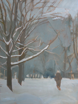
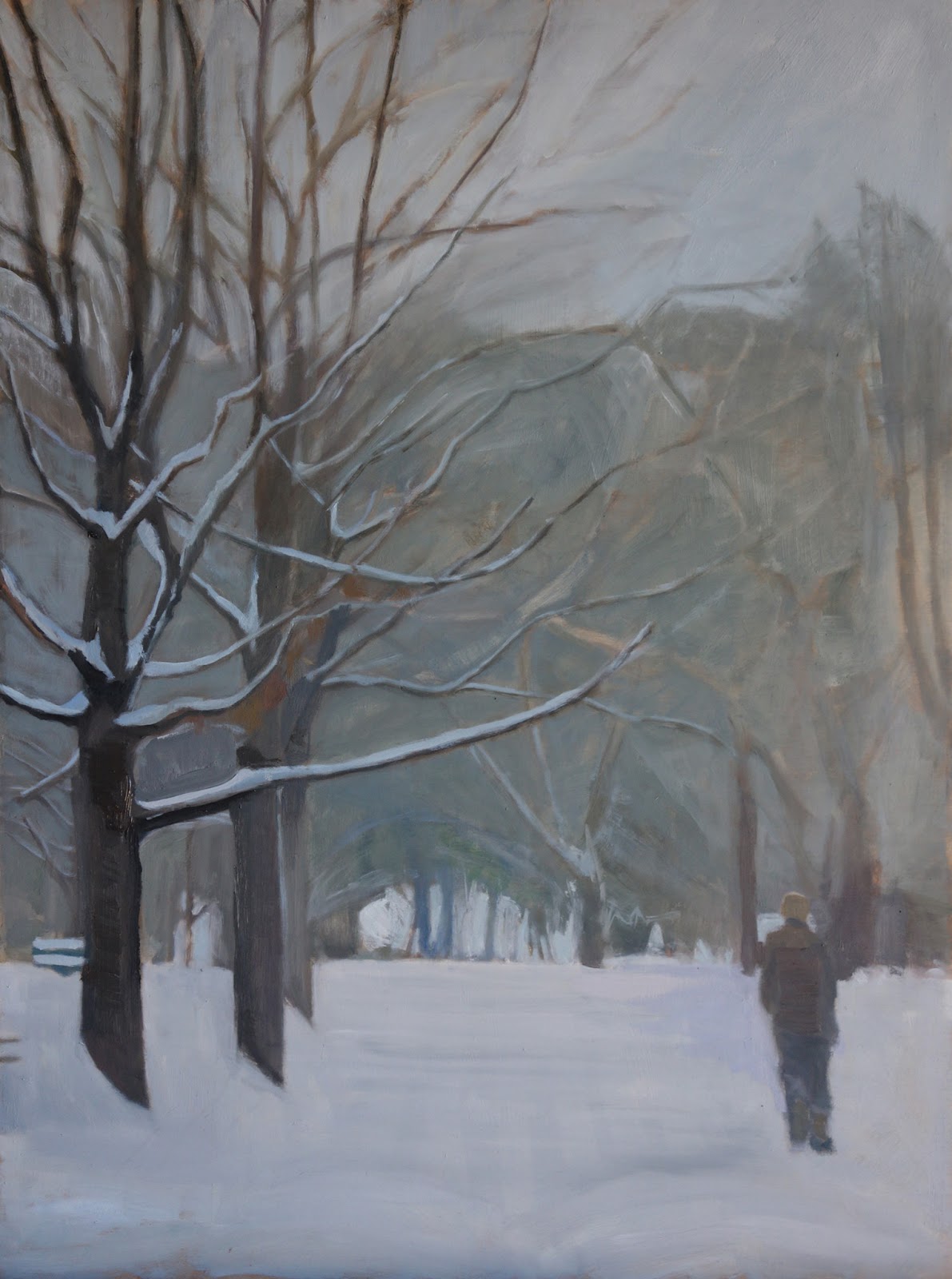
I started this painting before Christmas. Half way through it I realized that my drawing was way off and I just had to rework it. In the first photo you can see that the bottom limb on the forward tree is just too large. That tree also need to be darker. The figure was not in the right place for good balance, so I moved him down and over to the right. The other things that were changed: the mass color of the trees in the background, widened the opening in the trees in the distance (not sure that is going to stay that large) and brought in more sky. This is the point where it was when it was critiqued. Kevin liked how I incorporated the figure into the trunks of the trees and lamp pole and darkened the tree that is the main focus. I have worked on it since and when it gets to a place where I am well pleased with it, I will post the finished piece.

My idea for this was to keep it simple and to think of it as a wood block print, with three values: light, medium and dark with the medium marrying into the dark group (visual approach: Local Tone). In the photo reference there is another figure right in front of this figure, just enough to be confusing, so I removed her. I like the solitary figure in all this snow. I want you to be able to hear the quiet.

Read Full Post


Month 2, Day Two; Dark/Light Pattern

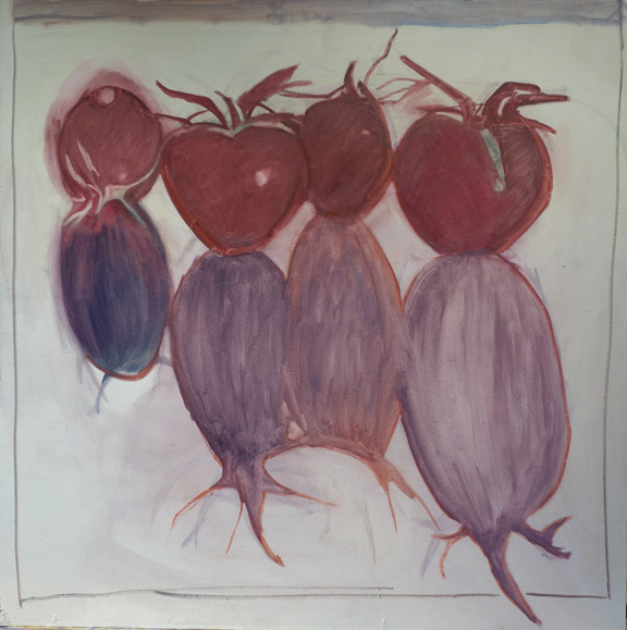
Block in for Long Shadowed Tomatoes,  24x24, oil on board

I missed the lecture for the second day, but had started my next painting last week. I was able to get the tomatoes blocked in but wiped the shadows off a number of times so decided to put them in thinner until I could get the shapes right. You can see the outlines of where I have been. I will miss the next two weeks so you will get a break from instruction. Here are my notes on dark/light pattern.

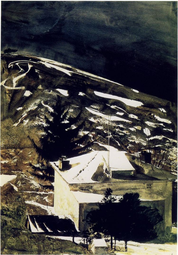
Light shape and dark shape-one shape will be a pattern (in my project above it would be the dark shape that is creating the pattern). Each shape should have different proportions within the bigger shape. The key thing to keep in mind is the uniqueness of each shape within the whole pattern.When defining the pattern it does not necessarily have to be the dominant shape (see Andrew Wyeth's Wolf Moon below).

Wolf Moon, by Andrew Wyeth. the light is creating the pattern that takes your eye through the painting, yet the dominant shape is the dark.


One of the two shapes will be more tied into itself which will aid eye-flow (or how the eye moves through the painting). In the painting of Andrew Wyeth's, the middle value of the hillside and shadow on the house tie into the dark shape. One way to think of this is that if the main pattern were cut out of contact paper, you could lift one corner and pull the whole shape off in one piece. The shape does not have to necessarily connect in one piece physically as long as it connects visually.

Only two values will be visible (as talked about in previous post). Gradation of values is okay, but that middle value will be tied to either the dark or the light and will not read as a separate value. Right now, even though my shadow shape is lighter than the tomatoes, it will be tied to the tomatoes as one large shape when I am finished. I did talk to Kevin about this today and he said it would be okay to keep the tomato color true to life, just to then keep the shadow that same value. I had planned on going rather dark red on the tomatoes to tie into the dark purple shadow. I think keeping the values lighter will actually be more of a challenge for me.

Read Full Post


Abstraction Week 2

Mea Culpa. This post was scheduled for Sept 29 but did not publish for some reason. Here I am ready to add the finished painting without the lead-in! So here you go. A few days late but who is to know?

Since I was not quite on the right track after the first class day of painting, I went home, took a photo of the painting where it was at, printed it out, and then used colored pencil to block in new areas and then took a brush with paint thinner and spread the color around. That is the lower right sketch above. Realizing that was not the most cost effective way to do it, I printed out a second copy and then used tracing paper and oil paint to do the two ideas at the top. Kevin picked the one I did first with colored pencils for me to work from. Below is what I did in class this past Monday. He was very happy with my progress but said I was "not done" and more layering needed to happen. I will print out a copy of the painting as shown below and play around with ideas of where to take it further for class on Monday. Monday is the last day to paint on this assignment. I offered to obliterate the buildingness of the composition, but he said no, the composition is great.

It is an interesting lesson for all of us in this class. I don't think there is one person not struggling. Eeven among those whom I think are doing quite well with the assignment say they are struggling. I am looking to Richard Diebenkorn for inspiration for this project. Others are trying Franz Kline for their inspiration, to name a few.

We are also charged with bringing in ideas for the next months assignment which will be dark light pattern. I will miss two of the four classes for that assignment so I am hoping to do a simple example.

Read Full Post


VW Bug

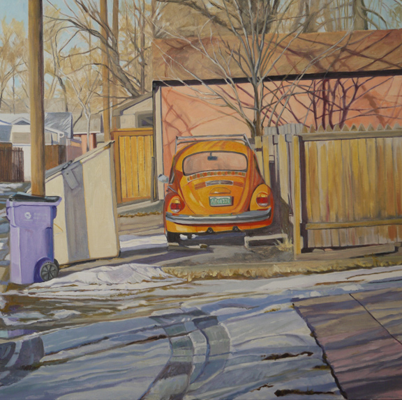
Orange Bug, 30x30, oil on linen

Help! I am stuck on this painting. It is close and worth showing off if for no other reason than it has been awhile since I posted a painting.
I came upon this scene one afternoon this past January while walking home from our local library. It makes me wonder why I never noticed this VW parked there before, being so brightly colored. Maybe it took the bluish snow and purple recycle bin and no leaves on the trees for me to see it as it obviously has been "parked" there for quite some time. I do like the tire marks in the snow and the composition, but if anyone has any helpful suggestions as to what I might be missing, I am open to hearing them. Sometimes I can't see the forest for the trees. In fact, I now wonder if it is that the cast shadows of the trees on the wall of the garage is the "problem." Are they too dark?

Read Full Post


Cattle Crossing

Cattle Crossing Work in Progress, 12x24, oil on board

Last weekend I started two paintings simultaneously. Neither of them was I able to complete. This one is along the same vein as the painting I posted last week of the cattle in the field. These are both from the same trip to Wyoming, but this one is on the way to Sarasota Springs, so north of Walden, CO. I think the block-in went pretty well, although don't look too closely at the cattle's feet. Talk about a puzzle to work through. I want to keep them as a teeming mass so don't plan on pulling out too much detail. I want the focus to be the main cowboy and his dog.There is another cattle dog that will be at the tail end (literally) of the second cowboy.

Read Full Post


Work in Progress where Progress was made

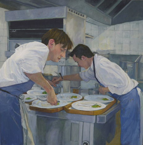
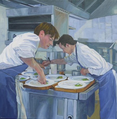
French Waiters, 24x24
From 10-23 post, works in progress

So this painting has been stuck in my craw for over a year, when I first started it. During my 10 days off over Christmas I finally "saw" what I needed to do and I literally reworked the whole painting in short order. I love it when that happens! I softened edges, unified objects and made the painting local tone instead of light and shadow. Local tone is where you have three major value groups, light, medium and dark, with a diffused sense of light. So, for example on the waiters aprons, I wanted the apron to read as one shape not with the wrinkles or folds showing so much light/shadow. Same with their shirts. I brought the light down and the  shadows up to be closer in value where you see the shirt as one shape versus what is the light and what isn't without losing the form. The plates I blended more together instead of trying to make them each read separately on their trays. I tied in the waiters dishrag into the stainless steel and darkened the reflection (floor tiles) on the stainless steel by the waiter on the right so he isn't quite so carved out but more unified. The pots and pans were all downplayed and again unified into the whole, correcting some of the drawing on them as well. I also warmed the tones of the waiter on the left and will do that with the waiter on the right now that I see it needs that from this photo. I did warm up the arm of his that is reaching as it was too blue and looked "dead."

Read Full Post


Ira's Truck or Pearl Street Alley


 I think this painting is now ready for critique. I know Kevin will give me the feedback I need to take it that much further. I have discovered working on these alley's that I can only get so far and then I am "done" with them for awhile. I thought it was the size of them, but I have done two 18x24 alley's now, and I am running into the same problem on them.  I must need time to let them grow on me so I can take them further. I am usually very excited at the block in stage, then the drudgery sets in and I get bored. I had to "sit" on this one for almost a month before I figured out what was bugging me, and that was with the help of one of my friends. She suggested I lighten the roof on the right; that led me to the trees in the middle behind all the garages, which I also lightened. I darkened the house at the very end of the alley to let the brightness of the bush in front of it be in the light and to continue the eye flow. I know Kevin will tell me I have too much detail, although I did try to reign myself in. I will do a follow up post after class tomorrow if we get a chance to critique.

I had taken this painting back to alley where I took this photo reference to try and figure some of this out "on-site." I had intended to paint there, but this is a surprisingly busy alley and a narrow one as well. There was no way I could set up and do any painting and keep the same angle. I was up against the wall of a carriage house when I took this photo. This is morning light, and the painting is 20"x 30."

Read Full Post


Work in Progress-Platte Park Alley

Read Full Post


Last Friday-Marie's Studio

Friday I drove up to Fraser to spend the day with Marie. I didn't get there until 11, and by the time we got around to painting it was almost 2! Marie showed me what she had been working on, including a nice little study of a new place she had found the day before. Our original plan was to go back there, but it was not to be. The clouds were playing with the light something fierce. I had brought up a few paintings I wanted to work on just in case, so I set up at one end of her studio and went to work. I started with this painting from last spring at the Iris Garden, a local business that is friendly to artists setting up and painting. I did not post my painting from this day, too embarrassed, but here is my blog post and the original painting, which is 9x12:


Wednesday night I had this painting critiqued and Drew suggested I warm up the shadow under the tree, which I did. I also made a pattern of light and darks through the iris, and pulled out some details in the iris's up front. I am not pleased with the ivy on the back fence, and I prefer the original painting of the top of the tree foliage. I think I will take it back to that.

Next, I pulled out this painting,Copper Penny Iris (and no, that is not the official name of these plants) also from a year ago, from my back yard. I love these coppery iris. Again, I did not post the original plein air study, which is below and is 10x16, as I wasn't quite happy with it. Looking at it now, I don't think is was as bad as I thought at the time. We are our own worst critics, after all. And I do like the original light green of the neighbors grass in this one better than what I did to it later in the studio.

There is a mid-rework of this painting that I did not photograph, as I can see when posting these together, that the brownish background worked fine, but I darkened it at some point. I did not touch the background on Friday. I worked on unifying (there is that word again!) the dark values in the iris plants and trying to weave the ground and ground cover in and around the flagstones (which are on the right hand side, as they sure don't "read" as flagstones). Those have not worked out too well YET. I reworked the chain link fence too. And since I am so unhappy with how the flagstone is working, I decided to see what happened if I cropped it to an 8x16 instead of a 10x 16 and I think that solved my problem area which is not to say I don't need to address what is left of it.
These iris are in my back yard and I am going to try this scene again. I do like the composition and the juxtaposition of elements.

Read Full Post


The Alley Critique


The last Saturday of March, I brought in Harvard Gulch alley for critique. I have been working on it since. Kevin voiced much of what I had been thinking. It is interesting to note, that the one area he really liked he said I should repeat in the one area where it was weakest. That was all I needed to hear, as I knew what the weak link was – I just didn’t realize what the strong area was. He said he particularly liked the upper left hand corner; the trees and the light. Funny thing is, that was one of my major areas of trouble, so I finally got tired of trying to replicate the photo and went right into orchestration. Ie what did I want from it, and then I just went for it. Getting a rhythm going with movement and color which I then carried into the whole mass of trees that create the backdrop. So Now I had to Do That with the snow and melting snow on and around the alley…Snow is not my forte, but I have been studying it more intently while the past two storms went into melt mode. Not with paint, unfortunately, but going out and watching the play of light and shadow and seeing what the pavement looks like with wet snow in light and shadow which had gotten me stuck. Looking at the alley now, I may have overdone it, as is my wont. But at least I have it reading better and simplifying is becoming easier for me to do, once I have gone overboard first. I do love oil paint and its forgiving nature.

Another thing he told me was to unite the light by using a mother color, and do the same in the shadows. I thought I had done that in the shadows but I apparently went to far there as well. I do think the light is popping more now. I still have a few things to touch up, but I am just about there.

Read Full Post


The Alley Progress Pt 3

Last weekend saw more progress made on this ambitious (for me) painting. I went back in and simplified the big shadow shape on the alley road. I had gotten a bit carried away last weekend. While I was at it I darkened the whole road a bit. The snow was simplifed and given shape. The chain link fences were completed and I put the dead Virginia Creeper in on the fence by the red shed. While I was working on the dead creeper, I then united all the dead vegetation along the alley. I didn't like the tree branch going towards the upper left hand corner of the main tree so I simplified that but I am not sure it is where I want it yet. Last weekend I had also finished up the RV. I have to give Leslie Allen credit for this painting. We had painted at Harvard Gulch together a few years ago and I remember her saying that this looked like a painting waiting to happen. I have kept that thought all this time.

Read Full Post


The Alley Progresses

 This weekend saw some work on the road which included putting the winter refuse from the tress in and working on the big shadow (snow and melting snow) in the middle of the alley. I did not get a lot of time in on this painting this weekend but not because I have lost interest, which was my fear. The above update was done on Saturday. I also dabbled on a few of the WIPs (works in progress) that I have all over my studio. (to see one that I think is just about done: Deadheading: before and after)

Read Full Post


Let the Painting Begin

I finished blocking in this painting yesterday; it is 3o x 40 which is ambitious for me. This is being done from photo reference and the painting I did a few weeks ago: Alley Scene off Harvard Gulch Park. I have not touched the original alla prima painting wanting to keep the freshness of the brushstrokes and the angles I played with. I must remember to keep that going in this piece; my husband had to remind me to knock the telephone poles off kilter, which you can see I did do, but I think they may need a bit more of an angle. I am going to try and post photos of the progression of this piece as I paint it.

Read Full Post


Antiquerra, Spain revisited

Here is an interesting progression I have been working on when not feeling like painting on the works in progress lined up in my studio. I went through some of my older paintings and found the painting below in the stack. I have always had a warm spot for this particular piece even though I have never been satisfied with it. The original plein air piece is at the bottom of this post. I added the dumpster back in - and using the photo reference, changed the shadows. I also added the vehicles and lamppost for more visual interest. Feels more complete. The version above I did in 2007 trying to salvage the scene, but I think I did more harm than good, and taking out the dumpster and the driveway just left a very bare and boring foreground.

I was in Spain painting a few years ago and the bus stopped atop a knoll over looking Antiquerra. We were literally parked next to the city dump, but there was a wonderful view of the town. That view was a bit overwhelming to me at the time, and there were 60+ people lined up to paint it, so I went back to the bus to find some shade. The door to the "hold" was open and provided a great seat with shade, but the only view was of the end of this little street with a trash can. So that is what I attempted to capture. My relative relationships were not very good, to say the least. I had run out of film (hadn't gone digital yet) so I borrowed someone's polaroid (now this is seeming very dated) and took a not very good photo of the scene.

Read Full Post


It has been awhile...

This holiday season saw a few things happening that have kept me from doing much computer work. First, we signed a contract to remodel our kitchen, with work to start on Dec7. The next week, on Thanksgiving Day, my laptop died. I just could not focus on replacing my laptop with having to move everything out of the kitchen and keep some of it handy for use during the two week remodeling. The second week into the project, my husbands car died. I have not had the inclination to do much in the studio, with having to make so many other decisions. That is not to say my mind and brush have been idle. Just quieter than usual. I did go out and paint on Christmas Eve Day, at my favorite little park. I am not overly thrilled with the piece but I was blinded by the light reflecting off the freshly fallen snow. I am not making excuses, just observations. I will post it for everyone to make their own assessment. Now that I have a new laptop up and running and am using the trial version of photoshop CS4 for a month, I will get some photos taken.

I also have been reworking some older pieces, all of which are in varying states of "work in progress." On that note, I would like to post from an article I just read written by Ron Riddick.

"As a great teacher once expressed to me "no great masterpiece ever just hastily happened." There was great searching, questioning, working, reworking, caressing, redefining and patience."

Through my reworking of older pieces, I don't expect a great masterpiece, but I do learn so much and I can't help but believe, I have improved both myself and the painting. In sharing both my triumphs and my not so successful works, I hope to strike a chord within each of you. We are all "works in progess" after all.

Read Full Post


Critique Update

Lockkeeper Along the Yonne River
Here is where I am at after working on this painting yesterday. I darkened the jeans so that they tie into the bike more. I now can't decide if I should lighten the gravel road and the middle field or darken the shadow of the white jacket. I am going to think on that some more.
High, Wide and Lonesome
I pretty much repainted this one since the critique last Saturday. I did everything Kevin suggested and more. From darkening the sky, simplifying the road, the middle ground and the mountains; making the wedge of hillside read as one value; reworked the car and Donna sitting in it. I think the only thing I didn't touch are the dry grasses along the road.
I am having a hard time photographing this painting due to its size. I just don't have the setup for it. It took me hours today just to get one that was acceptable.
On the Beach
On this one, I lightened the top edges of all the boats to be the save value as the overturned boat, redid the walkway to the building and also put in the ropes. Didn't take too long to get this one fixed up.

And that is as far as I have gotten. It sure helped to have a snow day yesterday from work.

Read Full Post


Topics

Archives