Blog


Grey Heron - Adapting to One's Environment

Adapting to One's Environment, 12x16, available

The photo I took for this painting was taken while visiting my son in Kanazawa Japan. He had moved there to teach English a few years after graduating college. This would be around 2006. The city sits between two rivers, so I am not sure which river this is along, but as you can see, it is concrete and granite banking the river. Kanazawa sits along the Sea of Japan on the western coast of Japan. I took the photo from across the river, so the actual image is quite grainy. I had to fill in some areas that did not read well, especially around the eyes.
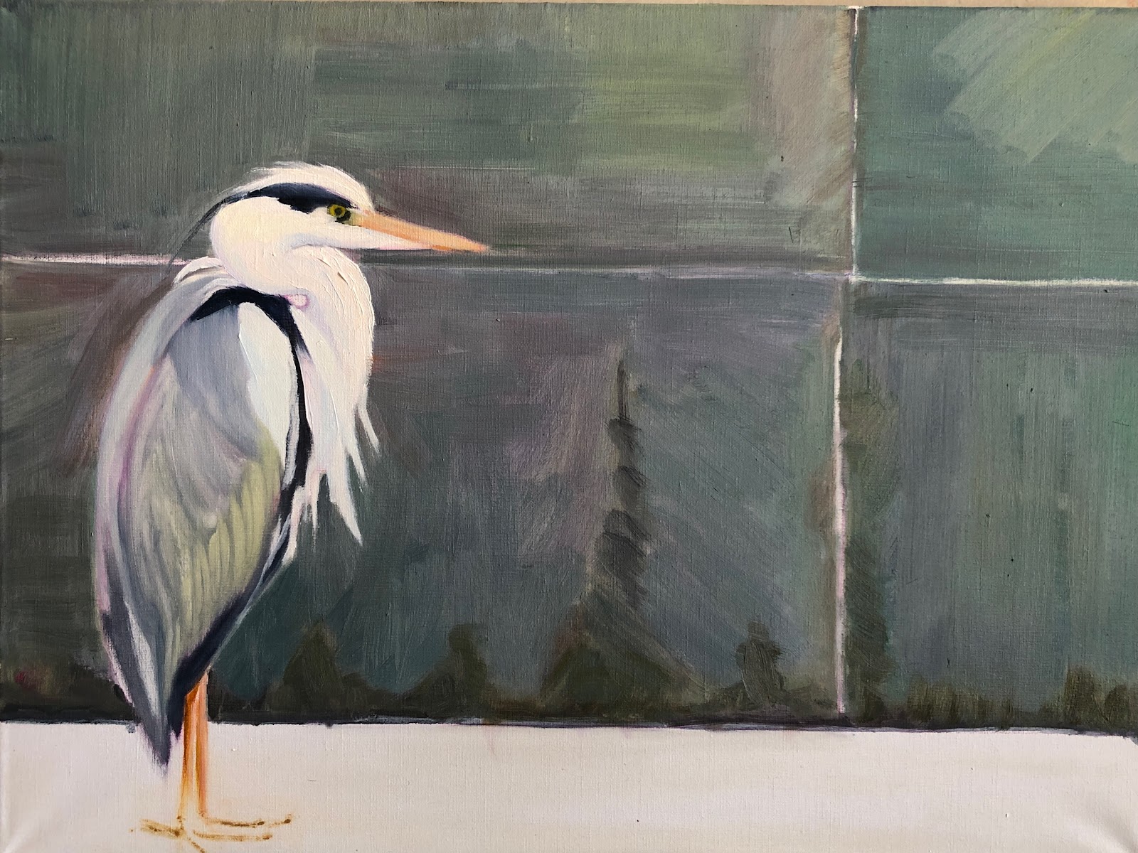
 

1. Getting the Shapes in

I sketched the bird in with a crimson colored pencil, which you can see still in this block in as I figure out relationships in shapes and values. My thought was to have the Heron blend into his 'environment,' so I used the same color palette for the granite wall and the bird.


2. Darkening down the wall

Even thought I liked the colors in the granite wall, I decided it needed to be more neutral so I added a darker value of a greyed blue overall. Dry-brushing it on to allow texture. I added a pinkish color to the concrete surface which as up to this point, I had left blank canvas. 
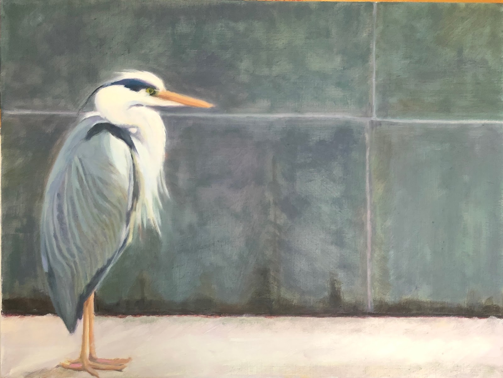
3. Finishing the bird
Now that the surrounding area is where I want it, I start work on finishing the bird. I softened the hard dark blacks and darkened the greys of his feathers. Also added some soft yellows and purples to his neck and head.


All these images were taken in my studio with my iPhone. I find it interesting that the earlier photos look darker than the last. 


Read Full Post


Just an Illusion

Wow! How time flies...I had not realized I had been gone so long. It has been a struggle for me to write as I feel that with so much information pouring in from everywhere, who needs one small artist's thoughts on any given topic, even on art. However, I made a decision to attempt a come back for my sake and hopefully yours as well. 

Here is a painting I finished up this spring. It was started a year ago but I could not seem to work on it much until finally it called me back to the easel to getter done. 

Just an Illusion, 30x24, oil on panel SOLD


Here is the block in almost finished. I wanted to see if I could get the warm yellow transitioning to cool shadows in the white house. I think that is what initially stumped me for this was about where this painting sat for so long. I would venture into the tree on the side and the foreground and even into the reflections in the windows, but not that daunting white clapboard. Once I got started on it though, I ran with it and gotter done. This painting was submitted to the Framed Image show, on blues and greens, and it sold in the first week the show was up. That is very gratifying.

I had done a poor sketch of the doorway to capture the warmth of the light even in shadow at the time I took the photo reference for this painting. I had also done another study on the back of the property to get a grasp of the feeling I wanted to remember of the whole. My on-site sketches are just that - to instill a memory of what caught my attention. I don't usually show these sketches but here we go...I did this first as this is what I came upon as I was walking around during the Georgetown Plein Air event. (of which I did not participate) I try to do these very quickly and think about the shapes. Essentially, a block in. But as you can see, the shadow side had a warmth to it that I did not want to forget.


Then the quick grab some basic info before meeting friends for lunch:

I bought this linen oil pad for just his purpose and I find it is working out well for me since I really don't plan on doing a completed painting most of the time. It does get awkward so I added a binder clip after this trying day to hold the pad pages from flapping in the breeze as I try to paint.

This years Georgetown Plein Air is the end of this month, so I am going to plan on going up to paint again with a few friends. Seeing what catches other artists eyes if always fun to observe and inspire.


Read Full Post


Cathedral Rising

Cathedral Rising, 18x36, oil Available-contact me

This one has been a long time in the making. It is hard for me to fathom that I have been working on this painting for 2 years!! I just could not make it work for me despite many friends and family telling me it was fine. One would not think such a 'simple' scene would be so hard for me to get right. It is because it is so straight forward that I felt it had to be a certain way. Can't tell you how I studied snow, and the light on the snow at a certain time of day. No two days are the same conditions but to get a feel for it. I still did not delineate details, going for an overall sense of a bright, yet crisp winter morning.


I clearly remember this morning. My walking buddy and I were at Washington Park in Denver bright and early. It was one of those crisp but beautiful blue sky winter day. As the sun was rising. Hardly any one else at the park. It was magical. We walk the park every day, most always in the early morning. I know this park so well, yet some days it takes your breath away. 


Read Full Post


Morning Glory - EAST


Morning Glory-East, 24"x24" oil - available - please contact me


Here is another one I started over a year ago. I think I have determined I really don't like this canvas, that I once thought I did. I have a hard time taking good photos of any paintings I do using this substrate. That alone is not the problem, as it just reveals things to me I don't want to see, which is a good thing overall. I just don't like how the paint works on this slick linen. I am currently working over an old painting on cotton and on a board substrate and those paintings are coming along swimmingly.


As I was raising the blinds in my bedroom one November morning this scene was a beautiful reminder of how unique each sun rise is. I ran to get my phone and then ran out to the back deck, and thankfully, the sky was still spectacular. This is looking East on Iowa Street towards Downing St. That is my garage in the lower right hand corner. When I was working and had a dog that needed to be walked prior to going to work at 7 a.m. I saw the sunrise way more than I do today as a retired and a dog-less individual. So I am far more moved by them now that I see them less often, and I have always been in awe of the beauty of nature.


I painted the whole street scene trying to keep it within a certain value group; enough variety to know what it is and differentiate between the houses, but still reading overall as a whole. The lighter values help you move within this larger dark shape. but not enough to take away from the sunrise. Hopefully, they compliment each other.

Read Full Post


The wee Western Grebe

Western Grebe, 12x16, oil


This juvenile Western Grebe was seen in Washington Park here in Denver where we often see birds stopping by on their migratory journey. It is rare to see a grebe, though, so it was a day to note. I took a number of photos before this was immediately 'the one' to render in paint. The patterns in the reflection reminded me of  a tapestry or damask fabric. Verifying that it was a Western grebe took me some time before I stumbled on a photo of a juvenile. Then it was Bingo! I knew the beak was right, not that I am a birder.


I started off painting over an ugly snow scene I had done a few years back from my office window on Lowry. Not a beautiful view, but it was 'my' view. I started out figuring out where I wanted the bird, and since I wanted the bird to stand out I flipped the painting upside down so I could keep my eye on it while developing the water around it. . Then started to indicate the movement. This next image was taken under lights in the evening hence the different lighting, but I am using it to show how I started to build up the water thinking in shapes and leaving negative space. It might have been easier to paint the water a solid color and then add the reflection but this is how I see: very abstractly with shapes and negative space.

I was thinking of a title using a tapestry term as the water does have a somewhat damask feel to it. Yet nothing is sounding good to me. If you have any ideas for a title besides my uninspiring Western Grebe, I would love to hear it! Many thanks.

Read Full Post


Start of a New Year - A Seat in the Sun

A Seat in the Sun, 9x12, oil


To start this new year it seems a good time to post this painting. To remind me that the sun is still shining!


A couple of my painting buddies were over before Thanksgiving to paint together. As it was a beautiful Colorado day we set up outside my back door. It was very interesting as we all painted "the same thing" yet they could not have been more different in approach. I pulled out an old plein air painting that was not worthy of the title "painting" to begin afresh. I do enjoy the challenge of that and I am always surprised by how it turns out if allow myself to not cover every inch of the preexisting image underneath. I believe this one to be fairly successful in that regard, especially in the interesting colors and shapes coming out of the darkness of the interior of my garage. Keeps the imagination wondering what is in there? I did not plan it this way, but the color of the chair is also coming through on the wall behind it, which originally was a brick wall with white trim.


I don't consider myself a plein air painter, but I always enjoy being outside painting. If I keep it simple, as I did in this piece, the exercise is more successful. As I mentioned above, there were three of us painting together. I was the most zoomed in on the subject. Jeannie added the whole garage, and Marianne had the whole garage plus sky and trees and behind the garage, on a much smaller sized canvas, I might add. How she manages to do that is a mystery to me. That is what makes the world go round! That we are all unique individuals. Thank God for that~


Read Full Post


Fall into Spring

Fall is the Wrong Season as we see Spring on the Horizon

Smith Lake-Fall Reflected, 18x24, oil...available

As I walked the park this morning there was decidedly Spring feel to the air despite the temperature which was 19 degrees. The air was clear and there was a bird singing that heralds the change of seasons. That is in stark contrast to the painting I am posting today. I started this painting in early fall last year (or could it have possibly been the year before?) and finally was motivated to go for it. I never had gotten far, and had somehow lost all interest in. It is not my usual style, which is on purpose. I would like my landscapes to be more abstract which is how I started this painting but ended up being more loosely painted. I would like to believe I was listening and dancing to some lively music, but that was really not the case. More a wanting to do something completely different for me.
I have walked this park so many times I am surprised that there is no groove to prove it!


Read Full Post


The Old and the New

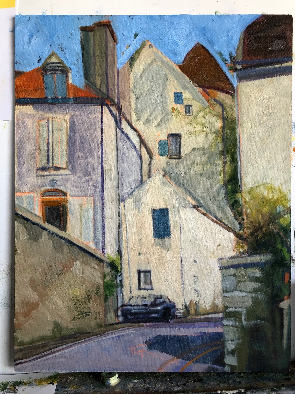
Semur Street Scene with Car, 14x11, block in

To start of this new year of 2020 I am posting an updated painting I started back in 2015. Here is the original block in from that year. Not bad at all. I did a number of paintings from that 3 week trip to France. In my quest to have better paintings overall, I picked this painting to update. Surprising to me was that I had no updated images of it since the block in phase and I had considered it 'finished' at some point in time. So I did  not think to photograph it before redrawing it and starting in again. Below is the latest restructured image. Not too many corrections overall. I wish I had looked at the original block in before starting over as I see plenty of things I like in it.


Semur is an old walled town in Burgundy, France. I found so much to like about the winding streets and old buildings. We only spent an afternoon walking around this town yet I have done at least 5-6 paintings from there. It is amazing how many centuries these houses have seen, yet still stand.


Semur Street Scene with Car, 14x11. oil 


Read Full Post


Post Pop-up Art Invitational

Admirers looking at my wall, 4-26-19

My wall after I was done hanging it, 4-26-19
I wanted to show those of you who were unable to come to the one night art invitational what it looked like. We had to be there to hang between 9-11 the morning of, and the art had to be taken down either after the show or the next morning starting at 8 a.m. I had a plan for hanging my wall and though I didn't follow it, because I had a pretty good idea, it went pretty fast. I wish I had thought to take photos of how the different artists did theirs, as just like when there are a group of artists painting the same subject and each one is so different, how to hang a wall of art follows pretty much the same pattern.
My friend, Jeannie Paty, hanging her wall
It was my first experience with this kind of a venue. It may well be the wave of the future as yet another well established art gallery closes this month in Denver. I thought it was very successful overall. There was a continual stream of people in attendance with the busiest time starting around 7:30. I believe I had the first sale of the evening, the little hollyhock study on my wall above. For an artist, our loyal supporters are always very close to our hearts, and without them where would we be? When a total stranger likes your work enough to buy it, that is a different kind of validation. It is an entry into a new relationship. The man who bought the little piece below the hollyhocks, "Along the Arno," wrote on the subject line of his check "Keep up the great work!" This is particularly poignant for me as I have been struggling with whether I should stop painting altogether. My shoulder has been reconstructed twice and it has been causing me enough trouble that giving up painting was definitely on my radar as a possibility. I received so much validation to keep on keeping on during this show. I will share one more experience: I was standing in the vicinity of my wall during a quiet time where I was not engaged with anyone else. A man and his wife approached and stopped next to me looking at my wall. He said to his wife "Now these paintings tell a story." He proceeded to go through each painting telling the story he saw. I cannot tell you how gratifying that was to hear. I want my work to draw people in to tell a story or open up a dialogue.

I know I was happy with how many people stopped at my wall and really looked and enjoyed. A great big thank you to Cherry Creek Art Gallery for organizing this event.

Read Full Post


Tom Cat Revisited

Tom Cat, 2019, 20x20, oil on canvas

Here is an update of a painting from last summer. I was never really satisfied with it yet I could not figure out why. Everyone who saw it remarked how they liked it. Finally, I figured out what was bugging me.  So that you can see the difference, I will post the painting from last summer.

Feral Cat, 2018

I liked the colors in the walls but somehow I felt it still wasn't quite right. Almost felt dirty rather than in shade. The other big thing for me was the cat's face. I don't know why it was so hard for me to get that right.

Going back to it I saw a number of things right off the bat that had escaped me previously. First thing I noticed was the cat's back. The cat was a bit to thin on top which was one of the reasons the face didn't look right to me. That was easy. Then the ears. The ear on the left was too small and the space between the ears was too broad. That was easy to fix too. Next I realized I was a bit off on the nose so got that done.  This is on an island. I felt that even though it is 'said' cool light, warm shadows; warm light, cool shadows, there would be a lot of reflected light and and I wanted the warmth to come through of the ambient air. So I changed the overall color of the whitish walls in shadow. As so happens whenever you redo a painting you have to sometimes lose something you are attached to to make it work better overall. So I kept some of the rosiness of the front wall coming through but not as much as there was. I also decided to add the clouds. I think they help make it more interesting. And a few more holes in the plant to give it more dimension.

Your comments are always welcome. If you have a more creative name than Tom Cat, let me know!

Read Full Post


A View from the Uffizi Gallery

Tuesday, February 26, 2019

A View from the Uffizi Gallery


A View From The Uffizi Gallery, 30x30, oil on linen
I started this painting before I went to Greece last Spring. After the initial block in which always gets me excited I somehow lost my way. Here is the blockin:

It was not becoming what I had envisioned. Not many of my paintings do, come to think of it. I had this conversation with my sister recently. About how hard it is for me to paint a scene the way I see it in my mind. That doesn't mean I don't like the end product...And that might be what keeps me coming back. The insatiable quest to get it to come out the way my mind's eye sees it. Or does the vision in my head change along the way? I don't know. I did have someone come into the studio a few weeks ago and exclaimed what a great painting it was, so that made me realize maybe it was done after all, at least for now. So I am posting it, finally. It does make me want to go back to Italy I will say that for it.

The lines to get into the Uffizi had discouraged me from going in when I was in Florence for a few days on my own. Then one afternoon I happened by on the way back to where I was staying and there was no line! The Museum was only open for another hour or so, but I decided to go in just the same. I think I spent as much time looking out the windows at the views of Florence than at the art...And this view towards the Duomo is just not one you see highlighted so I thought I should give it a go. I just love the jumble of tile rooftops and the construction added visual interest and a complimentary color.


Read Full Post


New painting found new home

Urban Garden, 30x30, oil on linen in its new home
One of my recently finished paintings found a home this month. A thoughtful, generous and loving husband bought it for his wife's birthday. He told me he found her looking at it so many times online (and it hasn't been on my website all that long) that he wanted to surprise her. So I delivered it in person on her birthday and she was surprised! Both in seeing me and the painting. She was delighted and is very happy to have it where everyone who walks in their home will see it. His wife is a friend as well as a former co-worker of mine from back in the day when we worked at Emily Griffith Opportunity School (since updated to Emily Griffith Technical College). I am, of course, grateful to them both for their support of my work. Thank you Ron and Linda! I think it looks great in your front room.

For more information on this painting see the post from December 2018.


Read Full Post


Along the Arno

Along the Arno, 6x6, oil on panel

This is not my normal style but for some reason this little scene called for something different. And it is hard for me to paint this small anymore where once it was very comfortable.
The texture comes from two things. I gessoed the panel with a paint roller which gives it a kind of knobby texture to begin with. And second I had painted this scene already. Then decided I didn't like it so painted over it again. I do like the painted over effect so I am happier with the newer version. I also decided to use colored pencil instead of trying to paint the lines I wanted.

The story here is about the buildings. I do love the way the buildings in Italy are orderly yet jumbled. Florence has a lot of hills so it almost appears as if buildings are built upon buildings. The flower boxes are ubiquitous as well. It is one way to add color and get your hands in the dirt in a place with very little garden space.

Read Full Post


Then and Now

An acquaintance/collector contacted me today. Here is what her email said:
I haven't seen you in a long while but did want to let you know how much I am So So ...enjoying your partings in my home on - going - ly!  I just moved one from downstairs upstairs to my office to so that I can look at it as I work at my desk.  I thought of you and how much I wanted to let you know.  Much love to you and our old investment group too!... Love... M
I have attached a photo of the one I look at now everyday in a new way...
Painting Along Cherry Creek, oil

I looked in my art files to see if I could find the images for this painting and its name. I could not! It is from before the age of digital photography! Oh My. It is my only palette knife painting and painted plein air back in the day when I was just starting to paint outdoors. It is very gratifying to know that it is still being enjoyed after all these years.

Spring Reflected, 36x24, oil on linen


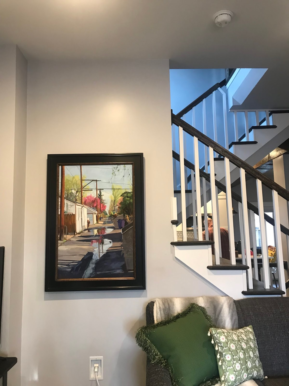
And here is a painting I just sold to someone who found me via Nextdoor! One never knows how you will be found. I had responded to someone months ago who was looking for local art to furnish their office. I was never contacted from that post. Last week I had a private message from new neighbors looking for local art to hang in their new home who had seen my response. They are so happy with their new painting and it just so happens to be of their alley! Isn't it amazing how things work out? 

Read Full Post


Urban Garden

Urban Garden, 30x30, oil on linen, available

This painting has taken most of this year to get it where I like it and the camera likes it as well. Sometimes the camera "sees" things I miss. Or it will pick out a paint color that just jumps out of the image and becomes a bulls eye. Finally, it seems we both can agree, at least for the time being.

This scene is in Urbino, Italy, a medieval walled hill town in the Marche area of Italy. Which is adjacent to Tuscany. I had read that Marche was so much like Tuscany except less tourism and less money. So of course I had to go and check it out! We were staying in a resort town off season. But this resort town was for Italians. So not much English spoken here. While at the train station trying to figure out buses or even a taxi, for pity's sake, I heard English! This is after trying French, German and English with the ticket agent in the train station. There was  a young woman taking to two others in English. She was a student in Urbino and her brother and his girlfriend had come for the weekend to spend it with her. They were all from England. She said they would walk us into town and help us get oriented as my internet was not working and the map I had found online for this seaside town was so not accurate on any level. While walking us into town (lots of pedestrian streets) she said we should take the bus on Saturday to Urbino for the market. Flea market, antiques, and normal food market was something to go and experience. I had no plans as I often depend on serendipity when traveling, so market day seemed the perfect thing to do. Urbino was all up or all down, with barely any just flat areas except the small main square. I was quite taken with it. This is not my first painting from that day going to market.

Urbino Alley, 30x20, oil on linen, available


Here are paintings I did from the seaside resort area where we stayed in one of the only hotels still open. As is usual in seaside towns, you can tell the foreigners because they are not bundled up and they are in the water, if only wading...In October it was in the mid 70's and yet you can see this bicyclist has on a down jacket and scarf...

Racked, 20x30, oil on linen, available
Adriatic Evening, 24x24, oil on panel, available

I hope you enjoyed your little tour of the Marche area of Italy. It is just south of Venice as the crow flies. But by train you need to go West to go south! Be prepared for little or not English if you decide to venture here. I liked that aspect of our 3 days there, but I know for some it is not comfortable. It sure makes it an adventure.

Read Full Post


Cortona Italy


oil on linen panel, 15x30


Here is a scene from a trip to Italy I was on a few years back. It is in the Tuscan town of Cortona. One of the many walled used to be city states.  I was taken by the colors and the building block effect I saw as I came down a hill towards the main square. We were only there for a few hours, but in that time we went to a private wine tasting, the sprawling street market and explored many of the side streets away from the main tourist sections. Yes, there are still places in a small town to escape the disgorging of tourist buses. Even if that area seems to be shrinking daily. 


I have no name for this painting yet so if something comes to you, please let me know.

Read Full Post


The Feral Cats of Milos

It was a new experience for me to be around so many feral cats while on the island of Milos. They were everywhere. Literally and figuratively. You heard the random cat fight but overall they seemed to mind their own business and leave you alone. Unless you were eating. Then they would sit ever so quietly and watch you. They rarely fought at the table, believe it or not. They seemed to know that there would be enough for all or nothing for any of them. The couple sitting at this table did not feed the ever hopeful cats. Here is but one example:


Here is another typical scene and yes this cat is On the table; her mother would not allow her near "her table." :

So, to honor all the beautiful wild cats of Milos, I painted this portrait. It may not be the last but I started with this one because the cat on the white wall reminded me of John Singer Sargent's paintings from Capri. He had dancers among the white walls but I had cats.


Read Full Post


Attachments

I figured out why I was so stuck on one of the paintings I started in January this year. It seems to always be the area one is attached to that is holding up progress and/or one's unwillingness to let go of said area. So even though I haven't finished this piece yet, I wanted to post it to show how attachments you need to let go of, hold you up.


Last Saturday I had dinner with a writer friend of mine. She was talking about a new essay she had written for her online newsletter. She was lamenting that she had to cut the best line out of her latest work to make the rest of the article pull together. How her attachment to that one line was keeping it from being a cohesive whole. But that maybe she could work that cut line in some not yet unwritten piece in the future. I then proceeded to tell her I had the exact same thing happen to me! Except in paint. Her first response was oh how sad! I could not ever reuse it. Which isn't exactly true. I feel that every time this happens there is always a takeaway from it.

This first image is where I had finally roughed in the sky really liking the energy of it. Unfortunately, I put it in after I had already begun painting atop the block-in of the rest of the painting. I remember being intimidated by the sky in the reference, so I was in avoidance mode. Leave it until I am ready or can't ignore it anymore.

When not done in proper order, confusion results

If I had added the sky when the rest of the painting was in the same state (below), who knows where it might have gone, right? My aim is always to keep some of that block-in brushwork but it is so rare, not sure why I keep thinking that will happen.

block in as I figure out shapes and proportions

Here is the painting with the new sky that better fits the rest of the piece. The new sky actually helps the piece overall so much it almost seems like a new painting and yet I feel I was able to keep some of the brushwork I had become so attached to. I can finally go back to the rest of it now that it doesn't feel like two separate paintings. I don't think it will take much to finish. To be continued.

Starting to pull together finally

Read Full Post


What? Finished you say?

Just so you know, I can post a finished painting. Here are two little gems that got lost in all the new larger pieces I have been working on. They gave me a sense of accomplishment among all their larger brethren.

This first one is from Prospect Park. I did a plein air painting there a number of years ago which was very successful. Not always does a painting work with one pass on site for me! This is only 6x8 but it was on purpose so I would keep it simple.

Tree in Winter, 6x8, oil on panel

The second one is actually an old plein air painting of which I have painted over. I felt the need to loosen up one day and finalize it once and for all!

Harvard Gulch in Winter, 6x8, oil on linen

If I feel I am tightening up when working on my larger pieces, it helps me to to play on a smaller scale to remind myself to not get too caught up in the details.

Read Full Post


Block Ins!

After a dearth of inspiration, the new year has brought me back to life! It is my favorite part of the whole creative process for me and that is, The Block In phase. In the first week of January I started not one, not two, but FOUR new paintings. It is my habit to have multiple canvas's going at any one time and as it has been so long since I have felt any motivation to work, the ideas kept flowing out of me. I still have 2-3 unfinished pieces from when I left off but I needed a fresh start for the new year. They will find their place in the queue as the spirit moves me. One of them I am thinking will just have to start over a new life just as I am endeavoring to do. I have moved on and it just doesn't work for me anymore.

The first one of the new year is local. Walking Washington Park for the past three decades still brings new things to light. Our winter has been so warm, that fall extended way into December if not early January. I took numerous photos of this one particular view and many of the images clamored to be done until I settled on one that is a challenge for me. It is half graphic and half soft edges. I do not normally share the photograph, but I will this time.

What attracted me to this scene was the symmetry and the very, almost blocky shapes of the houses interspersed with the softening effect of the trees in winter.  But I can also just keep those trees very graphic as well. This stumped me initially, as to what to do, which approach did I want to follow? You will have to stay tuned to discover how the story ends. Here is a foretaste but no necessarily a clue.

Looking for the dark shapes


Working out the rhythms and patterns

In this bottom version I noticed that the cloud in the reflection is a bit too angled, so that will be rectified. A tree does go in front of it but that does not alleviate the need for adjustment. 

Read Full Post


Growth and Renewal

untitled, 30x20, oil on linen

“It is with art as it is with trees, constant growth and renewal. Seeking new forms of expression is a vital necessity for art. When art doesn’t put out new shoots, it is dead.” Birger Sandzen, 1913

With this quote in mind, here is a piece that shows something different for me. I have been digging through my old works lately and I am surprised by what I am finding. Lots of good work hidden below. It energized me. My roots are more graphic and flat before I opted to move to the more representational arena.

For this painting I used a photo my son had taken of some old buildings downtown Denver. Since the same rules apply in abstraction as they do in any other painting, I was not only thinking what colors to use but also what colors were in which value group. I was also thinking about repeating patterns using the 'windows' and architectural details to break up the bigger shapes whether they were there or not. The light group is used to help move the eye around.

Here is the image in B and W to illustrate the values and how the colors group.

untitled in B&W

If anyone has a brilliant idea for a title for this piece, I would be happy to hear it. I am stumped. Thank you in advance.

Read Full Post


Climbing the Wall - Denver Monolith

Climbing the Wall, 36x24, oil on linen

Here is a painting that has caused me great angst. One that I thought would be fairly straightforward. A man, mostly in shadow climbing a wall, mostly in shadow, and then a wall of glass reflecting...how hard can this be? Part of the reflection from the glass wall is hitting the Monolith; and the man has sun hitting him from the side, that is how hard it is. I even went downtown again to see the wall; it looks so black and dead and falling apart in real life. It is so hard for me to want to paint it that color!


So it may be 'too' blue but it is what it is for now. I need to take a break from it. Trying to make a man-made sculpture look like real stones is quite the challenge. Plus, the wall curves. Lots of things to throw you a curve ball. Challenges are what builds character, or so I hear.


I wanted to do this picture as part of my series on people experiencing art. This is just one of climbing on public art or sculpture that I have thus far completed. This was a first and only time I have ever seen anyone climbing the Denver Monolith which is in the plaza outside the main entrance to the Denver Art Museum. I did not hang around to see just how high he was able to go but here he is at the second story level.

Read Full Post


Wynetka Farm Barn - as painted on site

Wynetka Farm Barn, 14x11, oil on canvas  Available

Tuesday is the Plein Air Artists of Colorado (PAAC) day to paint in and around Denver each week. It has been years since I have been an active member. This year I am endeavoring to go out more, this being the second time I have actually made it.

I am posting the painting as it was when I walked away from the scene. I do plan to do a few minor things to it to "finish" it. Example: the fence posts do not have their slats in them. The grasses on the hillside were mostly dead but I like the contrast of the color so I doubt I will get into that, but the tall dead grasses along the pond's edge, which I started to put in, might get a wee boost.

It was a beautiful morning before the wind started to softly, at first, blow around 10 or so. It changed the reflection mightily over the time I painted this, approximately an hour or so. That is what is so wonderful about painting plein air. You must get it down quickly before the conditions change! The light, the wind, the clouds, etc etc. There is something magical about painting outdoors and every time I do get out, I wonder why I do not do it more often.

Note: this photo was taken with my phone on my easel inside. I totally forgot to take a photo of it on the easel with the scene in front. It is fun to see that, I know.

I chose this scene because it was fairly straight forward. It divided the panel into almost equal thirds; the shape of the barn is a rectangle; the roof is a parallelogram; the barn was nice and white against all the color and I liked the white Winnebago (even if you can't tell, that is what it is) repeating the white of the barn, and the dark window within the white, opposite to the window in the barn.

Read Full Post


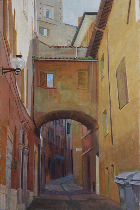
Urbino Alley, Italy

I don't believe I have posted this painting before. This painting was started in 2014, or possibly early as it is from a trip I took in the Fall of 2012. It is one of those "problem children" we artists sometimes give birth to.  It is a LOCAL TONE with light and shadow. What I mean by that is, since most of the subject is in shadow, it is painted with more flat surfaces, not impacted by light. But there is that streak of sunlight coming in on one side which produced some reflected light on the opposite building which can get tricky, so I just downplayed that reflected light. It was causing confusion, so it had to go. I also had trouble with the light coming down on either side of the bridge. I could not seem to get past a candy stripe effect on the street, so I finally down played that contrast as well. I will not publish all of the phases this poor painting has gone through, but suffice it to say, it is now the best it has looked. Darkening down all the values did make a huge difference. I also ended up redrawing the whole bottom left side so that the lines from the doorway did not go off the edge.

Urbino Alley 2014, 30x20, oil on linen
Urbino is a wonderful medieval walled town in the Marche region of Italy. I wanted to go to this region because one, I wanted to go to the Adriatic and two, I heard it is very similar to Tuscany in terrain but much cheaper! I found this to be true, especially in the off season. Heard very little English. We took the bus to Urbino for the day, as it is not an easy place to find lodgings. I enjoyed staying a half block off of the sea, so that was no problem. A pit stop on the Adriatic was a good way to take a needed break during our trip. Started in Paris (crowds), then went to Venice (more crowds) and from the Adriatic we headed to Rome (even more crowds as the day we arrived in Rome was the Marathon AND then Pope Benedict was canonizing 9 saints from around the world so Think BIG Crowds and the city shut down to normal traffic!). No crowds in the off season in a beach resort town Here is the post of the painting I did from one of my walks on the beach. The town on the Adriatic where we stayed was called Pescara.

Read Full Post


Venice Crossroads - revisited

Venice Crossroads, 30x30, oil on linen, available

Motivated by my recent visit to Tuscany, I pulled this painting out of the closest. It isn't that I didn't like this painting as it was; There was a lot I liked about it. It just felt a bit too dull for me. Even if it was overcast while I was in Venice 3 years ago, it was brighter in my memory than I had painted it.
Rereading the original blog post is always interesting! I don't disagree with any of it but I had been working on it then for almost a year. So there is no limit of time when I don't feel reworking a piece is called for.
In the painting below from two years ago I was going for a more local tone approach even though there was a sliver of light coming down. I am still going for the same thing but I added a bit of brightness to the colors and not as much atmosphere. I also reworked all the figures and gave them a bit more personality, yet not pulling anyone out. I defined the chairs and table a bit more showing more of the light hitting them. I think it aids the movement I want to create through the painting. A few areas got broken down a bit more. I ended up doing a bit more than I had expected as once you get started you see all kinds of things that need tweaking.

Venice Crossroads, original, 30x30, oil on linen

Read Full Post


Cortona - one of the oldest towns in Tuscany


Cortona, 30x15, oil on panel. Available

This piece is my favorite so far from my recent trip to Italy. We had wandered around this medieval walled town built on a hill for hours and were coming back down to the main square when I saw these buildings making great patterns and colors right in front of me. For the first time in a long time, I had to use two photos to make one piece as neither the phone nor camera photos were just what I wanted.

What I liked about this scene was all the repeating shapes and lines. Rectangles, half circles, squares and triangles. Despite the tall verticals there is good eye movement in it. Though it painted realistically, it comes off as an abstract. Since the majority of the scene is in shadow, I could paint it rather flat (local tone) with just a bit of light hitting the roofs (it was about high noon) to give dimension.

I am not sure of the significance of all the flags, but it seemed that each town we were in the town flag was in evidence. Everywhere.

Read Full Post


Italy, first round

Study, 9x12, oil on panel
A Walk Under the Tuscan Sun, 6x6, oil on panel


I have been busy doing some fun pieces from my trip to Italy last month. A 'walking' tour of Tuscany. Both of the references for these pieces were shot by one of my new friends from the tour, Nancy, from Tampa. Nancy was more than willing to share her photos with me to use. She and her husband are both avid photographers.  It is so much fun to see what catches other peoples eye.

We deemed the top painting's image 'Hopperesque' which was taken with Nancy's phone. I did this as a study to see whether I wanted to do it larger or not. I think I like it this size for now. 

Nancy took the bottom photo as well. It immediately made me think of Van Gogh and the south of France. I love the simplicity of the shot. I cropped it to be square, and I think these are the tiniest people I have ever painted! Group of 4 to fit in less than an inch squared. I had to get a sable watercolor brush out to to it as I do not own any tiny sable oil brushes.

I am always looking for help in titles, so if anything comes to mind, please let me know.

Read Full Post


Roof lines revisited

Still no title, 24x30, oil on board


Last seen in 2015, 24x30, oil on board

European roof lines intrigue me. It is the catawampus way of building without a grid I think that just makes them so interesting to me. Since most of the places that have these great angles are also usually built on hills, helps. The history that can be discerned from the ages of the tiles and the shape of the stucco or bricks or stones. This scene is from a walled town in Burgundy called Semur. It was an afternoon's byway on our way from Dijon to Paris. I did the bottom painting and was never quite satisfied with it. The color of the roofs are too similar with the red one jumping out in the middle like a bulls eye.

After finishing up the Cesky Krumlov scene recently I decided to give this one a revamping of its rooftops. I had figured out in that one what was missing in this one. In the original lower image, I was going for a more orange and violet complement but somehow it didn't work as well as I would have liked. I felt the painting lacked something. I set about in the upper left hand corner and worked my way left to right on each layer of roofs going for visual interest and texture forcing value shifts as needed, something I am often hesitant to do for some reason. Being bolder in adding pinks and pale blue greens to the rooftops. I had started on that idea but was timid in not going further. Adding texture to the red bulls eye roof in the middle helped to add to the visual interest and tied it to the break up of shapes in the shadows down below it. In that big shadow shape down below and heading up the right side of the painting I added a bit of lighter blue gray to stair step the tops of the bricks up to the tin roof to help the circular rhythm that I was originally attracted to.

I changed the color of some of the houses in shade leaning towards the blue green in some and adding more yellow red green to the once violet cast shadow on the house that is to the left and in the middle row. The cast shadow now blends from the house across the wall unifying the two. The wall with its tiles casting a shadow moves from that yellow orange to a more violet when it gets to the right.

In the deep shadows (window holes, doorways and blocks), I warmed them up. Where once they were towards the dark blue violet I added some yellow making them not only deeper but helping to break up the too blue violet of the shadows. This adds to the eye movement through the shadows and back up into the light, stair stepping the shapes.

Read Full Post


Rooftops -Cesky Krumlov

Cesky Krumlov, 30x40, oil on linen

Last year I saw the photo of this scene posted on FB by my sister-in-law. I Really Wanted to Paint it. But last year, it intimidated me. I downloaded the image (with her permission) and saved it for a later time. In April I decided to go for it. The rooftops are so catawampus who would know but me where it is off and really, in this scene, who cares? Not only did I want to have a few routes through and around this intriguing place but I also wanted to see how many different colored and textured orange roofs I could get out of it. In the end I think I used 3-4 different reds and yellows with blues added where needed. It was a maze to figure out but I did enjoy painting this piece and I learned a lot doing it. I have a few paintings unfinished that I think this piece has given me the information I need to finish them up.

I looked up Cesky Krumlov and it is a designated UNESCO World Heritage Site. I believe this was shot from the castle overlooking the old town.

This has been a tough painting to photograph. Some of the reds I cannot get the camera to read correctly so I may repaint them to see if that helps.

Read Full Post


Blood Moon - Denver Skyline

Blood Moon hitting the city at dusk, oil, 24x36

A couple of days after the Blood Moon rise a coworker showed me some photos on her phone. She and a photographer friend of hers had gone up to Lookout Mountain that evening to watch the moon rise. She initially showed me a photo with the moon in it, a big red orange ball in the evening sky. I really liked the photo and I asked her to ask her friend if I could possible use her image for a painting. She sent the original image along with another without the moon; shot earlier in the evening as the moon rose. The photographer was using her professional equipment that evening but I viewed them on an iPhone.

Image I thought I wanted to do of Blood Moon

After looking at the two images she sent me I decided I liked the orange light without the moon, so that is the one I ended up painting. I like them both and I may still end up doing the moon.  This skyline was not the 'piece of cake' I thought it would be. After I had it all done, I realized I had painted the skyline in a different manner from the rest of the landscape so it did not have an overall cohesive feel to it. I had to go back in and repaint the city so that it blended in texture wise with the rest. It was fun using orange and red in all the colors to unify the light. That was one of the most valuable lessons I think I ever learned; to use color in that manner. A blue green foreground has a lot of orange in it yet not as much as the middle ground so in relation to the middle ground, the foreground reads more blue green. Likewise, the sky has orange and red yet next to all the orange and yellow greens the sky looks more purple.

Read Full Post


Museum Exit

Museum Exit, 24x18, oil on panel

I saw this scene as I was walking out of the National Museum of Ireland. I immediately thought it was an abstract painting with all the colors and repeating shapes. And the buildings were catawampas on top of it. I had gone to the National Museum to see the 'bog' people. There is so much in this museum it is a shame I was already on overload and so really did just go to see what I wanted to see. The floors were beautiful mosaics and I had to walk past all the Celtic gold jewelry to get to where I wanted to go. The gold work looked amazing as I glanced at the display cases. I had already been to the National Gallery of Ireland to see art for a few hours, which I enjoyed very much. The two museums are very close which is why I headed over to the National Museum while I was in that part of Dublin. I had walked over from where I was staying which was across the river.

In this painting I was trying to get movement through color. There is the yellow that creates the most obvious movement; followed by the reds and then the blues. The image provided a good start to this structure as is, but I did force a few color notes as well. While working on this one I kept toying with making it much more abstracted in a Diebenkorn approach. Now that I have this one done I am thinking of doing it again, same size, with that more flattened, layered color block approach. Not sure if the figures would be included; that is still to be determined.

Read Full Post


Cherry Blossom Promenade

Cherry Blossom Promenade, 36x36, oil on linen

To be a harbinger of Spring, here is one of the latest to come off my easel. I have been working on this large for me painting since last spring. It was a struggle to get it to 'read' correctly. Originally, I was trying to imitate Tom Thompson and the way he could make the woods of Canada have such wonderful patterns within them. I managed to do that with the cherry blossoms but I could never get that to work with the cast shadows so in essence the painting looked like two separate ideas. I finally had to paint over that which I liked and was attached to doing to get the painting to have a cohesive and connected feel, which ultimately is what I was going for in the first place. Sometimes we artists can be stubborn in holding on to something which is holding us back from achieving where we want to go. What can I say? I finally saw what I needed to and got the ship righted and on course

One of the things I like about this scene is not only the promenade of blooming trees but the figures. It shows a cross section of people and one would think I had placed them there to add to the composition the placement is so perfect. You can't see the last grouping in this image as they blend in with the trees but there is a 6th  grouping in between the trees that are to the upper right of the rabbi's hat.

This scene is at the Brooklyn Botanic Gardens. It was quite by chance I was in NY in April for the Cherry Blossoms. I had come to see the Sargent watercolor show at the Brooklyn Art Museum and my cousin had gone with me. When we left the museum she wanted to go to the Botanic Gardens which was right next door to the Museum. So glad we did. A lovely oasis in the city and what a welcome to be outside in it.

Read Full Post


Studies in 3 Values - Local Tone

Study for Line at the Louvre, 9x12, oil on canvas panel

Here is a quick study using light, medium and dark. I like how it is working but after seeing this cropped version of the scene, I decided to open it back up to show the scope of the line. It was phenomenal how many people were actually standing in line to get into the Louvre on this rainy, gray day. I believe it took us 35 minutes. By this time we were almost half way there! On second thought, what better place to be on a rainy day in Paris? The Louvre is certainly large enough to take in this crowd without much of a problem.

Back to this little study above. The hard part is deciding what to tie each value to. When using only three values it limits your options in some ways and then there are loads of choices to make at the same time. I originally had the umbrella peaking into the image in the upper left corner as a medium  gray catching the color of the sky. It just seemed too blah. Making it black helped the composition remarkably. The arch was almost as light as the sky so in the photo, the trees in the arch showed up much more. But if the arch is "white" then it blends into the sky and we don't get the nice band of gray we now have in the middle or the play of patterns in the dark and light umbrellas standing in front of the arch.

Line at the Louvre, 30x30, oil on panel

 I decided to see what the square format would look like doing three values before I started to paint. As you can see, I divided up the umbrella of the main figure but it is not as effective as it is in the study. I do think the square format gives more of the depth and breadth of the line snaking into the Louvre so I am glad I opted to change the format. It also added more public art into the scene. There is a sculpture right above the woman with the white umbrella and another to the right of the arch.

Read Full Post


Park Avenue in Spring

Park Avenue-Spring, 30x30, oil on linen

This particular painting left me struggling. I don't normally do downtown type buildings when I paint the city. Then there was the fact I had to force what was in shadows from all the reflected light off of the windows. In the photo reference much of what was in shadow on the left hand side was almost as light as what was in the sun on the right. There was also reflected light hitting the tulips but they were not in sun at all. Lots of things to think about on this one. This was painted mostly as a local tone (three values, no light source) because so much of it was in shadow although technically it is light and shadow as a visual approach.

I was in NYC exploring on my own. I had walked up to the Frick Museum via Park Avenue and walked back through Central Park on this glorious April day. The day before my cousin and I had gone to the Brooklyn Museum to see a wonderful John Singer Sargent show. After absorbing all the art we could (we did 4 exhibits that day!) next door to the museum are the Brooklyn Botanic Gardens which were in their spring glory with cherry blossoms galore. My cousin lives in NJ but we can take the bus from where she lives for $7 and we are at Port Authority in approximately 20" depending on traffic, of course. There is another John Singer Sargent show coming to the Met this summer that is calling me to come see it. This show will be approximately 75 of his more personal portraits, not the society portraits he is known for. It will be in London and NYC only. The link is not yet posted on their website but I just discovered there is a Van Gogh exhibit there this summer as well so it will be a two for one!

Read Full Post


Squaring the Circle or Ordered Chaos?

24x24, oil on Canvas

Unusual for me...I have two good names for this painting. "Squaring the Circle" or "Ordered Chaos." I see value in both darn it. "Ordered Chaos" came out of the block in. "Squaring the Circle" came up upon completion.
This piece was painted with equalization in mind. Lots of repeated patterns and despite all the squares and rectangles it does circle through the square...I thought this painting would test my abilities but it was amazingly fun to paint and despite my best efforts to tone down the colors, I kept coming back to the rich bright colors you see here. Happy Happy Happy!

Read Full Post


Lowry In Snow 26

Lowry in Snow, 12x16, oil on panel

This photo came out very stark! But I am not sure I will have time to retake it any time soon so I am going with it. I painted over an old still life I had done in blues that was never finished and not likely to be. I figured blue and purples under a winter scape was apropos. It was a bit more difficult than I expected fighting that blue. I had a hard time with my values and colors on top of it. They still seem a bit overly warm to me and the sky needs to be a shade or two darker perhaps. Could be the light reflecting on the brushstrokes too. I am thinking out loud here...

This is the view from my window where I work on the old Lowry AFB again. This lone tree was actually in the photo with the Purple Deer on Day 20 but it did not add value. It is not a beautiful view but I have grown to love it over the years. Glad that I have a window and a view at all!

http://lesliesaeta.blogspot.com/2015/01/thirty-paintings-in-30-days-day-twenty_26.html

Read Full Post


Purple Deer 20

Purple Deer, 9x12, oil on linen


Today's image is from a photo I took outside my office window last spring. I work on the old Lowry AFB in the city of Denver. We have a herd of mule deer that honor us with their presence from time to time. This painting was done using the complements purple and yellow. The scene lent itself to those colors naturally because of the dried grasses and the deer being in the shade of our building. She came right up to the window to see what I was doing.

Read Full Post


Sunday Morning-Dun Laoghaire side street

Sunday Morning Side Street, 30x24, oil on linen
We don't often think of Ireland being sunny, but here is an example of a beautiful, quiet Sunday morning in the coastal town of Dun Laoghaire which is just south of Dublin by commuter train. It is pronounced Dun Leary I learned when I was trying to catch the train and I was making sure I was on the right side of the tracks. My sense of direction was not tuned to the area yet. It was not that early in the morning but I felt like I had the town to myself as I wandered around. Although the sun was out it was quite chilly near the water so I explored the town first.  

This little street scene reads more like an alley but it was a street as you can see by the stop signs. I was attracted to it because of all the colors. and repeating shapes. Pink, green, blue, yellow and that great terracotta in the sun at the end of the road. I was in Ireland in March but the planter boxes were already green and flowering. 

The visual approach for this painting is light and shadow. This is my first painting from Ireland but I do intend to do more.


Read Full Post


Venice Crossroads

Venice Crossroads, 30x30, oil on linen


This painting was in a somewhat completed state last February.  I have sat on it all this time wondering how to finish it. Sometimes one just has to put a painting away until you are ready for it or it is ready for you. This was not an easy painting for me but I was really attracted to the scene for all the repetitive shapes as well as the activity. So many ways to go in and out of the alleys in Venice.

I actually did more work on this than I had thought was needed as once I get going I see more areas that need attention. I started in the shadows leading the viewer in. I darkened it down a notch or two and added more details though still trying to keep it simplified. Just enough to have some interest as you go into the painting and to also lead the eye in to the visual motion I was going for. That made a huge difference. So I went into the interior and deepened some colors and lightened others. I was in a groove so it did not take me that long once I figured out what it was that needed doing. It is such a good feeling when that happens.

This is my second Venice painting from my two days spent there wandering the alleyways. I sure loved every minute of it and hope to go back and explore other areas of the city. We were staying in the area that is called Cannaregio. It is the old Jewish Quarter and is on the outer rim of the city to the northwest. Across the Lagoon from our vaporetta stop is Murano, where the glass factories are. So we stayed pretty much on that side of the Grand Canal.

Read Full Post


Day on the Delta

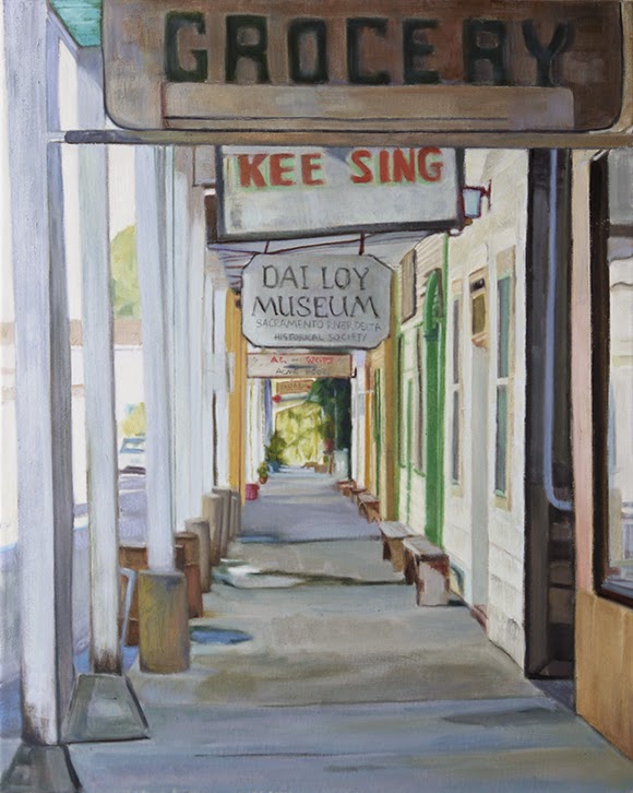
Locke, CA, 20x16, oil on canvas

I heard about the "town" of Locke, CA through a plein air workshop a friend of mine went to called Delta Funk. It is put on through a local gallery in the area. On a visit to family I was able to take a day trip to some of the towns that are included to explore the funk around the Delta towns of Sacramento. Locke is a small China Town, built by and for the local Chinese of the time (early 20th century). It contains only a few blocks but it did fit the bill for a funky little town. I took quite a few photos for reference, this being the first view I have chosen to paint. I have another view of this covered walkway from the other end of it that I want to do as a companion piece.
The day we were there it was dead as you can see, but I was told it was packed on the weekends.

I started this painting two years ago and finally brought it out again this summer, determined as I was to not start anything new before trying to finish up some of those I had left hanging out there. It technically is a light and shadow painting but I painted it as flat local tone because most of it is in shadow with reflected light bouncing in.

Read Full Post


Topics

Archives