Blog


Entre'!

The Entry, 30x40, oil available

There are times when I just want to break the rules to see if I can make it work. Let's see what you all think. Did I succeed or not?


The 'rule' in particular is to not split a painting in two, down the middle. Which is exactly what I did on this one. The vantage point is from the floor looking from the living room into the entry hall and staircase. I had been playing with my dog and when I looked up, thought that this could make an interesting painting. There was a myriad of reasons I liked this scene. The repetition of vertical lines in the stairwell, the radiator,  the legs of the table and the books in the bookcase. Then there was the oak of the stairs and banister and window, the floor, the bookcase and the oak chest. And finally, the plant, the pussy willows in the vase on the table on the landing and the daffodils. 

My justification for doing this scene this way is my hope that the viewer would either want to go from the living room to explore what is up stairs or to go around the corner to the front door. 

Multiple light sources can also be tricky. There is the window you can see on the stairs, the front door is all glass with a reed shade, behind the bookcase in the entry hall, and there is a window behind the couch off to the right of the edge of this painting. Oh, plus the two windows behind me on either side of the fireplace.


Read Full Post


Lilacs

Day 3 -mostly done-thinking the 'vase' is too prominent

Wednesday of last week (May 10, 2023) everyone on our morning walk was talking 'hail!' So, I came home, covered my vegetable garden plants (we here in Denver know not to plant before Mother's Day-but who listens?), cut some lilacs, iris and hellebores, 'just in case' to bring inside. If nothing else I could enjoy the heavenly scent of the lilacs, or possibly even do some sketching of the flowers on the grey day that ensued. It did rain for 24 hours straight, but thankfully, no hail here. The area where I live has been called  "hail alley."

Sketch of Lilacs

Friday, so two days into the cut flowers shortened life, I decided to paint one of the vases full of lilacs. Being still overcast outside the arrangement was under artificial overhead light. I went and found an unclean previously painted panel, 24"x12" and proceeded. Sometimes, the first run on a used panel is the toughest, especially if the painting was varnished, as this one had been. I could not find a photograph of the painting so I am surprised it was varnished. Despite the effort put in by me, who knows how long ago, to remove the varnish and then sand it, it still lingers. The first flush of new paint means it is absorbed by the old varnish so I must remember to go darker and lighter in value to combat this phenomenon. It doesn't seem to matter - it all ends up monotone.

From Nicotiana to Lilacs- starting the block in- carving out shapes

Day 1-Black almost covered - allowing this layer to dry a bit
Saturday is not so gray and the sun actually shines forth from time to time. But in keeping with what I had started, I turned on the overhead lights. My thought was even if I don't finish the study, it has been fun painting from life and fighting the substrate at the same time. Today's effort felt less like a wrestling match and more fluid and easy. 
Day 2- Big shapes defined

Day 2 before quitting for the day- Lilacs holding up so far 

Day 3 Sunday is just to finish the vase. Which is really for drinking wine, I believe. I inherited it from my parents and is from the 60's when we first moved to Germany. I am not sure what it says on it but I believe it has to do with cultivation of wine.  It does have a handle but I have ever only used it for a vase.


Read Full Post


White Phalaenopsis


block in


White Phil, 24x12, oil, available

Here is a painting I did recently. I am not convinced it is finished, but I was done. It has been awhile since I painted an orchid from life and with 4 orchids in bloom right now I went with the one that was most advanced in its bloom. It took me longer than I care to admit, working on it over days, trying for the same time of day, which isn't always that easy.


In the block in I was thinking I would add an abstracted version of the desk that is the background of this none set up. I literally just brought the orchid and set it on the computer table I have next to my easel. I then decided I didn't like the idea of the desk but I kept the dark band across the white orchids for contrast. as well as the color of the wall behind the desk. The only color I made up is the golden color in the middle. That would be very dark as well otherwise. I have a gold screen I often use as a simple backdrop for these impromptu still life set ups so that is, I am sure, why I picked that color.

An artist friend of mine was over the other day and I asked her opinion on whether this needed any more work and she said 'no.' I signed it and am posting it 'as is'. I am trying hard to not keep 'fine tuning' it as is my wont.


Read Full Post


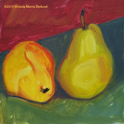
Turned Around - Bosc Pears

The Conversation, oil, 6x8, available

Side by side with initial blocking in


The same basic set up as with the blue background except I turned the pears to another angle where they would still stand up on their own and used some of my scrap paper to change the background color. It sets up a more intimate pose for these two pears to continue their conversation. I had found a clean 6x8 panel which I didn't realize I had as I rarely paint this size anymore. This was the next day and already the pears are ripening quickly. This one I think I can call "the Conversation." 


Read Full Post


What is it about painting pears?

A question that was asked of me by a student I have been working with. I have done MORE continuous line drawings with more pears, being as they are currently in season. And those drawings turn me to my easel to paint them. I suggested to him that he try drawing pears to see why so many artists like to paint pears to see where it leads him. I have my own theories about why I am drawn to pears.

I am not going to include the line drawings in this post, just a progression as I painted over an old plein air landscape. You can see I set the pears up right at eye level on my easel. Nothing fancy at all. In fact, using the 2x4 is rather tippy and I had to be careful the painting and 2x4 didn't end up on my palette! But then, why not add a little adventure to the whole thing? Since I used a red background before I decided to use a piece of blue mat board this time.

Set up with 6x8 old painting


blocking in the pears with a lime green


Blocking in with blue background and brick


Bosc Pears- further blocking in


Bosc Pears, next to set up


Bosc Pears, Still looking for a Title, 6x8, oil


I had thought to name this little study "the Conversation." Yet it almost looks like the Pear on the left is listening closely while the pear on the right is maybe a bit forward in what it has to say. The stems are intimating a heart shape now that I look at it differently. A title is not coming to me. Any help with a title would be greatly appreciated. I have used "Tete a Tete" before.

These fun studio studies keep me from getting too serious in my studio works since I don't get outside and paint as much as I used to. I do think it is important to paint from life whatever that  looks like. These don't take much of a time commitment as I do try to keep moving and not think too hard about it. Just observe.


Read Full Post


The Pears have it

Last week a bag of little red pears were on a manager's special of $.97 for 3 pounds! How could I pass that up? The first thing I did with them was to do some continuous line drawings. I started doing continuous line drawings because it is a good reminder to look at what you are drawing not at what you are doing so much on the paper. I had done some eggplants and clementines the week or so before and had so much fun doing them, so I am trying to do some every day or so. 
Here are the pear sketches. As with the eggplant, I ended up doing a painting. Each of these sketches takes about 5 minutes or so. No more than 10. So really no excuse not to do something every day.


#1


I don't always add the shading but it helped to keep my pencil on the paper to do so with this set up.
#2
I thought I had done more than one from this perspective, but I only have one. I know I thought about it. It gets the creative juices flowing to play around with the set up.
#3
I did lift my pencil to do the solo pear but otherwise each section was done without. I dumped these out on the table to see what it would look like.
#4

The drawings lead to this little 6x6 painting. Which was great fun to paint.


#6

Then I sliced them all up and dried them~ dried pears are the best and still so beautiful.


Read Full Post


Eggplants as inspiration

 These eggplants were the last I harvested from my garden before the temperatures dropped. I decided to memorialize them as I wasn't sure I would be able to eat them all. I set them on my dining room table being to lazy to go up to my studio as well as wanting a different venue.

#1

Here they are in front of my seat at the dining room table

#2

Then I went to the chair across the table and did the reverse view. I must be easy to please as I had so much fun doing these.

#3

Deciding I did not want to move the set up, I left it up and did this painting at the table. I did not have any clean 9x12 panels so I grabbed a panel with an old painting on it that was not worth saving. I like painting over old paintings anyway. This was painted in less than an hour. 

#4
Of course, I then had to do the other side too! The painting below is the one underneath #4. It had been varnished, which tends to absorb the paint on top of it which you can see in the top of the new painting. The whitish effect from the varnish. I liked the red 'swirls' coming through from below. These paintings are done just for the pure joy I get from doing them to see the effects. I could have spent more time totally obliterating the painting beneath. This was done in less than an hour too.


These acorn squash and peppers were also the last harvest from the garden but way back in the day. I want to say 20 years ago.

Read Full Post


New Little Studies - winter fruit


It has been too long since I have paid much attention to writing a blog post. I am not one for making excuses so I won't start now. I do have a possible explanation, however I don't think anyone is really interested in that!

Suffice it to say, I am here, it is a new year, and I hope to be back at my easel more than I have been this past year plus. Everything seems to be taking longer as I have worked on a number of paintings all year and can't seem to make much progress as in getting them done. I was able to get some small studies done over the holidays and it really was a struggle at the start to compose from life. It started with fruit my sister had thoughtfully brought with her from her yard in southern California. Who knew that is all it took to get me motivated? I am going to try and remember the order I painted these, but don't hold me to it.

Lime Persimmons, 6x9, oil on canvas, available

My sister had brought with her limes, lemons, and persimmons. I picked this lime as it still had a leaf attached. I believe I painted this first as the limes were going to someone else. As I painted the leaves visibly dried before my eyes. I tried to do them in a limited time frame although I did not set a timer as I would normally do when going for a quick sketch. There is an under painting showing through as I paint over old paintings. I don't paint this small normally anymore, but the size is perfect for doing these exercises.

Persimmon Pair, 6x6, oil on panel, available

Still trying to get that leaf in before it broke off, I did another little painting of a couple of persimmons. Two is what worked for the square format. I still used the same blue mat board and red rice paper to offset the orange. 

Stacked, 9x6, oil on panel, available

I wanted to see if I could stack the persimmons as there enough to pick from to find what might work. Who would have thought a smaller one would be on the bottom with the largest in the middle, but that is what worked. No toothpicks or other assistance needed. Just wanting to have fun as I got to know persimmons as a subject. 

These were all painted over old paintings. I don't usually do well with allowing the layers to come through but this time I did as I worked quickly trying not to think about anything much. 

Next my sister had brought home some pears to put in the pear walnut salad we do for Christmas Eve dinner so I had a new subject to paint, and I have always enjoyed painting pears.

Pearishable, 6x9, oil on linen

The Bartlett's refused to stand on their own, so reclining it was to be. I propped the one on top of the other for visual interest and to get a circular composition going. I changed to a purple paper and the wood from the table for this one. This was my sister's favorite of those I did while she was here, so it went home with her. It was a gray day out and so the light is more subdued in this one.
Pear Trio, 6x8, oil, available

One more before the pears became salad for our consumption. The Bartlett's still refused to stand up. A stubborn pair. Different lighting on this one which brightens up the study and adds reflected light onto the paper. This is the only one of this group that was done a clean canvas. Very different feel.
There are two more but I forgot that I hadn't taken their photo yet. So, another post to come to follow up to this sojourn at my easel to have a bit of fun.


Read Full Post


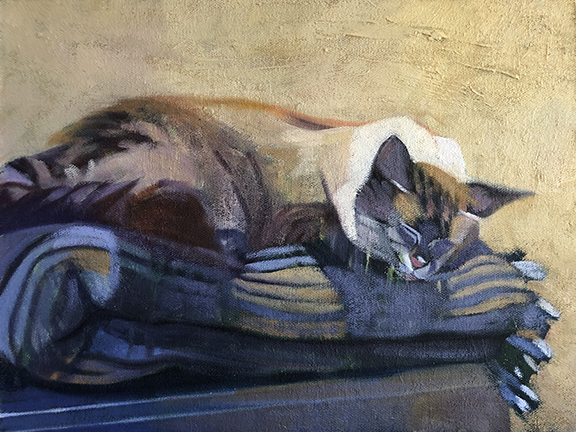
Stormy III or Stormy Napping - cat portrait

Stormy Napping, 9x12, oil

The comment I received from Stormy's owner when I sent him an image for final approval of #3 was:


Purrrrfect!!! She looks so "Stormy" like! That's our kitten who just had her 13th birthday You do such lovely work Victoria!


Can't get much better than that. It is nice to have satisfied customers. I stopped doing pet portraits years ago after one client had so many little tweaks. She was finally satisfied but I was done with that.


To keep with the other two portraits (https://victoriasart.blogspot.com/2019/10/stormy-ii-cat-portrait.html and https://victoriasart.blogspot.com/2019/10/pet-portrait-1-stormy-outside.html) I found an old 9x12 plein air painting from 2008 to paint over. It was a path leading into a dark grove of trees with some tall grasses catching the light. I turned it upside down to start this painting. I drew in white chalk a basic outline. I decided to paint in the background to get rid of distractions and start my building blocks. I liked the strong texture coming through from the path of the painting underneath for the background. Interestingly enough, the wall in the photo was an old textured plaster wall. I recognized it as I have the same in my house.

Blockin start

Next, I started with the bigger shapes of the cat and outlined the blanket folds. I did like the green coming through, as I own a green plaid blanket and it seemed apropos with it already laid in so nicely!

Alas, it was not a green plaid blanket Stormy slept on. Never having to paint plaid before I think that intimidated me more than anything else. So, go to the trusty shape thing and don't worry about what it actually is. The owner doesn't seem to mind that it isn't a perfect rendition of the blanket but is of Stormy. A man who has his priorities straight!


I did have fun doing these pet portraits. I like doing cats, I have decided. A shout out to The Whole Cat and dogs too for the referral.


Read Full Post


Weekend Warriors II

Weekend Warriors II, 9x12, oil 
In an effort to keep clutter down to a minimum, I was thinking it was time to ditch these favorite pair of Birkenstocks. Because they have been such faithful and easy shoes, I thought I should do another portrait of them first. It was also a diversionary tactic to avoid working on any of my other paintings in progress too. In 2002 I painted them thinking it was time to toss them then. Forgotten by me until I just went for this photo of the first version, I called them Weekend Warriors back then too! The first version sold soon after I painted them and bought to hang in his office to remind him that the weekend was coming...

My father, 6 months before he died, bought these Birkenstocks for me while we were in Phoenix for my sisters  Master's Degree graduation. That was 37 years ago. My son was a babe in arms. When I painted the first portrait I was fairly new to oil painting and still very graphic and flat in my approach to painting. I still like the original and I am happy that they still look like the same pair of shoes if not a little more worse for wear now. They are only used for gardening or quick dog walks. They are still a very solid pair of shoes having been made with a heavy leather yet malleable enough to fit the form of my feet, horrific bunions and all. The sole was replaced in recent memory and still has many miles on them. But one of the shoes hurts the top of my foot now, which is a new development. Enough to be quite painful if I am not wearing socks. Who wants to wears socks in the summer to work in the garden? Not me, at any rate.
I had sent the new image to my family saying I was planning on tossing the shoes but how did they like the painting? Well, the uproar from them was deafening even though 2 were in Greece at the time and my sister in California. I am not, under any circumstances, to throw these shoes away. What is a little pain with such stalwart supporters of my feet? Even if I choose not to wear them they are a memento that they all were unanimous on keeping in the family.
So there you have it. I haven't tossed them yet, and I will keep them, for now. I enjoyed painting them again. The portrait will go into the next pop up show that is upcoming the First Friday of August. More on that soon.


Read Full Post


Clear Wine Bottle Still Life

Keeping in the theme of staying out of my comfort zone I started this still life the other day when my power was off. I was of two minds. Start abstractly but bring it around to a more finished completed painting or try and stop before I get too involved in it.

I grabbed a wiped off painted panel that still had the previous image on it, as you can see the tree in the off centered bottle. The roof line and buildings are still coming through. It was about at this stage that I decided to try to keep some of those elements. My hesitation was that I did not retain any of the under painted image on the left side. But somehow it doesn't bother me. Every time I walked by my easel I was just liking it more and more. I can't tell you how hard it was for me to just stop.

Here is where I ended up.  It was a fun exercise.

untitled at this point, 14x18, oil on linen panel

Read Full Post


Red as theme


One of the local galleries here does themed shows every two months. The next show will be Red. I do not normally paint to the show but submit what I already have on hand. But I needed something to get me going so I decided to paint with red in mind. Here is the first little painting I did.


One Red Rose, 10x8, oil

 It was painted over an existing painting dated 2004. I can't even remember what it was now and I just painted this last weekend. No title on the back. I do enjoy painting over old paintings and letting the original layer come through. One of my neighbors had brought over a beautiful bouquet of flowers and a bottle of wine for me on Thanksgiving. I am their Local Grandmother replacement and I babysit when they need help and I am available as they have no family in town and have two little ones. I am happy to help. Fortunately for me, there were red roses included in the bouquet so I had a ready target. I do not normally paint roses, but what the heck? I used my trusty Japanese gold screen as a backdrop, and a new brass vase I recently added to my collection, and voila! Something fun to get me painting.
So, in addition to that little gem, I had set up these three stemmed clems, thinking of doing one still life with all the elements. But instead, I divided them into 2 separate paintings. In this 2nd painting, I did not include the base of the brass vase with the clementines reflected in the base of the vase, which I had intended to do. I decided it wasn't needed and would only confuse. I used some red rice paper as the surface to set the whole still life on.

Red Clems, 6x9, oil over old painting

This one, too, was painted over an existing painting from 10 years ago. A plein air painting I did on a rafting trip on the Yampa River. It was the only surface I could find that was the right size I wanted to use and the painting was expendable. I really don't paint this small anymore so I don't keep clean panels handy. Yet, after so long not being at my easel, small is what I needed to get myself going. Simple shapes and small.

Read Full Post


Orchids Evolve

Studio Orchids II, oil on panel, 20x16

Here is an oldie but goodie. This piece originated in 2002 when I was very interested in orchids in particular, and plants in general. I liked doing what I considered 'plant portraits.' Not so much in the botanical illustration mode, although I did take a class in that at the Denver Botanic Gardens at the time. For me, being what some consider a detail-oriented person, botanical illustration did not appeal to me.

I had orchids lining every windowsill in my home. This scene was in my studio. I was even a member of the Denver Orchid Society so I would have access to more varieties of orchids. I still like having an orchid or two around the house, but I no longer have them in every window that was feasible. Working on this painting has made me realize that I miss the color and the jauntiness of orchids in my life.

Not sure I should show the original version, but here it is, painted from life. Oh, the things that I have learned over the years! What is 'wrong' with this version, as if I need to point them out, they are so obvious. No, instead I will focus on why I thought it worth saving: It shows the character of the plants coming through which was my goal at the time.

The window faces north. So the light coming through the blinds would not be warm. First thing that had to change. Second, the perspective has every thing falling off the canvas to the lower right. Can't have that. Funky Orchids was the title of the painting as I tried to take a lighter, less serious approach to my work, but there are still some things that need to be considered, even going for a less formal format. The Moses in the Cradle leaf coming into the painting from the lower right had corner was supposed to help with the tilt of the blinds and board and it does, but not enough. Luckily the drawing of the plants themselves was good, and only required a little tweaking, the blinds and putting the plant stand in where it belonged took a bit more brain power. Unifying the shadow shape was helpful too as I tried to be more true to the light source. I can't believe now that I put all the shadows into black but back then I thought it would help the flowers be more colorful.

I was reading in "American Art Review" earlier this week an article on an upcoming Richard Diebenkorn show opening next month on his early years. I was heartened to read this about him and his process:
"Many have described this process as one of trial and error-even Diebenkorn himself-but it was not so much that he was creating and correcting 'errors' as he was attempting to find a better way, the extended journey being relevant to his final result.".. then finishing with "He kept working until he believed the painting was not wrong anymore, feeling his way until, in his mind, the painting had somehow become "miraculously right."

This idea has been floating around in my head for awhile now, and I liked that the journey was the important thing for Diebenkorn. And the idea of not correcting errors but finding the rightness.

I do hope I can get to Sacramento's Crocker Museum to see the show this fall.

Read Full Post


Winter Still Life

Winter Still Life, 16x20, oil on panel

This painting below that was posted this past winter needed to be reworked. I did this painting from an old slide I found from decades ago. I always liked this image so I was happy to find it after years of being packed away in the basement.

I wanted to put it in so you can see the difference as I explain what I did. the most obvious is that I lightened up (or added atmosphere to) the trees across the way. then I added more color and warmth to the overall painting. More reflected light gave the overall structure less heaviness and the birds now are more interesting.

Here is an interesting note. In my spring cleaning I came across a photo I had had made from the slide. I had forgotten all about it, but then remembered having framed it to hang on my wall. The photo was much better visually but it was also a mirror image to that of the slide! So though I had this improved image, I had to switch it visually from the photo to the painting. A mind bender to be sure.

Let me know your thoughts.

Read Full Post


Kicked off Vans

Vans, 16x12, oil on panel

I have been doing some major spring cleaning the past month or so and one of the projects led me to stored paintings of questionable value. Here is one I pulled out from that pile. I am seeing it with fresh eyes and thinking, 'now what is so very wrong with this little piece?' It is not so bad after all. I must not have thought it awful, as those get wiped off or painted over.

So, here is a study I did of a pair of Vans sneakers I inherited from my then teen-aged daughter. I had wanted to document them before I threw them out after miles of walking the dog in them. Oh good and faithful servants that they were.

What is it about shoes that I get so attached to? I sure enjoy painting my shoes. I have a very hard foot to find comfortable shoes for so when I find a pair that doesn't give me blisters or great pain. I am then so overjoyed, no matter how homely they may be.

Read Full Post


Another Round

Ye Olde Beer Glasses, 12x9, oil on canvas

Ok, round 2 of these beer glasses. I know I am getting behind in posting the paintings I have been working on for this month of 30 paintings in 30 days (now amended to painting every day for 30 days). I decided to work this one up again. It is not quite where it needs to be but it is far enough along to talk about. The first go around I felt the beer and the table were too close in color so in this version I lightened the table and gave more orange color to the beer to aid the contrast. The table really is sunshine yellow formica from the 60's. I believe these glasses are also from that era. They appear to be hand blown as they are both heavy glass and very irregular in shape. My drawing is really not that far off, believe it or not. I am working from a phone photo not from life. I had given this pair to my daughter for Christmas so she sent me the image to show they are enjoying the glasses. I never thought to paint them from life while they sat in my cupboards for the past 20 years!! Shame on me. And I like wheat beer, which is what these glasses are for. Weissbier in German. Prost!

Read Full Post


Gold and more gold

10x8, oil on canvas

I have this collection of French pottery that I really like, but it is brown. No getting around that. Here are a couple of pieces. The squat piece with the top I found out by watching "Downton Abbey" is for salt. I saw Anna get it down from a kitchen shelf and I was blown away that there was my piece of pottery, of which I did not know what the original purpose was. You learn something every day.  I inherited these three pieces from my mother. The tall skinny one I think is for olive oil or wine, but that is just a guess. The short little pitcher is actually from Spain and it is for olive oil. I had first thought to use the wall as the back ground for this still life. After doing the block in I changed my mind and put the gold doll screen back there. It does add a richness to all the earthen colors.

Blockin using wall as backdrop

Now I am not sure the gold screen was such a good idea. Maybe too much of the yellow and orange and brown going on. I did that color scheme on purpose working with the repetitious shapes. It might have helped to switch the pear with the clementine. (Pardon me while I think aloud here). I did use different browns in the pottery; ie more blue in the salt cellar, more orange red in the olive oil pitcher and a mahogany for the pipe bowl. It is hard to see with the glare on the painting. 

It is an effort to force myself to paint more objects in less time and still get it done in a day.  Something gets forfeited when one does that until one gets used to it but it is always a good lesson. The first year I tried this 30 paintings in 30 days I did smaller paintings than this with one simple object so progress has been made! I am tired, however, and I am only half way there...

Read Full Post


Juniper Blues

Block in over old plein air painting, 12x12


Juniper Blues, oil on linen, 12x12

Can you believe it? No gold screen today. I decided to turn the screen around and use the back side for a more neutral approach. The painting underneath was painted on a grey day and was of old weathered outbuildings and a concrete wall. Somehow it felt better to just keep a quieter outlook this time. I tried rearranging the gin bottles but this seems to be the way they want to work together for now. I added a tea tin and the glass bottle just to add to the composition. As you can see in the block in I was leaning towards a more abstract approach and was going to paint it flat with the bottles being united and through each other. Then I get painting and it all goes away. Maybe next time.

Read Full Post


Split Between the Two

Split Between the Two, 16x12, oil on linen

Here is that gold doll screen again. I so like the way one side gets the light and the other panel, not so much. Breaks up the painting so nicely. The bottles' shadows make such interesting shapes and colors against it. I am not tired of it yet. I carried two of these bottles home from Europe when you could still carry bottles on board a plane. What a concept! And that tells you how long I have had them, too. Again, I was taken by the unusual shapes. I had thought about calling this piece 'Vitae' after the name on the center label. Maybe hold that for another version using the same prop(s).  Red rice paper was used on the table this time. It did great things to the screen I think. I am so enjoying myself.

Read Full Post


We 3 Gins, disoriente I

We Three Gins, 12x12, oil on linen panel

I have been collecting odd shaped and colored bottles for years. Gin bottles are particularly fun and just recently a third bottle joined the collection. I really enjoyed painting this piece. The highly reflective gold screen background adds a richness to the scene and the different shapes and colors of the bottles made it pure joy to paint. I am having way too much fun.

You will see more of this gold Japanese doll screen as we move through the month. It is an easy background to put up. My sister taught English in Japan 20+ years ago. She brought this screen home to me thinking I could find a use for it. She had found it on top of someone's trash. One man's trash is another man's treasure...

Read Full Post


Not every attempt is a success

mid-century hand blown beer glasses

A photo sent to me from my daughter's phone; I gave this pair of Weisse Bier glasses to her for Christmas. I believe they are from either the late 50's or early 60's. I grew up with them in our home. They appear to be hand-blown, hence their irregular shapes. I liked that about them. I did get further than this before I decided to wipe it off. Don't ask me why as I am not sure now. Seemed the thing to do at the time.
It is painted over an old plein air painting which is why there are still some dark blotches that don't quite make sense yet. I will be starting it again at some point as I am not to be defeated. Figured I need to post the good with the not so good. It happens...

Read Full Post


Color Play: Three to One

Three to One, oil on panel, 8x6   available

Day Three, so the title seemed apropos. Playing with colored paper and fruit out of the fridge. Serendipity is what I look for as I roll the fruit out on the table. I have a collection of colored paper from years ago that I just rediscovered recently hidden away in the basement so look for more of these as I play around this month to loosen up and just experiment with the detritus of my life that surrounds me.

The job I had until 2001, was in a public school.  I was responsible for the bulletin board in the main hall. Do schools even have bulletin boards anymore? I accrued a collection of leftover paper of all kinds and sizes that I was allowed to take with me when I left. I have used this scrap collection over the years for cards, decoupage and still life! What got me thinking about it again was I volunteered before Christmas in a local jewelry/art gallery to help out with extended hours. The shop had these cases inset into the walls, and they were essentially a white box. The jewelry was mostly silver, displayed on these sandblasted glass necklines and hands. So white box, silver and neutral gray displays. It was killing me. Hard to see, and no one I ever saw looked into these boxes. I took it upon myself to dress these boxes up with color! I dragged the paper, cutting board, x-acto and ruler down to the shop and while the owner was away, I got to work making a few examples pop to see what happened. One of the regular jewelry cases had metal work, displayed on limbs of trees, dark pine cones and leather. Black literally on dark brown. Again, UGH. A piece of that lime green paper in this painting got cut into squares, rectangles and triangles and I popped those pieces right out. Now you can see the jewelry from across the shop. Luckily, not only the owner, but that jeweler, liked what I had come up with. I had so much fun doing this little project that I am bringing it to you. Aren't you lucky?

Read Full Post


Put it in your pipe...

An Odd Trio, 6x8, oil on Masonite

 A quick study done to say I painted this day. I pulled out this slick surfaced piece of Masonite being too lazy to give it a quick coat of gesso. The paint just skips over the surface, so for me with the attraction to big flat colors, it adds a texture whether I like it or not! Again, using scraps of paper to add some visual interest. Here are the much maligned hand-made brass handled scissors from India from a previous post, a mini magnifying glass that was my mother's, and a Meershaum pipe I believe belonged to my brother-in-law. This particular pipe looks like a Scotsman by the use of a thistle on his headdress not visibly apparent in this quick sketch. I had these three object in a can that I unceremoniously dumped things into to save for future use, like now.

I had originally thought I would work on this more later, but I decided I like it as is for now and am moving on.

I went looking for Meershaum pipes online as I was not sure how to spell the name. These pipes are not inexpensive so I am glad I held on to them.

Read Full Post


January Goal - 30 paintings in 30 Days

I participated in a 30 paintings in 30 days last January that I found out about through Facebook. Surprisingly I believe I got to 25 'paintings' done (loosely using the term paintings as a few were more like studies), although my goal was anything over 15 and I would be happy. I am not participating in this worthy challenge this year as far as uploading to the website but I am going to do my best to do it for myself as a way to start off the new year.


Sewing Kit, 7.5x4.5, oil on panel

I found this odd sized board and decided to use it for a small study as you see above. I have not had large chunks of time to be at my easel during the holidays so small sounded like something I could accomplish quickly.

In my studio I have a piece I did in one of my 'get a painting done in 30 minutes' period a few years back. Here it is:

Scissor study on sample watercolor paper postcard stock

I have it in a plastic sleeve attached by binder clip to an old cigar box in my studio. During my art open house a month ago, I cannot tell you how many people commented on this little 4x6 painting. My mentor, Kevin Weckbach, used the term "sweet." Seriously. A pair of sewing scissors. I keep it up to remind me how even a pair of sewing scissors can be painted well, and apparently I was right in my assessment.

In my new found freedom of no longer working, I decided to go through my collection of still life items I have in an attempt to use them or see what might inspire. I found a pair of hand made Indian scissors; cool, right? In that vein I had been doing some sewing repairs long overdue so I had all kinds of items at hand that lent themselves to playing with the idea of sewing. I wiped off more false starts than I can mention trying to get these 'cool' scissors to not only look right but be interesting. Long story short, I remembered the attention these little Fiskers got so I pulled them out and threw them in and viola! Problem solved. I think the bright orange plastic handles are just more fun then dull brass but I am not giving up on them as subject just yet.

Does anyone even use pin cushions anymore or sew for that matter? I still have some wooden spools of various sizes and shapes and I think they might lend themselves to some fun this month, too. TBD

Read Full Post


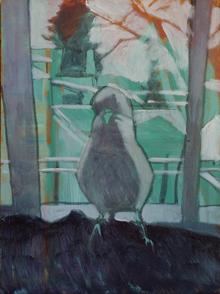
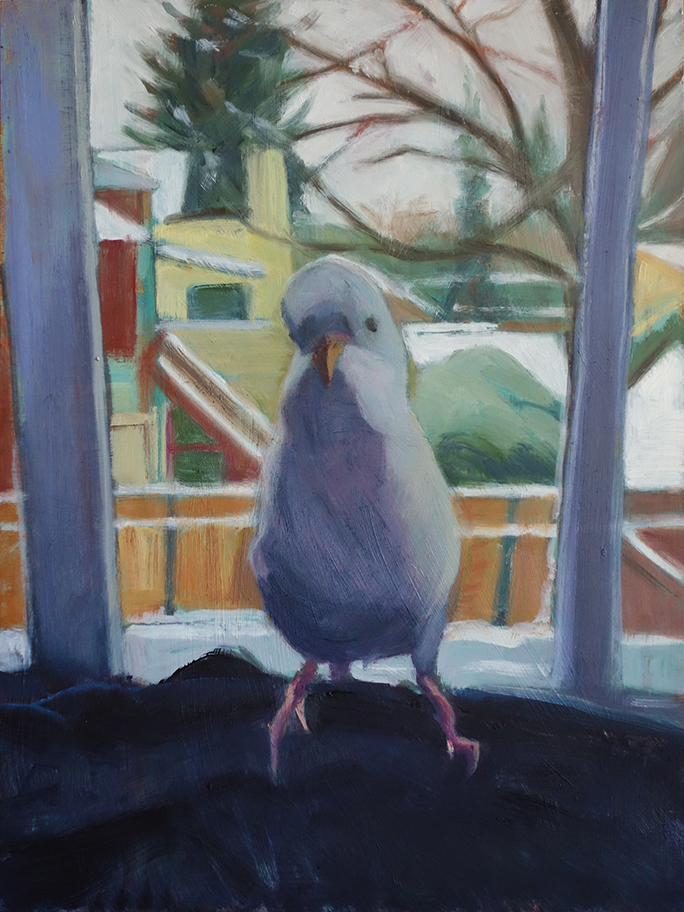
Silhouette of a parakeet

Peepers, 9x12, oil on panel block in stage

Here is a painting over a false start. The green and orange come from when I had played with an abstraction of a sea and beach scene but it was not successful. I thought it might be an interesting color to have underneath this portrait of my daughter's parakeet taken in winter. The white shapes are the sky and snow on buildings and fences. I want to get some snow scenes done in time for winter so this one was just to see what I can do with a silhouetted white parakeet against a snowy background. His attitude is already in evidence, that is for sure. He is very curious.

Peepers with color added, 9x12, oil 2nd stage

Here is with some color added and filling in the shapes I had blocked in above with the white. He is still looking a bit plump for such a little guy so I tried to shave some weight off of him and yet keep the overall shape. He has a deformed foot from being in a large cage with so many other birds. He had been attacked, probably for being different since he was a totally white parakeet. He now has some black on his wings and face and a blue belly. Every time he molts, more color is added, if incrementally.


Finished?, 9x12, oi on panel

Read Full Post


Wishing you all a Happy Thanksgiving

Green and Orange Pumpkins, 14x18, oil on canvas

My neighbor is married to a minister. Her mission is to provide food baskets to a number of families each week during the growing season. To that end she has gardens all over this neighborhood as well as many other neighborhoods throughout the metroplex. However, she does not grow raspberries and I do! She and her daughters pick my raspberries and in return I get a pumpkin pie pumpkin when she harvests them. This year she had this one greenish blue pumpkin and wasn't quite sure what to do with just one and then she thought of me...I had to paint this portrait in short order as I had little time between when I received the pumpkins until now. The orange pumpkin is now ready for pie but I am not sure what to do with the green pumpkin except to use it as a decoration for Thanksgiving. If anyone knows different, please let me know. My intention is to give this painting to her in thanksgiving for all she does for others. I know that they struggle themselves.

I painted this over an old varnished painting. I did remove the varnish but it leaves the old paint tacky unless you let it dry again. I did not have time to wait for it to dry so what that means is that the new paint melds into the old and light colors become darker and dark colors get lighter. In other words a lot of mediums show up. I put many layers on this to get it this "light." I do like painting on the tacky surface as the paint drags across it and lets the old painting show through.

Read Full Post


Ready When You Are - Tools of the Garden


Ready When You Are, 12x9, oil on linen panel

Monday I was invited to a group day of painting at a friend's house in Conifer. Amazingly, it was a perfect, beautiful spring day in the Colorado High Country. We have had few and far between days in the past several months where we have not had rain, so this was a big deal!  I have not painted plein air since last summer so that was another "big deal."  The place was so green. So naturally Victoria has to be different and paint something so not in keeping with a day painting in the mountains! No aspen trees for this girl. I found that the back wall of Karen and Barney's home had a line up of gardening implements. I mean the whole side of the house had this perfect lineup of tools. I picked these four to concentrate on as I liked the shadows.

The wall was raw wood. I had set myself the task to use as little white as I could possibly get away with. This was a bigger challenge than I thought and definitely took a concerted effort on my part. For instance, to paint the wall I used burnt sienna and a little dab of two yellows (cadmium lemon and Cad yellow medium). Then I grabbed the white! NO! By not adding white to this mixture it meant that the red handles had to be dealt with in a different manner too. They could not read darker than the wall which is in the light. Adding white to red does not make a lighter red, it makes variations of pink. I added a tad of yellow to the red enough to keep the red (and not make orange) and a smidgen of Naples yellow which lightened the mixture but did not weaken the red. It made me realize just how much I rely on white for value shifts. I needed light colors for the other two handles and what is in the light on the metals so I did use white. Keeping white to a minimum makes for a much brighter painting to be sure.

A friend of mine had said my paintings tend to be "chalky" so I took it to heart and am doing my best to address this. That was why I am working on this as my summer project. She is right. I recently added Zinc White to my palette as it is semi-transparent while my normal white, Titanium is opaque. I may try Flake white too. It has lead in it but is also semi-transparent. It helps lighten without deadening the color it is added to. It is my summer project for myself. I rediscovered an artist that I am using for my mentor in this endeavor. Aldro Hibbard. His colors are so vibrant.

It was a fun day. I do like painting outdoors. It was lovely to see some old friends and to meet new ones. It is always a treat to see what others do when you are out with a group of painters.

Read Full Post


Pears- for the fun of it

Pears in Blue and Green, 6x6, oil on panel


Pears in Red and Green, 6x6, oil on panel

Remember back in January when I signed up to do the 30 paintings in 30 day online challenge? Well, this week I had these two charming pears in the fridge and I painted them on two different days before work. That was one of my goals for doing the challenge; To see if I could paint before or after work during the week. I don't even mind if I don't do it often, but it is nice to see I can get to my easel if only for 30," from time to time during the work week.

Recently, while reorganizing in my basement to find room for some new canvas's I ordered, I came across some very early oil paintings. So early that they are painted on cardboard. We were cautioned to not spend money on high end supplies while doing the basics. It was our first foray into color after using only black and white while learning values. They have been kept all these years because I really liked them at the time, and believe it or not, I still really like them. They are simple in shape and color but they work. Finding those old paintings made me want to paint simple shapes and color for the fun of it and so voila. Here you have it.

Also while cleaning up for above said new canvas's I realized I need to have a studio sale. It is time to clean house. There will be small studies such as these pears as well as plein air pieces and other studio works. I will keep you posted.

Read Full Post


Apples 3 to One Day 4

I am a day late in posting...life got in the way

Apples Three to One, oil on panel, 6x8, $150

 Here is the 4th painting for the 30 paintings in 30 day challenge. This may be harder than I expected. Although I did not have high expectations to painting every day, I have been painting every day thus far. What is going to be my downfall is photographing and posting every day. I just don't want to take the time it takes to do that on top of everything else. I mainly use natural lighting for photographing my art work. Being that I currently go to and come home from work in the dark this is going to present a problem. I had anticipated this so what I am thinking is that I just may not post during the week much. I will post when I can and will probably skip those days paintings altogether. I am sure I hear a big sigh of relief that you want be bothered with daily posts for a month!

I had already painted today's painting when I wrote yesterday's post so it has 4 apples. I promise that tomorrow's posting is not fruit or has 5 of any one thing in it! It really was just by serendipity that these past three days worked out this way. I set these little gems onto my laptop stand and did this quick little still life.

Read Full Post


Blue and Orange


Painting 3 in the 30 paintings in 30 days. How fitting to have 3 oranges. This was not intentional! I will be off the fruit soon. Since I am also incorporating painting fast into this exercise I am keeping it simple; although sometimes simple does not mean easy! To make a simple composition interesting can be a challenge. I am not saying that these paintings are fine examples of that, just an exercise to get me thinking more about this without thinking about it, so to speak!

This painting is again painted on top of another.  It is meant to improve on what came before. The original and the new are not all that different on this particular painting. I used the same composition, same bowl but of course, different oranges and lighting conditions, as is to be expected. I did not date the original but I am guessing it was two years old. The color theory is blue and orange or complimentary colors.

Read Full Post


Studio Tour - a Peak Inside

Easel in front of North facing windows

Today we take a studio tour since nothing in process do I want to post yet. Here is my easel area. It looks cramped but actually works well for me. I know a chair in front of the easel is not the ideal image of a painter at work, but I forgot to remove it from the scene. OOPS. I have had sore hips (bursitis?) which has made standing for any length of time hard, so I only stand when I really must and then I switch back to sitting when it gets to be too much. And yes, I use color charts. Sometimes I just need help if it is color I may not use in my everyday arsenal.

moving to the right of the easel

Fritz the Wonder Dog was hounding me for a walk or he would never have lowered himself to come into the studio. I think he must be sensitive to the smells as he has never liked to hang out with me here. He will lay in the hallway at the door. In this area of the room is where things are stored. The teak china cabinet I inherited  is full of art supplies. The dresser holds my CD's, extra oil paint and other mediums. The doorway connects to the second studio. The paintings stacked around the room are awaiting attention.

moving to the right again is my desk area

There is a doorway to the hall between the chest of drawers and the desk area. Here is where I do my blog, develop and upload my photos, correspond, and all other computer related tasks. Nothing is level in this old house so the drawers never stay shut...yes, I know I could level the desk...but the desk is solid walnut and it is heavy. I never think of it when I have brawn available to assist. The old radio cabinet to the right is not very useful but I love it. It stores books I am referencing and other things I want close at hand but it does make the area a bit tight. It should have probably stayed with its original finish (and yes, it did have the fabric front on it when we found it but the inner radio parts were gone) according to Antiques Roadshow, but I stripped it to show the beautiful burl wood veneers.


opposite the desk and behind the easel is where I store small panels and found objects

This fits nicely behind the closet door, an otherwise useless space. It has objects I found of interest that may find their way into a still life and small panels for plein air painting. Does anyone know what the metal object is in the upper left hand top shelf?

2nd studio where I gesso, varnish, frame, etc

Moving into the next room is where I do the nuts and bolts associated with my work. I think this room was once a nursery as it is small and has no closet. It was also used as a kitchen when our house had been divided into two units during the Great Depression. While in use as a kitchen, it had a fire! This is one room that now has drywall as opposed to lathe and plaster.

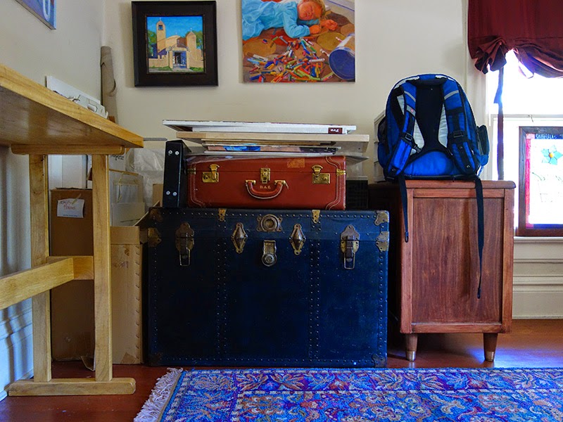
opposite wall in 2nd studio. Trunk and suitcase stores old paintings and frames

We end here with the packed trunk and suitcase. I can't help myself. I would rather have interesting furniture than more space efficient studio furniture. In the trunk are old paintings and smaller frames. In the suitcase are plein air paintings on canvas that never made the grade to be mounted and displayed, but I somehow can't throw away yet. To the left and behind the trunk are various sizes of canvas. I store only one of each size here to keep them close at hand and the bulk of blank canvases live in the basement.


Thanks for coming along on the tour. I hope you enjoyed this glimpse into my world.

Read Full Post


Recycled Glass

Recycled Glass Jars, 12x16, oil on canvas

About a month ago, after plein air painting in the area of Parmalee Gulch, I stopped at a little cafe in Kittredge, CO to see if I could get something "to go" for lunch. While I waited, I was sitting at a bar near the kitchen looking around. Then I noticed this wonderful tableau right in front of me. I don't know if it is the colors, the color harmony or the fun shapes but I just started snapping photos. Then I picked up one of the jars as it looked like it had a price tag on it and sure enough all of this (except the salt and pepper) were for sale from the shop next door. What a brilliant idea. I decided I would regret it if I did not purchase all three bottles, jars or what have you, so I did. They sit on our dining room table where I just enjoy the jeweled tones. I painted this piece just for the fun of it. (They are made from recycled glass in Spain.) I expect you will see more of them in future...

Read Full Post


Sea Shells 2

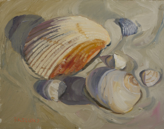
Sea Shells 2, 8x10, oil on linen

Thanksgiving day found me wanting to paint another shell painting outside on my back deck as I knew the weather was beautiful and the forecast was not so sure for Friday. I had time before the turkey had to be prepped and my attention would be needed elsewhere. I opted for an 8 x 10 format to see how it would go and threw in another large shell and a few other smaller shells. This one was a bit more complex adding that more detailed scallop shell. I also thought in the first painting that I did not push the light on the sand enough so I wanted to do that this time. To not lose the nuances of the sand but not to focus so much on it. I got the majority of it in before I called it quits and then finished up a few details the next day in my studio.

Read Full Post


Eggplant #3

Day 3 Eggplant, 8x6, 20" study on canvas board
Eggplant is always fun to paint. The rich colors in one little homely shape-but oh what interesting shapes they all have. I only have 6x8" panels as my smallest size on hand and this one did go over the 15" - I just wanted to carve out the shapes of the crown (can't really call them "leaves" and I don't know the proper term for the eggplant cap.)
I noticed that inadvertently I have a color thing going on here. Red tomato, Yellow pear and now Purple eggplant. I did paint eggplant for the next 2 days which I will not be posting.

Read Full Post


Old Friends Two

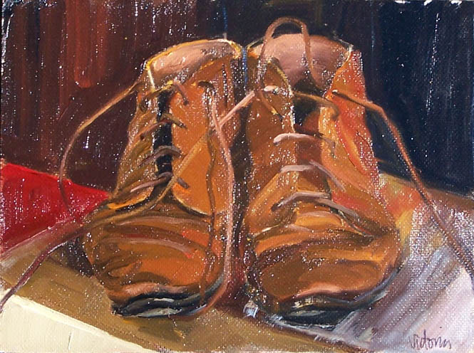
Old Friends Two, 10x 8 oil on Linen

I was stunned by how many people commented on my old pair of boots painting that was hung in the museum show. It was always a personal favorite of mine, but I really did not expect that response. The painting sold at the opening reception and at least 5 people told me they would have bought it had it not already sold. I still have those old boots so I pulled them out to see how I would see them now as opposed to 3 years ago. This is a larger painting at 8x10. I purposely did not look at the photo of the original painting so that I would not be influenced by it. Very different yet the same look to the boots. I see now that I had put the boots up at eye level on my table top, but in the new one I kneeled on the floor and had the boots on the rug.

Old Friends, 6x9, 2008, oil on canvas paper, sold

Read Full Post


Topics

Archives