Blog


The Pears have it

Last week a bag of little red pears were on a manager's special of $.97 for 3 pounds! How could I pass that up? The first thing I did with them was to do some continuous line drawings. I started doing continuous line drawings because it is a good reminder to look at what you are drawing not at what you are doing so much on the paper. I had done some eggplants and clementines the week or so before and had so much fun doing them, so I am trying to do some every day or so. 
Here are the pear sketches. As with the eggplant, I ended up doing a painting. Each of these sketches takes about 5 minutes or so. No more than 10. So really no excuse not to do something every day.


#1


I don't always add the shading but it helped to keep my pencil on the paper to do so with this set up.
#2
I thought I had done more than one from this perspective, but I only have one. I know I thought about it. It gets the creative juices flowing to play around with the set up.
#3
I did lift my pencil to do the solo pear but otherwise each section was done without. I dumped these out on the table to see what it would look like.
#4

The drawings lead to this little 6x6 painting. Which was great fun to paint.


#6

Then I sliced them all up and dried them~ dried pears are the best and still so beautiful.


Read Full Post


Marketing for Artists

There is a new class starting in March 2021 at the Art Students League of Denver (ASLD). I was offered the opportunity to take it along with the other artists in the Cherry Creek Art Gallery. We all signed up! It is called Practical Marketing for Artists. It is not yet listed on ASLD website (as of 2-15-21) but Rose Frederick says it will start March 3, 6-8 pm. We took it via Zoom so I imagine that is how it will be presented again. Here is the phone number to call ASLD for information: 303-778-6990.


The course we took was loosely based on her e-book which is available on her website for download when you subscribe to her newsletter. Our class ran 1.5 hrs over 6 weeks. Through our feedback she has extended the time per class as well as the length of the class. We had homework every week and some of that homework required way more time and energy than we had expected. That being said, it was well worth it for those of us who really did want to make the most of her expertise. Our websites were looked at and critiqued by another student in the class, and then talked about in front of the class. This was hard on some, but it was a valuable look at what worked and why, and what doesn't. Some of us thought her suggestions not apropos for artists, but others ran with her suggestions. As with any class, take what works for you and don't worry if you don't feel her suggestions fit your personal style.

I am not sure how this next class is laid out, but I do hope the class that stumped most of us and made us work! will be a bigger part of the new format. It was to examine our values: who we are, why we do what we do, what is important to us, not just as artists but as individuals. This lays the foundation from which we then base not only our website (mission statement, about page, artist statement), but also our social media (SM) ’campaign.’ I am not sure ‘campaign’ is the correct word, as we are all left to do what we want with the information provided. But this initial hard work gives direction to all we put out there. We all do SM to different levels.

The majority of us had a very generic artist statement. By that I mean it could be anyone’s. It really didn’t say much about who we are except in a very general way. Made to focus on our values, the new, improved statements actually differentiated us in very distinct ways.

I did not save my original artist’s statement to be able to show you the difference. Lack of foresight in writing this article or embarrassment, who is to know? Suffice it to say, I can’t give you the ‘before and after’ as I so like to do with my paintings. I do highly recommend the class if you are interested in taking your promo pieces and marketing to a new level.
Read Full Post


inspired by another artist's blog post

A blog post from Oil Painters of America came into my inbox the other day and the title caught my eye so I did open and read it. The title was Becoming a Better Realist Painter thru Abstraction or something close to that. I do believe that to be true but I wanted to see what this artist, Larry Moore, said about it. I found his article very well thought out and pertinent. Since I have not been at my own easel much this summer I decided to start doing some of his exercises to get the juices flowing. I started with the continuous line drawing. It has been a very long time since I played with that. Here are my attempts. The first two were with a sharpie pen, hence the spots on the following pages before I switched to pencil. His examples were more simplistic landscapes and I chose flowers in my garden. Flowers with one line is a challenge to be sure but it was a great exercise. The last one is of African Violets of which I had hoped to get some of the leaves in but I could not figure out without lifting the pencil. It is easy to paint yourself into a corner if you don't think it thru ahead of time and that is part of the challenge. As I wrote this I now realize a way to have done that but my logical mind got in the way. I just didn't figure that out until now...just do it! Go through the flowers or whatever it takes. That is part of the abstraction and letting go to see what happens. Happy shapes!


The next day I decided to play with abstract in oil. Here is my first go, where I painted over a plein air painting. It is not finished yet but you get the idea. The inspiration for this is from a photo a friend of mine from the 6th Grade when we lived in Orleans, France posted on FaceBook a few years ago. It was her father's collection of the different toilet papers from his jaunts into local toilettes. Who would have thought to do that? Pure Genius. I actually laughed out loud when I saw the photo as I remember all the different colors and textures most of those textures have never touched most American bottoms I can tell you that for a fact. Those shiny brownish ones were more like waxed paper than not. This is not something one forgets. I still have the horror of having to use what we called a "turkish" toilet and essentially consisted of a hole in the ground with two pads either side of the hole for your feet and only the shiny waxy toilet paper. One square at a time. I would say the average size was 4x4 or so. And no door. I could look outside to the parking lot. Not fun for a 10 year old girl. So who thought an abstract could bring back such fond memories? I always wanted to paint that memory she sparked. I still want to add some layers to it to see if I can pull of the translucent aspect of the waxier papers. The pink and blue were more like thin paper towels. None of these came on a roll.
on that note I will close for today...

oh what to name you? 12x9, oil

Read Full Post


An Aha! Moment

Last week I read a daily essay/meditation that comes to my inbox. Last week's theme was on art and creativity. Each day had it's own thought on that subject, but Friday's theme was what caught my attention. The title was "Unconsciousness Awareness."  It resonated with me because I had shared some photos of some paintings I was working on with some friends in a social situation. I have been very excited by my new work after spending 2 weeks in Greece and had three paintings I was working on from that trip. Someone in the group really liked one of the paintings in its very early stages and asked me what it would cost when finished. He asked about it again the next week. In that intervening week I had not put a brush stroke to its surface. I had not even looked at it. I attributed this hiatus to being on another house project and no time for painting, yet I was working on other paintings, so that could not be the answer. After reading this article, I realized that I had lost my intuitive or 'unconscious' approach because now I was "afraid" of ruining it! Has anyone else had that happen to them? I think it has happened before to me, because I have found it odd when what seems to be "all of a sudden" I lose my mojo.

Read Full Post


Attachments

I figured out why I was so stuck on one of the paintings I started in January this year. It seems to always be the area one is attached to that is holding up progress and/or one's unwillingness to let go of said area. So even though I haven't finished this piece yet, I wanted to post it to show how attachments you need to let go of, hold you up.


Last Saturday I had dinner with a writer friend of mine. She was talking about a new essay she had written for her online newsletter. She was lamenting that she had to cut the best line out of her latest work to make the rest of the article pull together. How her attachment to that one line was keeping it from being a cohesive whole. But that maybe she could work that cut line in some not yet unwritten piece in the future. I then proceeded to tell her I had the exact same thing happen to me! Except in paint. Her first response was oh how sad! I could not ever reuse it. Which isn't exactly true. I feel that every time this happens there is always a takeaway from it.

This first image is where I had finally roughed in the sky really liking the energy of it. Unfortunately, I put it in after I had already begun painting atop the block-in of the rest of the painting. I remember being intimidated by the sky in the reference, so I was in avoidance mode. Leave it until I am ready or can't ignore it anymore.

When not done in proper order, confusion results

If I had added the sky when the rest of the painting was in the same state (below), who knows where it might have gone, right? My aim is always to keep some of that block-in brushwork but it is so rare, not sure why I keep thinking that will happen.

block in as I figure out shapes and proportions

Here is the painting with the new sky that better fits the rest of the piece. The new sky actually helps the piece overall so much it almost seems like a new painting and yet I feel I was able to keep some of the brushwork I had become so attached to. I can finally go back to the rest of it now that it doesn't feel like two separate paintings. I don't think it will take much to finish. To be continued.

Starting to pull together finally

Read Full Post


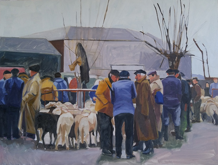
Spanish Sheep Market Circa 1962

the Art of the Deal, Sheep Market, Spain, Circa 1962; oil on panel, 18x24


Here is my latest painting shown below as a work in progress.  I had wanted to do this in a square format but I did not have that sized surface ready when I was ready to go. The image used for this painting was from a slide that was turning orange that I had made into a digital image at Costco. My mother took the photo circa 1962 in Spain. The men at this sheep sale make me think of the Basque but according to her note it was just north of Barcelona, a place now known for its beaches. I was attracted to this image for a number of reason. I liked the composition; I liked the subject and I appreciated the group of men doing business. Each of them taking a unique stand, as it were. Something about a wet gray day and fairly flat light attracts me.


Sketching in on the canvas with colored pencil


Starting the big shape block in


Working on unifying the dark shapes


First wave of color in big shapes


Second wave of big shape value correction


Fine tuning figures and values, 18x24, oil on panel

I am struggling with a name for this painting; The Art of the Deal; Market Shares-Sheep Trading; Deals Going Down; Your thoughts?

Read Full Post


The Rush is On


Starting with the finished piece first and then the explanation for a change. I repainted this piece over three or four days while also working on a few other paintings. It took me a bit longer than I expected as I thought I would only "fix" a few areas. I don't think I left anything untouched except the hair on both of their heads.

2017 The Rush is On, oil on canvas 24x24


2010, oil on canvas, 24x24


2016 showing repair and mounted on board (bad lighting lightened up the overall image)

This painting is 6 years old. There is nothing major wrong with it for where I was at 6 years ago. A year or two ago I had hung it in a place where I could look at it with the thought to revisit it. If a painting hasn't sold, it is always fair game. For whatever reason, it fell off the wall one night - it woke me up- and on it's way down, hit a few places and in one particular sensitive area ripped a substantial hole. I could not decide if it was worth fixing or if I should just chuck it. I researched repairing paintings. So many different approaches. Some said do not patch an area as it will shrink at different rates and then will always looked patched, so reline the whole painting. Others said patch and you will be fine! The repair kits I found were nowhere near a 24x24" size. This particular painting was cotton canvas on the 1.5" profile of stretcher bars. Not my favorite painting surface.

After much contemplation, I took it off the stretcher bars and glued it to a gator board trying very hard to line up the edges of the tear across the front waiters forearm. I filled in the area with a bit of gesso and lightly sanded the area. I could not sand it smooth as the texture of this canvas was rough. I tried refilling the area and sanding again. All I can say is that it is as good as I can get it. It was worth trying to save at this point as moving forward I was going to repaint the whole thing. The structure and drawing are pretty good so it should be pretty straight forward. The major issue with the original version from my perspective today is once again a value thing. So in the redo, I pushed the values away from the middle. Not much color shift overall except in the skin tones. I thought the waiter in the back had too blue gray a skin tone so I lightened up his face overall and to his arm in the shadow made it a reddish blue.

There is something about the original version that I still like but overall I am still happier with the redo.

Read Full Post


Having Fun with old works from July 2015

I found this old draft for a post that I never uploaded. Since it is the holidays and I would rather not post something new right now, I am going to put it out there as originally written with a few added adjustments.


The other day 18 new, large canvases arrived. Two large boxes and one thin medium; and nowhere to put them. It really made me realize I need to move some paintings as I tried to reorganize the basement.

These are the first I grabbed to work on today. I hope to work on the rest during the week as I have time. Some of these don't look so bad in their original state but over the years I have dinked on them, sometimes much to my chagrin.

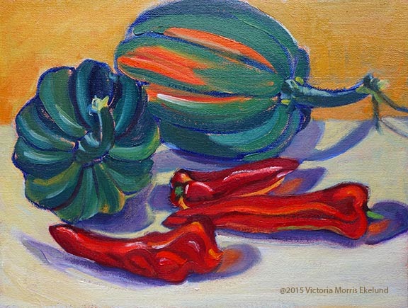
Last Harvest 2003, 9x12, oil on linen
Last Harvest, 2015, 9x2 oil on linen

For the Acorn Squash, I remember when I first did this piece I was trying to create energy; No one has paid much attention to it over the years so I felt I had nothing to lose by reworking it. After seeing the "remake"  however, I think the purple cast shadows are too much of a distraction and I miss the energy aspect. I think this one may get my attention again...

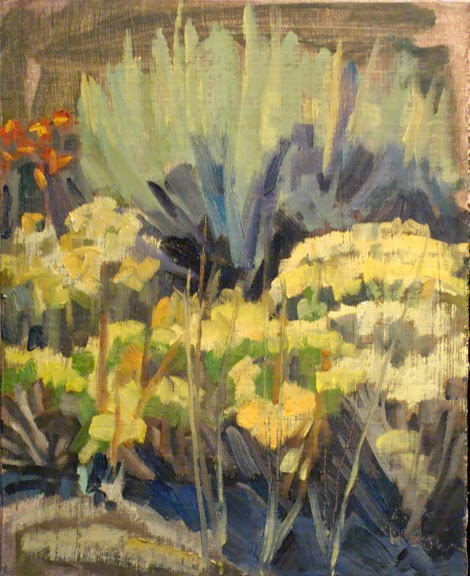
The "Sagebrush" paintings were done in bright late morning sun. Although the painting itself is "not bad" it does not really give you sense of that bright overhead light. That is why I brightened up all the foliage and flowers and darkened down the top part which was not doing its part in the original. I also took some of that orange red of the flowers and wove it through the rest of the flowers for a feeling of continuity.

Sagebrush, 2008, 12x9, oil on linen


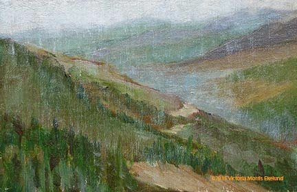
"On Berthoud Pass" we have a decent plein air painting; It does give a sense of distance but not a sense of rain. I was painting in the rain. I also tended at that time to put a lot of color shifts without thinking of the values. If the colors stay within the overall value (value = on a scale of 1-10, white to black) of the object(s) then it gives a sense of unity. My original has strips of color which is distracting to the whole.  A side note on this painting: my mentor, Kevin Weckbach, came to my recent open house and picked this painting out as a perfect example of edges that are working. He knows how I struggle with this particular aspect of painting and he said I did an amazing job and that I needed to keep it not sell it. High praise indeed!
On Berthoud Pass facing North, 2006, 6x8, oil on linen

Read Full Post


Bad Advice?

One of the worst things I think I was ever told when learning to paint by an instructor was to "stop resting on my laurels" and learn to paint. He was referring to the fact that I liked to paint in big bold simplified shapes. Every week he would say what was good about what I was doing and why it worked, but then would tell me now I needed to learn 'to paint' and not be so stylized as obviously that was easy for me. And boy, was it hard to break myself of this viewpoint. 

It was my first formal class in oil painting, which I took at the Arts Student League of Denver when it was located in Lodo on Larimer Street. He started us out in black and white only, then to gray and then moved on to adding one color at a time. Here are two color examples I came across recently, and I still like them! Painted on gessoed cardboard, you can see where the top example was punctured. Being that these are now 30 plus years old, they have held up remarkably well, don't you think? I think they were painted in acrylics, not oils, though.


I had recently seen an artist friend post her new paintings on Instagram and they reminded me so much of my own work way back when. I really like what she is doing. I still paint in bold simplified shapes, but in a more 'painterly' and 'refined' way. A part of me is wanting to go back to the day and revisit flat color. Play around a bit. Simplify and exaggerate.

Read Full Post


Janice Nowinski Workshop Day 2 and 3

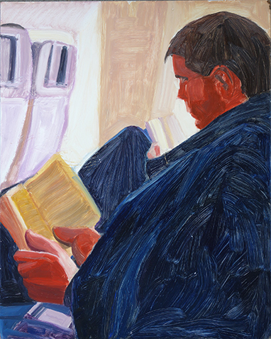
Day Two: I decided to start a new painting and leave the boats for now. I was a bit confused by the end of day one so I brought in a larger board and decided to go graphic with big simple shapes. I used a photo of my son since figures seemed to be the modus operandi. It is a photo I had taken to be part of a series I had started on reading years ago but had been distracted from completing. I started this series before the iPhone came on the scene but I have kept those photo references in an envelope as I add to it in case I revisit that series. NOTE: an ironic addendum to this. In yesterday's WSJ was an article on the decline of summer reading from its apex after WWII. The link to this article by Lee Siegel is not available but when I did a search I see that this is a recurring theme of his. I realized I had read other of his articles on this topic on the decline of reading books.

After quickly blocking the shapes in on this very slick surface I was ready to correct the relationships and start painting. It was suggested that I leave it as is. So I did. After looking at it awhile I think I did not have the right proportion board in relation to the photograph. My math is off, in other words. That is one reason I think the hands are so large. I can't find the photo to verify this.
I think this piece has potential. It was well received as is and deemed complete by the class and by Janice. Not sure I agree. You can judge for yourselves. What I may end up doing is starting a new one instead of my normal reaction to over painting the original. That is something Janice suggested that is starting to make sense to me. So there is a takeaway from the workshop.

Reading On a Jet Plane, 20x16, oil on slick board, 20x16

When I took these pieces to work one of my coworkers really liked this painting as well. Another coworker asked why I was taking a workshop and not giving one? Good question...Amazingly enough I had an email yesterday asking me to go to WI to give a workshop. I'm thinking on it.

Day Three:Another figure. I wanted to see what I would do with editing an image and not being so *literal in its translation. I left out quite a bit from the photo reference and am quite happy with this one. No one recognized it as the wall sculpture outside the Denver Art Museum. I don't think you are supposed to climb it but one day where I was meeting a friend, someone did!

Here are some photos from the critique at the end of the third day:

All three of these paintings were done from black andwhite photos. Nicely done, too.


Sampling of works completed during the workshop.


More critique...love the translation of Matisse.

*Note: "literal" became one of the hot button words of the workshop-not sure we all agreed on what that word means. I had to define the term "graphic" more than once when I used it to describe my work. Another interesting topic for another post. How we think we can redefine words to fit our own definition.

Read Full Post


Ready When You Are - Tools of the Garden


Ready When You Are, 12x9, oil on linen panel

Monday I was invited to a group day of painting at a friend's house in Conifer. Amazingly, it was a perfect, beautiful spring day in the Colorado High Country. We have had few and far between days in the past several months where we have not had rain, so this was a big deal!  I have not painted plein air since last summer so that was another "big deal."  The place was so green. So naturally Victoria has to be different and paint something so not in keeping with a day painting in the mountains! No aspen trees for this girl. I found that the back wall of Karen and Barney's home had a line up of gardening implements. I mean the whole side of the house had this perfect lineup of tools. I picked these four to concentrate on as I liked the shadows.

The wall was raw wood. I had set myself the task to use as little white as I could possibly get away with. This was a bigger challenge than I thought and definitely took a concerted effort on my part. For instance, to paint the wall I used burnt sienna and a little dab of two yellows (cadmium lemon and Cad yellow medium). Then I grabbed the white! NO! By not adding white to this mixture it meant that the red handles had to be dealt with in a different manner too. They could not read darker than the wall which is in the light. Adding white to red does not make a lighter red, it makes variations of pink. I added a tad of yellow to the red enough to keep the red (and not make orange) and a smidgen of Naples yellow which lightened the mixture but did not weaken the red. It made me realize just how much I rely on white for value shifts. I needed light colors for the other two handles and what is in the light on the metals so I did use white. Keeping white to a minimum makes for a much brighter painting to be sure.

A friend of mine had said my paintings tend to be "chalky" so I took it to heart and am doing my best to address this. That was why I am working on this as my summer project. She is right. I recently added Zinc White to my palette as it is semi-transparent while my normal white, Titanium is opaque. I may try Flake white too. It has lead in it but is also semi-transparent. It helps lighten without deadening the color it is added to. It is my summer project for myself. I rediscovered an artist that I am using for my mentor in this endeavor. Aldro Hibbard. His colors are so vibrant.

It was a fun day. I do like painting outdoors. It was lovely to see some old friends and to meet new ones. It is always a treat to see what others do when you are out with a group of painters.

Read Full Post


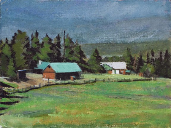
Fraser Valley Meadow - How to...Hold shapes together

Original Plein Air, Fraser Valley Meadow, 2006, oil on panel


Fraser Valley Ranch, 9x12, oil on panel

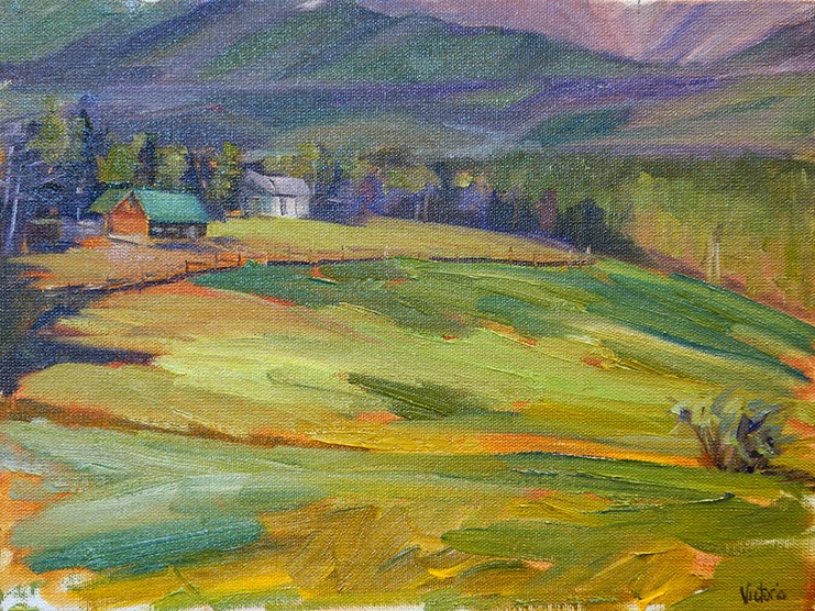
You have to close your eyes on this one! Can you tell I loved color in the original painting on top? (I still do, but I use it differently now.) There is a certain sense of energy to it. BUT, when I got the reference photo out I could not get the proportions of the canvas to make that scene fit as I painted it.  I admit that my recollection of where I was when I painted this "the story" was about the meadow. In this paint over, the story is about the ranch and the setting of the ranch. There is still plenty of meadow and I allowed some of the much loved color to come through.

As I have been going through my box of old  paintings I found that there is a pattern to my painting outdoors. I did not always keep the "big shapes" together. By that I mean, as an example,  in the original meadow, the colors and values are carving too many shapes within the whole so the whole is not sticking together. ie see the difference between the two meadows above. There is a lot of variety of colors within the green but it is holding together as a lawn of grass; in the original you are not sure what it is, although the colors sure are pretty...

As what happens with alot of painters, especially painting outdoors, the values were not strong enough. If you squint at the top painting there are three values, barely.If it weren't for the white house it would be only two, and those two values are very close in range with the exception of the yellow green in the meadow. In the remake you definitely see three values. I carved out the houses with trees. The misty mountains and the meadow are very close in value and they are medium with the sun lit roofs being my lightest value. Even though the trees are technically in the light, they need to be a darker value to group the trees together. The composition still has a nice circular feel to it which was something else I remember drawing me to this scene.

Read Full Post


Studies in 3 Values - Local Tone

Study for Line at the Louvre, 9x12, oil on canvas panel

Here is a quick study using light, medium and dark. I like how it is working but after seeing this cropped version of the scene, I decided to open it back up to show the scope of the line. It was phenomenal how many people were actually standing in line to get into the Louvre on this rainy, gray day. I believe it took us 35 minutes. By this time we were almost half way there! On second thought, what better place to be on a rainy day in Paris? The Louvre is certainly large enough to take in this crowd without much of a problem.

Back to this little study above. The hard part is deciding what to tie each value to. When using only three values it limits your options in some ways and then there are loads of choices to make at the same time. I originally had the umbrella peaking into the image in the upper left corner as a medium  gray catching the color of the sky. It just seemed too blah. Making it black helped the composition remarkably. The arch was almost as light as the sky so in the photo, the trees in the arch showed up much more. But if the arch is "white" then it blends into the sky and we don't get the nice band of gray we now have in the middle or the play of patterns in the dark and light umbrellas standing in front of the arch.

Line at the Louvre, 30x30, oil on panel

 I decided to see what the square format would look like doing three values before I started to paint. As you can see, I divided up the umbrella of the main figure but it is not as effective as it is in the study. I do think the square format gives more of the depth and breadth of the line snaking into the Louvre so I am glad I opted to change the format. It also added more public art into the scene. There is a sculpture right above the woman with the white umbrella and another to the right of the arch.

Read Full Post


Young Artist at work - in stages

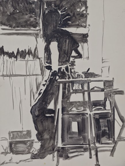
4. Young Artist, color started; 5. above finished dark/light pattern
 
3. block in for painting, 24x18, oil on pane.


2. Study for Young Artist, 9x12, oil on panel
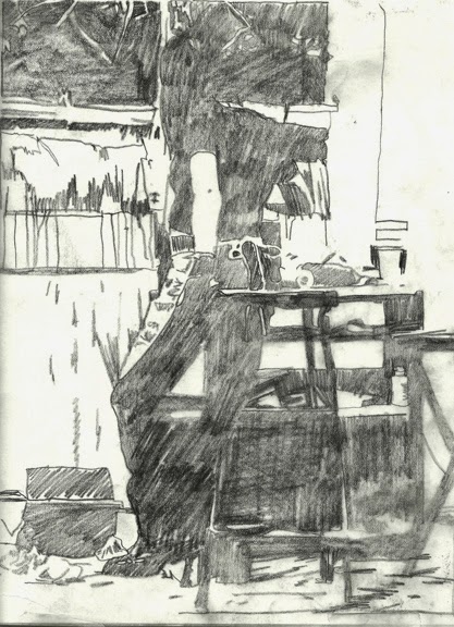
1. study for Young Artist, graphite on paper


  1. This was my first attempt at a dark/light pattern for this painting. (In doing a dark/light pattern you have to think of the mediums values going either towards the dark or towards the light while maintaining a good flow to the pattern created.) In this version I joined the stool and the taboret (storage shelves) together and it seemed too heavy, not enough pattern, even though the colors of the two are very closely matched which made me think to tie them together.
  2. In the small oil study I carved the stool she is holding on to out of the dark shape and also a tube of paint that is standing up on the lower shelf within the shape of the legs of the stool. I decided I had to leave parts of the legs tied to the dark pattern and I am liking #2 better. 
  3. On the full sized board I decided to start the color version with a black and white block in to help keep me within the pattern I had created. I added on more section of the fourth leg into the light pattern but I am not convinced it will stay there. At this point in time, I don't think it adds anything to the whole. 
  4. Here I am starting to add color. In the dark recesses of the taboret is dark blueish red, which reads as a dark as does the blue black of her jeans. Distinct color shifts but not value shifts. This is not going to be a "color filled" painting overall, but you can see what color does to the overall image already. Her shirt is a solid black but I was leaving the black of her shirt that is in the light separate for the subtle value shift that will come. This is just where I ended my day.
  5. This is the completed dark/light pattern although technically I would force a few more areas now that I see the photograph. In the light hitting her shoulder for one. I forgot to go back in and tone that down. It is now too late as I am moving it into a local tone painting. Stay tuned!

Read Full Post


Trail Down Herman's Gulch - Summer

Block in, 18x24, oil on oil paper

Here is a studio landscape that I was determined to try and maintain a more loose or painterly approach throughout. So far so good on the block in. Keeping the big shapes very simple.

Next phase

I tightened up on the background area but still keeping loose up front. I can live with that since I want the distant hills to recede and quiet down. I added more blue to the back hills but they are still retaining too much color variation and not enough depth. The trees had light added to them but still must remain darker than the hills behind them. Played with the path a bit to give it some depth.

Trail Down from Herman's Gulch, 18x24, oil on paper

Here I blued down the distant hills again...it is amazing how much blue you have to use to get them to recede! I added the clouds, still keeping the strokes loose, added some flowers to the hillside and more motion to the path calling it done. Sure love this hike and have always wanted to paint it. There is a view from up top that is still on my radar to paint.

Read Full Post


Mini Drawing Class at the Beach, San Jose del Cabo

Everyone Busy at Work,  minus one

Last month I went to San Jose del Cabo for a friend of mine's birthday. She invited family and friends to join her in celebrating in the sun, on a beach, in January. Hard to refuse that little trade-off to winter. Behind my back via email she announced that there would be an "art class" on the beach so to bring pencils and paper with them.

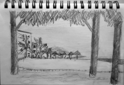
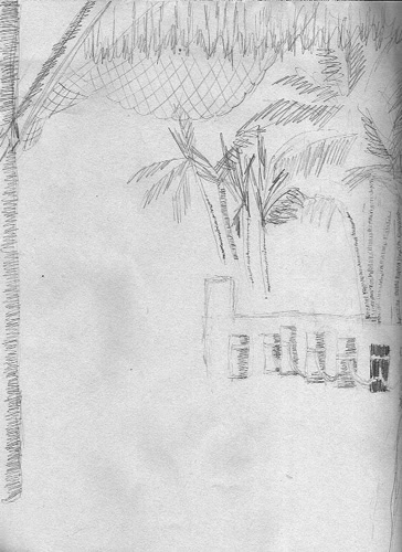
I was told upon arrival that I would be teaching a drawing class, so a time was set, and then changed and set again. Not everyone got the memo for the new time, but we had 7 hearty souls show up. I did a basic demo of using the whole page and not stick your drawing in the middle of the paper unless you drew a frame around it, think about how to compose and to look at the shapes not just the object.(s). I did not specify what to draw. We all then set to work, as you can see, facing different directions. Most of the class was willing to share their work for this blogpost. I was very pleased with what they did and went around one on one to give them more specific guidance. This was a short one hour time frame. Most had little or no art since HS or college, so I was very pleased with their work.

Nice view of the boardwalk. We talked about values and their relationship and also to watch the direction of the sun on the umbrellas.
I talked with her about values. Her spatial relationships were pretty darn good but how to get depth and variety of darkness out of a pencil.
Dale got some good patterns going here in a very nice graphic display.
On this one we talked about perspective and  how to gauge that when trying to draw a row of something as in these posts. You can see where I showed her on the far right post how to use value to carve out other shapes. The buildings that are behind the palm trees were all in shadow with the palm trees so I explained how to think of the whole shadow as one big shape and then bring out some details to separate out the smaller shapes for future reference.
I love that she put in a dog and the life guard tower. This one was monotone when we talked so I showed her how to add depth for a feeling of distance and form.
the only one besides myself to add a figure. She thought her figure looked like a tombstone, so we talked about how to remedy that and also what to do to get more form through light and shadow, although over all the "umbrella" has a good shape to it. The figure was in shade so we made his head darker to break up the solid dark shape and gave his shoulders a bit less of a stiff appearance.

I must have done a decent job with this little mini class as I was told that they want to do it again next year when we all go back for a mid-winter break in the sun. And the people who were "late" want to be included. Can't wait!

Read Full Post


Topics

Archives