Blog


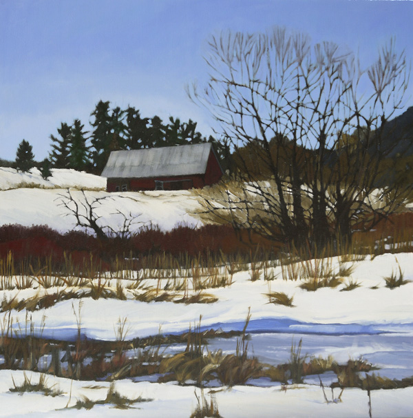
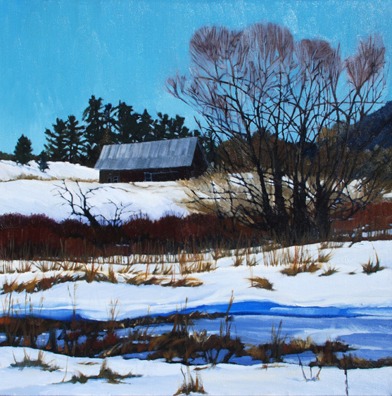
Winter Compostion

   
Winter Composition, 24x24, oil on canvas


Winter Composition, 2007, oil on canvas

This painting was meant to be stylized, but the longer I looked at it the longer I did not like the tops of the winter trees or the blue green sky. The sky did not go well with the more violet blue frozen water. This painting got a lighter, more violet blue sky and simplified tree tops. The barn roof was also lightened a tad and the barn made more red, yet still keeping it in the shadow. A few of the bushes and some of the dried vegetation got a tiny bit of attention. The main difference in color between the two is different cameras as I did not touch the snow, the frozen water, tree trunks or anything in the background.

Read Full Post


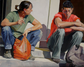
Smokin' Revisited

Smokin', 16x20, oil on canvas
Smokin, 2009

This painting is from a photo I took while on a trip through Burgundy in 2007. (This medieval walled town of Semur was really a neat place to stop.) I decided that his face still did not read as well as I would like it to; so my intent was to fix that. Well, once I got it on my easel I saw a myriad of "issues." The only things I did not touch were her jeans and shoes and his shoes. Everything else was redone. I started with the wall that is in full sun and brightened that up. I then redid his cast shadow and the steps they are sitting on. I decided to work on her first, starting with giving her a neck. I hadn't realized what a bull neck I had given her. I both lightened and darkened her hair giving it more form. From there, her shirt, adding more variety of color and form. The shirt then reflected into her face where I then went in and softened the planes of her face and neck. Her arms and hands needed the same thing, and also more color (red!) in between her fingers.

On him, I had noticed his jeans didn't read quite right; what was in the sun needed to be lighter and what was in the shadow needed to be darker; the reflected light bouncing off the wall didn't work as well as it could, so that got fixed. On his shirt, I realized I had made the neck of it too high on his neck, so I took that down and did some other minor adjustments. I realized that his head is in full sun, and yet I had his hair as pretty much a solid dark, so he needed his curls put in. Not quite ready to do his face, I simplified his backpack and the started on his arms. Once that was done, he got a much needed facelift. In the original I had tried to simplify the shadow side of his face, but in doing so, I had not given him any features at all. Very amorphous. Still wanting to keep that one big shadow shape, I was able to give him a complete nose and set of lips. To be fair to myself, this painting was done when I was trying to go back to my graphic roots, so the goal was to keep the shapes and forms more flat.

I can't decide if I am giving too much information out in these before and after's. If I should just post the new version as a new painting and forget the "before" version. My thought is that any artist struggling in their own work see what is possible and that there is almost always hope; from the viewer's perspective, my intent is to educate. If I talk about why I am making the changes, that the viewer can learn how to get more out of any painting they come across and become more discerning. Any and all feedback is always welcome!
Read Full Post


The White Alley or Duffy Roll Alley at 1300 S. Pearl Street

White on White final, 12x16 oil on canvas panel
White on White original, 2010

This painting was originally done with a white on white theme. I purposely went for everything tending towards white which means lighter than normal. Kevin had critiqued it saying that the whites were too much the same white and that I needed to add more color to them. Just enough to give them a yellowish or pinkish or whatever-ish tint. Along with doing that, I also strengthened the contrast as I would in a normal light and shadow painting.
I started with darkening the alley road. I decided to add the darker band  in the road to draw the eye back in to the painting; leading the eye to the slanted roof line and back to the house; next came color added to all the south facing walls, getting lighter from left to right; the shadows were then given a base color with some reflected light thrown in where needed including clarifying the shadow on the trailer (I am noticing that the shadow of the telephone pole reads a bit warm in this photo so I may need to fix that); weeds were given more color and definition to finish it off. This touch up went really fast, but I think it is much enhanced.

Read Full Post


Touch up of Bobolink Trail Head

Here is an older (re: 2008) plein air piece. The original was painted on an overcast gray and rainy October day at Bobolink trail head in Boulder. I tend to add more color instead of concentrating on the value. I felt that I did not give a good sense of distance in this piece.
I updated it in the middle version not long after I painted the original. The field is reading better but i felt I had lost the unity of the tree in the center and the field vegetation is still a bit chaotic.
This past week I did minor touch ups to clarify the scene. I carved out more sky in the group of yellow cottonwoods in the upper left and made them read as a unit; same with the color of the main tree clump, and the field. The field needed more flat spots of green grass and a pattern to the other vegetation. Even though most of the brighter golden yellows were lost, they show through in spots that are not that evident in the photo and I believe it reads better as a whole.

Read Full Post


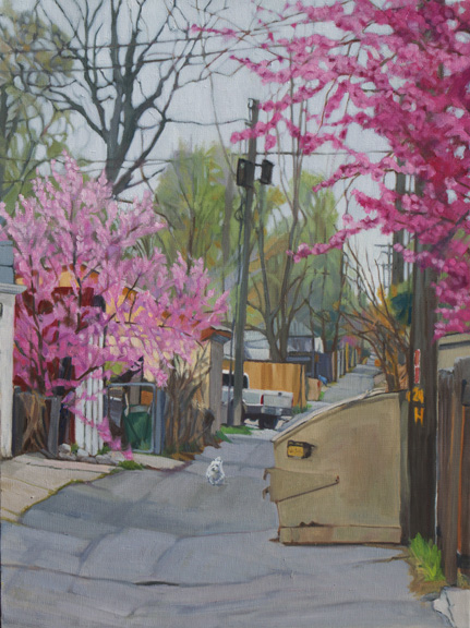
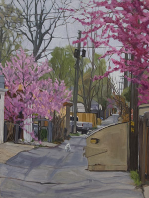
Fine Tuning Alley in Spring

latest


the one that came before

 
This past week has been spent fine tuning paintings. This painting, which has the uninspired title of "Alley in Spring," did not require much, but I ended up doing more than Kevin suggested. His suggestion was to darken the road because it was almost as light as the sky. What I did was to lighten the sky and the trees in the background and darken and unify the road. The road doesn't look that much darker but relative to the sky it is. I also lighten the shadows of the white truck and added a subtle pattern of light to the blooming trees.

Read Full Post


A Solid Show

Last Saturday my mentor, Kevin, came over to view and critique a portion of the paintings I intend to hang in the upcoming Littleton Museum show. I have been holding off investing in frames until he could come over. We all know that paintings we like don't necessarily make the cut, while others we deem unworthy turn out to be winners!

As to be expected, he picked up paintings lying around my studio that I did not deem worthy.  I was surprised as two of them were paintings I wiped off, as in scrubbed and sanded, to "start over." He thought I should finish them and include them! That the compositions were strong and the subjects were cool. Really? A few others he said were ready just as they are. I will keep them at the back of the list but not off the list. I am still wondering...

The actual paintings I wanted him to critique left me with a "to do" list but overall not that much. I got most of them fixed up last Sunday and have only 2 or 3 left to work on. That will allow me time to do a few more pieces that I have in mind. He said I have a "solid show." Wow! Thank you Kevin!

Read Full Post


Topics

Archives