Blog


Month 3-Equalization

Ideally, in a painting that is Equalization as a visual approach, there is no focal point; That the elements are equal in the pattern and the relationships to the whole (ie line, color, value, shape, texture and patterns). So, within the painting, each element is equalized or uniform. So, for instance, if you use the color red as an element, it must be evenly balanced throughout the whole but the red does not have to be tonally equal; ie you can use a red that is different in its general coloring (ie tint, shade, hue or value).  The shapes must be proportionally the same, but there still is variety in the shape (consistency and balance). The shapes will create pattern; texture is the “feel” of it; you can get to texture with brush strokes or by making the shapes/pattern ever smaller.  Keep in mind that the whole painting or area of the painting you are equalizing, reads as one unit.

Ideally, in a painting that is Equalization as a visual approach, there is no focal point; That the elements are equal in the pattern and the relationships to the whole (ie line, color, value, shape, texture and patterns). So, within the painting, each element is equalized or uniform. So, for instance, if you use the color red as an element, it must be evenly balanced throughout the whole but the red does not have to be tonally equal; ie you can use a red that is different in its general coloring (ie tint, shade, hue or value).  The shapes must be proportionally the same, but there still is variety in the shape (consistency and balance). The shapes will create pattern; texture is the “feel” of it; you can get to texture with brush strokes or by making the shapes/pattern ever smaller.  Keep in mind that the whole painting or area of the painting you are equalizing, reads as one unit.
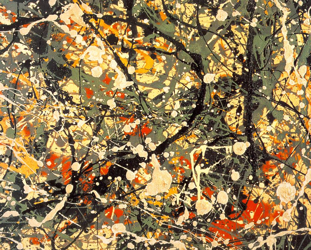
Jackson Pollock example of equalization
Jackson Pollock’s drip paintings are a perfect example of equalization. Nancy Switzer is a good example for pattern and paint quality; Nancy gets good movement with gradation of color that creates a movement and supports the pattern; She keeps each shape and each color shift unique.Her paintings almost all incorporate equalization as the visual approach.
Vincent Van Gogh example of equalization (texture) as an element
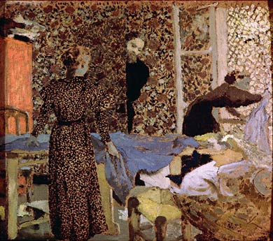
Equalization can also be used as an element within a painting. Van Gogh’s drawings are an excellent reference for equalization within a section. Each section is defined by its texture (which then creates a pattern). When equalization is used as an element the approach is usually about texture and pattern. Texture will have a feel about it and pattern won’t. Think Eduard Vuillard.  Vuillard was about elaborate patterns that were harmonious and usually very flat (local tone; ie the use of three values: light, medium and dark with no obvious light source – think an overcast day). Pierre Bonnard did lots of pattern through layering of paint which created expressive textures.  Gustav Klimt is another who used pattern as an element and did amazing landscapes using equalization as a visual approach.
Eduard Vuillard example of equalization (patterns) as an element
Gustav Klimt example of equalization as visual approach (whole painting)
Next post I will show what I am doing for my project(s) for this month. 
Read Full Post


Month 2- Dark/Light Pattern Wrap Up

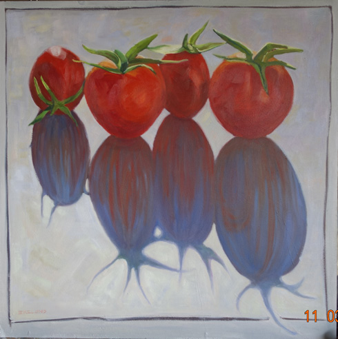
24x24, oil on board

I picked a simple subject for this last month's project since I would miss half the classes while I was in Europe. I did manage to finish it in time, so my plan did work perfectly. It was a  fun project. And it was successful to the assignment. The reference for this painting was from a 2008 newspaper cover story on, you guessed it, tomatoes!  The trick was that in order to get the painting to work as dark/light pattern, I either had to darken the tomatoes to match the value of the cast shadow, which was dark purple, or lighten the shadow to go with the value of the tomatoes, which is the direction I took. In order for dark/light pattern to work the darks must be tied together in value. In the light value, which is the whole background, I worked on gradation. Starting cooler and darker in the upper right hand corner and moving diagonally across to the lower left got warmer and  lighter.

At the critique, it was suggested that I try using dabs of paint for the background to work the gradation in an equalization pattern, which I have done. (not in this photo) But it makes the tomatoes and shadow too different so now I must go back and repaint them. Once that is completed I will repost the results side by side to see the difference.

Read Full Post


Recap of Museums Visited - D'Orsay

Another special exhibit was to be had at the D'Orsay Musee while we were in Paris, Impressionism and Fashion. I had read about it beforehand in the Wall Street Journal, and this was the selling point to get my traveling companion to go with me, as she is all about fashion, even in the historical context of this show. Impressionism and Fashion will travel to the Met in NYC from Paris, but many of the clothes will not go as they are too fragile to travel. It was a much more extensive collection of the fashions of the day then I expected, but you could really see how well the clothes were painted. I am eternally grateful that we are not subject to the corsets those women had to wear, or the day dress versus the dress for outings and dinner. But we definitely lack the feminine that the women of that time had in spades. The paintings themselves included many I did not know, but I did not write them down, and no photos allowed. Beautifully handled, that I do remember. A Sargent in particular, Renoir, a few from Manet and a Morisot.
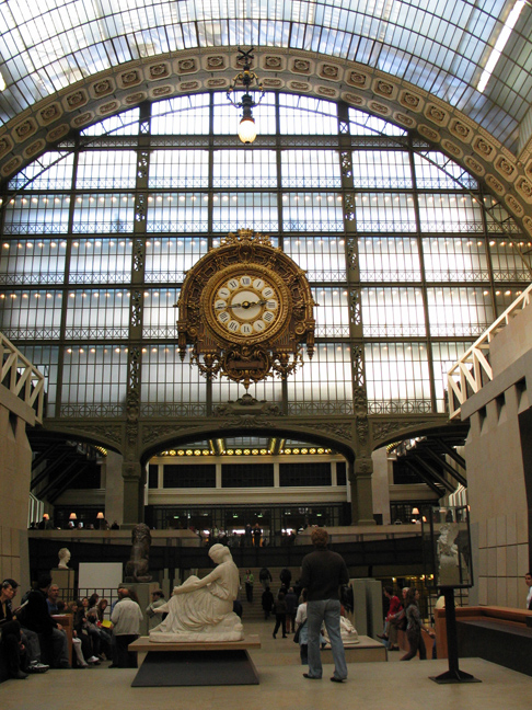
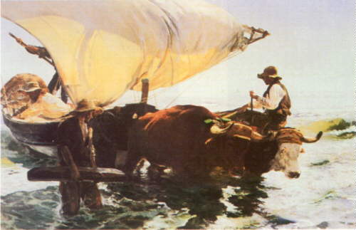
We also did a quick tour of the upper floors. The one painting I had wanted to see was no longer hanging (Gustave Caillebotte, The Floor Scrapers, none of these images come close to the "being there" this painting gives you), but there was a Sorolla that assuaged my disappointment. The reproduction below does not do it justice, but it gives you an idea of the light. The D'Orsay is still one of my all time favorite museums.

Return from Fishing, Joaquin Sorolla y Batista

Read Full Post


Month 2, Day Two; Dark/Light Pattern

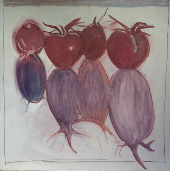
Block in for Long Shadowed Tomatoes,  24x24, oil on board

I missed the lecture for the second day, but had started my next painting last week. I was able to get the tomatoes blocked in but wiped the shadows off a number of times so decided to put them in thinner until I could get the shapes right. You can see the outlines of where I have been. I will miss the next two weeks so you will get a break from instruction. Here are my notes on dark/light pattern.

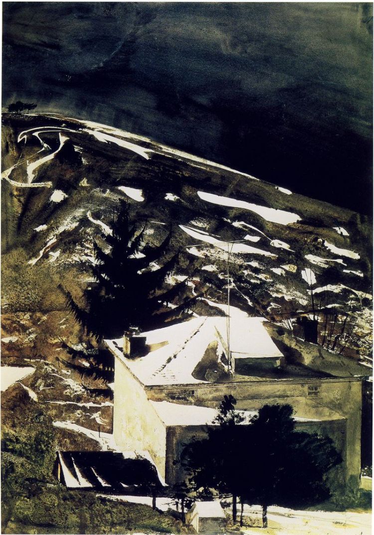
Light shape and dark shape-one shape will be a pattern (in my project above it would be the dark shape that is creating the pattern). Each shape should have different proportions within the bigger shape. The key thing to keep in mind is the uniqueness of each shape within the whole pattern.When defining the pattern it does not necessarily have to be the dominant shape (see Andrew Wyeth's Wolf Moon below).

Wolf Moon, by Andrew Wyeth. the light is creating the pattern that takes your eye through the painting, yet the dominant shape is the dark.


One of the two shapes will be more tied into itself which will aid eye-flow (or how the eye moves through the painting). In the painting of Andrew Wyeth's, the middle value of the hillside and shadow on the house tie into the dark shape. One way to think of this is that if the main pattern were cut out of contact paper, you could lift one corner and pull the whole shape off in one piece. The shape does not have to necessarily connect in one piece physically as long as it connects visually.

Only two values will be visible (as talked about in previous post). Gradation of values is okay, but that middle value will be tied to either the dark or the light and will not read as a separate value. Right now, even though my shadow shape is lighter than the tomatoes, it will be tied to the tomatoes as one large shape when I am finished. I did talk to Kevin about this today and he said it would be okay to keep the tomato color true to life, just to then keep the shadow that same value. I had planned on going rather dark red on the tomatoes to tie into the dark purple shadow. I think keeping the values lighter will actually be more of a challenge for me.

Read Full Post


Recap of Museums Visited-Louvre


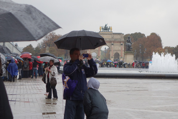
Most people are thrilled to go to the Louvre, but I, stubborn as I am, was not really enthused. I have been many times, and though have seen a very small section of the Louvre, would still rather do something else if I had my druthers. My traveling companion however, was hellbent on seeing the Mona Lisa, and it being a wet, miserable day, I said okay to going. We waited 30" in the rain to get inside and then another 20" to get a ticket. I then waited while she went to see Leonardo's painting. I drew the line at fighting the crowds there! While she was doing that I looked at the map of the different wings and opted to go to see the Flemish section. My photos may not be the best but I took some photos of the pieces that struck my fancy, including of course, those that are more easily recognizable.

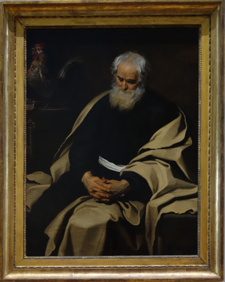
Repentant St Peter, 1651, Gerard Seghers
I really loved this painting. It had such depth to it and fit into the dark/light pattern we are covering this month in the Advanced Master Painting class.

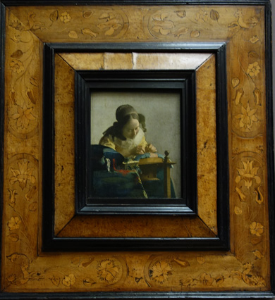
The Lacemaker, 1669, Johann Vermeer
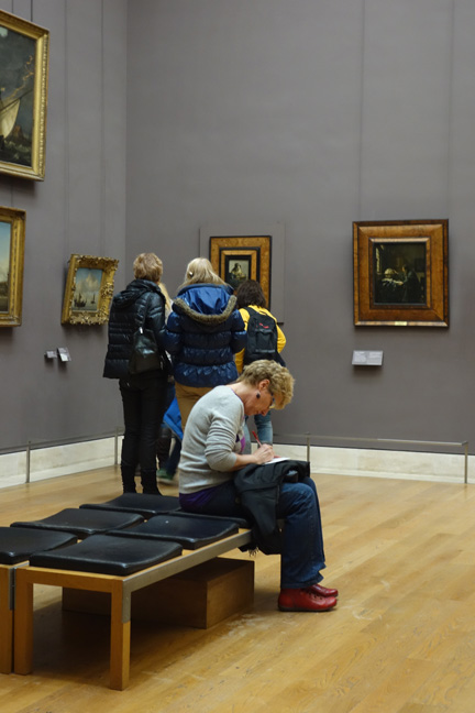
My photo of The Astronomer did not turn out very well. The two Vermeers were on one wall together.
The Young Artist, 1673, Jan Lievens
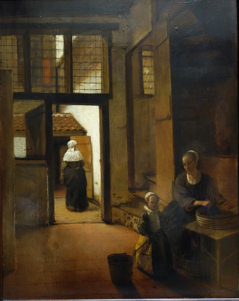
Woman Preparing Legumes, 1684, Pieter de Hooch
(there were a number of paintings by Pieter I liked, but this one was my favorite.)
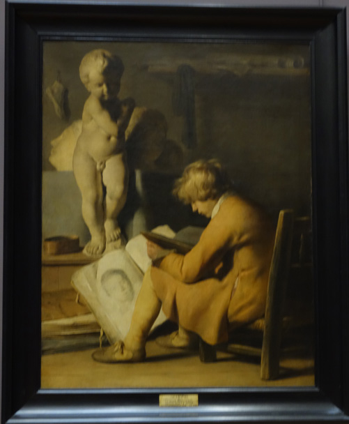
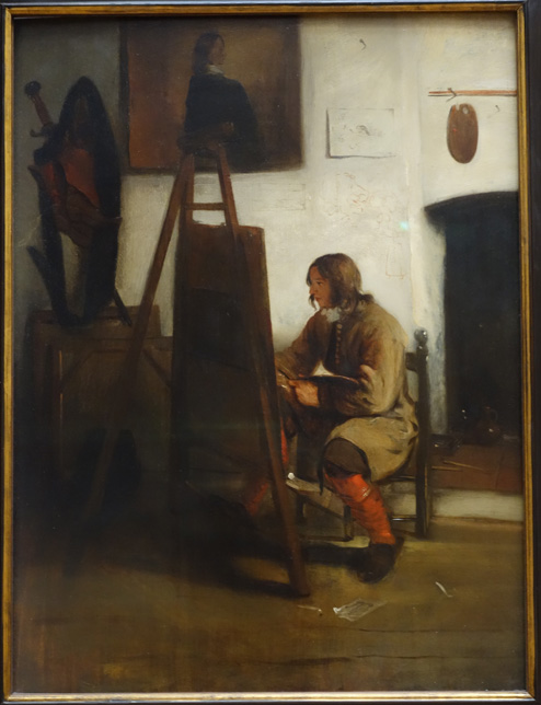
Young painter in the Atelier, 1673, Barent Fabritius

There were a number of Rembrandt's,both portraits and self-portraits. I enjoyed my sojourn in the 17th century very much. My companion wrote postcards under the Vermeer paintings while I took in the rest of Flemish artists. We then watched "Girl with the Pearl Earring" on our flight over the Atlantic to finish our trip.

As evidenced in the photo above and in the others I took, "The Lacemaker" got all the attention It was as if "the Astronomer" did not exist! Such a shame.

Read Full Post


Topics

Archives