Blog


A Little Touch of Beach

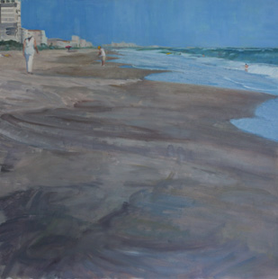
Here is the finished painting from my post of May 19th, before critique, Melbourne Beach. This painting was about paint quality, or as I interpret that, expressive brush work. I spent the morning unifying the sand. Someone had made the comment to me that it looked like two paintings. That I should cut off the top and make a long skinny beach painting with the figures and a bird painting below. That is what told me I had to unite the top and bottom via the beach. I do think it works better now as a whole.

Adriatic Bicyclist, Italy-October, 24x24, oil on board

I have also worked on the painting from March 16th post. I worked on refining the main figure, and the two little anchor figures that form a triangle with the bicyclist. The girls face did not please me, nor did the whole figure over all; she did not need anything major just a little here and there. The figure on the right was too small relative to the guy on the left in the water, so she is now bigger and the one on the left just needed a touch up. I also added the bike trail in the sand. It is the little things that can get you.

Of these two beach scenes, I thought more people would be drawn to the birds, but so far, more people like the bicyclist. As I study this photo, though on this post, I think I may play some more with the sand in the shadow. I think I can unify the whole shape better, to be more pleasing. I learned alot on doing the sand in the Melbourne Beach painting. You may see The Adriatic Bicyclist again...

Read Full Post


Melbourne, FL - Beach with Sea Birds, WIP

Melbourne, FL Beach with Sea Birds, 24x24, oil on board (Day 3)

Our last class project is to paint outside our normal  modus operundi. So if we normally paint with thick paint, to paint thinner; if you normally paint thin, paint with more texture. I normally paint thin and fairly graphically, so I am attempting to paint with more texture and less line.  I am using the brush to allow the strokes to be more integral to the painting. I am having so much fun.

I forgot to take a photo after the block in, but after two class periods I had gotten close to where I wanted it to be. Just needed the birds and the rest of the people on the beach to be added. By the end of day 3 I had the birds added and worked on a finishing the water. I also had added more color into the wet sand while make it all read better as one value. In the beach the sand looks too choppy. Tomorrow, before critique, I hope to have all the rest of the people added on the beach. I don't expect that to take too long.

After posting this I realized that the painting looks like two separate paintings. Ie, a 6x24, if you take the top part with the people, and then an 18x24 for the bottom section, with the birds. I worked on that today to integrate them into one unit so I did not finish getting the people in. Stay tuned!


Read Full Post


Brooklyn Museum- John Singer Sargent Exhibit

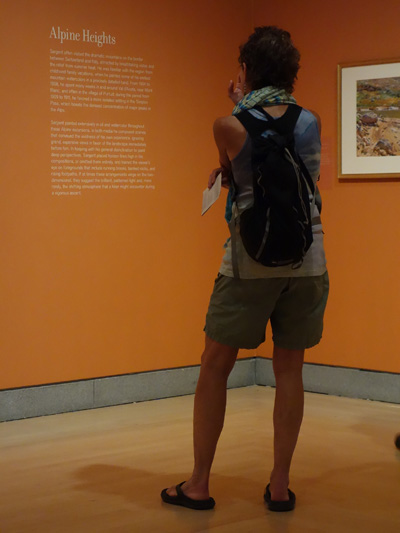
I was recently in the NYC area to visit relatives and to see ART. The Brooklyn Museum of Art had 4 memorable exhibits going on. Normally, one exhibit is more than enough for me, but knowing it was a one shot deal, we did almost 4. Today we will cover just one.

John Singer Sargent was the raison d'etre for going. It was well worth it.  The exhibit was the combination of the collection from the Brooklyn Museum and the Boston Museum; both venues had the foresight to purchase every painting Sargent exhibited at two different times, in NYC. This exhibit is the first time the two collections have been shown together, so there were around 100 paintings, mostly watercolor but about 6 or so oil paintings. The paintings were done in groupings by subject and place. The warm burnt orange of the walls was the perfect color to show off these amazing watercolors. The show was very well curated. We were allowed to take photos, too!

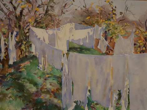
As some of you know, I started a laundry series after spending a few days in Venice, so of course I was drawn to this gem. It is called La Biancheria. The thing that I like about this painting, besides the subject, is how many colors he uses to illustrate WHITE laundry. there is very little pure white since most of the laundry is in the shade or silhouetted.

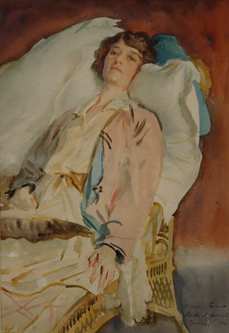
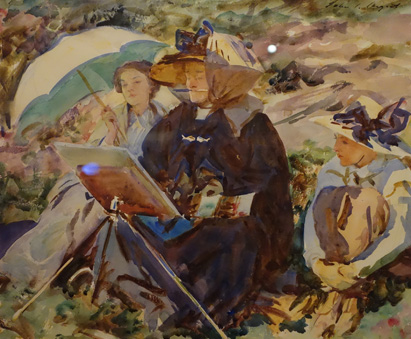
Above: This portrait is of Alice Runnells James; one of many stunning figurative pieces. It was not the top favorite of his portraits, but there was something about it that I did relate to. I think I was ready to lounge myself! And "The Lesson," below. (Please excuse the little bit of reflected light on the back of her easel and one right behind her hat. I did try to avoid those little bits, but sometimes it could not be helped.) Aside for the proverbial brush in her mouth, just how well he can give you a feel for the figures and what they are doing with very little detail. That little triangle of blue at the base of her orangish easel centers your attention yet also deflects to the observers.

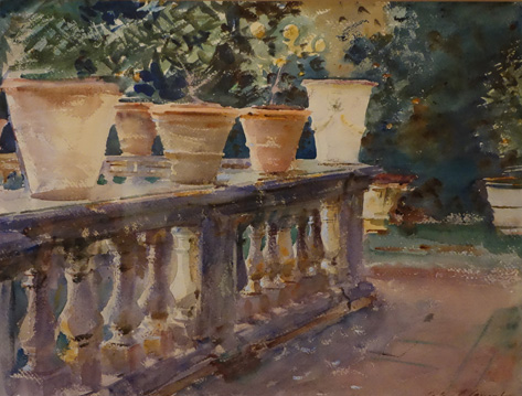
 I do not want to overwhelm you with all the photos I took, and I hardly got them all; I haven't even touched on all the different subjects or places illustrated by this extensive show. I had so many favorites, it is hard to chose what to show you. But here is a fine example of a garden. I think it is called Terra Cotta Pots. The colors that man uses in the old balustrade. You get a feel for the solid nature of it.

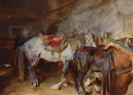
Pun intended, we will end with another favorite. Who would have thought the rear end of horses could be so beautiful? But they are. A fine piece called "Arab Stable."

Hope you enjoyed this little teaser. The show is up through the end of July if any of you will happen to be in NYC. Well worth it.

Read Full Post


Topics

Archives