Blog


Take a Seat

Almost finished!


as it is being taken down to the frame


Finished chair in natural light

Once upon a time, in a life faraway, there was an artist that decided to learn upholstery. This artist had a premature infant that required a full time mom, so the family had only one income stream from dad, a taxi driver. Furnishing the home was out of the question, so this artist became an alley rat. There was much to be found in the central Denver alley's around Cheeseman Park, but most needed work, and lots of it. Taking the very inexpensive Upholstery class at Emily Griffith Opportunity School, these finds from another era soon furnished the living room with wonderful antiques from the 1920's and 1930's and a little side business developed. By this time another child appeared, so still not ready to pull out the oil paints just yet. There were no odorless turps or mineral spirits in those days.

Those infants are now in their 30's and I have not upholstered anything but dining room chairs in decades. This chair was going to be joint project with my daughter, but after 2 years of storage in our garage, my husband wanted it out. Hence the idea to do it as a Christmas present. I had intended to have it done by a professional, but the quotes on it were $330 and $430 and it would take 4 months! Certainly not by Christmas, even though I started research on this in late September/early October. The good news about taking it in for a quote is that I learned it was an Eastlake chair that was mainly manufactured in the Midwest/West during the mid to late 1800's. They were usually sold in pairs. He said this was a higher end chair for the period due to the extra carvings on the top and the piece of burl wood on the front of the seat. He said the name came from a furniture maker in the 1700's who had this idea to mass produce chairs and had designed it to be so. This idea did not catch on until it was brought to the USA by some enterprising soul almost a 100 years later as an affordable, but good looking seating option. I can tell you it is a very hard wood, possibly walnut as it was very hard to tack and staple into!

It was hard to find the inner pieces I needed to work on this chair, so fortunately I had enough still stored in my basement to complete the task. Thank goodness for Youtube as I had not tied springs in 25 years. There are 5 springs in the seat I had to tie 8 ways so that they move as a unit. Only had to tie each one 3 times to get it taut enough, straight enough, etc. There were many aspects of rebuilding this chair that I did 3 times to get it right. The seat was not straightforward with the little extra detail or brace on the side coming off the back. Made that corner very tricky for cutting fabric. I can honestly say I am glad I got it done. It was fun, up to a point, but am I ready to tackle another upholstery project? Not really, at least not yet. But this is where my creative juices have been focused for the last week or so. Hence, it is worthy of a post.

Read Full Post


Having Fun with old works from July 2015

I found this old draft for a post that I never uploaded. Since it is the holidays and I would rather not post something new right now, I am going to put it out there as originally written with a few added adjustments.


The other day 18 new, large canvases arrived. Two large boxes and one thin medium; and nowhere to put them. It really made me realize I need to move some paintings as I tried to reorganize the basement.

These are the first I grabbed to work on today. I hope to work on the rest during the week as I have time. Some of these don't look so bad in their original state but over the years I have dinked on them, sometimes much to my chagrin.

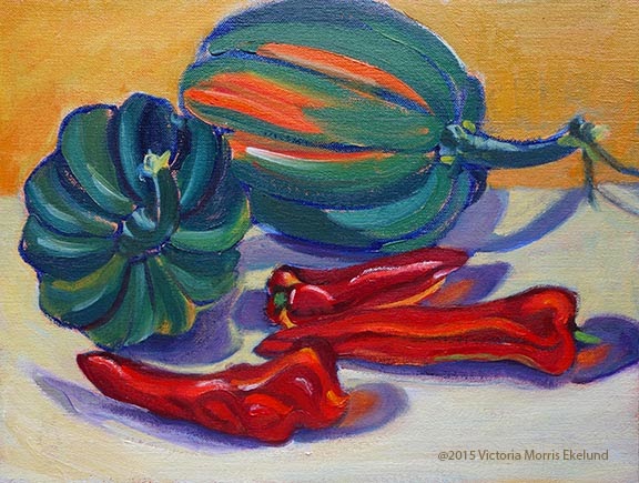
Last Harvest 2003, 9x12, oil on linen
Last Harvest, 2015, 9x2 oil on linen

For the Acorn Squash, I remember when I first did this piece I was trying to create energy; No one has paid much attention to it over the years so I felt I had nothing to lose by reworking it. After seeing the "remake"  however, I think the purple cast shadows are too much of a distraction and I miss the energy aspect. I think this one may get my attention again...

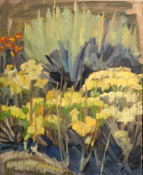
The "Sagebrush" paintings were done in bright late morning sun. Although the painting itself is "not bad" it does not really give you sense of that bright overhead light. That is why I brightened up all the foliage and flowers and darkened down the top part which was not doing its part in the original. I also took some of that orange red of the flowers and wove it through the rest of the flowers for a feeling of continuity.

Sagebrush, 2008, 12x9, oil on linen


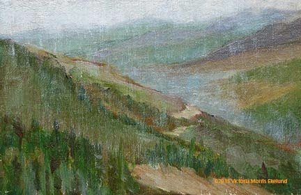
"On Berthoud Pass" we have a decent plein air painting; It does give a sense of distance but not a sense of rain. I was painting in the rain. I also tended at that time to put a lot of color shifts without thinking of the values. If the colors stay within the overall value (value = on a scale of 1-10, white to black) of the object(s) then it gives a sense of unity. My original has strips of color which is distracting to the whole.  A side note on this painting: my mentor, Kevin Weckbach, came to my recent open house and picked this painting out as a perfect example of edges that are working. He knows how I struggle with this particular aspect of painting and he said I did an amazing job and that I needed to keep it not sell it. High praise indeed!
On Berthoud Pass facing North, 2006, 6x8, oil on linen

Read Full Post


Vail Pass Descent

Vail Pass Descent, 30x30, oil on linen, available

I posted this when I had it on the easel for it's block in last April. This post was started shortly after, but I just found it was still a draft. Guess it is time to finish this post up.

I did try to keep that energy and rhythm that I had in the block in going while I worked on it. That is not an easy thing for me to do, but I believe I succeeded on this one. Since the block in went so well this painting took no time at all to finish. Big Shapes; Three Values; Local Tone; what's not to like?

I forgot about finishing this post up way back when that this painting is now hanging at the Framed Image (Happy Canyon Shopping Center, 5066 E Hampden Ave, Denver, CO 80222) through the end of December for the Snow Show. Stop in and check it out if you are in the area.

Read Full Post


Bad Advice?

One of the worst things I think I was ever told when learning to paint by an instructor was to "stop resting on my laurels" and learn to paint. He was referring to the fact that I liked to paint in big bold simplified shapes. Every week he would say what was good about what I was doing and why it worked, but then would tell me now I needed to learn 'to paint' and not be so stylized as obviously that was easy for me. And boy, was it hard to break myself of this viewpoint. 

It was my first formal class in oil painting, which I took at the Arts Student League of Denver when it was located in Lodo on Larimer Street. He started us out in black and white only, then to gray and then moved on to adding one color at a time. Here are two color examples I came across recently, and I still like them! Painted on gessoed cardboard, you can see where the top example was punctured. Being that these are now 30 plus years old, they have held up remarkably well, don't you think? I think they were painted in acrylics, not oils, though.


I had recently seen an artist friend post her new paintings on Instagram and they reminded me so much of my own work way back when. I really like what she is doing. I still paint in bold simplified shapes, but in a more 'painterly' and 'refined' way. A part of me is wanting to go back to the day and revisit flat color. Play around a bit. Simplify and exaggerate.

Read Full Post


Topics

Archives