Blog


Reflecting

 
Reflecting, 24x24, oil available
 

Here is another fresh off the easel. As often happens when I am working on so many simultaneously, a few come to completion about the same time. This one I relate to in that I can sit and watch water for ages, be it the gulf, a brook, a lake or the ocean. Yet it seems like a short time only has passed. Even though I am more likely to walk a beach, I am often pulled to just sit still in silence, watching and listening. I saw this man doing just that one evening and the skimmers flying by just added to the story.

Read Full Post


The wee Western Grebe

Western Grebe, 12x16, oil


This juvenile Western Grebe was seen in Washington Park here in Denver where we often see birds stopping by on their migratory journey. It is rare to see a grebe, though, so it was a day to note. I took a number of photos before this was immediately 'the one' to render in paint. The patterns in the reflection reminded me of  a tapestry or damask fabric. Verifying that it was a Western grebe took me some time before I stumbled on a photo of a juvenile. Then it was Bingo! I knew the beak was right, not that I am a birder.


I started off painting over an ugly snow scene I had done a few years back from my office window on Lowry. Not a beautiful view, but it was 'my' view. I started out figuring out where I wanted the bird, and since I wanted the bird to stand out I flipped the painting upside down so I could keep my eye on it while developing the water around it. . Then started to indicate the movement. This next image was taken under lights in the evening hence the different lighting, but I am using it to show how I started to build up the water thinking in shapes and leaving negative space. It might have been easier to paint the water a solid color and then add the reflection but this is how I see: very abstractly with shapes and negative space.

I was thinking of a title using a tapestry term as the water does have a somewhat damask feel to it. Yet nothing is sounding good to me. If you have any ideas for a title besides my uninspiring Western Grebe, I would love to hear it! Many thanks.

Read Full Post


Another Commission; Another Happy Client!

Jeez Louise. I knew it had been awhile since I have written a blog post but would never have guessed it has been 2 months! Yes, the holidays were in there but here it is Valentine's Day! It isn't because I have been slacking off. Well, possibly a little. I have had house guests as well.


But here I am with a commissioned painting that was finished up in the past week. It is not a normal pet portrait as it has a human in it which takes it out of the 'pet portrait' category, yet I don't want a new category as I don't want to be a portrait artist. This was commissioned by a friend as a gift to her sister for all the help and support she has provided during my friend's very long and trying divorce.

Her sister just lost her beloved dog and since her face is mostly in shadow and a very simplified shape I decided to do this painting for her.
Hollie and Jill, 12x12, oil on linen panel
My main goal was to capture the contentedness of the dog, Hollie. I believe I have caught that. My instructions were to focus on the dog, it supposedly to be a dog portrait. I ended up putting more into Jill than was expected just because I wanted to show the love from her to her dog. My friend is thrilled with the painting. I am gratified to have another happy client especially since she is a friend.

I will start playing catch up and posting more regularly again. Thanks for your patience.


Read Full Post


Life Imitating Art - Baumann

Life Imitating Art - at the Gustave Baumann Exhibit, 36x18
I have been working on two paintings simultaneously over the past several months but they were interrupted because of the welcome pet portrait commissions. I just received the final approval on a dog portrait so it is now drying awaiting varnish.

If you saw the link going around on Facebook from a photographer who took photos of people imitating the art they were looking at, I just want you to know these two paintings were started and this one almost finished, when I saw his collection. I did feel a bit gypped. This has happened to me before...where I get this idea and am in the middle of a painting and then something manifests in some form taking the uniqueness right away. I guess there is nothing new under the sun even when we want to believe it!

What captivated me about this scene is how she is standing like the trees she is looking at as well as the colors matching from her sweater and her skin tone. This one is from a now defunct art museum in Pasadena. It just recently closed its doors. It was a unique concept in that it showed only artists who painted in California, even if they did not reside there for long. There was no permenant collection. It was three galleries and there was usually one contemporary exhibit and two from the past. I had not realized that the Gustave Baumann exhibit was in the second gallery, so it was a very pleasant discovery to be sure! He is best known for his woodcuts of Taos. This exhibit actually included the press he used for his wood cuts as well as examples of the different color blocks. The pictures she is looking at were gouache, I believe. I wrote about the main gallery show, Joseph Kleitsch, if you care to check his amazing work out.

The second painting in this particular series is from NYC. The contrast is striking...to be continued.


Read Full Post


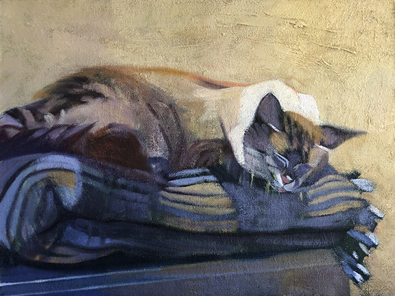
Stormy III or Stormy Napping - cat portrait

Stormy Napping, 9x12, oil

The comment I received from Stormy's owner when I sent him an image for final approval of #3 was:


Purrrrfect!!! She looks so "Stormy" like! That's our kitten who just had her 13th birthday You do such lovely work Victoria!


Can't get much better than that. It is nice to have satisfied customers. I stopped doing pet portraits years ago after one client had so many little tweaks. She was finally satisfied but I was done with that.


To keep with the other two portraits (https://victoriasart.blogspot.com/2019/10/stormy-ii-cat-portrait.html and https://victoriasart.blogspot.com/2019/10/pet-portrait-1-stormy-outside.html) I found an old 9x12 plein air painting from 2008 to paint over. It was a path leading into a dark grove of trees with some tall grasses catching the light. I turned it upside down to start this painting. I drew in white chalk a basic outline. I decided to paint in the background to get rid of distractions and start my building blocks. I liked the strong texture coming through from the path of the painting underneath for the background. Interestingly enough, the wall in the photo was an old textured plaster wall. I recognized it as I have the same in my house.

Blockin start

Next, I started with the bigger shapes of the cat and outlined the blanket folds. I did like the green coming through, as I own a green plaid blanket and it seemed apropos with it already laid in so nicely!

Alas, it was not a green plaid blanket Stormy slept on. Never having to paint plaid before I think that intimidated me more than anything else. So, go to the trusty shape thing and don't worry about what it actually is. The owner doesn't seem to mind that it isn't a perfect rendition of the blanket but is of Stormy. A man who has his priorities straight!


I did have fun doing these pet portraits. I like doing cats, I have decided. A shout out to The Whole Cat and dogs too for the referral.


Read Full Post


Anticipation

Anticipation, 16x12, oil on linen
In the heat of the summer we have been experiencing here, it seemed apropos to dive into something to cool me off! I saw this young boy while walking the beach in western Italy. We were on a tour, and the first day of the tour was a 'free' day or you could add on a day trip to St. Lucia with the guide. We opted to go to the beach by train instead. I had hoped we could go to Cinque Terra, but that was going to make for too long a day, so this was next best. There were not many people in the water as the orange flags were out. I watched his intensity of finding "the" wave to catch. Someone recently made the comment that of course this is not a beach in the USA because he is wearing a speedo! For some reason that never crossed my mind that boys here don't wear speedo type swim suits.

Below is the block in for this painting. As is my want, I picked an unfinished start of a portrait to paint over. I thought you might like to see the big shapes and patterns I use to build upon.


Read Full Post


Evening Glow

Evening Glow over the Gulf, 20x30, oil on linen, available
Seems appropriate with Hurricane Dorian wrecking havoc and approaching the east side of Florida to post this recent painting from Florida's west coast. A bucolic scene if ever there was one.

Here we have the proverbial walking on the beach at sunset. What can I say? It was a beautiful time spent on  a Florida key near Tampa Bay. The light was just perfect. It isn't a dramatic sunset but these calm colors are soothing to the soul sandwiched between the gathering clouds and the still warm sand.

Overall the colors are impacted by the sunset except that one little slice of cool blue water. The long triangular shape of the water is repeated with a bit of cooler sand in the path in the lower right hand corner.


Read Full Post


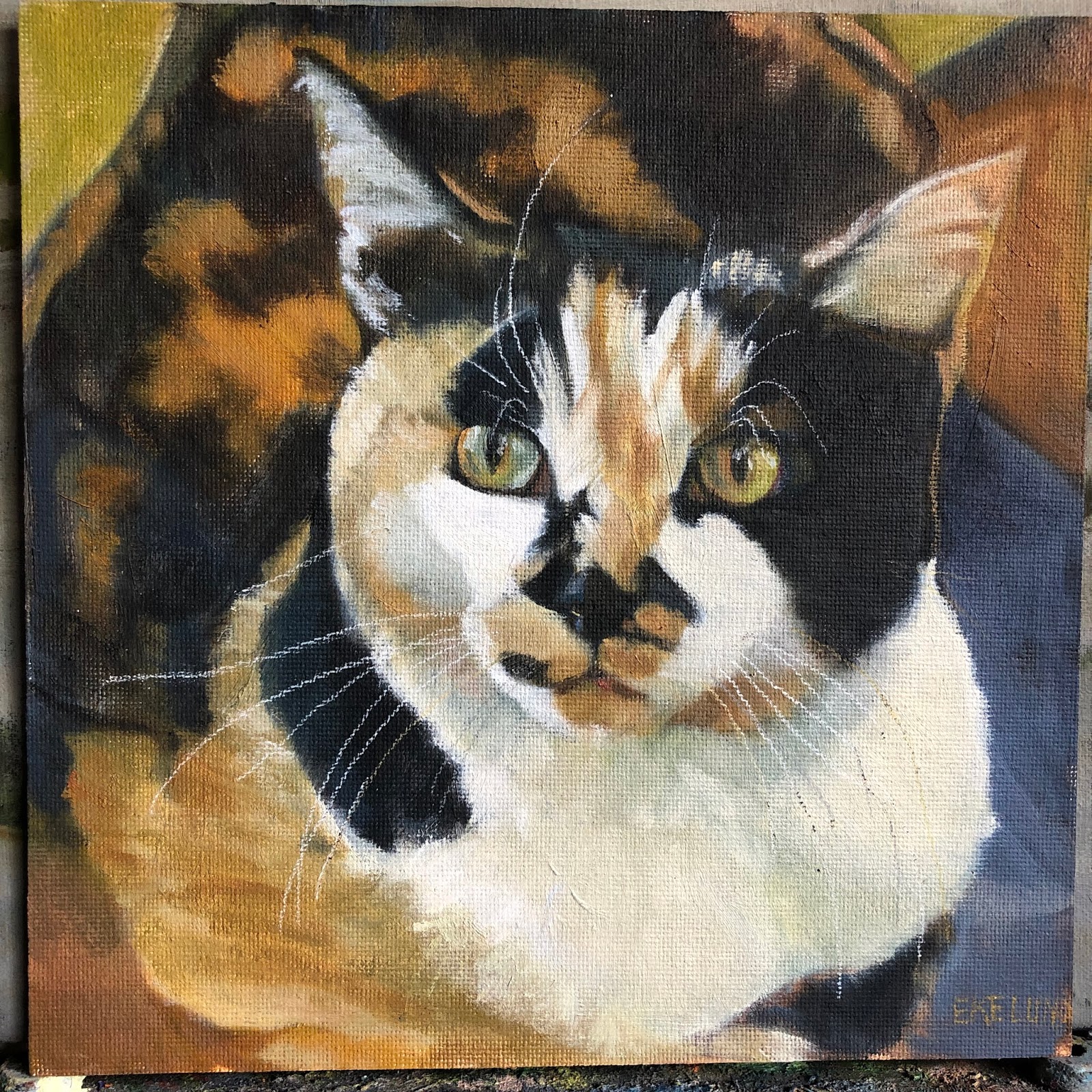
Pet Portrait: Petunia

Petunia, 8x8, oil on board


I just finished this portrait of Petunia, the calico cat belonging to two sisters who own and operate a pet store on South Pearl Street here in Denver, The Whole Cat...and dogs too. For many years now they have kept dog biscuits out for all the dogs who walk the neighborhood and then also give out extra special treats at the Farmer's Market every Sunday during the season. In fact, they downright spoil my dog! He is shameless when it comes to Nancy in particular. Petunia was a fixture at the store and often seen sleeping in the window at their prior location. Last year I offered to do one of their pets portrait because I wanted to give back to them. Petunia just died so it was Petunia whom I was asked to do.

Here is my initial block in on top of a plein air piece I did a few a years ago that was not worth keeping. I have so much fun at this stage. Just thinking of big shapes. This came together really fast and was just flat out fun to paint!

Read Full Post


Post Pop-up Art Invitational

Admirers looking at my wall, 4-26-19

My wall after I was done hanging it, 4-26-19
I wanted to show those of you who were unable to come to the one night art invitational what it looked like. We had to be there to hang between 9-11 the morning of, and the art had to be taken down either after the show or the next morning starting at 8 a.m. I had a plan for hanging my wall and though I didn't follow it, because I had a pretty good idea, it went pretty fast. I wish I had thought to take photos of how the different artists did theirs, as just like when there are a group of artists painting the same subject and each one is so different, how to hang a wall of art follows pretty much the same pattern.
My friend, Jeannie Paty, hanging her wall
It was my first experience with this kind of a venue. It may well be the wave of the future as yet another well established art gallery closes this month in Denver. I thought it was very successful overall. There was a continual stream of people in attendance with the busiest time starting around 7:30. I believe I had the first sale of the evening, the little hollyhock study on my wall above. For an artist, our loyal supporters are always very close to our hearts, and without them where would we be? When a total stranger likes your work enough to buy it, that is a different kind of validation. It is an entry into a new relationship. The man who bought the little piece below the hollyhocks, "Along the Arno," wrote on the subject line of his check "Keep up the great work!" This is particularly poignant for me as I have been struggling with whether I should stop painting altogether. My shoulder has been reconstructed twice and it has been causing me enough trouble that giving up painting was definitely on my radar as a possibility. I received so much validation to keep on keeping on during this show. I will share one more experience: I was standing in the vicinity of my wall during a quiet time where I was not engaged with anyone else. A man and his wife approached and stopped next to me looking at my wall. He said to his wife "Now these paintings tell a story." He proceeded to go through each painting telling the story he saw. I cannot tell you how gratifying that was to hear. I want my work to draw people in to tell a story or open up a dialogue.

I know I was happy with how many people stopped at my wall and really looked and enjoyed. A great big thank you to Cherry Creek Art Gallery for organizing this event.

Read Full Post


Painting from Life-The figure

Sunday evening as I was preparing dinner a friend called me to tell me that the instructor of a week long figure workshop she had signed up for had just let her it was okay for me to substitute for her the first two days of the workshop. My friend was not able to take the whole week off from work. I offered to fill in for her if she wanted me to keep her abreast of what was going on and take notes for her. I offered because my friend spoke so highly of this instructor and she keeps inviting me to join her in these workshops, so here was an opportunity for me to get a feel for what she was saying. We had spoken about it a few weeks ago so when she called Sunday night I had quite forgotten about the whole thing. And the class started Monday morning.


I was able to make it work into my schedule although this week was not a prime time for me to be taking two full days away. What swayed me to go was the opportunity to paint from a model. I have not done that in years and years. Here is the portrait from Monday.

9x12 head study in oil

The instructor had us do a monochrome portrait in the morning. In the afternoon you could finish the portrait continuing with monochrome (5 values using burnt umber and white) or add temperature. I worked on top of my monochrome portrait adding temperature (not color). You can still see just the value on her collar bones and shoulders where I did not quite finish painting over the morning study. All things considered, I was happy with this portrait. Painting from life is a whole different ballgame. I really enjoyed the exercises. The model had such good bone structure too.

Tuesday we did another head study adding color. I wiped that one off as it was fine but nothing I cared to keep. In the afternoon we were to stay with temperature and value alone or add color. I added color. Her skin was so fun to paint. I would have like to have been able to 'finish' this piece but I was happy enough with it as is, until I dropped it on my garage floor face down when I was unloading the car. I had not photographed it yet, so here it is dried grass and all.

12x16 figure study in oil

An artist friend I had seen at the Summer Art Market a few weeks ago invited me to join her at the Arts Students League of Denver to paint long pose uninstructed. This little exercise was just the thing to get me to want to go to just paint from life and be among other artists.

Read Full Post


Icons

Welcome back Me!


A perfect swimming 'hole'

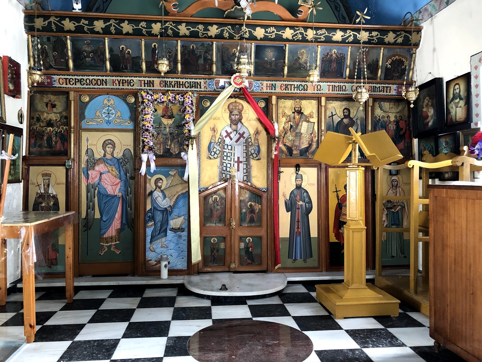
I spent two weeks on a Greek island in the Aegean Sea. The water is every bit as beautiful as you see in all the promotional photos, and more. This will not so much be a travelogue as on Icons. One thing I found out is that there are little chapels all over the island of Milos. I doubt it is unique in this quality, but I don't know. Churches too. Most of them were unlocked and you could stop in for a quick prayer any time of day.


Typical screened front. The alter is behind the doors

I have been contemplating taking an Iconography class this summer from a Greek Iconographer who is coming to do this workshop. It is an intense program, lasting 5 days I think it is, and full days. 9 a.m. to 4 p.m. And only finishing one smallish icon.

With this in mind, I was paying attention to the icons. My first impression is that so many of Jesus and especially the saints, looked so dour. The overall images could be beautiful but still not something that would inspire me. I realize showing a peaceful or holy continence is not necessarily easy. The ones I tended to gravitate towards mostly had an enigmatic smile.

Here is one that I found on a book cover of all places, but really felt an affinity towards. It is called the Blue Angel. The artist has a shop on Oia, Santorini which we did visit. He was there the two times we stopped in to see his shop and studio and he never once said a word to us!

I wish I knew more about who the saints were. This saint above I started to recognize by his robes, his white hair and beard and always holding a book. He never 'looked' the same twice but by these symbols I learned to recognize him as he was in many of the churches and chapels I stepped into.

When in Athens at the end of my trip, I went to the Byzantium and Christianity Museum hoping to see some amazing Icons. This museum took you through the history of the Orthodox Church in Greece so it was a large collection dating back to the 2nd or 3rd century AD. Icons came rather later on that timeline. I did like the cartoons that the museum had on display and these were for large icons. Here is one of Mary and baby Jesus that had color added so it is easier to see. The tracing paper had thousands of tiny holes to transfer to the panels.


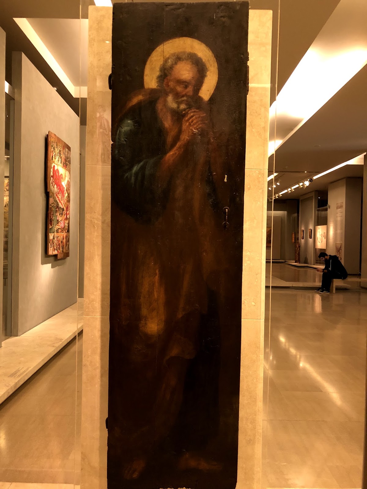
One of my favorite icons in this museum is not a typical one, if it is even an icon. It shows St Peter mourning his betrayal of Christ. It may be a painting on a panel from a church. I think I assumed it was an icon so really did not read the tag. He is more life like than is typical of iconography now that I am writing about it!


I am glad I went to this museum. It was well laid out and had not only religious artifacts but also how the early Christians lived, so included household items, jewelry, clothing, etc. I did not realize that hooks and eyes were in use as early as the 9th century, for instance. It was also like a little oasis in the sea of tourists that descended onto Athens everyday I was there from the cruise ships. There were people there but not many!

Read Full Post


Friends - A Journey Back in Time

Friends - A Journey Back in Time, 20x30, oil on canvas

Friends, here is a painting I did just for me. Another one from my slides I went through that were my mothers from the 1960's when we lived in Europe. I had a bunch of them turned into digital images. This is the second one in the series I have done from her collection. My mom is on the left and her French friend, Beatrice is on the right. This old farmhouse had been in Beatrice's family for generations. I am not sure who took the image, possibly the caretaker or family member who lived there. Since I was a snot nosed brat, I never took my mother up on the invitation to go with them. We lived in Orleans, France at the time, and my mother had met Beatrice at the Franco American Women's Club. They remained friends even after we moved to Germany, up until the time Beatrice died. I visited her when in my 20's and home to visit my parents who still lived in Germany. My mom and I took a road trip to visit Orleans, her friends still there and then on to Paris!

I really picked this image not so much for my mom and her friend, as I had actually thought to leave them out. I thought the composition was well suited for a painting. I liked that it was basically local tone but with a bit of light and shadow. A very diffused light source. I kept the background diffused; I know it is 'not done' to pick out bricks and stones, but that is what I liked about this image. I wanted to highlight how it was built and survived for centuries.

Here is the link to the previous post on the progress of this painting.

Read Full Post


Klimt at the Legion of Honor

Lady with Feathered Hat
The show at the Legion of Honor in San Francisco is a double billing of Klimt/Rodin. For me, it was all about Klimt. Don't get me wrong, I like Rodin's work, but I came to discover and see Klimt's paintings in person. This painting of the Lady with Feathered Hat struck me because it brought to mind one  of Klimt's proteges,  Egon Schiele, whom I happen to really like, more so than what I would think of a typically Klimt piece. But this exhibit was not a show of what most people have in mind when they think of his work. A few pieces, of course, but not overall.

For instance, one usually thinks of females, especially the Kiss or the Woman in Gold. There was one piece that fit that mold, The Maiden, shown below. I took this long view of it to show its size. Klimt painted LARGE! But the size adds to the power of his images. I think there are at least 6 women in this painting, with the virgin in the middle of this menagerie.


My personal favorite works of Gustav are the landscapes. Most people have no idea that he painted landscapes. It said in the exhibit he fit them in around his commissions, but tended to do 3 or 4 per year. They are also quite large, and all of them are square. Below is one of the 4 that were on display. It is of the Schloss were he went for rest and recuperation. You can see the lake to the left where he boated. I took a close up of another painting so you can see the brush work. I was quite surprised to discover how loosely he really painted.


Next up, either Richard Diebenkorn or The Women of Paris from our own Denver Art Museum show...


Read Full Post


Beach Trinity

Beach Trinity, 6x6, oil on panel

I liked this little vignette I saw on a beach in Florida. That it included the dog was a bonus. I am glad that he was somewhat connected to the sea grasses as I did like the family group of three.

This being a simple little composition, I tried to maintain that without getting too involved in details.

Read Full Post


the Critique

Critique, 30x24, oil on linen panel
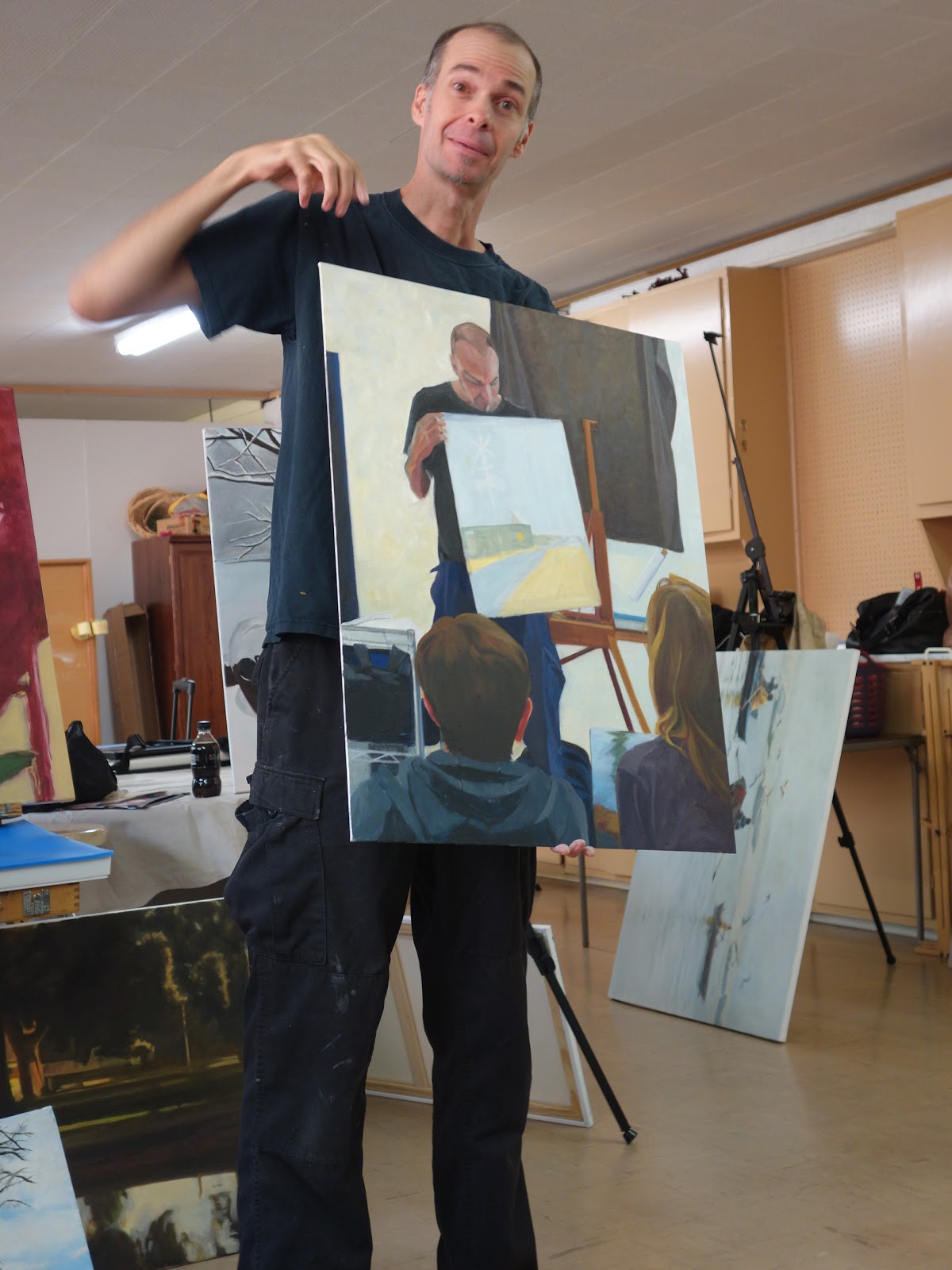
 I don't believe I have posted this painting before. It is really hard to put out there a portrait of sorts of someone so well known in the local art community here in Denver. This is from the Master Painting class I took a few years ago with Kevin Weckbach. I am very grateful for the time I was able to spend under his tutelage so the last thing I want to do is put a bad painting of him out in public.That happens to be my easel behind him with my nifty tennis ball tube turned brush holder hanging on the wall. People who have seen this painting ask if that is me sitting on the left, but alas, no; I took the reference photo and then used it as a class project for dark/light pattern.

I have explained dark/light pattern before so to briefly review what that means it is to find a pattern either in the light or the dark values and then push the medium values either to the light pattern or the dark pattern. This one I used the darks to carve out the light. The dark values marry to one another to create a circle that moves the eye around. To do the assignment, for instance, the brown hair highlights of Tomiko on the left were toned down so as to not be disrupted by her highlights and to blend from Kevin's black shirt to his navy pants to her brown hair, etc. Her sweatshirt was overall a darker gray to unify with the darker areas of her hood folds. Kevin's blue cargo pants were overall darker and flatter too. I brought the mediums back out after the critique but still keeping the pattern in mind.

The other things I liked about this composition were the repeating square shapes and the angles both in the painting being critiqued and the easel and the brush holder. That is what we call the "abstract quality" and in this case, help guide the eye as well.

Here is Kevin critiquing the start of the painting where you can see what I was talking about marrying the values.

Read Full Post


Reading on a Jet Plane

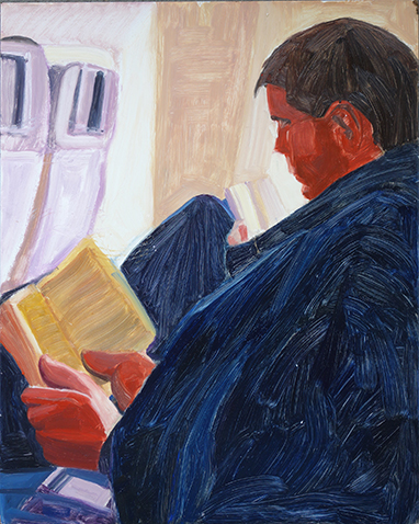
Reading On A Jet Plane, 20x16, oil on panel


Sung to the tune of "Leaving on a Jet Plane, Don't know when I'll be back again..." I could not help myself with this particular title.

Another more challenging painting for me as it is back lit which makes the figure a silhouette. And most importantly, painted from a 4x6 photograph as this image was taken BEFORE digital photography!  I just never got around to painting it before, being spoiled with technology. It doesn't seem that long ago but counting back, it has been 16 years since our family went to Germany. This is my son, with his sister by the window. It was to be part of a series I wanted to do on people reading. I think I have done a number of pieces on this theme but never have they been shown together as they do span 20 years now.

Lost in a Good Book, 18x24, oil on canvas, 1996ish with a few updates along the way

For giggles and grins, I will add a few others from this drawn out series. The above painting is of my daughter at 7 or 8 years old. I originally painted it sometime in the late 90's. I did work on it again after that.

@ The Metropolis, 20x16, oil on canvas, 2009

Another one of my daughter. She had agreed to be my model so I could paint her plein air for the Denver Plein Air Event back in 2009. I did a 9x12 while she patiently read a Charles Dickens novel (Great Expectations?) all for a cup of coffee. I did this larger piece in the studio and it won Best of Show at the 'Own an Original' juried show at the Littleton Museum. It also sold at that show, which is always a wonderful thing for an artist. The gentleman who bought her said she looks like his daughter.

The Butcher's Son, 6x6, oil on panel, 2012

To throw in a non-family member, here is a young boy reading at the Dijon, France Saturday market. His parents had a butcher shop and he was perched between to cases of prime meats of all kinds.

Liz Reading, 20x16, oil on canvas, 2009?

Here is another one of my daughter when she was in college. It may be 2009 as well (no date on the back). I did this one from life sitting on the couch opposite her in our living room.

Read Full Post


Joseph Kleitsch at the Pasadena Museum of California Art

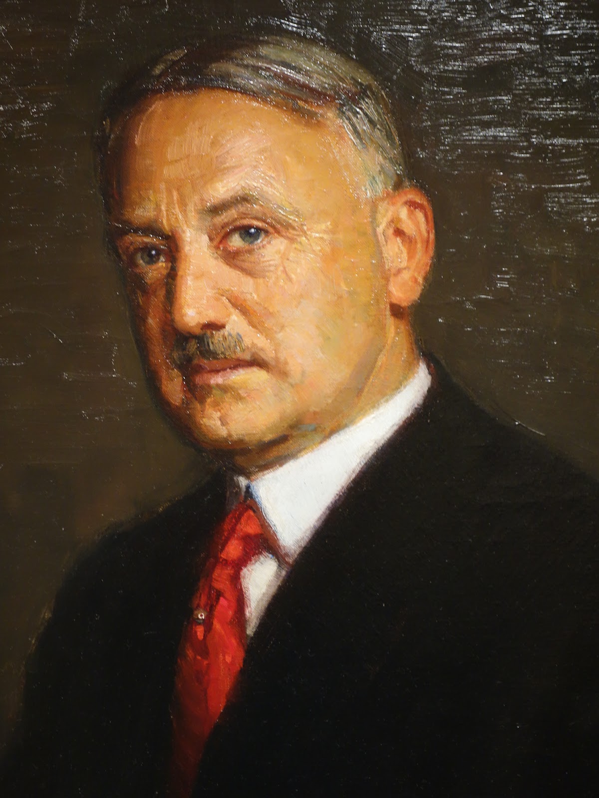
Joseph Kleitsch; who the heck is he? Most of us have never heard his name before. I sure hadn't. He was born in Hungry and immigrated to the US at the turn of the last century. He lived in Denver (who knew?), Cincinnati and settled in Chicago by 1912. He was a very well known portrait painter and made a decent living at it. I have included some portraits for that reason. He was called to California to do a few portraits of Hollywood starlets, and after enjoying the warm climate there, moved to Laguna Beach in 1920. (He became friends with Edgar Payne) There, he started to do landscapes, and noticing how fast Laguna Beach was changing, started to document those changes. He also loved painting the Missions of the area. After his untimely death in 1931 he was largely forgotten. This is the first exhibit of his works since his death. So happy that he has come to light again.


The Pasadena Museum of California Art has no permanent collection. It holds exhibits of artists who lived and/or painted in California. This show is up through August 6. A must see if you are in the LA area. The icing on this cake was that there was a second show, on Gustave Baumann, as well. I have always liked his work but have rarely seen his prints in person. The exhibit included some of his wood blocks and print proofs. That may be its own post. Stay tuned!

I particularly love the painting above; the commentary on it was that this could be his wife, but more than likely is an 'amour' from his stay in France. No matter; it is a a beautiful tribute not only to her but what a stunning view of the reflected windows and into the room as well.

Another one I liked; Who knows if she is looking at a portrait of herself or if she is evaluating her own work? It is so graphically pleasing overall and I like the color harmony. Joseph's use of windows to frame his subjects was evident in a number of his works.

I cannot remember who this gentleman is. But he looks like a banker. I liked the look on his face.

This is a detail of an early self-portrait of the artist. Who could resist those blue eyes? The commentary said you could tell by his portraits of women that he held them captive with his charm and good looks.


Another early painting from his time in Paris. Not his normal subject but I thought the composition particularly interesting.

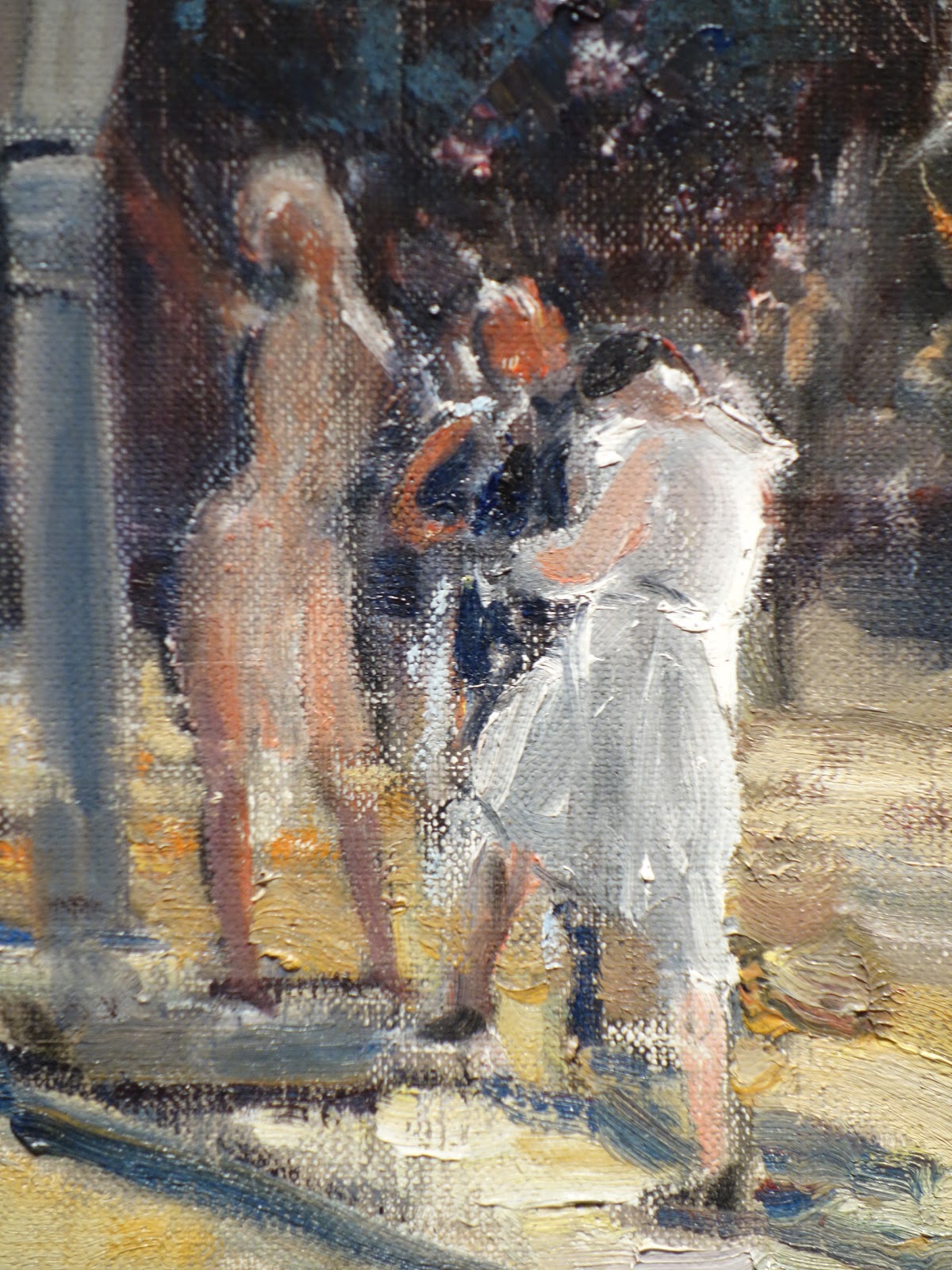
 Here is one of his scenes from Laguna Beach. Notice what seems to be dirt streets. This is a crop of the scene. Below is another closer in view to see how he showed how bustling Laguna Beach was becoming in the late 1920's. And a third, closer detail below that one. I noticed a number of loosely, almost nude appearing females in his paintings of Laguna Beach. His later works did get looser with more paint texture.


Last but by no means least, another stunning portrait using the window to frame his subject.

Read Full Post


Climbing the Wall - Denver Monolith

Climbing the Wall, 36x24, oil on linen

Here is a painting that has caused me great angst. One that I thought would be fairly straightforward. A man, mostly in shadow climbing a wall, mostly in shadow, and then a wall of glass reflecting...how hard can this be? Part of the reflection from the glass wall is hitting the Monolith; and the man has sun hitting him from the side, that is how hard it is. I even went downtown again to see the wall; it looks so black and dead and falling apart in real life. It is so hard for me to want to paint it that color!


So it may be 'too' blue but it is what it is for now. I need to take a break from it. Trying to make a man-made sculpture look like real stones is quite the challenge. Plus, the wall curves. Lots of things to throw you a curve ball. Challenges are what builds character, or so I hear.


I wanted to do this picture as part of my series on people experiencing art. This is just one of climbing on public art or sculpture that I have thus far completed. This was a first and only time I have ever seen anyone climbing the Denver Monolith which is in the plaza outside the main entrance to the Denver Art Museum. I did not hang around to see just how high he was able to go but here he is at the second story level.

Read Full Post


Spanish Sheep Market Circa 1962

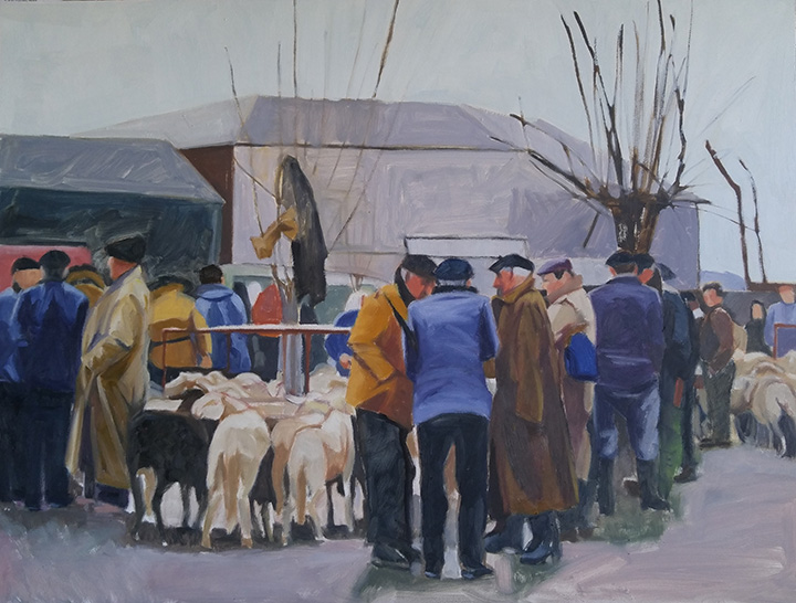
the Art of the Deal, Sheep Market, Spain, Circa 1962; oil on panel, 18x24


Here is my latest painting shown below as a work in progress.  I had wanted to do this in a square format but I did not have that sized surface ready when I was ready to go. The image used for this painting was from a slide that was turning orange that I had made into a digital image at Costco. My mother took the photo circa 1962 in Spain. The men at this sheep sale make me think of the Basque but according to her note it was just north of Barcelona, a place now known for its beaches. I was attracted to this image for a number of reason. I liked the composition; I liked the subject and I appreciated the group of men doing business. Each of them taking a unique stand, as it were. Something about a wet gray day and fairly flat light attracts me.


Sketching in on the canvas with colored pencil


Starting the big shape block in


Working on unifying the dark shapes


First wave of color in big shapes


Second wave of big shape value correction


Fine tuning figures and values, 18x24, oil on panel

I am struggling with a name for this painting; The Art of the Deal; Market Shares-Sheep Trading; Deals Going Down; Your thoughts?

Read Full Post


The Rush is On


Starting with the finished piece first and then the explanation for a change. I repainted this piece over three or four days while also working on a few other paintings. It took me a bit longer than I expected as I thought I would only "fix" a few areas. I don't think I left anything untouched except the hair on both of their heads.

2017 The Rush is On, oil on canvas 24x24


2010, oil on canvas, 24x24


2016 showing repair and mounted on board (bad lighting lightened up the overall image)

This painting is 6 years old. There is nothing major wrong with it for where I was at 6 years ago. A year or two ago I had hung it in a place where I could look at it with the thought to revisit it. If a painting hasn't sold, it is always fair game. For whatever reason, it fell off the wall one night - it woke me up- and on it's way down, hit a few places and in one particular sensitive area ripped a substantial hole. I could not decide if it was worth fixing or if I should just chuck it. I researched repairing paintings. So many different approaches. Some said do not patch an area as it will shrink at different rates and then will always looked patched, so reline the whole painting. Others said patch and you will be fine! The repair kits I found were nowhere near a 24x24" size. This particular painting was cotton canvas on the 1.5" profile of stretcher bars. Not my favorite painting surface.

After much contemplation, I took it off the stretcher bars and glued it to a gator board trying very hard to line up the edges of the tear across the front waiters forearm. I filled in the area with a bit of gesso and lightly sanded the area. I could not sand it smooth as the texture of this canvas was rough. I tried refilling the area and sanding again. All I can say is that it is as good as I can get it. It was worth trying to save at this point as moving forward I was going to repaint the whole thing. The structure and drawing are pretty good so it should be pretty straight forward. The major issue with the original version from my perspective today is once again a value thing. So in the redo, I pushed the values away from the middle. Not much color shift overall except in the skin tones. I thought the waiter in the back had too blue gray a skin tone so I lightened up his face overall and to his arm in the shadow made it a reddish blue.

There is something about the original version that I still like but overall I am still happier with the redo.

Read Full Post


Creek Crossing

Creek Crossing, 12x12, oil on linen panel

Here is something a bit different from all the still life setups I have been doing this month. The direction I was going here was to keep every thing very simple and in that I think I succeeded. It may still need a bit of fine tuning but I made myself stop as simple is simple and maybe it is time to just let some things be. Hard as that is for me to do.

I was up in Parmalee Gulch on a plein air paint out a number of years ago and we were painting along this creek when these kids came into view. I had forgotten all about this image but came across it recently and it was just what I was looking for and didn't know it.

Queen Anne's Lace, plein air study, Parmalee Gulch

This is what I was working on when the kids crossed the creek near me. The shadows were deep that fine summer day.

Read Full Post


Bad Advice?

One of the worst things I think I was ever told when learning to paint by an instructor was to "stop resting on my laurels" and learn to paint. He was referring to the fact that I liked to paint in big bold simplified shapes. Every week he would say what was good about what I was doing and why it worked, but then would tell me now I needed to learn 'to paint' and not be so stylized as obviously that was easy for me. And boy, was it hard to break myself of this viewpoint. 

It was my first formal class in oil painting, which I took at the Arts Student League of Denver when it was located in Lodo on Larimer Street. He started us out in black and white only, then to gray and then moved on to adding one color at a time. Here are two color examples I came across recently, and I still like them! Painted on gessoed cardboard, you can see where the top example was punctured. Being that these are now 30 plus years old, they have held up remarkably well, don't you think? I think they were painted in acrylics, not oils, though.


I had recently seen an artist friend post her new paintings on Instagram and they reminded me so much of my own work way back when. I really like what she is doing. I still paint in bold simplified shapes, but in a more 'painterly' and 'refined' way. A part of me is wanting to go back to the day and revisit flat color. Play around a bit. Simplify and exaggerate.

Read Full Post


Fishin' off the Pier

Fishing off the Pier, 24x24, oil on panel

Here is the finished painting of my brown pelican. I was struggling with the block in for this piece. Getting the Pelican correctly drawn should not have been a problem but sometimes these things happen. It seems the simpler the shape the more the errors show!

This is local tone, or three main values: light, medium and dark. Just as a reminder, local tone is usually a gray or overcast day.

Once I got my pelican drawn in the rest was fun to paint. This image was taken on the inter-coastal river along the eastern seaboard of Florida when my aunt and I were on a road trip. She was so gracious to stop whenever and where-ever I got a fancy so I could take photos. I zoomed in when taking this handsome portrait as I did not want the bird to fly away if I got too close for comfort. Not to worry. He had his eye on bigger fish than me.

Not only was I taken with the bird but I liked the graphic structure of the pier as well. A nice break up of the space. The juxtaposition of the organic on the linear intrigues me.

Sitting on the dock in the bay? I may have to take that for the name of this piece with a nod to Otis Redding.

Read Full Post


Blockin Pelican develops into struggle

Pelican Block in, 24x24, oil on panel
Pelican structure, 24x24, oil on panel

Loosely blocked in on the slick oil gesso I had put on the Masonite, makes for a very thin coverage of paint in the first photo. I am now building up paint layers. I added that sea green color to the sky to be under and behind the darker blue gray clouds that are building up in the sky and will pop the pelican's head out. I solidified the river's light color but I will be adding the darker edges of the waves that are rippling with the wind.
 I am still undecided whether I will leave the trash can in that is peaking out behind the tail feathers. I thought it might be a good balance to the beak but know am not so sure I like it. It seems to be competing instead of complimentary. There were two figures on the bridge that I have so far left out. One figure is fishing and has his back to the viewer; the other is peaking out from behind the pelicans shoulder and looking over his shoulder at the viewer. My husband said to take them out but I am not yet convinced they don't belong.

Pelican Drawing Correction

The Pelican's head, neck and beak just felt off to me so I had to redraw the whole thing. The only part I did not move was the back of the head and neck. The bird's body didn't seem able to support the head. I think the proportion's are better. I finished blocking in the feet and legs, too. Good drawing is so important to the whole painting's success. I was convinced I should take out the trash can but now I am waffling on it...again.

Those nice straight lines that I like so much will most likely be softened once I get down to really laying down the color. The slick surface forces me to layer, which is a good thing. I like having the depth of color. I still struggle with the good coloring book syndrome of 'keeping within the lines.' Which for me translates to cover everything flat within those lines, ie not allowing the underlying colors to come through. It is a challenge for me but I have been working so hard on that aspect I think I got it. It is my yin and yang fighting! In one sense I like the rigid Mondrian linear quality against the organic shape of the Pelican. Then I think, flatten down the Pelican to a more abstract linear image to go with the other lines...Then, no, soften edges! I am still not sure which side of me is going to win the fight on this particular painting.

Read Full Post


Museum Exit

Museum Exit, 24x18, oil on panel

I saw this scene as I was walking out of the National Museum of Ireland. I immediately thought it was an abstract painting with all the colors and repeating shapes. And the buildings were catawampas on top of it. I had gone to the National Museum to see the 'bog' people. There is so much in this museum it is a shame I was already on overload and so really did just go to see what I wanted to see. The floors were beautiful mosaics and I had to walk past all the Celtic gold jewelry to get to where I wanted to go. The gold work looked amazing as I glanced at the display cases. I had already been to the National Gallery of Ireland to see art for a few hours, which I enjoyed very much. The two museums are very close which is why I headed over to the National Museum while I was in that part of Dublin. I had walked over from where I was staying which was across the river.

In this painting I was trying to get movement through color. There is the yellow that creates the most obvious movement; followed by the reds and then the blues. The image provided a good start to this structure as is, but I did force a few color notes as well. While working on this one I kept toying with making it much more abstracted in a Diebenkorn approach. Now that I have this one done I am thinking of doing it again, same size, with that more flattened, layered color block approach. Not sure if the figures would be included; that is still to be determined.

Read Full Post


Cherry Blossom Promenade

Cherry Blossom Promenade, 36x36, oil on linen

To be a harbinger of Spring, here is one of the latest to come off my easel. I have been working on this large for me painting since last spring. It was a struggle to get it to 'read' correctly. Originally, I was trying to imitate Tom Thompson and the way he could make the woods of Canada have such wonderful patterns within them. I managed to do that with the cherry blossoms but I could never get that to work with the cast shadows so in essence the painting looked like two separate ideas. I finally had to paint over that which I liked and was attached to doing to get the painting to have a cohesive and connected feel, which ultimately is what I was going for in the first place. Sometimes we artists can be stubborn in holding on to something which is holding us back from achieving where we want to go. What can I say? I finally saw what I needed to and got the ship righted and on course

One of the things I like about this scene is not only the promenade of blooming trees but the figures. It shows a cross section of people and one would think I had placed them there to add to the composition the placement is so perfect. You can't see the last grouping in this image as they blend in with the trees but there is a 6th  grouping in between the trees that are to the upper right of the rabbi's hat.

This scene is at the Brooklyn Botanic Gardens. It was quite by chance I was in NY in April for the Cherry Blossoms. I had come to see the Sargent watercolor show at the Brooklyn Art Museum and my cousin had gone with me. When we left the museum she wanted to go to the Botanic Gardens which was right next door to the Museum. So glad we did. A lovely oasis in the city and what a welcome to be outside in it.

Read Full Post


Cliffs at Half Moon Bay

Monday, January 4, 2016

The cliffs along Half Moon Bay

A few years ago I was in Half Moon Bay, California to spend Easter with Richard's niece. Richard and his brother and I spent the morning walking along the cliffs and then back via the beach. My brother-in-law is still on the cliffs as he did not join us on the beach walk. That would be him scanning the horizon.

Cliffs-Half Moon Bay, 24x24, oil

I know this is somewhat of a 'gutsy' composition. Not only does it slash the square into almost two identical shapes, but the cliffs fade off the canvas! I have the bird soaring to act like a period to stop the viewer as well as the hills in the distance to go back into rather than off to the left.  The figures in the foreground also help to anchor the viewer in the composition. So the thought was the viewer would start with the figure (my brother-in-law) go off towards the left, see the bird, drop down to the figure and come back across the beach.

My aim was to keep each large shape in one value group yet keep those shapes interesting. So, sky, cliffs and beach. As a graphic designer I want to make each shape a flat color so this is my continuing struggle to add interest with texture (paint quality), subtle value shifts and layering of paint. Layering paint sounds so easy but for me it is not. I want to cover the previous layer, every speck of it! Sand is a particular favorite of mine to practice using texture and value shifts. There is so much blue (reflected sky after all) in that sand with some rose and ocher too.

Read Full Post


The Critique of The Crit

critique of The Crit painting

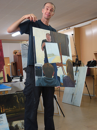
Here is a photo from last week's working critique. Kevin is critiquing my painting that I am doing of him critiquing another artist's painting. My painting of The Critique is not done in this photo with Kevin holding it.
As I was working from the outside in on this painting, Steph's painting just blocked in. 'The Critique' is done as dark/light pattern where I wanted a strong sense of light versus dark. Even at the angle it is being held at here you can sense that strong structure of what is in the light group and what is in the dark group. When you squint, the mediums marry themselves to one or the other.
Below is the painting on my easel this weekend as I continue to build on it. The structure is there so it is a matter of  time before it is completed.

The Critique, 30x24, oil on linen panel

The reason I like this particular subject is because of the repetitious shapes that the dark values carve out. The lines in the painting he is holding repeat shapes in the background and also help lead the eye around the whole painting. This particular composition has repetitions of rectangles as well as triangles. The viewer is taken in by the direction of the two figures looking at the painting.

Read Full Post


Study for The Critique

The Critique, study for, 12x9, oil on Panel, available

Here is a study I did for a larger piece I am now working on. It is a "dark/light" pattern that I have spoken of before. If you squint your eyes you will see that every shape is either a part of the dark shape or a part of the overall light shape. I am staying away from medium values to create this pattern. The only medium here is really the light on the sweat shirt of the figure on the left which I will darken down in the larger painting. In this study it is tied to the darks but not quite enough so.

The head of Kevin transitions from the light into the dark pattern, as does his arm. Against the light background his arm groups itself with the dark pattern, but against his shirt and the painting he is holding his hand transitions to the light group. I love working with dark/light pattern. If done well, the painting is so much more interesting to me.

Read Full Post


Reading on a Jet Plane

Reading on a Jet Plane, 20x16, oil on canvas panel

From the takeaway from the workshop I did earlier this month, I decided to redo one of the subjects started there. Not over paint the existing painting as is my habit, but start over from the beginning on a new canvas. I spent more time getting the proportions correct up front instead of covering the canvas with big shapes as I did in the previous version. This version is working so much better. You see the second figure reading much more clearly. His hands don't look like hams.

In my efforts to always improve, I decided it was good to start over as I knew what I wanted to do differently after the study done in the workshop. In this version I wanted to keep the yellow/violet complements but not overuse either. I wanted to keep the big shapes simple. I think it gives a good idea of the bright light you get flying high above the earth. 

Since this photo dates before digital imagery or maybe at the beginning of digital photography (was it really 13 years ago?) I worked from a 4 x6 photo I had in our photo album from our trip to Germany in 2002. This is my son (sans glasses as I did not think that the glasses were needed for the success of the painting and it is not technically a portrait) and my daughter is in the window seat.

Read Full Post


Janice Nowinski Workshop Day 2 and 3

Day Two: I decided to start a new painting and leave the boats for now. I was a bit confused by the end of day one so I brought in a larger board and decided to go graphic with big simple shapes. I used a photo of my son since figures seemed to be the modus operandi. It is a photo I had taken to be part of a series I had started on reading years ago but had been distracted from completing. I started this series before the iPhone came on the scene but I have kept those photo references in an envelope as I add to it in case I revisit that series. NOTE: an ironic addendum to this. In yesterday's WSJ was an article on the decline of summer reading from its apex after WWII. The link to this article by Lee Siegel is not available but when I did a search I see that this is a recurring theme of his. I realized I had read other of his articles on this topic on the decline of reading books.

After quickly blocking the shapes in on this very slick surface I was ready to correct the relationships and start painting. It was suggested that I leave it as is. So I did. After looking at it awhile I think I did not have the right proportion board in relation to the photograph. My math is off, in other words. That is one reason I think the hands are so large. I can't find the photo to verify this.
I think this piece has potential. It was well received as is and deemed complete by the class and by Janice. Not sure I agree. You can judge for yourselves. What I may end up doing is starting a new one instead of my normal reaction to over painting the original. That is something Janice suggested that is starting to make sense to me. So there is a takeaway from the workshop.

Reading On a Jet Plane, 20x16, oil on slick board, 20x16

When I took these pieces to work one of my coworkers really liked this painting as well. Another coworker asked why I was taking a workshop and not giving one? Good question...Amazingly enough I had an email yesterday asking me to go to WI to give a workshop. I'm thinking on it.

Day Three:Another figure. I wanted to see what I would do with editing an image and not being so *literal in its translation. I left out quite a bit from the photo reference and am quite happy with this one. No one recognized it as the wall sculpture outside the Denver Art Museum. I don't think you are supposed to climb it but one day where I was meeting a friend, someone did!

Here are some photos from the critique at the end of the third day:

All three of these paintings were done from black andwhite photos. Nicely done, too.


Sampling of works completed during the workshop.


More critique...love the translation of Matisse.

*Note: "literal" became one of the hot button words of the workshop-not sure we all agreed on what that word means. I had to define the term "graphic" more than once when I used it to describe my work. Another interesting topic for another post. How we think we can redefine words to fit our own definition.

Read Full Post


Lazy River, Floating on the Yampa

Lazy River, 24x18, oil on paper, available

Here is one hot off the easel. It is from a rafting trip I took 10 years ago with some friends of mine. You can almost sense the wonder and silence of the scene. This painting is a bit out of my normal realm of subject. I turned my head to Colorado this year and what makes this state so special.

In the spirit of this painting, I am also working on a second piece from another trip down the Yampa that is quite a bit larger than this one so that the majesty of Tiger Wall is shown in perspective to a 2 man raft. The raft in the next painting is tiny, less than an inch. You will have to look for it. Stay tuned!

The rafting trips I went on were with a friend from work. He and his friend were the trip organizers and then a bunch of others would be invited to go along too. I went three times and each time I went, I was on the barge raft. It was the big slow boat that carried the food and much of the extra things like tables, cook stove etc. I had a high perch as I sat on the food locker - really I had a seat, but the food locker was under the seat. My companion was one of the organizers, not my friend from work but his good buddy. One trip we had his 11 year old daughter with us. We had lots of quiet time but also many philosophical discussions as well. He taught me how to read a river map and I was able to find where we were by reading the map. One time I had to get in the river and get the boat unstuck while he worked the oars. I felt more confident doing the outside work rather than manning the oars. It was in a calm and rather low spot so I was in water only to my waist. In this particular photo the front boat has two ex-marines and their wives.

Read Full Post


Studies in 3 Values - Local Tone

Study for Line at the Louvre, 9x12, oil on canvas panel

Here is a quick study using light, medium and dark. I like how it is working but after seeing this cropped version of the scene, I decided to open it back up to show the scope of the line. It was phenomenal how many people were actually standing in line to get into the Louvre on this rainy, gray day. I believe it took us 35 minutes. By this time we were almost half way there! On second thought, what better place to be on a rainy day in Paris? The Louvre is certainly large enough to take in this crowd without much of a problem.

Back to this little study above. The hard part is deciding what to tie each value to. When using only three values it limits your options in some ways and then there are loads of choices to make at the same time. I originally had the umbrella peaking into the image in the upper left corner as a medium  gray catching the color of the sky. It just seemed too blah. Making it black helped the composition remarkably. The arch was almost as light as the sky so in the photo, the trees in the arch showed up much more. But if the arch is "white" then it blends into the sky and we don't get the nice band of gray we now have in the middle or the play of patterns in the dark and light umbrellas standing in front of the arch.

Line at the Louvre, 30x30, oil on panel

 I decided to see what the square format would look like doing three values before I started to paint. As you can see, I divided up the umbrella of the main figure but it is not as effective as it is in the study. I do think the square format gives more of the depth and breadth of the line snaking into the Louvre so I am glad I opted to change the format. It also added more public art into the scene. There is a sculpture right above the woman with the white umbrella and another to the right of the arch.

Read Full Post


Art Appreciation

Art Appreciation, 24x30, oil on linen panel. Available


Today we are visiting the Brooklyn Museum of Art during the 2013 John Singer Sargent exhibit. For the most part I was busy looking at the art as I was so taken in by his work. Stunning. I went around 2-3 times to absorb as much as I could. There was approximately 100 works owed by the Brooklyn and Boston museums. This was the first time these 2 collections had been shown together. We were allowed to take photos which isn’t always the case at a museum. That is when I started to notice some of the people around me, and this painting is the result of that.

It is not good practice to paint from life or from photos that have multiple light sources as this scene most obviously suffers from. Since I liked the overlapping reds that the cast shadows made on the bright orange wall I decided to go for it and break that rule. The movement they create is almost like a dance. I also loved the body language of these three museum goers and how they were each framed with their own Sargent picture. One of those “perfect can’t make it up” moments. I love it when that happens!

I know I have mentioned this in a recent blog post but some things bear repeating. Another John Singer Sargent show is coming to NYC this summer and if you will be out that way, I highly recommend you go. This one will be at the Metropolitan Museum of Art so you can go to Central Park as well. Such a deal!

Read Full Post


Young Artist study 25

9x12 oil on linen

This painting was a black and white study for a larger piece I posted last month, #2 in that post. I decided to paint it in color and give it to the young lady in question when it is done. It is not where I want it to be yet but I have it mostly covered in color now so here it is as a painting for the challenge. I want to sit on it to see if I like the high key or if I want to tone it down a bit.

I was so exhausted by the time last Friday came around that I did not really paint anything this weekend for the week coming up to finish up the 30 paintings in 30 days challenge. My hat is off to anyone who manages to complete. It isn't that I haven't been at my easel everyday, as that I have managed to do. This weekend I really wanted to get some larger pieces finished that just needed a bit of attention. They started to weigh on me, and I was motivated to work on them. When I focus on the challenge it takes up my whole weekend. I could not do both.

http://lesliesaeta.blogspot.com/

Read Full Post


Purple Deer 20

Purple Deer, 9x12, oil on linen


Today's image is from a photo I took outside my office window last spring. I work on the old Lowry AFB in the city of Denver. We have a herd of mule deer that honor us with their presence from time to time. This painting was done using the complements purple and yellow. The scene lent itself to those colors naturally because of the dried grasses and the deer being in the shade of our building. She came right up to the window to see what I was doing.

Read Full Post


Gallery Cat 19

Gallery Cat, 8x10, oil


Day 19 is another that started out with flat shapes. The surface is that slick oil based gesso I used that sometimes I enjoy but other times, not so much. I struggled with the paint slipping all over the place on this one. This surface lends itself more to landscape for me so now I know. Details are hard to garner until you have a layer of paint dried on top. I really liked the composition on this one so may give it another go. This cat was hanging out in one of the galleries in downtown Denver.

Read Full Post


Goats 18

Goats, 8x8, oil on panel


Day 18 brings goats.  A cool jumble of goats that would be fun to play further with and not get to serious about; ie flatten out the shapes and integrating and overlapping them. I like the overall design and think it can be pushed further.

Read Full Post


Storm Brewing 15

Storm Brewing, 6x6, oil. $100

Day 15 fresh off the easel. This is a quick photo shoot so I apologize for the glare bouncing off the brushstrokes. It does highlight the brushwork even if it is distracting from the painting itself! Staying on the beach if not focusing on birds today. I have so many beach references from my recent trip to FL; all times of day and weather conditions. I lost count as to how many beach stops we made. I had to walk a beach every day. My aunt was gracious enough to indulge me. This is the Atlantic side, as we were heading north towards St Augustine. We were on the coast road all the way to the GA border which provided a lot of opportunities for pulling off the two lane highway and a quick walk

Read Full Post


Silly Bird 14

Wednesday, January 14, 2015

Silly Bird, 6x6, oil, $100

Here is my second bird of the week. I may have to continue with birds for awhile. They are intriguing and full of personality and possibilities. See where that takes me. It is thrilling to me that I have been better this week about not only squeezing in painting where before I did not, but also photographing at my easel and posting before work! My exercise routine is suffering, however...

Read Full Post


Topics

Archives