Blog


Series: Doors/windows

Two weeks ago


A month ago


Since this is how I sent what I was working on to my aunt in a letter, (yes, I still write letters, and she is 96) this is how I am presenting them here as there is no other means now to show the progression. In the bottom image is the first image I sent her on where I was at that time, about a month or so ago. Mostly blocked in and taking shape if not yet pushed to finished. The first painting in the bottom image going from left to right, Georgetown CO, Morrison CO, the green door is from Bavaria, the blue door is Orleans FR from a photo I took in B&W back in the early 70's, and the old metal chair is in front of my garage, and the only one painted plein air.


The top image has most of them nearing completion although since I took this photo a few weeks ago, Georgetown hadn't made much progress, but now is almost done. I have also worked more on the Bavarian Green door. I will post the updated grouping once I finish Georgetown. 

I have been working on some larger paintings and I started to do these 9x12's as a way to break up the monotony I sometimes get into while working on large (30x40) for me paintings. I hardly paint this small anymore unless doing studies from life. It has been fun, and I have a few more in mind to continue and riff on this theme. I showed them to some friends of mine recently and I was surprised that they both liked the same painting the most, the one I expected the least attention from. Can you guess which one it is?


Read Full Post


The Old and the New

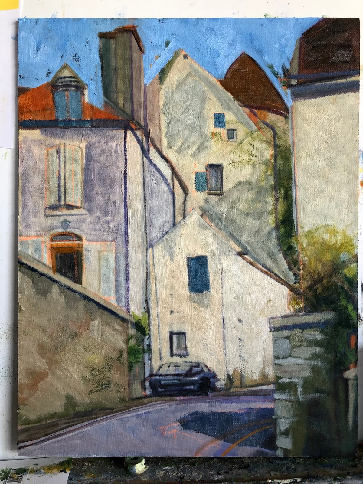
Semur Street Scene with Car, 14x11, block in

To start of this new year of 2020 I am posting an updated painting I started back in 2015. Here is the original block in from that year. Not bad at all. I did a number of paintings from that 3 week trip to France. In my quest to have better paintings overall, I picked this painting to update. Surprising to me was that I had no updated images of it since the block in phase and I had considered it 'finished' at some point in time. So I did  not think to photograph it before redrawing it and starting in again. Below is the latest restructured image. Not too many corrections overall. I wish I had looked at the original block in before starting over as I see plenty of things I like in it.


Semur is an old walled town in Burgundy, France. I found so much to like about the winding streets and old buildings. We only spent an afternoon walking around this town yet I have done at least 5-6 paintings from there. It is amazing how many centuries these houses have seen, yet still stand.


Semur Street Scene with Car, 14x11. oil 


Read Full Post


Paris Rains

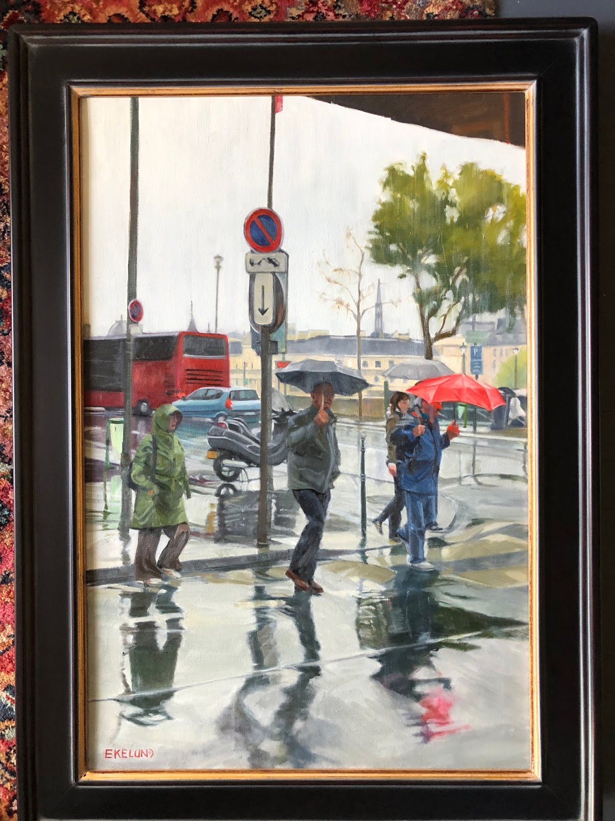
Paris Rain, 30x20, oil on linen

Here is a painting I did about 5-6 years ago. I was so very pleased with it at the time and proudly hung it in my home. It was done in the master painting class I took with Kevin Weckbach and it was the piece I did for the month we studied Dark/light pattern. In my quest to make improvements on existing 'finished' art works, I started to study this piece. Why had it never sold? Was it the subject? Or the way it was handled? Composition seems good to me. There were a few small things that I thought could be improved upon but overall I was still pleased. BUT. Once I got started working on it so much started to pop out. Drawing being premier. Just some subtle things but which I think make a difference.

The bus at a wrong angle on the backend; a few angles here and there on the umbrella's; I added some  tiny features to the figures faces. I don't like faceless humans and though there was a hint at features in the faces, I put a bit more character into them; a bit more shape was added to the clothing: The woman's raincoat was lightened and given more form, the man in the middle now has a pocket on his jacket with his left hand now in a pocket; and the man in the red umbrella lost a little weight and has a brighter blue jacket on, which brings him out from the woman behind him. I darkened the pavement (although in the image it doesn't quite show up as the paint is still wet) and made the crosswalk a bit more distinct. My daughter's comment was "It looks so much lighter." And yet I had darkened more down than added more light. An interesting paradox.

I had pulled this painting out to update it prior to Notre Dame burning but the spire is in this painting. So weird to contemplate that it is now gone. Let us pray that when the repairs and rebuilding are done that they have enough common sense to rebuild as it was and not some horrific idea of 'improving' upon it. Our culture seems to have a huge ego and superiority complex, especially when it comes to history.

Read Full Post


Morning Mist on the River Yonne, Burgundy

Can you believe it?? I am posting a painting I did. Amazing I have the nerve after all those wonderful paintings I posted from the Laguna Art Museum the past few weeks. So be it. Thought it was time to get with the program. Lots coming off the easel at the same time!


Today's painting is a remake of a sketch I did, oh, 7-8 years ago. I was happy with it but decided it  needed a facelift.


This scene is from a trip I took over ten years ago to Burgundy in France. My sister had rented a boat to do a river cruise on our own. There were 7 of us. I believe it was called a barge trip but really we had what I would call a yacht. We spent almost a week on the L'Yonne River. This stop was Joigny if my memory serves. I was usually one of the first ones up in the morning so I would go out and find a patisserie and bring back breakfast for everyone. Hence being out in the early morning fog that blanketed the river.  These boats were moored across from ours. It was interesting to see how many countries were represented on the boats. And yes, we saw working barges, too.

Read Full Post


Friends - A Journey Back in Time

Friends - A Journey Back in Time, 20x30, oil on canvas

Friends, here is a painting I did just for me. Another one from my slides I went through that were my mothers from the 1960's when we lived in Europe. I had a bunch of them turned into digital images. This is the second one in the series I have done from her collection. My mom is on the left and her French friend, Beatrice is on the right. This old farmhouse had been in Beatrice's family for generations. I am not sure who took the image, possibly the caretaker or family member who lived there. Since I was a snot nosed brat, I never took my mother up on the invitation to go with them. We lived in Orleans, France at the time, and my mother had met Beatrice at the Franco American Women's Club. They remained friends even after we moved to Germany, up until the time Beatrice died. I visited her when in my 20's and home to visit my parents who still lived in Germany. My mom and I took a road trip to visit Orleans, her friends still there and then on to Paris!

I really picked this image not so much for my mom and her friend, as I had actually thought to leave them out. I thought the composition was well suited for a painting. I liked that it was basically local tone but with a bit of light and shadow. A very diffused light source. I kept the background diffused; I know it is 'not done' to pick out bricks and stones, but that is what I liked about this image. I wanted to highlight how it was built and survived for centuries.

Here is the link to the previous post on the progress of this painting.

Read Full Post


A Journey Back in Time

Earlier I had mentioned that I was on a roll and had started all these new pieces. So here is another one of those starts from early January.


Last year about this time, I went through all the old slides my sister had pulled out of our mother's closest when she died 10 years previously. They had been in my basement all these years as I did not quite know what to do with them. Should I just toss or should I take the time to go through them all? Our mother was a traveler and I knew if I took the time to look at what was there I would find some treasures. They were still in the trays from her old slide projector and meticulously documented where they were taken and when.

So, after going through her slides, I also went through MY slide collection. I had quite a collection as well. Once I sorted through both collections, I picked 50 or so to take to Costco and turned into digital images. This is the second image from my mom's slides that I have picked to paint. This one is from France in the mid 60's. She is in the painting with her close French friend, Beatrice at Beatrice's family farm in the countryside outside Orleans, France, where we lived for 5 years. I picked this image to do for a number of reasons. One, it is my mother as I remember her as a preteen. Beatrice was a woman she met at the Franco American Club, a place for women to meet and cross the cultural divide in new friendships formed. Beatrice became part of our family and after we left France and moved to Germany, my mom often went back to visit Beatrice. I know, because I went with her once.

I was asking myself this question the other day? Is it strange to paint from old photos? Are they dated somehow? I am betting this farm house is still standing and hasn't changed all that much. I wish I knew exactly where it was located.

Here is the progression to date:

Peg and Beatrice, 20x30, block in stage
Peg and Beatrice, 20x30, oil, coming together

The slide made digital image is overly purple. I tried putting different filters over it to see what if any improved it or made it more natural looking, but none of them improved it enough for me to want to go that direction. I am enhancing the warm oranges that are already present and graying down the overall purple color. Believe it or not, that is what I have done here and it still appears purple, but I am okay with it.

Read Full Post


Reading on a Jet Plane

Reading On A Jet Plane, 20x16, oil on panel


Sung to the tune of "Leaving on a Jet Plane, Don't know when I'll be back again..." I could not help myself with this particular title.

Another more challenging painting for me as it is back lit which makes the figure a silhouette. And most importantly, painted from a 4x6 photograph as this image was taken BEFORE digital photography!  I just never got around to painting it before, being spoiled with technology. It doesn't seem that long ago but counting back, it has been 16 years since our family went to Germany. This is my son, with his sister by the window. It was to be part of a series I wanted to do on people reading. I think I have done a number of pieces on this theme but never have they been shown together as they do span 20 years now.

Lost in a Good Book, 18x24, oil on canvas, 1996ish with a few updates along the way

For giggles and grins, I will add a few others from this drawn out series. The above painting is of my daughter at 7 or 8 years old. I originally painted it sometime in the late 90's. I did work on it again after that.

@ The Metropolis, 20x16, oil on canvas, 2009

Another one of my daughter. She had agreed to be my model so I could paint her plein air for the Denver Plein Air Event back in 2009. I did a 9x12 while she patiently read a Charles Dickens novel (Great Expectations?) all for a cup of coffee. I did this larger piece in the studio and it won Best of Show at the 'Own an Original' juried show at the Littleton Museum. It also sold at that show, which is always a wonderful thing for an artist. The gentleman who bought her said she looks like his daughter.

The Butcher's Son, 6x6, oil on panel, 2012

To throw in a non-family member, here is a young boy reading at the Dijon, France Saturday market. His parents had a butcher shop and he was perched between to cases of prime meats of all kinds.

Liz Reading, 20x16, oil on canvas, 2009?

Here is another one of my daughter when she was in college. It may be 2009 as well (no date on the back). I did this one from life sitting on the couch opposite her in our living room.

Read Full Post


The Rush is On


Starting with the finished piece first and then the explanation for a change. I repainted this piece over three or four days while also working on a few other paintings. It took me a bit longer than I expected as I thought I would only "fix" a few areas. I don't think I left anything untouched except the hair on both of their heads.

2017 The Rush is On, oil on canvas 24x24


2010, oil on canvas, 24x24


2016 showing repair and mounted on board (bad lighting lightened up the overall image)

This painting is 6 years old. There is nothing major wrong with it for where I was at 6 years ago. A year or two ago I had hung it in a place where I could look at it with the thought to revisit it. If a painting hasn't sold, it is always fair game. For whatever reason, it fell off the wall one night - it woke me up- and on it's way down, hit a few places and in one particular sensitive area ripped a substantial hole. I could not decide if it was worth fixing or if I should just chuck it. I researched repairing paintings. So many different approaches. Some said do not patch an area as it will shrink at different rates and then will always looked patched, so reline the whole painting. Others said patch and you will be fine! The repair kits I found were nowhere near a 24x24" size. This particular painting was cotton canvas on the 1.5" profile of stretcher bars. Not my favorite painting surface.

After much contemplation, I took it off the stretcher bars and glued it to a gator board trying very hard to line up the edges of the tear across the front waiters forearm. I filled in the area with a bit of gesso and lightly sanded the area. I could not sand it smooth as the texture of this canvas was rough. I tried refilling the area and sanding again. All I can say is that it is as good as I can get it. It was worth trying to save at this point as moving forward I was going to repaint the whole thing. The structure and drawing are pretty good so it should be pretty straight forward. The major issue with the original version from my perspective today is once again a value thing. So in the redo, I pushed the values away from the middle. Not much color shift overall except in the skin tones. I thought the waiter in the back had too blue gray a skin tone so I lightened up his face overall and to his arm in the shadow made it a reddish blue.

There is something about the original version that I still like but overall I am still happier with the redo.

Read Full Post


Gold and more gold

10x8, oil on canvas

I have this collection of French pottery that I really like, but it is brown. No getting around that. Here are a couple of pieces. The squat piece with the top I found out by watching "Downton Abbey" is for salt. I saw Anna get it down from a kitchen shelf and I was blown away that there was my piece of pottery, of which I did not know what the original purpose was. You learn something every day.  I inherited these three pieces from my mother. The tall skinny one I think is for olive oil or wine, but that is just a guess. The short little pitcher is actually from Spain and it is for olive oil. I had first thought to use the wall as the back ground for this still life. After doing the block in I changed my mind and put the gold doll screen back there. It does add a richness to all the earthen colors.

Blockin using wall as backdrop

Now I am not sure the gold screen was such a good idea. Maybe too much of the yellow and orange and brown going on. I did that color scheme on purpose working with the repetitious shapes. It might have helped to switch the pear with the clementine. (Pardon me while I think aloud here). I did use different browns in the pottery; ie more blue in the salt cellar, more orange red in the olive oil pitcher and a mahogany for the pipe bowl. It is hard to see with the glare on the painting. 

It is an effort to force myself to paint more objects in less time and still get it done in a day.  Something gets forfeited when one does that until one gets used to it but it is always a good lesson. The first year I tried this 30 paintings in 30 days I did smaller paintings than this with one simple object so progress has been made! I am tired, however, and I am only half way there...

Read Full Post


Roof lines revisited

Still no title, 24x30, oil on board


Last seen in 2015, 24x30, oil on board

European roof lines intrigue me. It is the catawampus way of building without a grid I think that just makes them so interesting to me. Since most of the places that have these great angles are also usually built on hills, helps. The history that can be discerned from the ages of the tiles and the shape of the stucco or bricks or stones. This scene is from a walled town in Burgundy called Semur. It was an afternoon's byway on our way from Dijon to Paris. I did the bottom painting and was never quite satisfied with it. The color of the roofs are too similar with the red one jumping out in the middle like a bulls eye.

After finishing up the Cesky Krumlov scene recently I decided to give this one a revamping of its rooftops. I had figured out in that one what was missing in this one. In the original lower image, I was going for a more orange and violet complement but somehow it didn't work as well as I would have liked. I felt the painting lacked something. I set about in the upper left hand corner and worked my way left to right on each layer of roofs going for visual interest and texture forcing value shifts as needed, something I am often hesitant to do for some reason. Being bolder in adding pinks and pale blue greens to the rooftops. I had started on that idea but was timid in not going further. Adding texture to the red bulls eye roof in the middle helped to add to the visual interest and tied it to the break up of shapes in the shadows down below it. In that big shadow shape down below and heading up the right side of the painting I added a bit of lighter blue gray to stair step the tops of the bricks up to the tin roof to help the circular rhythm that I was originally attracted to.

I changed the color of some of the houses in shade leaning towards the blue green in some and adding more yellow red green to the once violet cast shadow on the house that is to the left and in the middle row. The cast shadow now blends from the house across the wall unifying the two. The wall with its tiles casting a shadow moves from that yellow orange to a more violet when it gets to the right.

In the deep shadows (window holes, doorways and blocks), I warmed them up. Where once they were towards the dark blue violet I added some yellow making them not only deeper but helping to break up the too blue violet of the shadows. This adds to the eye movement through the shadows and back up into the light, stair stepping the shapes.

Read Full Post


Roof Line Jumble - Semur, France

Zigzag of Roof lines, 24x30, oil on panel, Day One
Day 2 photo taken on my easel (blue tone)
Day 3


Here is the other painting I started the day I blocked in Jersey Shore. This painting has been on my "to do" list for years. Every time I think I want to start on it, I would talk myself out of it. Full  of conflicting ideas of how I wanted to paint it. This is not normal for me. I had painted another smaller painting from this town which I think is the root of this discord. After all these years I still had not settled these questions in my mind. The problem is a made up problem, as so many problems are. So for this particular painting, on this particular day, after doing a couple of drawings I decided to go with my normal style of painting. BUT I do want to do another version of it after I finish this painting and try to do it totally different. I won't say "have fun with it" as truly, I am having fun with it going in the direction I chose to go with.

This is the town of Semur en Auxois in the Burgundy region of France. It is a medieval walled town built on a hill, of course!

Read Full Post


Auvers sur l'Oise street scene - revisited

Auvers Street Scene, 24x24, oil on board

Here is a painting you may have seen before. I posted it this past winter. I determined that it was not really where I wanted it to be after all. Something was not quite reading as I wanted it to; That what drew me to paint the scene in the first place was not quite reflected in the painting. Back to the easel it went! A few changes to note: I redid the tiles of the roof, downplaying them. Then I pulled out the stones and the varied patterns in the different buildings to create interest and directional paths for the eye. I have learned not to say a painting is finished until it is actually sold and out of my hands, so though I am pleased with this piece now, it is not the same as saying it is "finished."

Just a reminder that this is the town where Vincent Van Gogh lived and was under the care of Dr. Gachet when he was tragically killed. It is a village built on a hillside and the field where Vincent painted the famous crow painting sits above the town on the plateau.

Read Full Post


Montmartre and Sacre Coeur

Montmartre with Sacre Coeur, 15x30. oil

Here is a new one for you. I started this months ago but only now have gotten it close to where I want it. The first draft I went very graphic with heavy outlines on the buildings. But I kept the cathedral more realistic which made it feel like two paintings in one. Since the idea of outlining the cathedral did not seem appropriate I painted over most of the lines in the rest of the painting and also removed windows and blended buildings together, leaving just some here and there. The trees remained the same, just one dark shape broken up by lighter shapes. I may at some point paint this scene again with a very graphic fun style. I am seeing it in my minds eye as I write this post. Take it in a totally different direction. Maybe paint it a little larger than this one.

This is a local tone painting, meaning it has three distinct values: light, medium and dark. The lower half is also a study in equalization. Equalization is a visual approach which brings a uniform sense of pattern to a painting. The goal is to create a visual rhythm out of the pattern. It does not mean all shapes are equal in size and shape but are similar in size and shape, no two alike. I also was doing color harmony as an element where every color has blue in it. That is still true but I did not take it as far as I could have.

The reference photo for this painting was from my two weeks in France 7 years ago. I have so much reference material from that trip I am still discovering. A real treasure trove. This is not the typical view of Sacre Couer but I love the fact that it shows so much of Montmartre a great little village built on a hill in Paris. Be sure to visit this landmark when in Paris. The cathedral is beautiful inside, the view from there across Paris is amazing and the streets are so much fun to explore. There is a funicular for those who can't walk that much.

Read Full Post


Repeat until Complete

In the Name of Blue; 20x30; oil on linen

A bien Mesdames et Monsieur
Here we are yet again as I continue to tweak and fine tune to get the painting correct. Every time I get to it there are things that are gained and some that are lost. I made some changes that I hope make the scene read as it should. Misty fog, mysterious light and a road less traveled. I await the verdict with baited breath. I am not inclined to give away what the changes are hoping someone will notice and comment.

Read Full Post


River Fog again or In the Name of Blue


I took this painting to work AFTER I posted it. As is usually the case when I hang a piece in a different environment, I saw some things that needed to be rectified. It only required some minor fixing to give the piece more of a sense of the fog and how it plays with depth perception but I thought it worth another look see. What I did is to push the tree without any leaves more into the fog. I also gave the bush which is right behind that tree softer edges so it was not so pronounced.The wall in the very back I shaved off the top 3/8 of an inch or so. I realized it was too tall and so I think now the perspective is a bit better going down the road. The sky/fog is reading too light so I still need to bring that value down. Part of the lightness is from the photography and how the light is hitting the brush strokes but not all of it. The value in the painting is reading as it should when compared to the photo reference but there are times you just have to do what works best for the painting and I think darkening the sky/fog might be what is needed. I will "sit on it" a bit longer before making a decision.

One of my readers came up with the name In The Name of Blue.  If you Feel French about it, Au Nom de Bleu (which echoes Au Nom de Dieu, which is how I got there in the first place.) If anyone has any thoughts on that please let me know. I am never sure how well received French names will be but sometimes they just work!

Read Full Post


River Fog

River Fog, 20x30 oil on linen

We are still on the Yonne River in Burgundy with this piece in the town of Gurgy that is fresh off the easel. We will call it blue harmony again. The painting I posted a few posts back, see below, was also blue harmony and is not far from this painted scene. You can see this intersection in the distance in Docked Dinghy. I had mistakenly called it "Blue as a Visual Approach" in that post. Not sure what I was thinking as I definitely knew better. Blue Harmony means I added the same color of blue in every color mix used. Blue as a visual approach would have used a variety of blues and the overall color of the painting would have been definitely blue. In blue harmony you see other colors but they all harmonize due to the "mother" color used in everything. I am normally a very graphic style of painter so I have been using the fog to teach myself to soften edges

Docked Dinghy, 24x24 oil on canvas
For those of you who did not read the last few posts, Gurgy was a happenstance stop on our river trip. In France, the lock keepers are government employees. Therefore they work set hours, even if they live right by the lock. We were running a bit behind on this particular day and we knew we would not make it to the lock in time to make it to where we had planned to dock for the night, so we stopped at this tiny place. The pad in front of the dinghy is where you tie up. It was just the dinghy and us that night. But I must say, this little town has provided a plethora of reference material. For an overnight stay I think this latest painting makes five.
The Lock keeper, 30x15, oil on canvas
Above is one of our lock keepers going to the other end of the lock to let us out. Notice the sun! We ran into a lot of fog along the river both morning and evening, which was lovely, but the sun burned it off most days which was even better.
Boats in the Fog, 12x24 oil on panel
Just for fun I will throw in another painting from the river. We were docked in Joigny and surprise, surprise, there was fog when we woke up that morning! This is a quick sketch I did a few years ago. We were seven people in a small yacht type boat. We piloted it ourselves, so not some exotic barge trip. Although we did see working barges.
This has turned into a mini travelogue post but it is rather fun to see the variety of work I have gotten from this little 5 day "cruise" all in one post.

Read Full Post


Docked Dinghy

Docked Dinghy, 24x24, oil on canvas

For this painting, I used "Blue" as the visual approach. I painted this as a local tone (three values with a flat feel) with the street lights providing the subtle light and shadow. For this to be blue as the visual approach, it means that every color in this painting has blue mixed into it. I used the same blue throughout, a very strong color, thalo blue. I rarely use thalo blue since it is so hard to tame, but it was the only blue that would give me the color I wanted for the fog/water.

This scene is along the Yonne River in Burgandy, France. We were on a 5 day boat trip. We were behind schedule this day and therefore what we thought would be our last lock was closed before we could get there. We found this little village to tie up to, Gurgy sur l'Yonne. Just like this dinghy, we were next to a small concrete pad which signified a place to dock. I have done more paintings from this little village and our unplanned pit stop there. The painting I am currently working on is a scene taken from just about where the road starts on the right side of this painting.

Read Full Post


Topics

Archives