Blog


Paris Rains

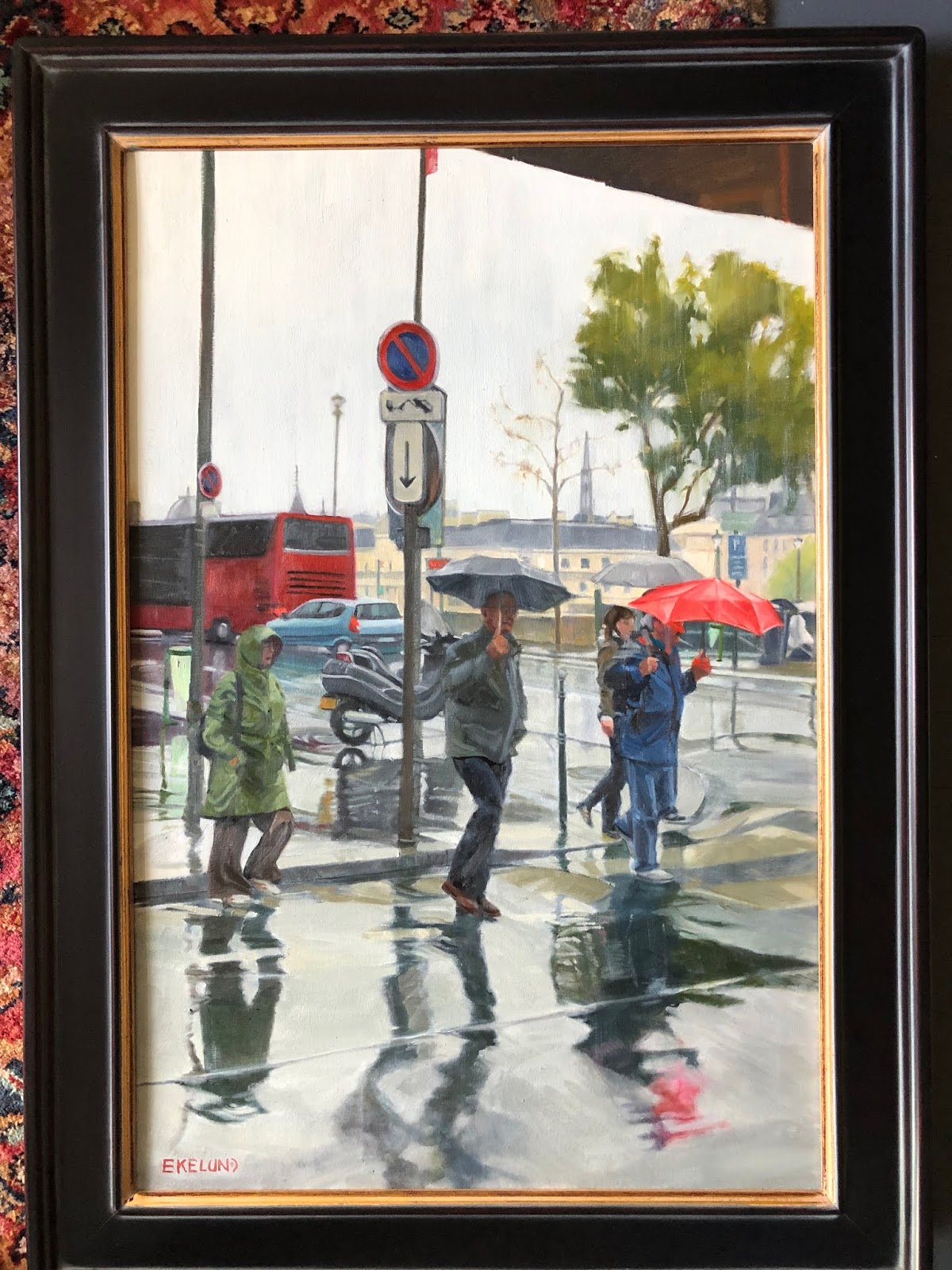
Paris Rain, 30x20, oil on linen

Here is a painting I did about 5-6 years ago. I was so very pleased with it at the time and proudly hung it in my home. It was done in the master painting class I took with Kevin Weckbach and it was the piece I did for the month we studied Dark/light pattern. In my quest to make improvements on existing 'finished' art works, I started to study this piece. Why had it never sold? Was it the subject? Or the way it was handled? Composition seems good to me. There were a few small things that I thought could be improved upon but overall I was still pleased. BUT. Once I got started working on it so much started to pop out. Drawing being premier. Just some subtle things but which I think make a difference.

The bus at a wrong angle on the backend; a few angles here and there on the umbrella's; I added some  tiny features to the figures faces. I don't like faceless humans and though there was a hint at features in the faces, I put a bit more character into them; a bit more shape was added to the clothing: The woman's raincoat was lightened and given more form, the man in the middle now has a pocket on his jacket with his left hand now in a pocket; and the man in the red umbrella lost a little weight and has a brighter blue jacket on, which brings him out from the woman behind him. I darkened the pavement (although in the image it doesn't quite show up as the paint is still wet) and made the crosswalk a bit more distinct. My daughter's comment was "It looks so much lighter." And yet I had darkened more down than added more light. An interesting paradox.

I had pulled this painting out to update it prior to Notre Dame burning but the spire is in this painting. So weird to contemplate that it is now gone. Let us pray that when the repairs and rebuilding are done that they have enough common sense to rebuild as it was and not some horrific idea of 'improving' upon it. Our culture seems to have a huge ego and superiority complex, especially when it comes to history.

Read Full Post


the Critique

Critique, 30x24, oil on linen panel
 I don't believe I have posted this painting before. It is really hard to put out there a portrait of sorts of someone so well known in the local art community here in Denver. This is from the Master Painting class I took a few years ago with Kevin Weckbach. I am very grateful for the time I was able to spend under his tutelage so the last thing I want to do is put a bad painting of him out in public.That happens to be my easel behind him with my nifty tennis ball tube turned brush holder hanging on the wall. People who have seen this painting ask if that is me sitting on the left, but alas, no; I took the reference photo and then used it as a class project for dark/light pattern.

I have explained dark/light pattern before so to briefly review what that means it is to find a pattern either in the light or the dark values and then push the medium values either to the light pattern or the dark pattern. This one I used the darks to carve out the light. The dark values marry to one another to create a circle that moves the eye around. To do the assignment, for instance, the brown hair highlights of Tomiko on the left were toned down so as to not be disrupted by her highlights and to blend from Kevin's black shirt to his navy pants to her brown hair, etc. Her sweatshirt was overall a darker gray to unify with the darker areas of her hood folds. Kevin's blue cargo pants were overall darker and flatter too. I brought the mediums back out after the critique but still keeping the pattern in mind.

The other things I liked about this composition were the repeating square shapes and the angles both in the painting being critiqued and the easel and the brush holder. That is what we call the "abstract quality" and in this case, help guide the eye as well.

Here is Kevin critiquing the start of the painting where you can see what I was talking about marrying the values.

Read Full Post


The Critique of The Crit

critique of The Crit painting

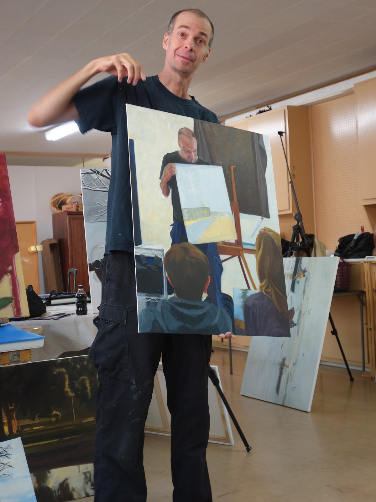
Here is a photo from last week's working critique. Kevin is critiquing my painting that I am doing of him critiquing another artist's painting. My painting of The Critique is not done in this photo with Kevin holding it.
As I was working from the outside in on this painting, Steph's painting just blocked in. 'The Critique' is done as dark/light pattern where I wanted a strong sense of light versus dark. Even at the angle it is being held at here you can sense that strong structure of what is in the light group and what is in the dark group. When you squint, the mediums marry themselves to one or the other.
Below is the painting on my easel this weekend as I continue to build on it. The structure is there so it is a matter of  time before it is completed.

The Critique, 30x24, oil on linen panel

The reason I like this particular subject is because of the repetitious shapes that the dark values carve out. The lines in the painting he is holding repeat shapes in the background and also help lead the eye around the whole painting. This particular composition has repetitions of rectangles as well as triangles. The viewer is taken in by the direction of the two figures looking at the painting.

Read Full Post


Study for The Critique

The Critique, study for, 12x9, oil on Panel, available

Here is a study I did for a larger piece I am now working on. It is a "dark/light" pattern that I have spoken of before. If you squint your eyes you will see that every shape is either a part of the dark shape or a part of the overall light shape. I am staying away from medium values to create this pattern. The only medium here is really the light on the sweat shirt of the figure on the left which I will darken down in the larger painting. In this study it is tied to the darks but not quite enough so.

The head of Kevin transitions from the light into the dark pattern, as does his arm. Against the light background his arm groups itself with the dark pattern, but against his shirt and the painting he is holding his hand transitions to the light group. I love working with dark/light pattern. If done well, the painting is so much more interesting to me.

Read Full Post


Young Artist at work - in stages

4. Young Artist, color started; 5. above finished dark/light pattern
 
3. block in for painting, 24x18, oil on pane.


2. Study for Young Artist, 9x12, oil on panel
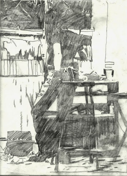
1. study for Young Artist, graphite on paper


  1. This was my first attempt at a dark/light pattern for this painting. (In doing a dark/light pattern you have to think of the mediums values going either towards the dark or towards the light while maintaining a good flow to the pattern created.) In this version I joined the stool and the taboret (storage shelves) together and it seemed too heavy, not enough pattern, even though the colors of the two are very closely matched which made me think to tie them together.
  2. In the small oil study I carved the stool she is holding on to out of the dark shape and also a tube of paint that is standing up on the lower shelf within the shape of the legs of the stool. I decided I had to leave parts of the legs tied to the dark pattern and I am liking #2 better. 
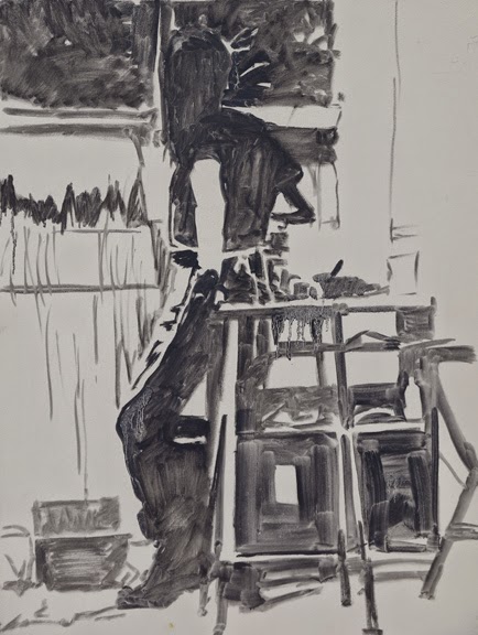
  3. On the full sized board I decided to start the color version with a black and white block in to help keep me within the pattern I had created. I added on more section of the fourth leg into the light pattern but I am not convinced it will stay there. At this point in time, I don't think it adds anything to the whole. 
  4. Here I am starting to add color. In the dark recesses of the taboret is dark blueish red, which reads as a dark as does the blue black of her jeans. Distinct color shifts but not value shifts. This is not going to be a "color filled" painting overall, but you can see what color does to the overall image already. Her shirt is a solid black but I was leaving the black of her shirt that is in the light separate for the subtle value shift that will come. This is just where I ended my day.
  5. This is the completed dark/light pattern although technically I would force a few more areas now that I see the photograph. In the light hitting her shoulder for one. I forgot to go back in and tone that down. It is now too late as I am moving it into a local tone painting. Stay tuned!

Read Full Post


Texture and Paint Quality - painting without a brush

Anyway you turn it...it looks interesting...and reads well


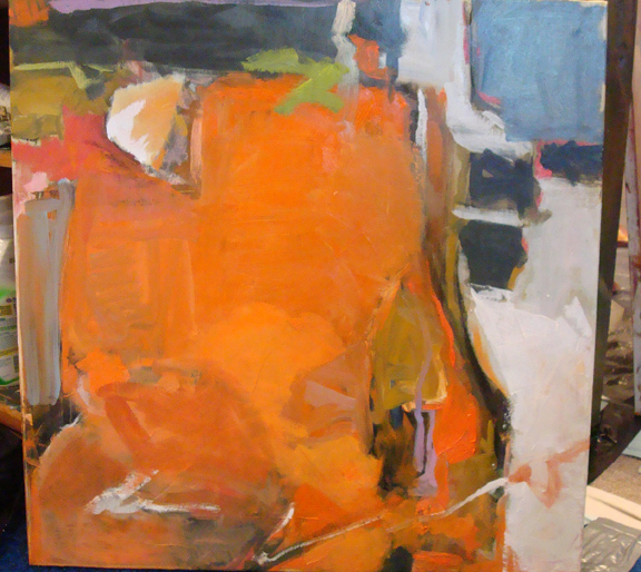
oil on linen panel, 11x14, Abstraction

Here is an exercise in paint quality. What is meant by that is the texture of the paint applied. I have had a tendency to paint fairly thin over the years. I have been working on a more painterly approach the past year or so but this exercise was helpful as it took me out of my comfort zone in not using a brush. One does get attached to painting with a brush! The tools used to apply paint to canvas were: a credit card, a putty knife, oil sticks and a plastic tool used in printmaking. I had some old paint on my palette that was not quite dry but had started to dry and I used that in places (notice the "white block toward the center) with those flat edges to get some interesting textures.

Painting a "non-subject" does not come easily to me but I did find this freeing in a way. It is also harder in that there is no subject to rely on. I had to think of varying the shapes, the colors and the values to make something pleasing and interesting. I was quite stunned when my husband asked to see it and then said he liked it and liked it whichever way I turned it. Now that is high praise! My daughter also likes it and the two images above are her preferred directions.

In case you are curious, the original way this was painted is below...my husband wants me to frame it but I can't decide which direction. I am open to suggestions. Let's go with 1, 2 or 3 in the order they are posted.Thanks!

Read Full Post


Tomales Bay in Local Tone as visual approach

Tomales Bay, California . 30x30, oil on linen

In my last post, I talked about local tone using just THREE VALUES. This painting is local tone, with three distinct groupings of a light group, medium group and dark group. But there are more than three values. My light group, as is very obvious in this particular painting, is the sky, the sky reflected in the water, the yellow house and boat house and the white roof. They create a wonderful circular pattern in this painting. The mediums are the rest of the houses (blue and red) and the 3 roofs in the center. The dark group includes the trees and the dark gray roof and the corresponding reflections including the darks under the docks to the right. The docks themselves are both light and medium and create their own pattern.

I currently have a number of other LOCAL TONE paintings in various stages of development. Local Tone is, I believe, my favorite visual approach. Stay tuned! But my next big painting will be light and shadow. As Kevin Weckbach likes to say "the foundation for a good light and shadow painting is a solid local tone."

Tomales Bay is in Northern California, or almost directly west of Petaluma.  Every time my husband and I travel to visit his family, we drive to Tomales Bay to get fresh oysters. We then eat oysters for days! Yes, most of them are eaten raw, but the chef will BBQ "some" for those who just can't eat them raw. But oh, my, talk about tasting of the ocean. I do love a good oyster, and Tomales Bay is where we go to get them. I have heard that there is now an outlet from the farm we go to in SF.  The Farm is called Hog Island. I highly recommend it.

Read Full Post


Melbourne, FL - Beach with Sea Birds, WIP

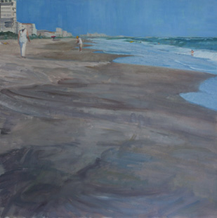
Melbourne, FL Beach with Sea Birds, 24x24, oil on board (Day 3)

Our last class project is to paint outside our normal  modus operundi. So if we normally paint with thick paint, to paint thinner; if you normally paint thin, paint with more texture. I normally paint thin and fairly graphically, so I am attempting to paint with more texture and less line.  I am using the brush to allow the strokes to be more integral to the painting. I am having so much fun.

I forgot to take a photo after the block in, but after two class periods I had gotten close to where I wanted it to be. Just needed the birds and the rest of the people on the beach to be added. By the end of day 3 I had the birds added and worked on a finishing the water. I also had added more color into the wet sand while make it all read better as one value. In the beach the sand looks too choppy. Tomorrow, before critique, I hope to have all the rest of the people added on the beach. I don't expect that to take too long.

After posting this I realized that the painting looks like two separate paintings. Ie, a 6x24, if you take the top part with the people, and then an 18x24 for the bottom section, with the birds. I worked on that today to integrate them into one unit so I did not finish getting the people in. Stay tuned!


Read Full Post


Blue: Color as a Visual Approach

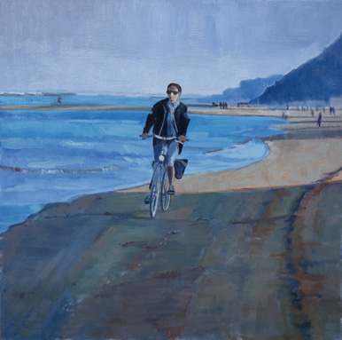
Along the Adriatic, 24x24 oil on board

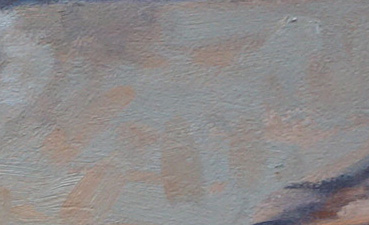
As I wrote last week, this project is Color as a Visual Approach. I chose an easy one to do in blues, since most of it already tended toward blue if it wasn't outright, like the sky and the sea. The only thing I really had to work at was the sand and the woman's face in the sunlight. It is reading as sand, but that sand actually has a lot of blue in it, making it a greenish color. See patch below and how green it looks on its own. BUT next to all the other blues, it still reads as sandy colored. Her face is basically the same pasty green but it reads as if it is in the light. This has been a good exercise for me. Even though the sand in the shadow has a lot of oranges and greens, the over color is blue if you squint down. That is the key. To use your whole palette and still keep the over color bluish.

Kevin critiqued this at the end of Monday's class. He likes it but said two things need to be done. The tire tracks on the right hand side are too soft and need a bit more graphic quality to them to match the overall graphic feel of the piece and to tie the shapes in the sand to the bicycle.

Read Full Post


Winter, Local Tone-Work in Progress

first draft, Winter Wonderland, 24x18
Second Round


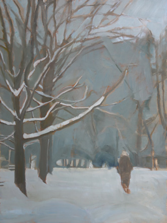
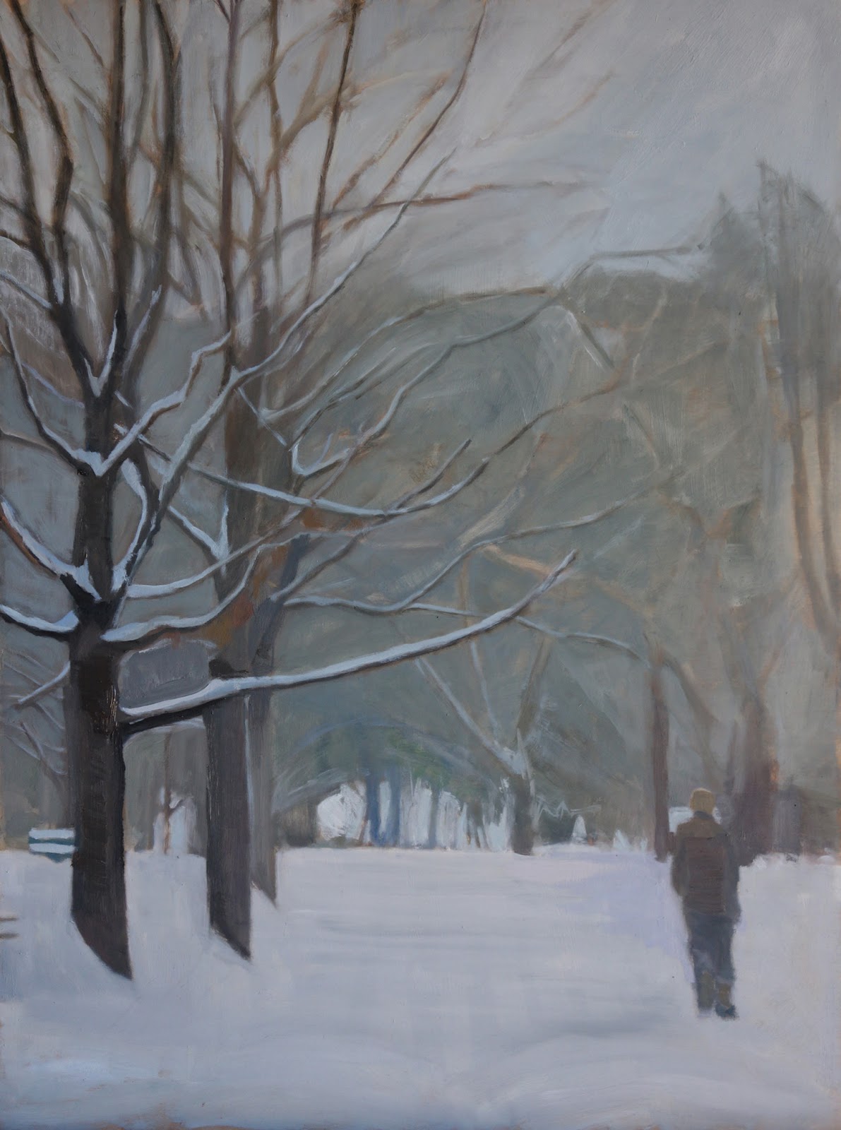
I started this painting before Christmas. Half way through it I realized that my drawing was way off and I just had to rework it. In the first photo you can see that the bottom limb on the forward tree is just too large. That tree also need to be darker. The figure was not in the right place for good balance, so I moved him down and over to the right. The other things that were changed: the mass color of the trees in the background, widened the opening in the trees in the distance (not sure that is going to stay that large) and brought in more sky. This is the point where it was when it was critiqued. Kevin liked how I incorporated the figure into the trunks of the trees and lamp pole and darkened the tree that is the main focus. I have worked on it since and when it gets to a place where I am well pleased with it, I will post the finished piece.

My idea for this was to keep it simple and to think of it as a wood block print, with three values: light, medium and dark with the medium marrying into the dark group (visual approach: Local Tone). In the photo reference there is another figure right in front of this figure, just enough to be confusing, so I removed her. I like the solitary figure in all this snow. I want you to be able to hear the quiet.

Read Full Post


Month 4: Local Tone

Local tone, to state it simply, is where a painting is "local" color. ie not corrupted by light or shadow. A snowy day, a rainy day or a cloudy day with diffused light coming in. The lack of light flattens the objects down and value is the relationship. There are three values in local tone: Dark, Medium and Light. The medium will be closer to either the light or the dark. In the example below, the sky is the medium and it is tied to the light. Even though this example has shadow in the snow, it is still lighter than the medium and if you squint, the shadow still reads with the large snow shape. In local tone you should have a "base" shape. The base shape below is the dark group or the trees with the house.

In the painting above, the base group is obviously the medium group. The darks are tied to the medium and there is not a lot of dark. Even though there is some modeling of the figure there is no real sense of light or direction the light is coming from.

In the paintings I am doing for this project, the base shape is the medium group. I have started three as I feel ambitious and I like local tone; I will post them as I get them done. Correct me if I am wrong, but do you get tired of seeing the painting progress? ie multiple postings of the painting as it takes shape or would you like me to post as works in progress? 

Read Full Post


Equalization: Laundry Day

 
Laundry Day, 30x30, Oil on linen


I was surprised how much I liked Venice and now wish we had stayed at least one more day there. The alleyways and laundry strung everywhere touched a chord with me. I am one of the rare Americans  who still hangs my laundry up; and yes, even in winter. It was heartening for me so to see how normal it still is in some places and Venice does not have the sun and dryness going for it like Colorado does. Anyway, this was a fun piece and I hope it is only the beginning of a new series. I am already wanting to go back as I did not really get a chance to explore this unique city as much as I would have liked. I left this painting hanging at work when I left on Friday, so I cannot finish it this weekend as planned. Just a few things still needed. Can you see how this would fall into equalization as a visual approach too? With all the repetitions of windows and clothes lines and the bridge? What fun!

Read Full Post


Equalization as a Visual Approach: end product

Racked, 20x30, oil on linen

This month I worked on two projects; one in class and one in my studio. As is my tendency, I kept the class project simple allowing for the distractions associated with being around that many people in a rather small space. In the studio I chose a more complex subject and one I wanted to tackle anyway; I see it as a start of a new series. Both paintings are from my recent trip to Italy.

The class project is of racked sea kayaks which were on the beach in the town of Pesaro on the Adriatic. I liked the simple symmetry of this scene and the way the red and orange kayaks dominate all the blues. Then to have the yellow bands break up the verticals against the horizontal kayaks.

Pesaro is normally a vacation hot spot but we were there off season and found a hotel open right off the beach. It was a wonderful place to unwind after the tourist crowds of Paris and Venice. The water was warm and only a light jacket was needed.

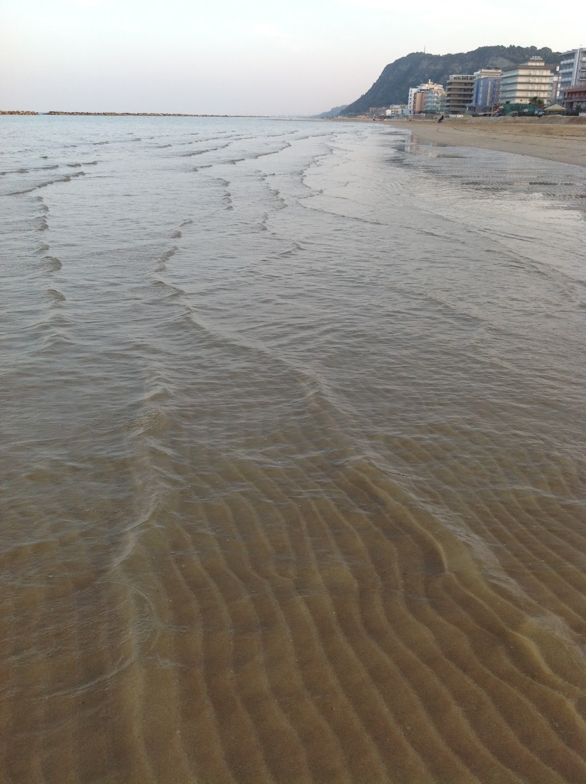
looking south along the beach-the hill is a nature preserve
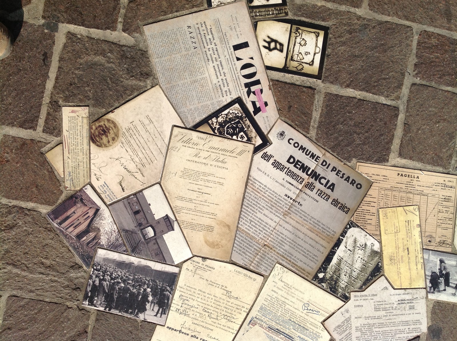
Built into the sidewalk stones: documents and photos from the deportation of Italian Jews

Read Full Post


Month 3-Equalization

Ideally, in a painting that is Equalization as a visual approach, there is no focal point; That the elements are equal in the pattern and the relationships to the whole (ie line, color, value, shape, texture and patterns). So, within the painting, each element is equalized or uniform. So, for instance, if you use the color red as an element, it must be evenly balanced throughout the whole but the red does not have to be tonally equal; ie you can use a red that is different in its general coloring (ie tint, shade, hue or value).  The shapes must be proportionally the same, but there still is variety in the shape (consistency and balance). The shapes will create pattern; texture is the “feel” of it; you can get to texture with brush strokes or by making the shapes/pattern ever smaller.  Keep in mind that the whole painting or area of the painting you are equalizing, reads as one unit.

Ideally, in a painting that is Equalization as a visual approach, there is no focal point; That the elements are equal in the pattern and the relationships to the whole (ie line, color, value, shape, texture and patterns). So, within the painting, each element is equalized or uniform. So, for instance, if you use the color red as an element, it must be evenly balanced throughout the whole but the red does not have to be tonally equal; ie you can use a red that is different in its general coloring (ie tint, shade, hue or value).  The shapes must be proportionally the same, but there still is variety in the shape (consistency and balance). The shapes will create pattern; texture is the “feel” of it; you can get to texture with brush strokes or by making the shapes/pattern ever smaller.  Keep in mind that the whole painting or area of the painting you are equalizing, reads as one unit.
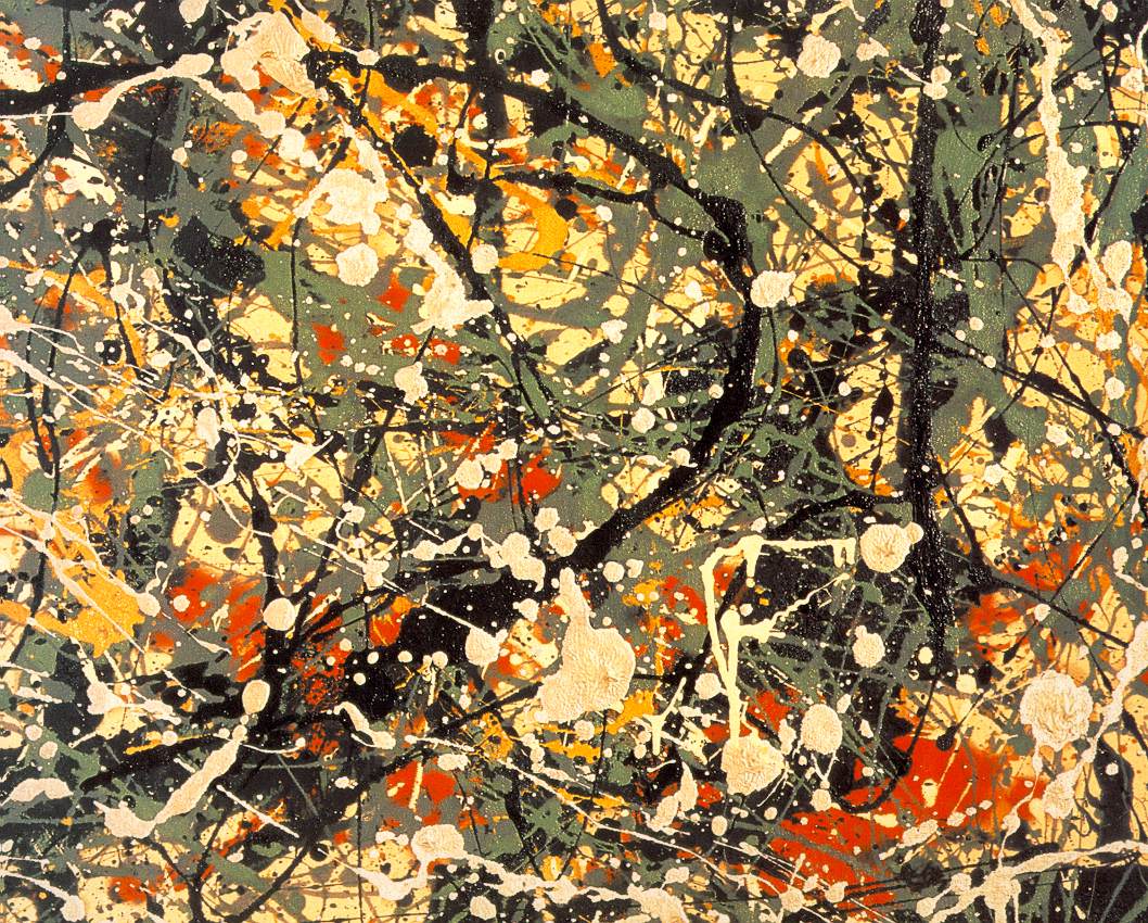
Jackson Pollock example of equalization
Jackson Pollock’s drip paintings are a perfect example of equalization. Nancy Switzer is a good example for pattern and paint quality; Nancy gets good movement with gradation of color that creates a movement and supports the pattern; She keeps each shape and each color shift unique.Her paintings almost all incorporate equalization as the visual approach.
Vincent Van Gogh example of equalization (texture) as an element
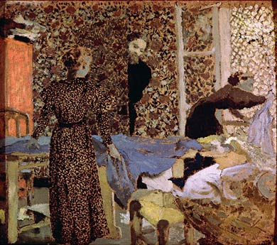
Equalization can also be used as an element within a painting. Van Gogh’s drawings are an excellent reference for equalization within a section. Each section is defined by its texture (which then creates a pattern). When equalization is used as an element the approach is usually about texture and pattern. Texture will have a feel about it and pattern won’t. Think Eduard Vuillard.  Vuillard was about elaborate patterns that were harmonious and usually very flat (local tone; ie the use of three values: light, medium and dark with no obvious light source – think an overcast day). Pierre Bonnard did lots of pattern through layering of paint which created expressive textures.  Gustav Klimt is another who used pattern as an element and did amazing landscapes using equalization as a visual approach.
Eduard Vuillard example of equalization (patterns) as an element
Gustav Klimt example of equalization as visual approach (whole painting)
Next post I will show what I am doing for my project(s) for this month. 

Read Full Post


Month 2- Dark/Light Pattern Wrap Up

24x24, oil on board

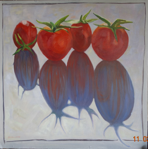
I picked a simple subject for this last month's project since I would miss half the classes while I was in Europe. I did manage to finish it in time, so my plan did work perfectly. It was a  fun project. And it was successful to the assignment. The reference for this painting was from a 2008 newspaper cover story on, you guessed it, tomatoes!  The trick was that in order to get the painting to work as dark/light pattern, I either had to darken the tomatoes to match the value of the cast shadow, which was dark purple, or lighten the shadow to go with the value of the tomatoes, which is the direction I took. In order for dark/light pattern to work the darks must be tied together in value. In the light value, which is the whole background, I worked on gradation. Starting cooler and darker in the upper right hand corner and moving diagonally across to the lower left got warmer and  lighter.

At the critique, it was suggested that I try using dabs of paint for the background to work the gradation in an equalization pattern, which I have done. (not in this photo) But it makes the tomatoes and shadow too different so now I must go back and repaint them. Once that is completed I will repost the results side by side to see the difference.

Read Full Post


Month 2, Day Two; Dark/Light Pattern

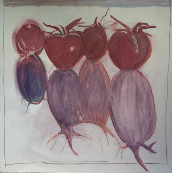
Block in for Long Shadowed Tomatoes,  24x24, oil on board

I missed the lecture for the second day, but had started my next painting last week. I was able to get the tomatoes blocked in but wiped the shadows off a number of times so decided to put them in thinner until I could get the shapes right. You can see the outlines of where I have been. I will miss the next two weeks so you will get a break from instruction. Here are my notes on dark/light pattern.

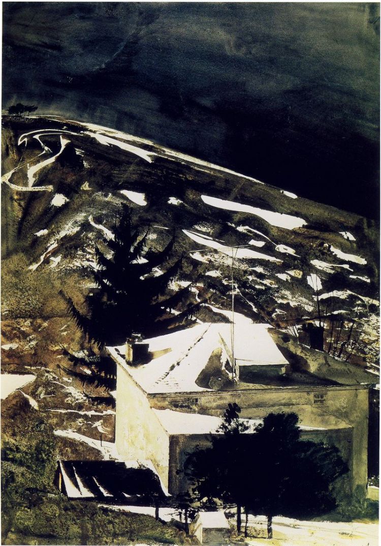
Light shape and dark shape-one shape will be a pattern (in my project above it would be the dark shape that is creating the pattern). Each shape should have different proportions within the bigger shape. The key thing to keep in mind is the uniqueness of each shape within the whole pattern.When defining the pattern it does not necessarily have to be the dominant shape (see Andrew Wyeth's Wolf Moon below).

Wolf Moon, by Andrew Wyeth. the light is creating the pattern that takes your eye through the painting, yet the dominant shape is the dark.


One of the two shapes will be more tied into itself which will aid eye-flow (or how the eye moves through the painting). In the painting of Andrew Wyeth's, the middle value of the hillside and shadow on the house tie into the dark shape. One way to think of this is that if the main pattern were cut out of contact paper, you could lift one corner and pull the whole shape off in one piece. The shape does not have to necessarily connect in one piece physically as long as it connects visually.

Only two values will be visible (as talked about in previous post). Gradation of values is okay, but that middle value will be tied to either the dark or the light and will not read as a separate value. Right now, even though my shadow shape is lighter than the tomatoes, it will be tied to the tomatoes as one large shape when I am finished. I did talk to Kevin about this today and he said it would be okay to keep the tomato color true to life, just to then keep the shadow that same value. I had planned on going rather dark red on the tomatoes to tie into the dark purple shadow. I think keeping the values lighter will actually be more of a challenge for me.

Read Full Post


Month 2 - Dark/Light Pattern

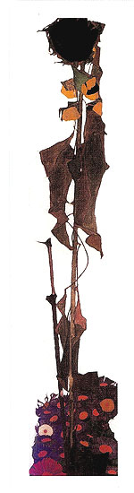
Monday was our last day working on our abstraction painting but the lecture was on dark/light pattern. Kevin talked about how to "marry" the mediums either to the light group or the dark group so that the mediums would not read as a separate group. It must be obvious that the overall painting reads as dark and light but not necessarily black and white. He gave the example of Egon Schiele's Sunflower.

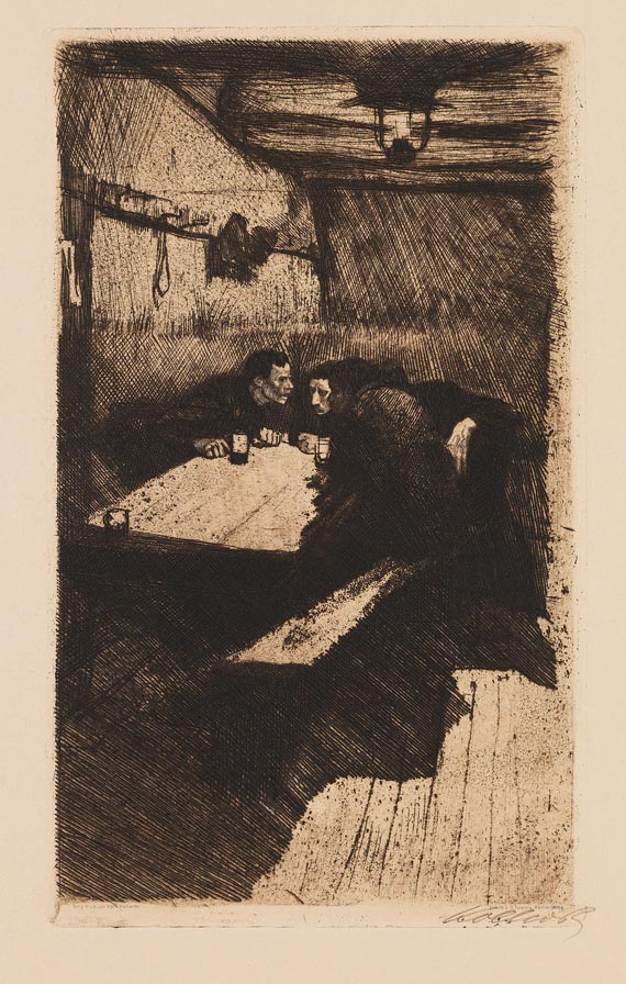
Even though the medium color group is obviously a medium (the ochers) it marries to the dark. The balance of the composition is beautiful and creates and interesting pattern. Keep in mind the movement withing the patterns. For this movement he showed a black and white of Kathe Kollwitz. This is not the image Kevin talked about but it is the closest I could find. You can see how the pattern repeats from the floor, to the bench to the table to the wall to the ceiling. The pattern moves the eye through the composition in an amazing way.

As a side note, Kevin talked about how the Master Painting and Advanced Master Painting classes and the resulting artists in the Denver area who have taken the class either with Kevin or Quang Ho are now talked about as the "Denver School" in other parts of the country. That the quality of work produced here is being noticed! How cool is that?

Read Full Post


Month 1, Finished Abstraction

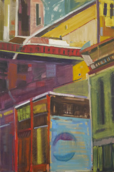
Champa, 30x20, oil on linen

Week 3 had this to say at the final critique. I done good. It reads as buildings, but not literally. Good balance, great color and use of texture and paint quality. He was amazed I used so many colors and pulled it off. Kevin was pleased. After the second week of struggle, I took it home, figured out where I wanted to go with it and pretty much finished it on Saturday. He had one recommendation for me when he saw it Monday  which took me all of 5 seconds to do since I still had the color mixed on my palette and that was to put the beige line back in between the green and blue shapes at the bottom right. He said I had lost it between the two green shapes and it needed that line to be more defined. How funny that me, the one who loves line and sharp edges got in trouble for not having a sharp enough definition.

I want to include two of my favorite paintings from the class. I think they are both wonderful. My friend Jeannie did the top one and Karen did the bottom one.

Read Full Post


Abstraction Week 2

Mea Culpa. This post was scheduled for Sept 29 but did not publish for some reason. Here I am ready to add the finished painting without the lead-in! So here you go. A few days late but who is to know?

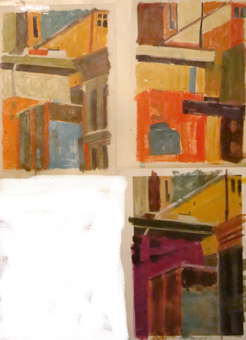
Since I was not quite on the right track after the first class day of painting, I went home, took a photo of the painting where it was at, printed it out, and then used colored pencil to block in new areas and then took a brush with paint thinner and spread the color around. That is the lower right sketch above. Realizing that was not the most cost effective way to do it, I printed out a second copy and then used tracing paper and oil paint to do the two ideas at the top. Kevin picked the one I did first with colored pencils for me to work from. Below is what I did in class this past Monday. He was very happy with my progress but said I was "not done" and more layering needed to happen. I will print out a copy of the painting as shown below and play around with ideas of where to take it further for class on Monday. Monday is the last day to paint on this assignment. I offered to obliterate the buildingness of the composition, but he said no, the composition is great.

It is an interesting lesson for all of us in this class. I don't think there is one person not struggling. Eeven among those whom I think are doing quite well with the assignment say they are struggling. I am looking to Richard Diebenkorn for inspiration for this project. Others are trying Franz Kline for their inspiration, to name a few.

We are also charged with bringing in ideas for the next months assignment which will be dark light pattern. I will miss two of the four classes for that assignment so I am hoping to do a simple example.

Read Full Post


Advanced Master Painting: First Day, Second Week of Abstraction

False Start, 30x20

I just started taking the Advanced Master Painting class with Kevin Weckbaugh. The first day of class was last Monday, which I missed. A friend, who is also in class, was kind enough to call me and give me the gist of what I missed so I could prepare for today. Well, I must have willfully read into it what I wanted to hear because I am off to a false start. I understood that this month's project is about abstraction and that we could take a photo reference but we had to abstract it. I picked this photo my son had taken downtown a few years ago as it is already fairly abstract. I have been told I must get it beyond the "feel" of buildings, so I did start on that before class ended today, but only after I had a really good start on it looking like buildings. It was hard for me to start "erasing" all that work as I really liked what I had going. I am tempted to wipe the whole thing off and start a new one, but then on the other hand I would like to try and pull this off so I will continue with what I began.

The notes from today are pretty sparse. We were told to be aware of line quality. To vary the line and create a dialogue with it. One of my buddies was using Franz Kline to get that dialogue, while Kevin prefers Willem deKonig. I am going to look at Richard Diebenkorn this week for inspiration. Kevin really wants us to play with the visual dialogue this month and for us to ask questions of ourselves while we work. ie What is working, what isn't working; is there too much of something or too little? how is the color working? is there harmony? To keep in mind that the easiest way to create shape is with line, and to try to incorporate line into the painting and to think about soft edged line and sharp edged line - ie to vary between the two. AND most importantly, to not be afraid or "ruining it" since this is all about playing and getting out of our comfort zone. Since we paint on one painting for a month, all canvas must be large.

Read Full Post


Topics

Archives