Blog


Another Save-Quayside

Quayside, 12,x16, 2005

In my effort to not work too hard for the Museum show, yet have a strong body of work, I have been looking at old paintings to see what I can salvage. This painting was a "good" painting for the time, and LOTS of people liked it, but it never sold. One year I had this hanging at the Summer Art Market where almost everyone walking by commented on how they liked it! I decided it was time to give it a new lease on life since at least I know it is a pleasing composition and/or subject. I started with the yellow boat, and worked out from there. I brightened the yellow using more pure color, and kept more yellow on the shadow side. For the shadow I mixed cad yellow medium with terra rosa and another pile of color using cad yellow medium and dioxide purple. I used these two to create transition from the darker to the lighter (from the back of the boat forward). The dark red boat color was about right, but I still worked on putting it into the sun; the light didn't read as well as it could. I totally missed the cast shadows of the ropes in the earlier version.

With the water, I started with the reflections making them more unified (there is that word again!). I then mixed a neutral gray blue green color as my medium color and blended that in all over the water (viridian green, burnt umber and a bit of Ultramarine blue and white). I let that sit overnight and then came back a day later and mixed a lighter medium value and then the lightest/brightest to hit the top of the water, also thinking about the water in back being lighter to transition to the darker water in front. Quite a save, I think; although there will always be those who prefer the original.

Read Full Post


Another Lesson Learned the Hard Way

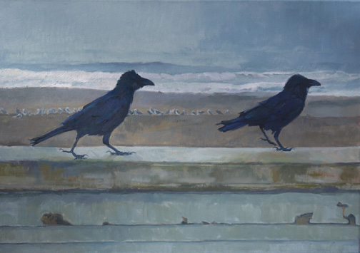
Wait for Me! 20x30, oil on canvas with a bit of wet paint glare
As submitted and not accepted

I know this is a topic not many of us want to discuss in a public forum - the rejection of the jury! While trying not to let this get to me I took the opportunity to critically look at the painting in question with a juror's eye, and I knew they were right in their assessment. I, again, as is my wont, was lazy. I let the current culture of the quick painting take over my inner judgment that this piece really wasn't as good as it could be. The interesting thing to note here is that I had started a blog post in December with the "finished" painting and the original block-in, and never posted it because I saw the inherent problems-the block-in looked better than the painting! But some of us are just plain hard-headed.

There were a couple of things I noted. First, that the sky going into the ocean was way too blue and the value  too dark. I lightened it all quite a few degrees and thought more about orchestrating the ocean waves. I also made the color more neutral (using Cerulean Blue/Burnt Umber/White) . I had known that the beach was the wrong color, and also too dark in value made more so now that the sky is lightened. The reddish cast had to go, so again I went with a more neutral mix (Viridian Green/Burnt Umber/White with some other colors thrown in for variety in the sand). I used the same colors, with different % to make the white caps. The wall I had known was too dark - that my original block-in value was more true, so I took it back to that value and got rid of the blue cast. The Ravens came next and I had been so caught up in the myriad colors that I had lost touch with the form, so I gave them both more form and thought less about all the color, simplifying that. I decided to take more time with the drawing of their legs and to create more of the shaggy appearance ravens are known for. The gulls on the beach came last. I was not content with them anyway, so I took a bit more time with them and yet tried not to give them too much definition to keep them in the background with a secondary place. I still see a few spots that need a little attention, but overall you can see the difference. Another lesson learned the hard way.

Read Full Post


Topics

Archives