Blog


At the Wheel-Before and After

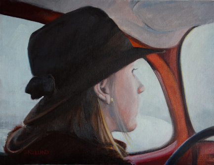
At the Wheel, 12x16, oil on linen

Here is a painting I did from a slide taken in December 1977! Oh my. My sister is driving my father's VW bug and we are on or way to Erfurt in West Germany. We lived in Zweibruecken at the time.  It is a cold winters day and it looks cold inside the bug as well. I painted the top painting in 2004 in an afternoon and I remember being very proud of myself. This painting was last hanging in my daughter's apartment but when she moved she decided to give it back in exchange for something new. Hey, with a mother as an artist, she can pretty much have revolving art! Well once I got it back in my hot little hands I knew I had to do something about it and it was the perfect project to work on during the holidays when there is so much else going on. As usual, the drawing itself and the proportions were okay. Value relationships and color left a lot to be desired! The first thing I decided to do was to block in the big dark shape and unify them. In other words, I made the upper rim of the door tie into her hat, her hair and her coat and then wrapped it around the molding and steering wheel. I knew that the liner was too light and had to be darker than the snow outside the window. So I lightened the snow outside and darkened the headliner-still not convinced it can't go darker...The red of the metal came next and it obviously was too warm and too light and not enough reflected light on it. Then I went back and cooled down her face which was totally off color. How could she be warm toned in all that cold?? I used some of the color from the snow to make the transition from the light hitting her face to the color of her skin..and got rid of the harsh outline. Her cheek looks natural now. I did very little to her hair from the mass blockin, just very subtle color and value shifts, and tied it into her scarf and hat. The hat I just put in some light to give it form and otherwise left it a solid color. I played a little with the repeating pattern between her scarf and her hat brim. It reads So Much better now.

Read Full Post


Month 4: Local Tone

Local tone, to state it simply, is where a painting is "local" color. ie not corrupted by light or shadow. A snowy day, a rainy day or a cloudy day with diffused light coming in. The lack of light flattens the objects down and value is the relationship. There are three values in local tone: Dark, Medium and Light. The medium will be closer to either the light or the dark. In the example below, the sky is the medium and it is tied to the light. Even though this example has shadow in the snow, it is still lighter than the medium and if you squint, the shadow still reads with the large snow shape. In local tone you should have a "base" shape. The base shape below is the dark group or the trees with the house.

In the painting above, the base group is obviously the medium group. The darks are tied to the medium and there is not a lot of dark. Even though there is some modeling of the figure there is no real sense of light or direction the light is coming from.

In the paintings I am doing for this project, the base shape is the medium group. I have started three as I feel ambitious and I like local tone; I will post them as I get them done. Correct me if I am wrong, but do you get tired of seeing the painting progress? ie multiple postings of the painting as it takes shape or would you like me to post as works in progress? 

Read Full Post


Equalization: Laundry Day

 
Laundry Day, 30x30, Oil on linen


I was surprised how much I liked Venice and now wish we had stayed at least one more day there. The alleyways and laundry strung everywhere touched a chord with me. I am one of the rare Americans  who still hangs my laundry up; and yes, even in winter. It was heartening for me so to see how normal it still is in some places and Venice does not have the sun and dryness going for it like Colorado does. Anyway, this was a fun piece and I hope it is only the beginning of a new series. I am already wanting to go back as I did not really get a chance to explore this unique city as much as I would have liked. I left this painting hanging at work when I left on Friday, so I cannot finish it this weekend as planned. Just a few things still needed. Can you see how this would fall into equalization as a visual approach too? With all the repetitions of windows and clothes lines and the bridge? What fun!

Read Full Post


Equalization as a Visual Approach: end product

Racked, 20x30, oil on linen

This month I worked on two projects; one in class and one in my studio. As is my tendency, I kept the class project simple allowing for the distractions associated with being around that many people in a rather small space. In the studio I chose a more complex subject and one I wanted to tackle anyway; I see it as a start of a new series. Both paintings are from my recent trip to Italy.

The class project is of racked sea kayaks which were on the beach in the town of Pesaro on the Adriatic. I liked the simple symmetry of this scene and the way the red and orange kayaks dominate all the blues. Then to have the yellow bands break up the verticals against the horizontal kayaks.

Pesaro is normally a vacation hot spot but we were there off season and found a hotel open right off the beach. It was a wonderful place to unwind after the tourist crowds of Paris and Venice. The water was warm and only a light jacket was needed.

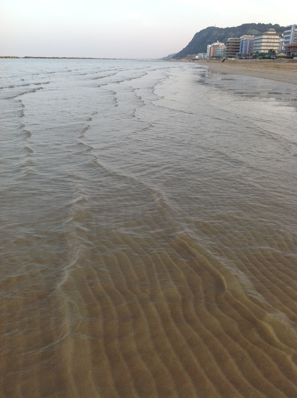
looking south along the beach-the hill is a nature preserve
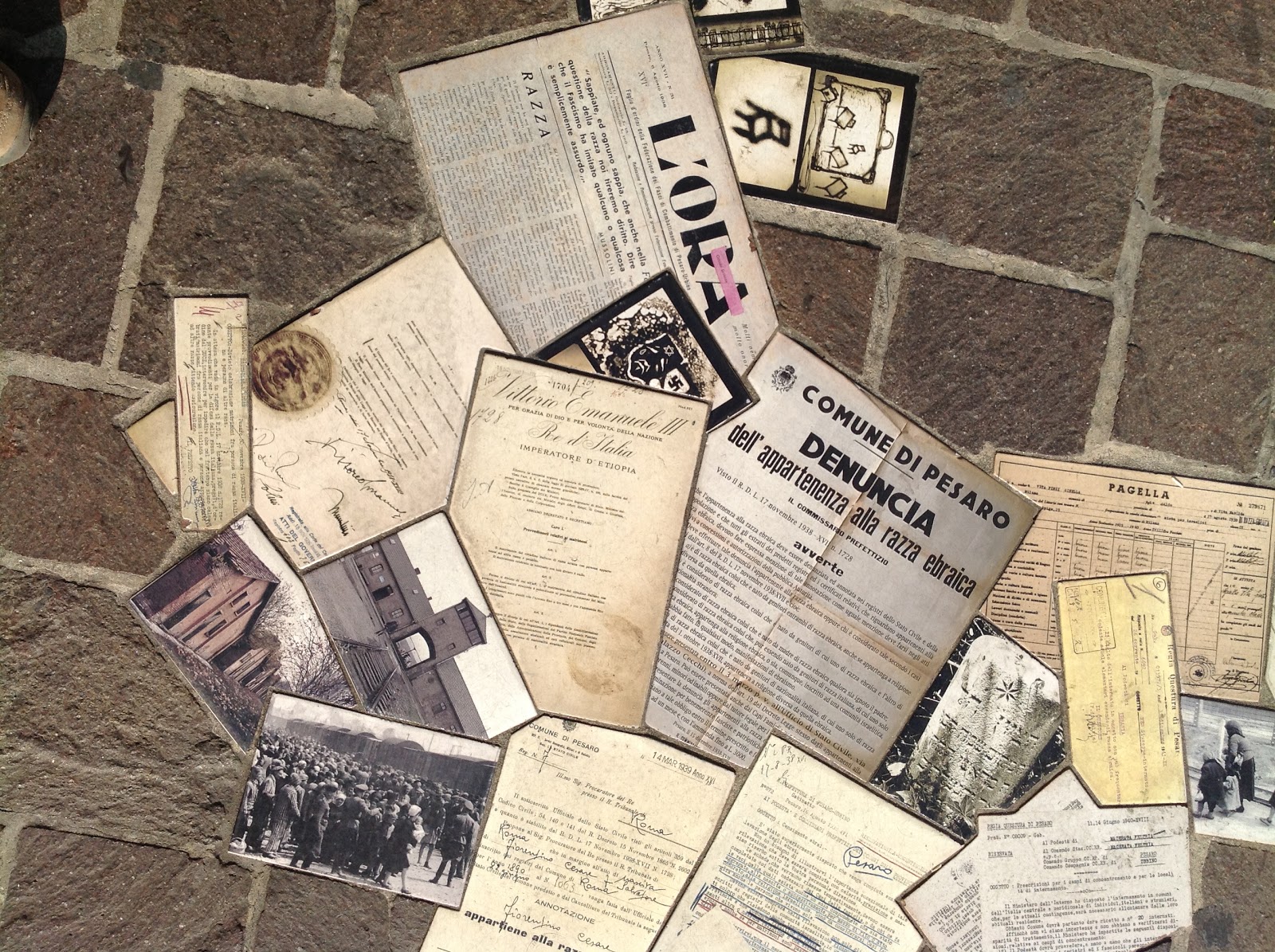
Built into the sidewalk stones: documents and photos from the deportation of Italian Jews

Read Full Post


Topics

Archives